

Play TTRPG
RUINED SPACES's itch.io pageResults
| Criteria | Rank | Score* | Raw Score |
| ART — How good is the art/graphic design? | #1 | 4.667 | 4.667 |
| FAVORABILITY — how much do you personally like the submission? | #13 | 3.583 | 3.583 |
| LAYOUT — How well does the module get across information? | #16 | 3.875 | 3.875 |
| Overall | #17 | 3.631 | 3.631 |
| WRITING — How does this read? does it emanate with horror, humor, drama...? | #20 | 3.750 | 3.750 |
| GAME DESIGN — How good is the game balance or concepts there in? | #24 | 3.417 | 3.417 |
| UTILITY — Does complexity inspire game prep? Or Is it very "Pick-up-n-Play"? | #34 | 3.208 | 3.208 |
| THEME — How well is the jam theme used? | #41 | 2.917 | 2.917 |
Ranked from 24 ratings. Score is adjusted from raw score by the median number of ratings per game in the jam.
Leave a comment
Log in with itch.io to leave a comment.
Comments
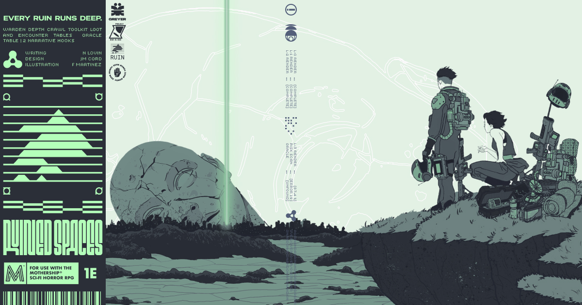
Art: I will say this art style evokes a sort of Ozymandias "Look upon my works ye mighty and despair. Nothing beside remains" feeling, which is exactly what I would want from an Ancient Myths trifold.
Writing: I'm guessing this was meant as a toolbox from the spartan writing. Lots of consideration for how much space you had without shotgunning it on the page. The instructions are concise and easy to understand, and I'll more than likely be using this in the future.
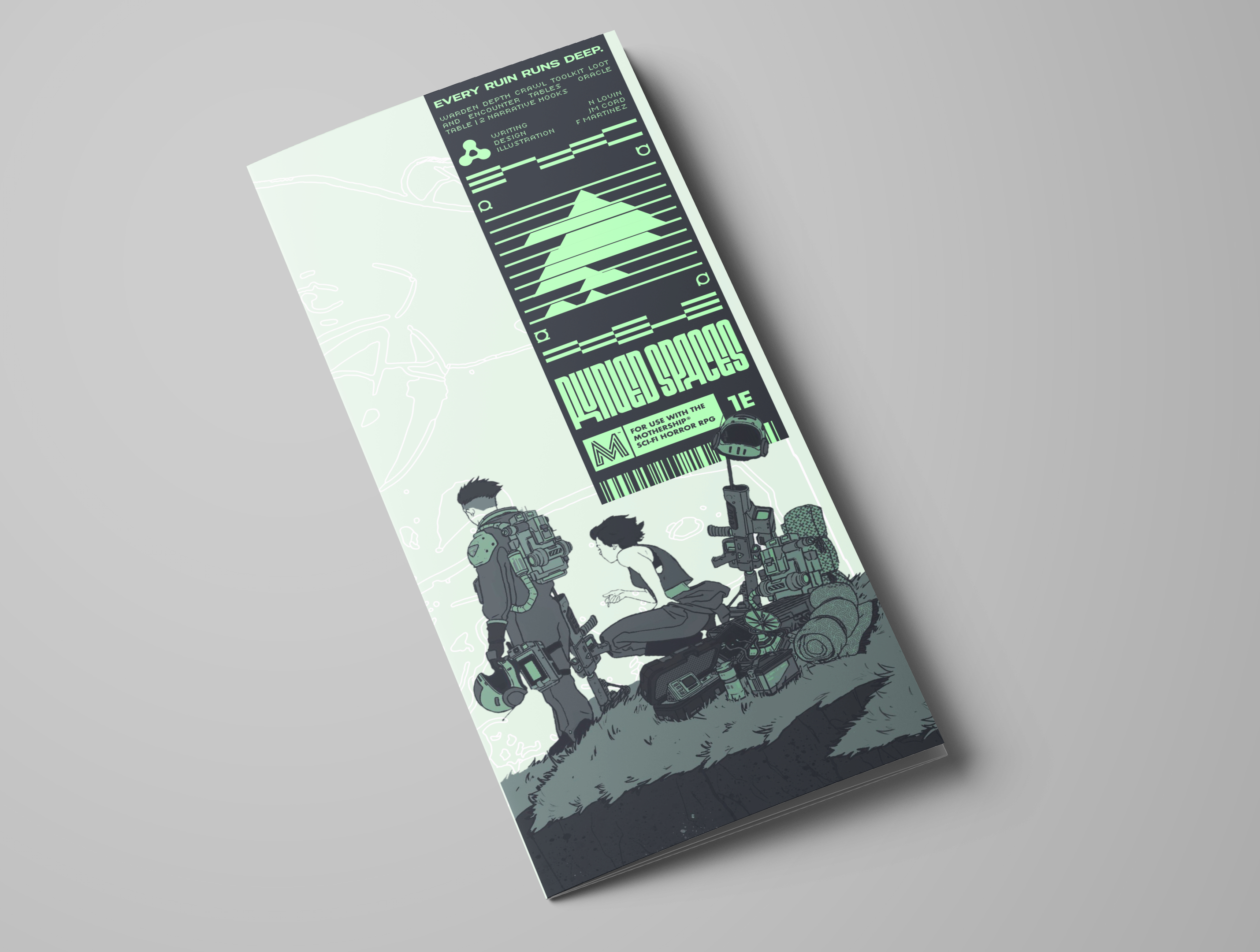
Game Design: As a dungeon maker? Really convenient, plenty of roll table curiosity. Easy to work off of one the fly.
Theme: For the theme, I do have to give points for integrating classical dungeon vibes into the dungeon maker, and the roll tables (love the list of inspirations)
Layout: While I do enjoy the two sides of the trifold separately, it does flow into each other a little choppy. Like one sort of setting suggestion and one toolbox for dungeons, leaving it as a sort of starter for the flame. If that was the intention, mission accomplished. If it wasn't, there might need to be more connective tissue between setting to utility.
Utility: As a toolbox this is insanely good for pickup and run. As something to generate lore? It's a good start, and good for initial thrust, which feels like the intention
Favorability:I'll say it: this grabbed me immediately. Even though it's labeled for Mothership 1e, this feels like WBR level utility.
Overall this entry is sick as fuck, and the only real critique I have amounts to minor polish on an already great trifold. I will be putting this in the proverbial Warden utility belt as an Ol' Reliable.
Thanks for the review Clocky! We were really excited to try creating a toolbox that also incorporates some example story arcs that can be taken and thrown against the engine. If you do end up generating and running some sessions with it, let us know how it goes!
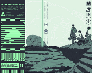
Art: Cover art will surely be Best in Jam, and the overall visual impression is very good.
Writing: I think going vibe-heavy for the scenario hooks and focusing on clarity for the interior was the correct choice and you did well with both. The Suneater scenario is by far the stronger of the two.
Game Design: I'm of the opinion that entrusting the dice with designing an adventure for you never goes the way you'd hope, but there are some nice tricks here. The solution for quickly generating a floorplan has broad utility, and using an "oracle" table to put the actual design decisions back on the Warden with vague prompting is a good call. Better than the loot and encounter tables, which will push the Warden in more bland and generic directions, which is inevitable when trying to use a single pamphlet to design a wide variety of scenarios. I think the system for determining when you reach the goal is unnecessary in that the Warden could just choose a number, and too high-variance... e.g, a challenging scenario has a 15% chance of ending on Level 2 and a 15% chance of ending on Level 10, when for the sake of session planning and pacing, you probably want the range to be +/- 1 or +/- 2.
Theme: Well-implemented in the Suneater scenario. For Consumptive Curiosity, the Mouth is something about which myths could develop, but I'm not sure I'd call the scenario mythology-themed.
Layout: Straightforward and effective for the most part. The only weak point is the table. The lack of row divisions (or alternating shading, etc.) combined with having the Yes/No/etc. answers in the same color and font as the numbering leaves the whole thing kind of lacking structure and not looking very table-y. It's not that it would be hard to locate the right entry when rolling, because it's big enough that you're not going to lose your place... but its form doesn't really follow its function. The design doesn't tell you how to use it without reading the text.
Favorability: I love the art, the Suneater scenario, and the floorplan generator. Everything else, I would probably pass on.
Some excellent feedback here. Thanks for taking the time. We're rolling it into the version we submit to TKG for license approval, especially the bit about the system for determining the "goal level" of the dungeon and the bit about oracle table readability. I also agree (as the guy who wrote the mouth section) that it wasn't super tied into the theme - I got excited about trying to draw out some occult horror vibes and lost my way somewhat.
The thing about theme is no one other than jam participants is going to care about it after the jam is over, so if you have to compromise on something to make the rest cool, that's the thing to compromise on.
Nice map generator, although it does take some time to process.
Oozing with style, clean as hell. Love the literary references (Roadside Picnic / S.T.A.L.K.E.R. is lkjashdkja), I adore tables/generators/systems so I’m probably predisposed to liking this– I could see someone who isn’t having trouble making it interesting, or finding the nested processes a tad inaccessible. For what it’s worth, I think it’s very elegant. Another BANGER submission, I’m gonna have so much fun with these. This seems like it would work well in conjunction with a module called ZONE– my mind is already going to how I can incoporate this lol.
Fantastic work.
I really like the map generator, and I think both the story hooks are well written! I feel that if I were to run this crawl though, I would have trouble coming up with interesting content after a certain point, even with the tables provided. With six to fifteen rooms on each floor, and at least a few floors to go through, the tables will be exhausted before long, especially if you try to run the challenging version of the crawl. I also feel that tailoring the content of the tables to better represent the writing in the story hooks would help GMs to weave a cohesive narrative.
Looks incredible from start to finish and the two scenarios presented are intriguing right off the bat, but could be worth condensing to make room for other stuff. Ruin generation mechanics are solid, I would love to see more tools to help GMs fill those ruins and engage their players. All in all this is a cool tool kit with a lot of potential that looks amazing, fantastic work.
thanks. I appreciate the kind words. What parts did you think could be more condensed?
I would consider shortening the two scenerio to take up one panel together. They are well written and very cool but with space at such a premium I think it could be using that area for more player facing content.
When you say player facing content, do you mean, for example, another loot table or something? I found it to be a pretty fun challenge to get the scenarios expansive enough to give a warden ideas to take into the generator but also small enough to remove as many prescribed story beats as possible and let the generator (and therefore the warden's creativity) sing more. I like the idea that they could be condensed even more.
I am so sorry, I some how missed your reply! I see your a little better now and I think it might just come down to a playstyle thing. Random tables I fall in love with are all filled with really specific, juicy, and wierd results, but I think that is more of a personal thing. I can totally see your tables can fueling creative flows and hitting that sweet spot is no easy thing.
I love the design and styling on this one; very slick!
Thank you!
I really like this! The procedures are fun and the oracle table looks like it would be fun to use.
I think some minor tweaks could make it more user friendly:
I had to read the Ruin Engine procedure twice before I understood it. I think putting a little label explaining that L0 rolled a 5, then a 3, then a 2, then a 6 would make the procedure much clearer.
The d100 to determine stairs is confusing to me, I think an example of how exactly the roll relates to the map would help.
I'm also not sure what "set the probability that the objective will be found by the desired difficulty of the scenario" means. What does it mean that an objective has a 30% chance of being found and how does this interact with or relate to the PCs actions?
I have read Roadside Picnic, but don't remember what "mosquito mange" is, I have not read the other referenced works. I think these references may frustrate more Wardens than they inspire.
I appreciate the kind words. It was a fun project, and something that I felt could be unique for a trifold.
Ruin Engine notes:
These are all solid critiques, and food for thought for how I might edit before public release. I really appreciate your thoughtful responses.
That makes sense about the chance of the objective being there. The wording about chance to be found made me think it meant found by the players, but you mean chance to be located there at all. I think changing the verb would definitely clarify.
This is really unique! I think since it's more of a system for running depth crawls it has to be judged moreso as a warden's tool than as a self-contained adventure, and in that category it really shines. Ideal for any GM who likes rolling up his sleeves and building something to challenge his players!
I appreciate it a lot. We were stoked to find a nice niche between warden tool and short adventurers.
I emailed you (I think?) about working on a webtool for this if you're interested, lmk if you want to chat about it, not sure how to DM here
I'm getting together with Greyer tomorrow and I'll see if he got your email. Also thanks for looking through our trifold! We had a lot of fun working on it.
I really appreciate the artwork; it is visually strong and an excellent choice for conveying the intended mood and aesthetic. The artists should be very proud of the work produced. I would, however, have liked to see some illustration work incorporated onto the exterior pages, even if only in a subtle or minimal way. Additionally, I found some of the maps slightly difficult to read at times.
Thanks! Frank is incredible! I definitely want to get some smaller callbacks from the main piece inside, but ran out of time to make it happen. I’ll see if I can’t make the edit before public release.
Also, what about the maps did you find difficult to read?
I found the map a little difficult to interpret at first, particularly in distinguishing if the accessible routes are walkways or vents. I think the segmented wall design may have contributed to that confusion. A clearer visual key would really help; perhaps something simpler, such as a coloured grid overlay across the entire floor plan, along with a dedicated legend indicating door locations.
I also think a more detailed Level 3 map would improve navigation. Since it currently only says “Down to L3,” it made me feel like I needed to search for an additional map to understand the layout properly.
Regarding the diagram beneath the maps, I assume the openings in the panels are intended to indicate where players can move between floors. If those are meant to correspond to the yellow squares on the floor maps, I think a couple of adjustments would make that relationship much clearer. First, the openings in the lower diagram should probably also be coloured yellow. Second, their arrangement should exactly match the placement shown across the three floor maps above.
At the moment, it feels like I’m missing a few key pieces of information needed to fully understand both the layout and where I’m supposed to go.
(Apologies if harsh.)
Doesn’t come across as harsh at all. I appreciate the feedback.
grand