

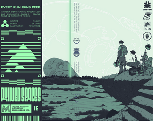
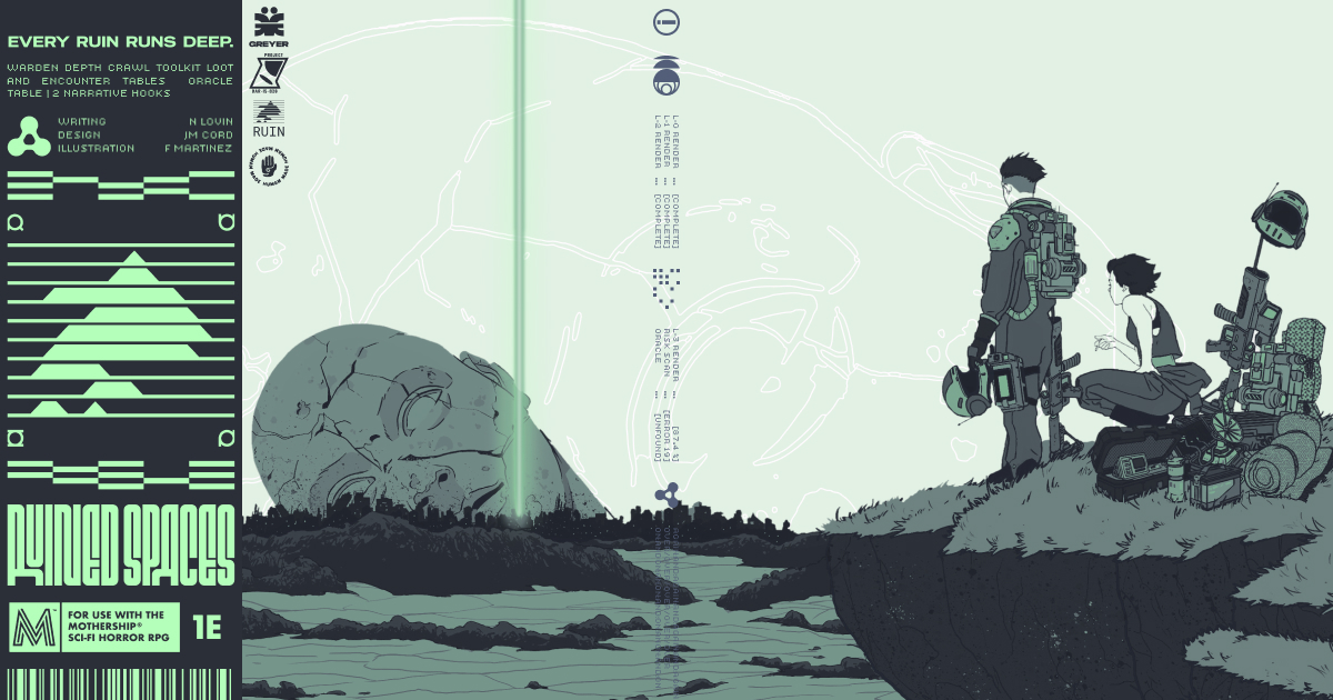
Art: I will say this art style evokes a sort of Ozymandias "Look upon my works ye mighty and despair. Nothing beside remains" feeling, which is exactly what I would want from an Ancient Myths trifold.
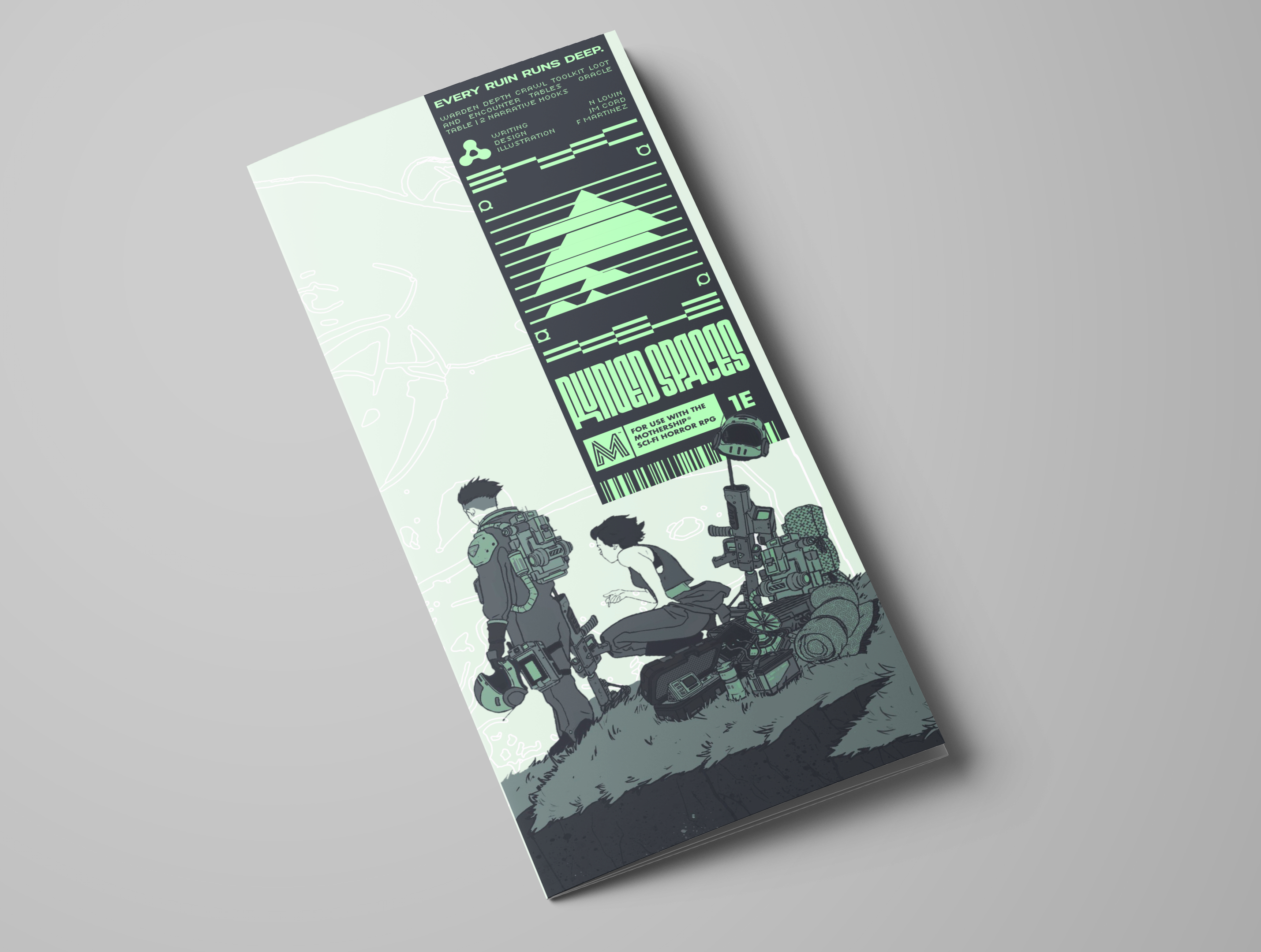
Writing: I'm guessing this was meant as a toolbox from the spartan writing. Lots of consideration for how much space you had without shotgunning it on the page. The instructions are concise and easy to understand, and I'll more than likely be using this in the future.
Game Design: As a dungeon maker? Really convenient, plenty of roll table curiosity. Easy to work off of one the fly.
Theme: For the theme, I do have to give points for integrating classical dungeon vibes into the dungeon maker, and the roll tables (love the list of inspirations)
Layout: While I do enjoy the two sides of the trifold separately, it does flow into each other a little choppy. Like one sort of setting suggestion and one toolbox for dungeons, leaving it as a sort of starter for the flame. If that was the intention, mission accomplished. If it wasn't, there might need to be more connective tissue between setting to utility.
Utility: As a toolbox this is insanely good for pickup and run. As something to generate lore? It's a good start, and good for initial thrust, which feels like the intention
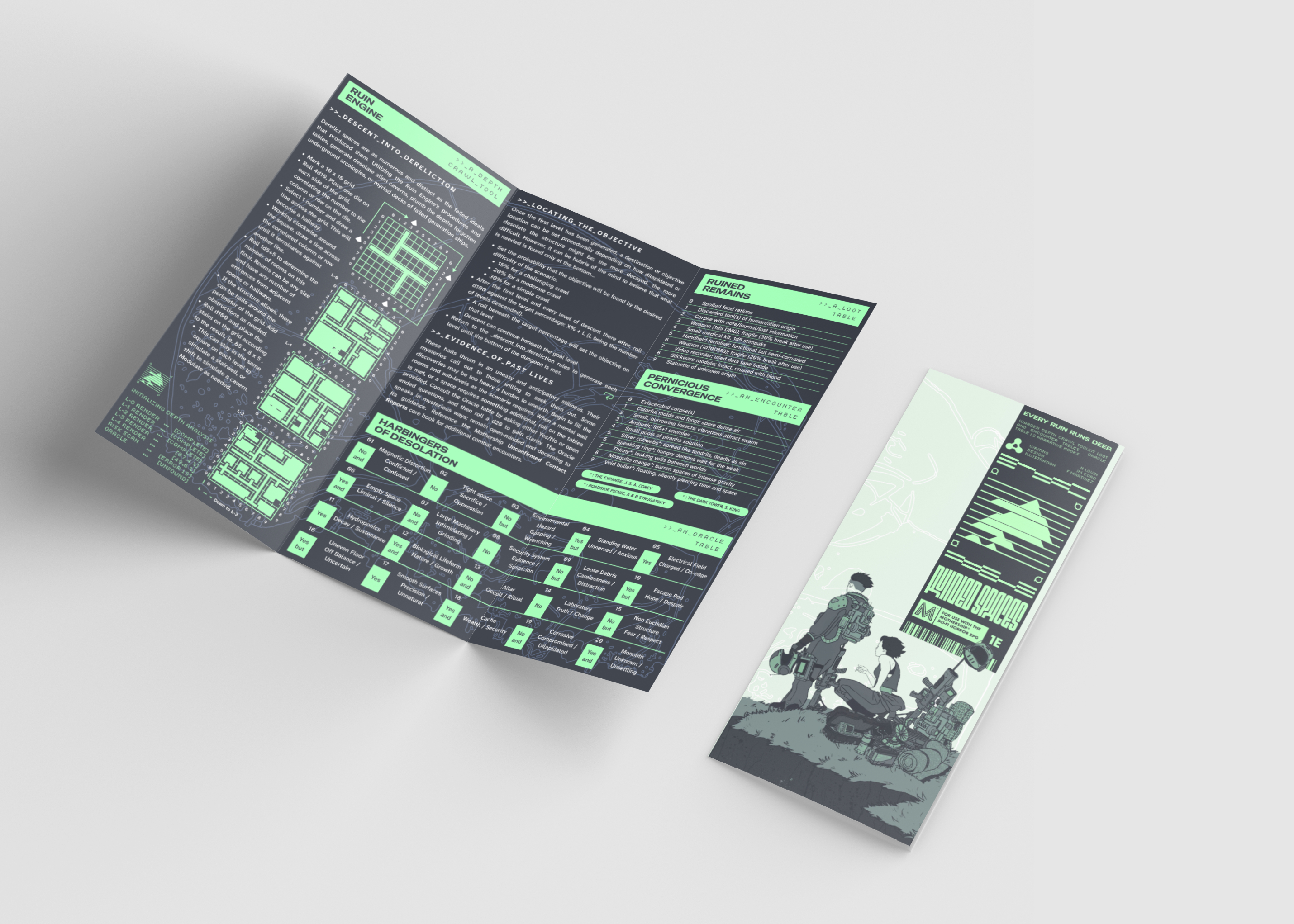
Favorability:I'll say it: this grabbed me immediately. Even though it's labeled for Mothership 1e, this feels like WBR level utility.
Overall this entry is sick as fuck, and the only real critique I have amounts to minor polish on an already great trifold. I will be putting this in the proverbial Warden utility belt as an Ol' Reliable.
Leave a comment
Log in with itch.io to leave a comment.