
Play adventure
To Dust We Shall Return's itch.io pageResults
| Criteria | Rank | Score* | Raw Score |
| Usability - How "pick up & play" is this for a Warden? | #16 | 3.444 | 3.667 |
| Theme - How well does it match the Jam's Theme? | #23 | 3.757 | 4.000 |
| Overall | #25 | 3.335 | 3.550 |
| Polish - How is the overall look/vibes/writing & design? | #26 | 3.068 | 3.267 |
| Favorability - how much do you personally like the submission? | #32 | 3.068 | 3.267 |
Ranked from 15 ratings. Score is adjusted from raw score by the median number of ratings per game in the jam.
Leave a comment
Log in with itch.io to leave a comment.
Comments
Excellent entry! I really love the layout, it is super clear and concise and seems like it would be extremely easy to run. I love the themes and the antagonist, very creepy and also very visual. Great mechanics with the radiation weakness.
The only real criticism I have is that it could really use a "What is really going on" section that just lays out the situation clearly for the Warden. It is relatively easy to get the jist of it with the We section, I was just kind of confused while reading and had to go back to a couple sections occasionally.
Other than that a great entry that I would definitely run. Great Job!
Also a rusty ship named Shackleford, Ha.
Hiya, here are some notes i took while reading this one!
I love the presentation of "We" -- wonderfully alien in design while still being legible. The compel and corrupt actions nail the horror just right for me.
the radiation weakness is really cool, and it makes me imagine a cool/scary/tragic result where players purposely irradiate themselves to beat the fungus. maybe the "bravely marching into radiation" is too top of mind because i rewatched chernobyl recently, haha.
the telegraphing of the weakness that comes from contaminated characters getting radiation is great touch!
cool stuff here!
This is a classic sci-fi horror setup! What I liked:
What could be improved:
All told though, this is a solid module. It's straightforward and appealing. I feel it would be a great pick to run at a convention or as an introductory one-shot!
Great work on this, the visuals are very cohesive! Here is my feedback:
+ The layout is clean, and the writing evocative
+ Progression of the horror is well-earned and well-explained for the warden.
+Iconss are useful shorthand,
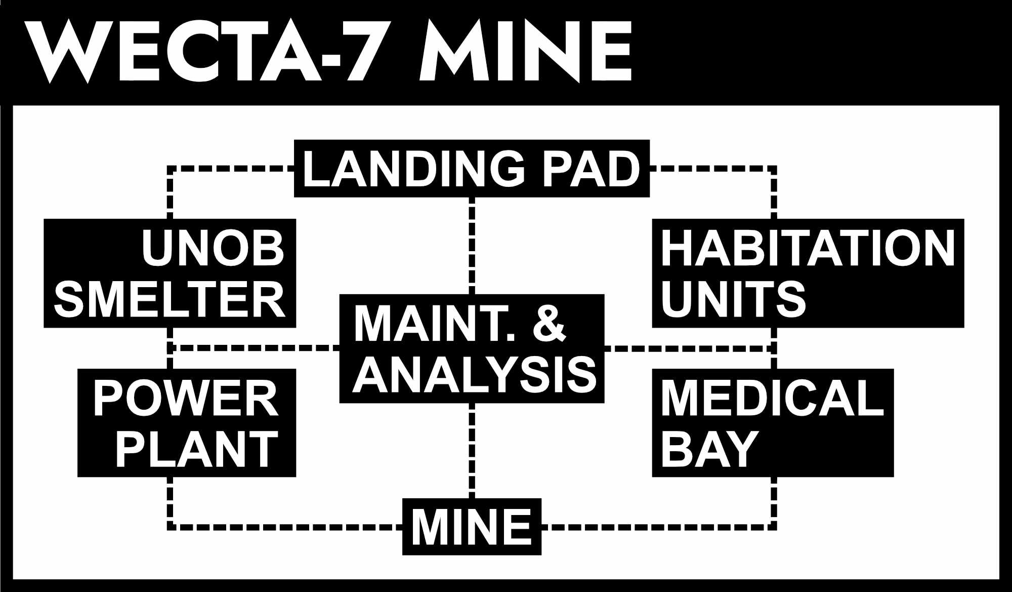
- Mini-map on the back feels a bit redundant
- I don't think the redactions add anything in this instance, as the info isn't player-facing.
- Locations and monster keys are a bit too verbose; some more editing and trimming would help ease of use.
- Icons could be a bit more distinct, the triangle makes sense, but at this scale it adds to the similarity
Thanks!
A classic mystery format. Style and layout is effective, but could do with editing. The redacted text in NPCs feels unnecessary. Overall, seems solid.
The redactions seemed like the right thing at the time because I was concerned about the back being read by players. The redactions are small enough that putting the original text back in shouldn’t really change much. It was mostly just hiding locations, which would probably be in bold. Hence the concern about players reading it.
Thanks!
Pretty solid effort. I like mines as a setting for this kind of thing. Maybe would have liked more to do in the mine itself instead of just a single location and encounter, but the Warden could always flesh that out a bit.
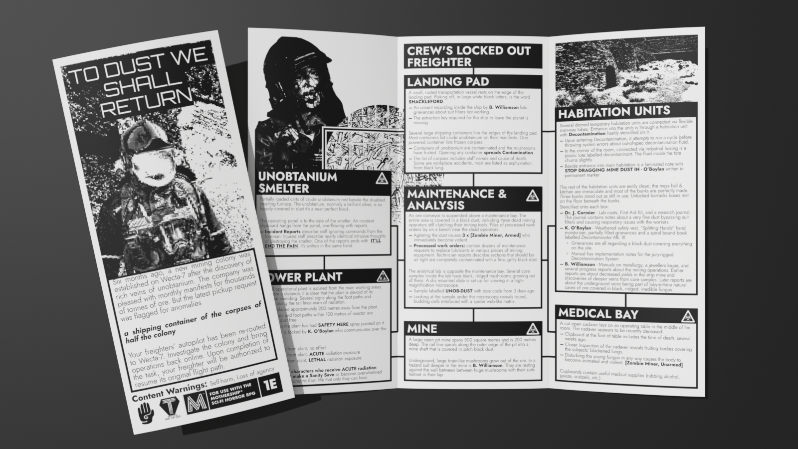
I'm not crazy about the art or that style of just running a photo through some filters in general, but I'm also not sure a trifold needs a ton of illustration, unless the art is so good that it's the selling point. I'd suggest reducing the size and/or number of pictures to make more room for game content. Biggest layout issue is text crowding the edges of its enclosing box, particularly on the cover. Need some internal margins there.
I like the idea of putting the location descriptions in boxes and connecting them with lines so that the descriptions ARE the map. However, that efficiency is maybe undermined (no pun intended) by repeating the map on the back panel. I'd rather have seen some advice on wrapping up/possible outcomes there. Also, the key to the hazard symbols should be on the same page that they're used, IMO.
On the subject of outcomes, is the Shackleford intended to be the only way off the planet? A "wrapping things up" panel could make that clear or provide clarity on what would be required to make the mine "functional" enough to let the players leave on their own ship. Or maybe We knows another way, and there's a "friendly" ending possible, at the cost of making an enemy of the company?
Not sure about the decision to redact information from the NPC descriptions. I guess the idea is that the Warden can make something up but it impedes the pick-up-and-play usability.
Despite some rough edges, though, I really like this and would consider running it, either with an updated post-jam version or some additions/adjustments of my own.
The thinking behind the redactions and map on the back was to provide a kind of hand-out for the players. The redactions are just duplicate information that’s already in the spread about the NPCs and was being redacted for stylistic / secretive reasons.
I didn’t provide wrapping things up solutions because I wanted to leave it open ended for the warden. This comes from my personal play style where I don’t like having expectations and prefer to have solutions develop during play. I can understand how that doesn’t align with the way everyone runs their games.
As for some of the layout choices, I was designing this with the physical artifact heavily in mind and how I would be interacting with it during play. The inside page (Monster stats & Workplace hazards) made sense to me since viewing that information was a quick glance by flipping the right fold inward.
As for the art itself, as a person who isn’t an artist, this is the way I’m able to express myself artistically. It’s heavily inspired by zines which make heavy use of xerography and is something I am able to do given my limited skillset.
Wait, the back of the pamphlet is meant to be a handout for the players? That makes sense with the minimap and the redactions, but the back panel NPCs box also spills all the beans about We.
I like the idea of a back panel that's meant to be photocopied and used as a handout, but even with the redactions it seems like there are way too many spoilers here to be used that way.
An ominous and atmospheric take on the fungal infection horror, designed to a familiar TKG layout.
+ Lots of great build up description to be found in the rooms
+ Good usage of the NPCs, serving as threats and obstacles than just information holders
+ Nice implementation of variety into the worker stat block, making every encounter feel different
If you're looking for feedback, let me know I can expand further.
hey Csaunders, please change the price of your module from “pay what you want” to free until the end of the jam. thanks!
Fixed!
Hey Csaunders,
my apologies, I have made a small rule change in favor of allowing submissions to be open for Donations, the edited rule reads as:
During the Jam you may list your game as Free or open to Donations. Someone pointed out to me that so long as submitters and judges download from the submissions tab instead of the individual pages, it will always download like its free. the original intent of this rule was to keep people from feeling inclined to donate simply to be a part of the Judging process. My apologies to those who were affected by this rule.
I hope this helps!