Play game
Transmuted Tower's itch.io pageResults
| Criteria | Rank | Score* | Raw Score |
| Playability | #1 | 5.000 | 5.000 |
| Theme | #1 | 5.000 | 5.000 |
| Cleverness | #282 | 4.000 | 4.000 |
| Artistic Style | #401 | 4.000 | 4.000 |
Ranked from 1 rating. Score is adjusted from raw score by the median number of ratings per game in the jam.
Judge feedback
Judge feedback is anonymous.
- Played well, easy to control. Great job on execution and responsiveness, I never felt like I whiffed or got hit because of bad hit boxes or something. Theme is great, challenge was fun (even though I suck). I hope you keep developing the idea!
Did you include your Game Design Document as a Google Drive link?
Yes
Seriously... did you include your Game Design Document?
Yep
Is your game set to Public so we can see it?
Yeah
Tell us about your game!
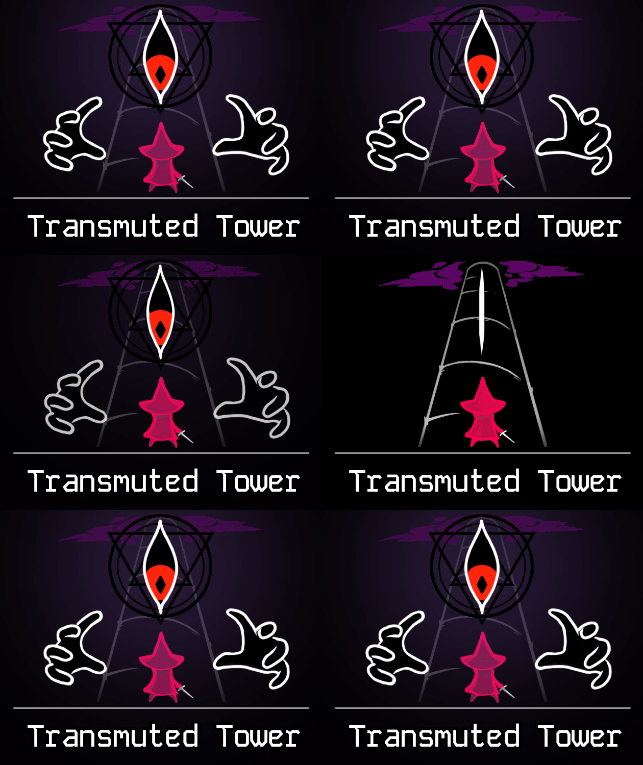
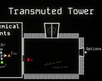
A bullet-hell game about climbing a tower of a Mad Alchemist.
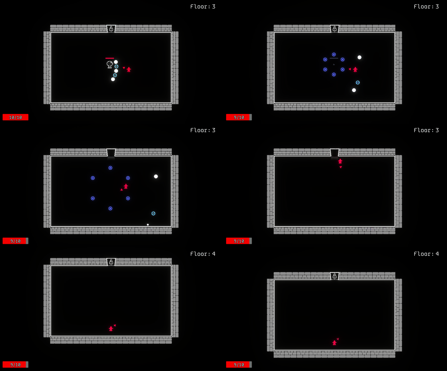
Player character doesn't have a means of dealing damage on its own, and must rely on deflecting (LMB) enemy projectiles.
Leave a comment
Log in with itch.io to leave a comment.


Comments
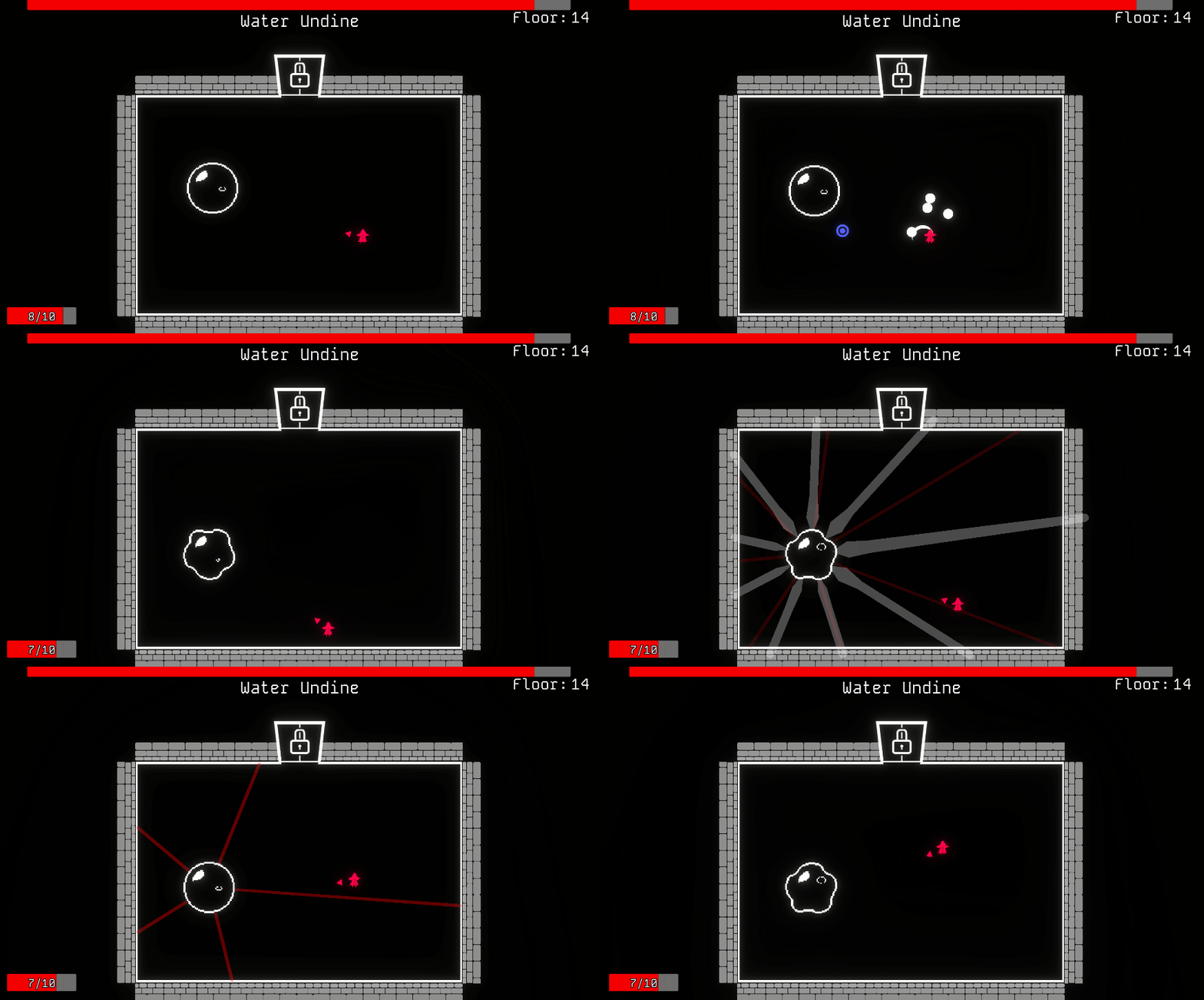
Even tho the visuals are simple, they are clear and give a nice atmosphere. First game without music that wasn't horribly quiet (although it could be nice). The mechanics are interesting, aiming the deflect was too hard tho imo. Nice' radiance' attack pattern on the blob boss ;)
I did miss a hit animation on the enemies with more than 1 hp. Just didn't know if I was doing damage!
Also really nice touch to not make this impossible. The level selecter and restart button are newbie friendly af
Nice on :)
This was a lot of fun! Everything worked well with each other and it all felt really polished! The lack of music also didn’t feel like a blow against the game, as it seemed almost to set the ambience nicely. Excellent job! If you continue working on this in the future, I’d look forward to playing through whatever comes next!
As a touhou player I am all for bullet hells! So seeing one here in the jam just make me happy. The game is unique in the sense that you need to reflect certain bullets to the enemy to deal damage, which is something that was seldom seen. The controls were clean, the bullet hells were tight but fair, this is a job well done!
My only little nitpick was that the element system was rather under-utilised. The only thing it did currently was the shield thing currently, but I think it has much potentials than what we have right now. Maybe double damage, healing, bullet effects, all sort of stuff. But given that this is a jam I'd say you've already done a very good job. Well done!
Thanks for feedback! I’m definitely planning
to yoink some ideasto expand on element system and make the deflects more varied.Fun game! This game feels really unique because I'm dodging and deflecting the whole time. I like the simplified graphics and the quick room transitions.
Very satisfying and rewarding game to play. I would just add some simple animations to the character like the monsters have so he feels less static. The game feels super smooth, and my favourite part was definitely the ball boss battle so more of thoseeee haha. Great job!
Great choice with the art style it looks and fits very well. Great submission!
A very cool concept and well executed.
The walking sfx did become a bit annoying after hearing it constantly xD
I did notice a nice way you made the reflect easy to perform is that the reflected bullets seem to travel towards the mouse. Nicely done.
do miss the shadow theme a bit(besides it being present visually), but you mention this in your GGD.
The game is rather difficult at times, but i think that is part of it's charm. Maybe if got better at it i could have defeated the second boss.
Definitely a nice game, with some polish I could easily see this being released on steam.
Thanks for the feedback! I tried to mitigate the difficulty a little bit by adding the Autoaim accessibility option, which makes your deflects automatically travel to the nearest enemy. But this option is quite easy to miss.
it is a really good game. managed to complete all levels available. the bosses are a little bit of a difficulty spike. especially the water undine. This is a minor issue but using a colorblindness simulator you may have a problem with the colors used. the free simulator I used does the two most common forms of color blindness. (my mouse is normally a similar shade of red as the character it is the same color for both) you might need to darken the air slightly. here is a suggested range for Air if you decide to add a color blindness option. R range:0-176 B range:215-220 G range:220-231. this is out of 255. (the lower the number on the range the more of a perceivable difference). for fire and earth just adjust the brightness of the colors and it will work. both of these are minor issues and can be worked around. below are the alchemical hints with both color blindness shown as they are in game.
Very good suggestion about color blindness options! I’ll see what I can do about it after the jam ends.
Nice concept, and great execution - movement and deflections are intuitive and have a good feel
I enjoyed this game. Both you and the enemy attacks move slowly, which lead me to think about my positioning. The deflect mechanic was fun, I first I assumed it was also a melee attack but learned very quickly that this is not the case after trying to hit an enemy. While playing, I did not fully understand the mechanic introduced on level 8. I knew that some bullet types might destroy some shields, but wasn't sure which. And I didn't feel the need to figure out which, because I could just throw whatever was in front of me and hope for the best. I also finished the game without being sure which shade of blue represents water or air, which could have added to my confusion regarding which projectiles destroy which shields. Making them totally different colors (maybe changing air to green and earth to brown) could have helped. Good job!
Can understand the confusion with shield mechanic. I was close to simplifying it to just matching colors, but felt that this wasn’t alchem-y enough, so I settled on opposing elements destroy each other.
Choosing colors was a pain in the butt, because for example brown for earth could be confused with orange for fire. I realized way too late that I can just make projectiles themselves a different shape depending on element, instead of using teeny-tiny symbols that are not even visible.
Fun game, although I would’ve liked more of a focus on alchemy. The movement felt fluid and it was satisfying to dodge attacks and get yourself into the right position to deflect multiple bullets in quick succession. Enemy variety is great, and the bosses are fun to encounter. I think the player’s deflection hitbox should be slightly larger, a little more polish in some of the boss fights (notably - the first boss probably shouldn’t spawn bullets right on top of the player), and maybe adding a way for the player to heal up would be nice, but it’s a really good start how it is :).
Thanks!
I actually felt that the game would be harder to understand if I put more focus on alchemy, like if I introduce shields earlier or make a more complicated interaction between elements. So I cut and simplified stuff.
First boss could use more work, I agree.
Very fun game, I really like the concept of not directly attacking your enemies.
My only feedback would be tthe element piece, I was originally trying to match the shield colors, and then when more elements were introduced I wasn't sure if it was always a certain element combo to break, or just any differing element. Not a big deal, easy to figure it out, but it was slightly confusing at first.
This is without a doubt, my favorite game so far (playing them in reverse order of submission).
I love the concept, the combat, love the movement, love the sound. It feels very complete.
The introduction into the mechanics is EXCELLENT! I just love it! Well done!
Super little game! I liked the difficulty level, it wasn't too hard but definitely felt like I could lose if I wasn't careful. Cute art style too. I enjoyed the challenge of keeping my cursor on the enemy while also avoiding stuff since you need to be aiming and avoid at the exact same time as reflecting is your only attack.
Really fun game! I loved the variety of enemies and their attack patterns. But in some levels where there are more bullets in the room the movement feels floaty and unprecise. Besides that great job!
simple and fun! i dont really feel the theme but i certainly feel the adrenaline of later stages. congrats on the game
A fun use of alchemy as a mechanic! I double-checked the GDD and you can definitely see and feel the inspirations. Enjoyed the boss fights, and loved the ominous ending.
My only critique is that I didn't really feel the need to use dash at all, except in the tutorial room. Would be cool to increase the importance of that as a mechanic somehow.
Well executed overall!
Cool concept, love the graphics
Very neat concept, though fighting the boss feels somewhat tedious. I lost almost half of my HP due to swords spawning on top of my face (instead of only spawning them inside the arena add another constraint where it's some not too significant range around the player, so that you can't ever be sniped, that feels unfair), and there also waves of only white swords, i.e. waiting out (maybe a little minRange variable so that it always spawns at least one colored projectile).
Otherwise, super dope stuff!
This boss was actually a late addition, so a lot of hacks were used just to make it work in time.
The concept is very cool, i like it a lot! Movement feels too floaty for how much precision is required though
Thanks. Yeah, maybe I should’ve spent a little more time polishing movement.