


Ya, the UI/UX is pretty poor.
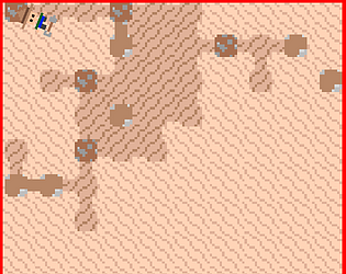
You have to click a tile and then click the drill tower button. I suppose now that you mention it, it isn't super obvious that it's a button and not just a text box. It used to just be "build drill" and then I crammed some rules text into it.
Pressing space is unintentional. I was using it for development and then never removed it. A side effect is that the drill button makes the cannon button appear and pressing space does not so if you never click the button, you can never make cannons.