Thank you! I'm looking forward to see what games you develop next \(^▽^)/
lourdes.localizes
Recent community posts
I'm glad it was helpful! If you want to and have the time, I would appreciate if you could leave a comment on my itch thread to help me reach more developers that could use this kind of feedback. Thanks in advance! I'm looking forward to see how you apply this in new projects ☺️
Heyy! What's up? I found out about this jam and it sounds pretty interesting! My skills are mostly in the UX QA side, but since game jams don't allow enough time to do so I would love to collaborate on the following areas:
- Game/Narrative design
- Writing/Copyediting
I'm mostly into narrative games, but iterative testing to see if a mechanic works or not is something I like doing too. Looking forward to hearing from y'all! 💖
Hey! Gotta say it was a challenging experience. I thought I knew how to count before I played this game. Art and voice acting felt so polished! Even if onboarding wasn't AAA quality (thank you, tight game jam deadlines), it helped me get to know the rules before the difficulty started gradually increasing, and I had a good laugh whenever I got the numbers wrong.
Played three runs, will probably come back once I get over the fact that I need to go back to elementary school. Great job!
Hey! The concept is really creative. I never thought I'd play a game where a living candle is the protagonist, and lighting is used as HP feedback! I had fun trying it out, and I wrote down a few observations that I hope are helpful if you decide to keep developing it or apply them to future projects.
- The game doesn't currently have a main menu, which could be a great place to include settings, credits, and a short introduction to the controls. Since the controls are only explained in the game's description, I found them difficult to remember once I started playing, and I died several times before I understood what I was supposed to do.
- The game looks much better in fullscreen. Since many browser games default to a smaller window, adding a note in the description recommending fullscreen would help players experience the game as intended.
- I wasn't immediately sure what my objective was. The description mentions "KEEP MOVING, FIGHT, AND SURVIVE TILL NEXT SHRINE APPEARS!!", but once I started playing, I found myself wondering what I should be doing next, because shrines appeared quite frequently. A short in-game objective at the beginning could make the progression much clearer.
- The melee combat felt a little clunky. My attacks didn't always seem to land where I expected, and since enemies don't have any visual indication of their remaining health, I wasn't sure whether I was damaging them or simply missing. At one point, a moth (assuming they're moths, since they're drawn to the flame!) stopped reacting entirely. I couldn't attack it, and it didn't attack me either. I wasn't sure whether that was an intended mechanic or a bug (pun intended).
- Using Flame Burst was a bit confusing. Because it's presented as a special attack, I expected it to require charging through normal attacks, but it seemed to be available at all times. After repeatedly using it, the screen eventually turned gray and I had to restart the game. I also noticed that repeated right-clicks sometimes triggered my browser's Back action, taking me away from the game and interrupting the session.
- The combo counter never went above 3x. I wasn't sure whether that was an intentional cap or whether my later hits simply weren't being registered, so it became difficult to tell how effective my attacks were.
- Enemy attacks were difficult to predict. Adding clearer attack telegraphs or some anticipation before enemies strike would make combat feel more skill-based and give players more opportunities to react.
- Finally, I think the game would benefit a lot from music and sound effects. The visuals already create an interesting atmosphere, and audio feedback would make combat feel much more impactful while also helping the game stand out in the jam.
Overall, I really enjoyed the idea, and I'd love to see how the game evolves if you continue working on it!
I don't have a GMTK submission for you to rate, but if you found this feedback useful, I'd really appreciate it if you could leave a comment on my itch thread as well. Thanks in advance!
Hey! This experience was one of the smoothest I've had in this year's jam so far. Onboarding is clean, the story is enjoyable and I had a great time making card combos, usually stacking Good Fortune and Sly Tricks for max optimization. I'll definitely be playing this again.
Just so that the narrative matches the gameplay, I would have loved to see how the email I wrote with the cards turns out when you're adding the cards, maybe with a roster of chain email sentences that match the card type (which would also enforce the onboarding experience for example with cards like Haunting Lore or Ominous Threat). I really liked the email at the beginning, brought back memories buried at least a decade ago! Please let me know if you decide to keep developing this!
Ohh I managed to beat it somehow! I didn't see the keypad minigame in my last couple runs, and I felt a little confused about how to sync the time but somehow pulled it off. Really liked how Maxwell bounces around once you feed him haha
I'm glad you found the review helpful! If you'd like to and have the time, I'd be really grateful if you could leave a comment on my itch thread so that I can reach more developers who can also use this type of feedback. Thanks in advance!
Hey! I was immediately drawn in by the cover art and the core mechanic. It's the first bug-catching game I've played, and I was really curious to see how such a cozy concept would work with a countdown-based challenge. I also really appreciated that the controls were introduced briefly in-game!
Here are a few observations I wrote down while playing:
- The game recommends playing in fullscreen mode, but I couldn't enable fullscreen while playing in Opera. I was able to do so in Chrome, though, so this may be browser-specific.
- The description mentions using an encyclopedia, but in-game the icon looked more like a square than a book, so I didn't immediately associate it with it. A quick onboarding prompt, similar to the one introducing the controls, could help players recognize it. That said, since the gameplay becomes fast-paced quite quickly, I didn't really find an opportunity to stop and read it once the run had started. If the encyclopedia contains information that's important for gameplay, players may benefit from being introduced to it before the pace picks up.
- Catching bugs with the mouse felt a little inconsistent. Sometimes dragging the cursor didn't catch them, while other times I caught bugs without intending to. Making the required mouse movement a bit more deliberate or adding clearer feedback when a catch is registered could make the mechanic feel more precise.
- Unfortunately, the game crashed every time I tried placing two beetles in the same jar. Because of that, I couldn't learn whether that combination was valid or not, so I wasn't able to use that information in later attempts.
I hope these observations are helpful! I'd love to come back and play more if you decide to continue developing the game.
Hey! I played a couple of runs, and I'm a bit sad I couldn't make it to the end because the setting is really interesting. I also thought using real photographs instead of illustrated icons was a very creative and resourceful choice!
I wrote down a few observations in case you decide to continue developing the game after the jam:
- While playing in fullscreen, the dialogue box felt a bit too small, which made the text difficult for me to read.
- During the air release minigame, I couldn't seem to lower the pressure even when pressing the space bar as prompted. Instead, the gauge kept going up and down arbitrarily, so I wasn't sure whether I was misunderstanding the mechanic or if something wasn't working as intended.
- After a few attempts, I completed the air release minigame, and I wanted to take a closer look at the numeric keypad, but I couldn't exit the minigame screen. Because of that, I wasn't able to inspect the environment for the code, which eventually led to a game over.
It felt like an experience I would have really enjoyed, but the combination of unclear feedback and constant time pressure made it difficult for me to understand what the game expected from me before it was too late.
I hope these observations are helpful if you decide to continue working on the project!
Hey! I gave your game a try, and I have to say that I really enjoyed the atmosphere and the music. Since this is your first game, I wrote down a few observations that I hope will be useful not only for this project, but also for any future games you make.
- Making the game playable in a desktop browser would make it much more accessible, especially since most GMTK entries support browser play. Downloading the game, I also found that it couldn't be launched through the itch.io app and required an additional third-party program, which added a few extra steps before I could actually start playing.
- The story and controls are explained in the game's description rather than inside the game itself. Since the game launches in fullscreen by default, it was difficult to check that information while playing. For example, I didn't realize I could attack until my second run, which made the game much easier from that point onward. I also think it's important to communicate that jumping while attacking performs a different attack, since it's part of the intended combat mechanics.
- I found the enemies a little difficult to read because they attacked without much warning. Clearer attack anticipation or telegraphing could help players react more consistently and manage their health more strategically.
- When I reached the treasure chest at the end of the first level, I discovered that I needed a key. Since I had focused on progressing quickly instead of exploring, I had to backtrack through the level and ultimately ran out of time. Introducing the objective earlier (for example, hinting that a key will be required) could help players make more informed decisions throughout the level.
- After opening the treasure chest, I wasn't sure if I still needed to keep exploring or if I had already completed the level. The stage only changed once the timer expired, so I spent that time wondering if I had missed something. Transitioning immediately after completing the objective could make success feel more rewarding while also preserving extra time for later challenges.
- In the following stage, I understood that the objective was to survive the enemy waves, but since healing items appeared unpredictably, it was difficult to plan around resource management.
- When I was defeated during that stage, the game restarted from the beginning with no checkpoint or save system. Since I had already invested quite a bit of time reaching that point, I decided to stop there instead of replaying the entire first level.
Overall, I enjoyed the game, and I think the story has a lot of potential. I hope these observations are helpful, and I wish you the best with your future game development projects!
Hey! I really liked the twist on this jam's theme, turning the countdown into a physical resource. It reminded me a bit of Yahtzee, except you're building straights instead of matching sets. The onboarding also made the gameplay loop very easy to understand from the start.
I wrote down a few observations in case you decide to keep developing it:
- Clicking on the dice can be a bit difficult when they're positioned in the corners of the tray. I also ran into situations where dice overlapped, making some of them impossible to select. From time to time, I couldn't select more than two dice even though I could continue my straight. This even happened on the opening roll once, preventing me from selecting a 6 and costing me what felt like a great start.
- Instead of going to the shop after every run, I found myself wishing for a Play Again button so I could keep earning points before deciding when to spend them. Since some upgrades are significantly more expensive than others, I naturally ended up saving for the higher-tier ones instead of buying the cheaper upgrades as they became available.
- Some background music would also go a long way. The gameplay already has that satisfying "one more run" feeling, and I think music could reinforce the game's casino-like atmosphere even further.
- I also encountered a bug where the dice shown in the shop became larger after every run. Eventually, they grew so much that I could no longer interact with the upgrade interface properly.
That last bug was ultimately what stopped me from playing, which is a shame because the game genuinely made me want to keep chasing higher scores and better rolls. Great job! I had a lot of fun with it.
Hey! I just played the game and managed to collect 22 out of 26 files. I had a lot of fun with it, and I wrote down a few observations in case you decide to continue developing it:
- I was really happy to see a Tutorial button on the main menu, especially since many GMTK entries place their onboarding in the itch.io description instead. That said, the tutorial mostly explains the controls, and I found it difficult to remember everything once the game started. Introducing mechanics gradually during gameplay could make them much easier to learn.
- The camera felt very responsive, to the point that it made me a little dizzy after playing. The mouse and keyboard controls also felt quite sensitive at first. I later read in rating comments that there's a sensitivity option, but it never occurred to me to look for it while playing. Starting with a more moderate default sensitivity and letting players adjust it afterward might create a smoother first impression.
- I wasn't immediately sure what my objective was. I only understood that I had to collect files after breaking down a few doors and finding them by accident. Even a short message like "Collect all the files before time runs out!" at the beginning would make the objective much clearer.
- While playing, I noticed that collecting files extends the timer. The game communicates this through audio feedback, but it took me a while to connect the sound with the extra time. Adding some visual feedback alongside the audio could make the reward much more obvious and encourage players to keep the chain going.
- Near the end of my run, when I only had four files left, I found myself wandering around trying to locate locked rooms that might still contain files. At that point, the challenge felt more frustrating than rewarding. A simple minimap or even an in-world map could help players spend more time making decisions and less time searching aimlessly.
Overall, I really enjoyed the game's fast pace, and the soundtrack is definitely a banger. Great job!
If you found this feedback helpful, I'd really appreciate it if you could leave a comment on my thread as well. It helps other developers discover my reviews. Thanks in advance!
Hey! Just played your game, and I really enjoyed the fast-paced arcade feeling. The HP feedback is one of my favorite parts of the experience. I thought it was a very creative way of showing the player's current state.
I have a few comments regarding the questions you asked:
- The kill-to-heal loop started feeling fair once I became comfortable with the controls and mechanics, though at first I struggled a bit because I was still learning how parrying worked while already being pressured by the enemies.
- I think the game would benefit from a short onboarding sequence instead of the initial block of text. Since some stages don't provide many safe opportunities to practice and I mostly relied on physical cover, I found myself returning to the instructions to check the parry mechanics. A small tutorial encounter where players can practice the mechanic without pressure could make the difficulty curve feel smoother.
- The parry mechanic itself feels satisfying once understood, but I think the onboarding cheatsheet terminology could be a bit clearer. This was actually the first time I saw "RMB" and "LMB" used instead of "Right Click" and "Left Click", so using the latter might be easier to understand for some players.
- The gameplay GIF in the description does a great job of showing the game's pace and overall feeling. I think players can understand what kind of experience they're going to get from it.
- The cover art, however, gave me a slightly different first impression. Since the game is focused on fast-paced arcade action, I expected the thumbnail to communicate that energy more clearly. The current cover focuses more on the protagonist's design, which is visually interesting and matches the psychosis theme, but it doesn't immediately show the intensity of the gameplay.
Overall, I really enjoyed the game and managed to beat it in 2 minutes and 21 seconds on my latest run. I would definitely come back to try it again if you continue updating it! I don't have a game submission for you to rate, but I would really appreciate it if you could leave a comment on my thread if you found my feedback useful.
Thanks in advance!
Hey! First of all, I want to say that the atmosphere and the art direction really stand out. I genuinely thought I was about to play a cozy café game... until I remembered the theme of this jam! 😄
I had a great time playing it, and I wrote down a few observations that I hope are helpful if you decide to keep developing it.
- Since the onboarding is explained in the game's description rather than inside the game, I had a hard time remembering the coffee-making sequence. I spent a good portion of my first shift figuring out the core gameplay loop instead of focusing on serving customers. A short in-game onboarding sequence would help players learn the workflow before the pace ramps up.
- The tip in the description—"Start a second brew while you finish the first drink. You'll need the head start when the rush hits."—is really valuable. However, I think it could be even more rewarding if players discovered that strategy naturally over multiple runs, especially since each run only lasts four minutes and the game has strong replayability. Alternatively, if you want every player to know about it, it could be introduced as part of the in-game onboarding instead of the page description.
- I found the coffee machine's audio feedback a little difficult to interpret. I wasn't always sure whether the sound indicated a successful brew or a failed one. A clearer distinction between success and failure sounds—or some additional visual feedback—could make the mechanic feel more intuitive.
Overall, I really enjoyed this entry. The countdown mechanic fits the café setting surprisingly well, and it creates a fun sense of escalating pressure without losing the game's charm. I'll definitely be coming back to try and beat my high score. Great job!
Hey! I really enjoyed the concept, and I think the art and story complement each other really well. One thing I especially appreciated was the onboarding. Even though the minigames were fast-paced, I always understood what I was supposed to do before they started, which made the challenge feel fair rather than confusing. I wrote down a few observations that I hope are useful if you decide to keep developing this build or apply them to future projects.
- After pressing Start, the game appeared to be cropped on my screen (tried it in both Chrome and Opera with the same result). Because of that, I couldn't read all of the text, and the UI felt a bit difficult to navigate since I was missing part of the information.
- The endings of the minigames felt a little abrupt. I wasn't always sure if I had completed them successfully or failed them, so some additional visual or audio feedback at the end of each challenge could make the transitions feel clearer.
- I would have loved to hear some background music during the story and minigames sections! The visuals and writing already create a nice atmosphere, and I think music would make those moments even more immersive.
Overall, I had a great time with it. I think the onboarding is one of the game's strongest points, and I hope some of these observations are helpful for this project or for your future games. Thanks for sharing it!
The game has an amazing presentation! The narrative, art direction and soundtrack create a very polished and memorable atmosphere that felt very easy to immerse in.
My main difficulty was understanding the lightning rod mechanic. Sometimes I could catch the lightning successfully, but other times the interaction seemed to fail (showing a flash and not turning the rod on) even when I was attempting the same action. Adding clearer feedback about what exact conditions are required to catch the lightning or why an attempt failed could make the mechanic feel much more consistent and rewarding.
The rest of the experience felt very polished, so I think improving the communication around this mechanic would help players appreciate it without having to rely on trial and error. I'd love to see a next build if you decide to expand on this!
Hey! I really liked the concept and the minimalist presentation, but unfortunately I wasn't able to progress past the first screen.
The main issue I came across was understanding what the game expected me to do. I tried interacting with the available commands, but I couldn't identify a clear objective or a way to move forward after several attempts, and switching between clones was also harder than I expected since the controls didn't respond adequately.
A small onboarding moment, a clearer objective, or additional feedback for the first interactions could help players understand the intended gameplay loop before the difficulty increases.
I would have loved to explore more of the game, so I hope this feedback helps make the first steps easier for new players!
I'm really glad you found it useful! 😊
If you're comfortable with it, I'd really appreciate it if you could leave a short comment on my feedback thread here.
I'm trying to reach more indie developers with this kind of UX feedback, and hearing from someone who found it helpful would mean a lot. Thanks again!
The noir atmosphere is really interesting, and the voice acting adds a lot of personality to the game! I wrote down a few observations that I hope are useful if you decide to keep developing it.
- Since controls are explained in the description and in a configuration window rather than within the game, I wasn't always sure which actions were available while playing.
- I also couldn't find a situation where the speed up time mechanic became necessary to progress, so I wasn't sure whether I was using it correctly or simply hadn't reached the right moment.
- The opening conversation is fully voiced, which is a nice touch, but it doesn't include subtitles. Since the rest of the game does have subtitles for voice lines, I missed some of the initial information before realizing subtitles would appear later.
- Once a conversation was opened, I couldn't find a way to close the dialogue window besides physically walking away. That left the interface feeling a little cluttered while exploring.
- Several objects, particularly in the door section, display an E interaction prompt but don't actually respond when interacted with.
- The game suddenly transitions to different scenarios with no in-game warning or prompt (the game description communicates that this happens every 20 seconds, which is not included in in-game onboarding). Since I didn't notice a clear trigger for the transition, it felt abrupt and left me wondering whether I had progressed correctly or skipped something unintentionally.
- Many dialogues are blocked because they require clues to be unlocked, but I couldn't find anything that could work as a clue even after multiple attempts, and so, progress didn't feel easy to track and I couldn't advance further into the plot.
Overall, I really enjoyed the presentation and voice acting. My main suggestion would be to make interactions and progression a little clearer so that players can focus on solving the mystery instead of wondering whether they've missed an intended mechanic or event.
I think the premise is really fun, and it definitely captures the feeling of being overwhelmed by an overflowing inbox. I wrote down a few observations that I hope are useful if you decide to keep developing the project.
- Most of the onboarding is explained in the game's description instead of inside the game. As a result, I found myself forgetting some of the available actions, such as when to use "finish", reply yes/no or when to attach files, because I had to rely on memory after starting the game.
- I wasn't sure what my overall objective was. Is the goal to survive for a certain amount of time? Reach a score? Keep the inbox under control? Having a clearer objective would help me understand what success looks like.
- Emails accumulate much faster than I can comfortably read and respond to them. This may be intentional, but since I didn't know if unanswered emails have consequences, I wasn't sure of how to prioritize them or if I was actually making good decisions that impacted on the outcome.
- Since many emails share the same subject and identical text, it becomes difficult to tell whether I'm reading a new message or one I handled already (even if emails disappear after being answered). Some variation or indication that this can happen would make inbox management much more... manageable, I think.
- Occasionally, the boss appears yelling at the player. I assume this represents negative feedback, but I couldn't identify what exactly triggered it or what I should do differently to avoid it. A clearer connection between the player's actions and the boss's reactions would make the feedback feel more informative.
Overall, I think the feeling of workplace chaos comes across quite well. My main suggestion would be to make the game's rules and feedback easier to understand so that the challenge comes from managing the workload rather than figuring out how the systems work. Kudos for the art as well!
The game has an amazing artistic direction! I'd love to see how it develops if you decide to continue working on it. I had a good time trying it out, and I wrote down a few observations that I hope will be helpful if you revisit the project in the future.
- I first tried playing on Opera, but after pressing the Start button the game took a very long time to load, so I ended up switching to the Windows build instead.
- The font size on some UI elements, especially the Start button and the ending screens, feels a little too small, making them difficult to read.
- Most of the onboarding happens outside the game itself. I completely understand the time constraints of a game jam, but having to leave the game page to check the controls makes it harder to stay immersed.
- The game explains that the protagonist has six days to find a partner, but it doesn't explain how the player is supposed to accomplish that goal.
- Because it's possible to find a partner on the very first day, the six-day limit ends up feeling less meaningful. Since the jam's theme is Countdown, I think making time management a more important mechanic could reinforce the theme much more strongly.
- The difference in graphics makes it easy to think that objects can be picked up, but at first it isn't obvious what they're for. I only realized through experimentation that they're used to court the different characters.
- Although there are several different items to collect, the love interests currently only have two possible reactions: disgust or awe. Since one immediately restarts the game and the other immediately triggers an ending, collecting different items doesn't feel as rewarding as it could. Additional reactions or intermediate outcomes could make experimentation more interesting.
- I also found myself wishing for an inventory. Since there's only one available item slot, I ended up walking back and forth quite a bit whenever I wanted to try a different interaction.
- The room designs are really charming, but the player can walk through most of the furniture, and so the environments end up feeling more decorative than interactive.
- The enemy owl in the hallway instantly kills the player on contact. Some visual or audio warning before the collision could help players understand the danger before it's too late.
- Pressing the interaction button while a dialogue choice appears automatically selects an option, which made me choose responses unintentionally a couple of times.
- It took me a moment to notice that the protagonist was actually walking because the movement animation is fairly subtle.
Overall, I think there's a really solid foundation here. The art direction is charming, the world is fun to explore, and with a bit more onboarding and player feedback, I think the experience could become much more intuitive while keeping its personality intact. I'd definitely be interested in seeing where this project goes next!
Bump! Wrapping up a busy month of UX QA reports and localization work!
I'm now opening a few slots for UX demo reviews, copyediting, and localization. Feel free to claim yours by filling out my request form or reaching out through Ko-fi! ☆彡
Hey! Just tested the three levels, and to be honest I beat the game just moving forward, since the game stopped me from actually crashing. The car felt responsive, maybe it was a bit too responsive since it went completely sideways when I tried to steer the car, and that definitely felt like an obstacle. I didn't understand how to use the boost mechanic at all, but that can be polished with a bit more guidance before starting the races. All in all, it looks like an interested concept, and I'm looking forward to see how you handle it in an actual game!
Bump! This week's article is all about onboarding and first impressions. Using Mage vs. Demons as a case study, I look at how iterative improvements made the game more welcoming without sacrificing its challenge.
Bump! The Japanese localization I made for Mage vs Demons (or rather, 魔法使い VS デーモン) is now live, along with a great quality-of-life update! I'd love for you to check it out!
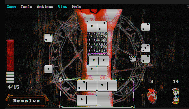
Thank you for your reply! I can see how it penalizes mismatches since the domino game is meant to match perfectly, but at the same time I feel like higher numbers shouldn't be affected by lower numbers, though I get that it would make the gameplay loop a bit stale and easy to break.
Do you have Discord or email? I'd love to keep discussing this since I still need to continue playing to see what else is there to discover ☺️
Hey! Just checked it out, I'll leave a few pointers in what caught my attention:
- Onboarding felt very immersive. It didn't feel like too much info at once or that it was hard to process, so the gameplay loop felt smooth and predictable. However, I find it a bit counter-intuitive that smaller tiles could damage bigger tiles while matching tiles didn't cause damage, but I want to think that there are lore reasons behind this design choice, and it's easy to play with it in mind.
- Continuing with design, the atmosphere was quite captivating, with the disturbing hints and the limited understanding of what's going on. It feels like I really stumbled upon something I shouldn't have discovered but kept playing anyway.
- Regarding gameplay, for the time being, I tested wax and iron as materials, but the wax graphic seemed like a gold ingot first and I was quite surprised to find it wasn't. When I tried iron, which is said to cause +1 damage, it wasn't clear whether the damage was towards the player or towards the domino tiles, since visual feedback was provided but at the same time I didn't notice any changes from playing with wax or normal domino tiles.
I played for around ten minutes before I got stuck in the "Proceed" screen after the second challenge, after which I couldn't continue playing. I tried starting over to see if that was a reproducible issue, but I ran into another bug when the domino tiles got stuck. Luckily I could solve it by clicking on "Resolve", but now I have a tile I can't choose and which stops me from playing with a full roster.

I hope my comments have been of help!