Totally valid. Thanks for taking the time to play! Your feedback will only help make the game better. We’re actively in the process of dialing in the difficulty for a more fair and engaging experience. Appreciate you!
A member registered Mar 28, 2015 · View creator page →
Creator of
Play in browser
Upgrade your bucket to dash, blast, and sneak past your vile human overlords in this Metroidvania roguelite
Adventure
Play in browser

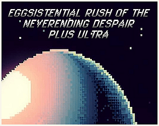
A wisecracking egg with legs tries to scale a mountain and beat his high score.
Platformer