Indie game storeFree gamesFun gamesHorror games
Game developmentAssetsComics
SalesBundles
Jobs
Tags

Typeface: Dicier

an advanced and accessible analog games typeface! · By Speak the Sky

Issues & Fixes Sticky

A topic by Speak the Sky created Jan 31, 2021 Views: 1,414 Replies: 43
Viewing posts 1 to 12
Developer (7 edits)

If you run into problems with the font, e.g. ligatures or stylistic sets not working as described in the guide, let me know in this thread—but first, download the latest version of Dicier, if you haven't already, and check whether the problem you've found has already been fixed.

To request new features, go to the Request a Feature thread. To help translate Dicier into non-English languages, go to the Translating Dicier thread.

Developer (1 edit)

Note: I won't be editing the Dicier design files until I pay for the Glyphs 3 license upgrade (see Dicier's main page for details). This means I won't be fixing minor or non-urgent bugs for the next 2 weeks or so (by which time the Dicier payout should have arrived), unless I can find money elsewhere before then. If you report a major bug that needs to be fixed ASAP then I'll find a work-around to fix it ASAP, though.

Hey!, first of all this is amazing! thanks for sharing it.

I’m not sure if it’s because this is a mac but I can’t get to make the codes work, like if I type MINUS it writes the word on Dicier text font, but it doesn’t create the icon, is it because Mac or is there a work around? I’ve tried to find if I can paste the exact glyph with no much luck, if I copy it from the pdf for example 3_7 it shows as the two dice separated by a small “_”

Developer

Most of Dicier's features need you to activate a font feature called 'discretionary ligatures'. The User Guide (currently v1.0) has instructions for doing this in Affinity Publisher (pg31), LibreOffice Writer (pg32), and MS Word (pg33).

If you're using another app, look up its Help docs or user forums for more info. Sometimes apps refer to them with other names, e.g. the Mac plain/rich text editor TextEdit calls them 'rare ligatures'.

Oh, oohh ok will try it out thanks!!

Developer

I dunno if you've downloaded the latest version (v1.1) but now Dicier works automatically, no need to switch on any features.

Hi there! Caught what a think are a few tiny errors in the 1.1 user guide:

- On page 43,  the first example for cv13 is mislabeled cv10.

- On page 47,  i'm not sure the example for the code D6_TOUT is displaying as intended.

Cheers!

Developer(+1)

Thanks for catching these! I've fixed the first one in my version, but the second is weird—it shows up fine in Affinity, but not in the exported .pdf, which is odd because the scripting for it works the same as PIECE_TOUT later on in that section, which displays right. I'll see if I can fix it today, and I'll publish the update after.

Developer

So I've traced it back to a bug with the affinity file or maybe publisher as a whole, where this one ligature doesn't display right unless it's used outside a table elsewhere in the file... so now one of the icons in the big demo in Chapter 1 is D6_TOUT. It works fine in shorter files and outside tables (so far) so I reckon it's some kinda pdf export issue (basically unsolvable from my end).

I've updated the files and I'll check this out again when I'm doing the v1.2 guide, but for now, this works.

(1 edit) (+1)

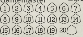
When trying to use dice results with a d20 shape, the 20 on a d20 does not display correctly. The 20 displays to the left of the shape, rather than inside of it.

Developer

Fixed (see the latest devlog)—let me know if you have any further problems.

(+1)

Thanks! 

I'm not able to enable ligatures in MS Publisher. When I go to the Font menu, all of the Typography options are greyed-out and unselectable. I'm using the most recent font release (1.51) but can't seem to make it work.

Developer

Which version of MS Publisher are you using?

I'm experiencing this same problem in MS Publisher 2016. (Was able to get it to work in Word 2016 no problem using the existing troubleshooting section).

Developer

I've looked into this and unfortunately it looks like MS Publisher 2016 doesn't support OT features. The most direct evidence I found was a mod on the Microsoft support forums saying, in 2019, that the only MS Office app that supports OT features is Word.

I don't have MS Publisher, but you could try downloading Vollkorn, a font with a wide range of OT features, and see if that works. If it does, then I can look into what it does differently to Dicier (if anything).

I downloaded that font but I can't quite figure out how to make it work. I'm leaning towards I just need to find a new editing program for my games (have found frustrations with Publisher other than this already haha). Thanks for your response! 

I'm using Pub 365, the most recent version. Vollkorn has ligature options, but none of the options seem to change the text.

Developer

Yeah, unfortunately it's looking a lot like Microsoft is inching towards deprecating Publisher, including removing support for OT features.

Crud. Thanks for looking into this.

Was looking to see if there was a solution for this! Maybe this is a sign that I need to stop using it haha.

(2 edits)

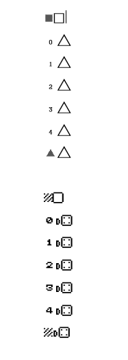
I'm running into issues with the dicier pixel font not displaying dice other than D6s. I'm currently working in Microsoft Office 2016 and I updated to the latest Dicier versions just in case.  Other dicier fonts are working in terms of showing the symbols, so I know I've at least enabled the ligatures properly.

In the screenshot below I've typed the following in both Dicier Flat-Heavy and Dicier Pixel.

ANY_ON_D6 

0_ON_D4

1_ON_D4

2_ON_D4

3_ON_D4

4_ON_D4

ANY_ON_D4


You can see the triangles are showing up in one but not the other even though the text is the same.  Any help would be greatly appreciated!

Developer

e; Dicier Pixel has fewer features, including dice sizes—the only dice it has are 6-sided or barrel (vertical or horizontal). Check the list of missing features at the end of Chapter 4 in the User Guide for more info.

Ah, makes sense! Thanks for your reply.  For the Dicier Flat-Heavy, have I done something wrong to get the "any" shading to show up on the d4? (Rather than next to it)

Developer

The results codes use kerning to combine two separate icons (the number or wildcard and the die shape). If you have OpenType kerning active (might be in the same menu as other OT features in Word) then they'll overlap. If you don't, then they'll appear side by side. They should all be consistent, all appearing either on the dice or before them.

I can't find any reference to OpenType kerning in Word 2019, and no option of negative kerning (surprise!).  So the numbers and dice shape are appearing separately. Cool but not correct. Any ideas? Or is it too much of a pain?


Developer

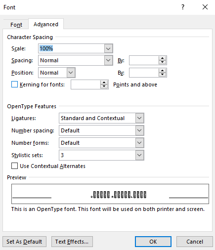
To confirm, does the kerning option marked "Kerning for fonts" (with the font size set to the lowest possible number of points) have no effect? AFAIK most apps don't explicitly distinguish between kerning in different font formats.

(2 edits)

So, I just posted that I thought that fixed it. And it does. A little. It fixes D6s. It doesn't seem to fix D10s or 8s. Or 4s.

It looks it applies Kerning to font size X and above, minimum is size 8. For the record, I tried increasing the size and it didn't affect the success/failure. Sorry.

(This explains why I thought I had tried it before without success, but I just didn't try all the permutations. In good news, testing has confirmed that you can apply font settings retroactively on the codes which wasn't explicit in the guidance.)

Developer

Each set of combination codes only works up to the maximum number of sides on that die (except d6), so 6_ON_D4 (like in your screenshot) will display side-by-side instead of overlapping like 1 to 4_ON_D4. However, as long as the numbers are within what you could roll on each die, the kerning should work.

  1. which version of Dicier are you using (the version number specifically)?
  2. do the ANY_ON_ wildcard combinations work?
  3. do the 0_ON_ combinations work?
  4. which version of Word are you using, on which operating system?
  5. do you have any other software you could test the codes in? If not, LibreOffice is free and reliable and works more-or-less how Word does, so it could provide a good comparison if there's some quirk in Word preventing certain combinations from working (I no longer have Word, so it's tricky to troubleshoot Dicier in Word myself). You'd also have to install the "otf-LibreOffice" fonts, at least temporarily.

0. I chose a bad example for the screenshot but I tried most dice and different numbers.

1: v5_1_3

2. I thought they had, but it seems not. Just D6 as the numbers.

3. Just D6 as before.

4. Word 2019, Win10, all updated.

5. Not at present, and TBH I think I'm going to consider this a sad write-off for now. I have spent quite a lot of spoons so far, which I don't regret, but I have limits. Hopefully having the conversation here will help others later. 

Less an Issue and more of a Question, but how would you reccomend Exporting the resulting 'icons' from a text file into an actual Icon in png/jpg/etc. format?

Developer

One way would be to:

  1. use Inkscape,
  2. resize the canvas to be whatever size you want your images to be,
  3. create a text layer and type in the code for the icon you want,
  4. open text options (select the text layer, then go to Text > Text and Font in the top menu),
  5. select the text in the layer,
  6. select the Dicier font in the fonts list,
  7. click 'Apply' under the fonts list,
  8. if you want, change the icon (e.g. rescale, recolour), and
  9. export as a .png file (using File > Export PNG Image... in the top menu.

In order to access all versions of Dicier in Inkscape you'll need to install the 'LibreOffice' font files, because the two apps handle fonts the same way.

If you're using the advanced features (like the stylistic sets or character variants) then you'll also need to go to the 'Features' tab of the 'Text and Font' area in Inkscape. This may take a little while to load (maybe 10s) due to the number of OpenType features in Dicier. In that tab you'll find most of the advanced features under 'Feature Settings', plus discretionary ligatures under 'Ligatures' and slashed zero under 'Numeric'.

Inkscape seems to just crash whenever I try to make those settings... Is there any reason btw why the fonts aren't being detected by Gimp?

Developer

As far as I know GIMP doesn't implement OT features (except in the text editor window, but not in the actual text layers), so the only icons you be able to get are each style+weight's basic dice (1-9 and 0 pips), guideletters, and Hebrew letter-coded dreidels.

(1 edit)

Hi!

Firstly, thank you for making such an amazing font. It’s so useful and I’ve used it in a few projects already. :D

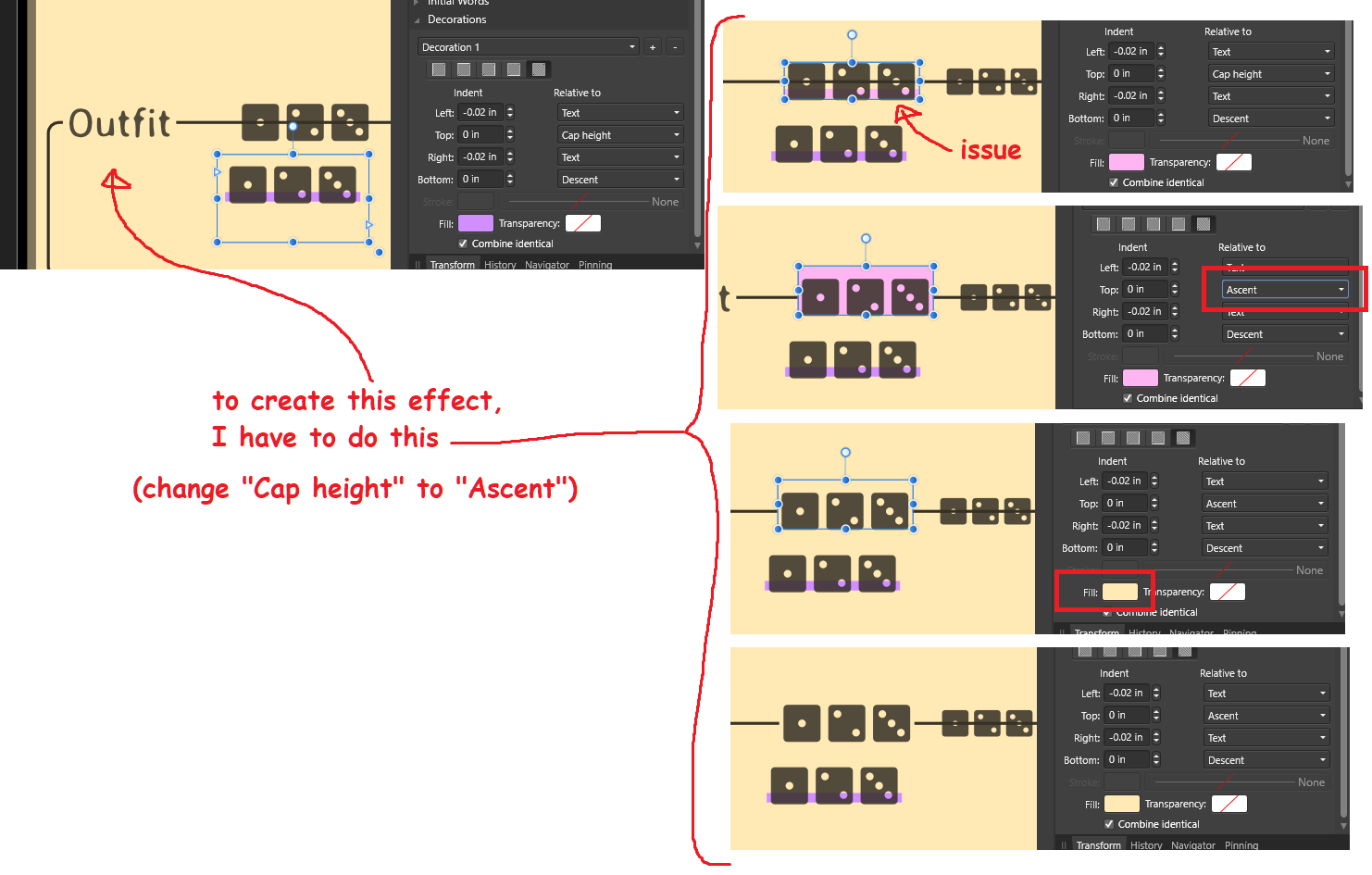
I have a question. Is there some way to address this issue with the font? (Please see attached image.)

I want to have a highlight (Decoration, in Affinity Publisher) behind my text so that it obscures art behind it (in this case, obscuring part of a horizontal line). I can achieve the correct effect by adjusting the “Relative to” of the Decoration to “Ascent”, but is there something to do to adjust it for “Cap Height” without having to adjust the Top Indent? At the very least, this is an interesting (yet inconvenient for me in this situation) aspect for the interpretation of the font in the program, and at the most an awkward annoyance because all the font styles that need this style must all be adjusted accordingly.

I’d love your insight into this.

Thank you!

Developer (1 edit)

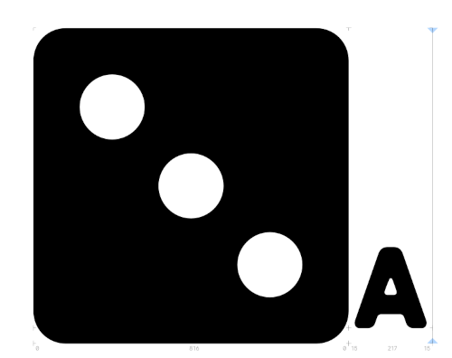
Yeah, it looks like this is due to Publisher (annoyingly, in this case) re-interpreting font metrics from the font curve data rather than using the actual metrics in the font file. The metrics in the file put the cap height and x-height at just below the top of the dice; looks like Publisher's taking the cap height from the height of the guide-letters instead (which isn't in the metrics at all). Compare the height of the guide-letter A to the lower-right pip of the 3-pip die in this image:

The top of the A is pretty much where the highlight stops in your example.

There's a simpler way of making a background for text, though: by using the 'Highlight' option under the 'Colour and Decorations' tab in the 'Character' section of the Edit Text Style menu. This option automatically uses the (app's interpretation of the) ascender height.

As for your current situation, you might be better served by making a single style that has the decoration/highlight and any other shared features that all these styles have, then making the individual styles be based on that style, so you can control the shared features in a single place.

Hello hello! Very small bug, but the latest version - 1.5.3 - still claims it's version 1.005 in the font viewer. This is true at least for the OTF version; I don't have a way to check for the WOFF version.  

Developer

Unfortunately the font design software I’m using doesn’t let me set version numbers deeper than 2 degrees or let me get rid of the leading zeroes (actually I don’t know whether that’s a problem with the software or font metadata generally). It’s annoying, but kinda unavoidable!

alas!

Hi! I’m trying to use Dicier-Dark on web and the only symbols that are displaying correctly are the ones in the documentation. Dice in the format X_ON_Y are displaying as solids. I’m using v1.5.4 but I don’t know if those symbols are supported or if I should turn on a different feature for dicier.

Thanks!

Developer(+1)

This is an issue with Dicier Dark versions. Basically, Dicier does the X_ON_DY glyphs by overlapping two glyphs ("X_ON_" and "DY"). That works fine for the fonts where the dice shapes are outlines, but in the Dark fonts the dice shapes are solid/filled, so the font just layers a black number on a black shape.

If you're dead-set on using those exact codes then there's no easy fix (you could probably wrangle something with CSS given your situation), but if you just want the icons then use the polyhedral dice font features specified in the user guide.

Interesting. Thanks! I’ll keep it in mind

(1 edit)

Hey, first off this is amazing, thanks a lot /gen pos

I'm running into an issue on 1.5 (MS Word) where the font won't translate into its dice even with correct options selected?  (with the codes X_ON_DY it creates them as seperate entities)

Developer

Try switching on kerning (which may be listed as "OpenType kerning" in Word). Dicier uses this to make the X_ON_DY parts overlap with each other.

Unfortunately, Microsoft's been slowly deprecating OpenType feature support in MS Office (now only a subset of features work, only in limited ways, only in Word). See this previous issue. This may not be fixable in current MS Word.

My plan for fixing this is still in the planning stages and basically involves letting people choose their own codes, which should remove the need for almost all the OT features used in Dicier, which should make it more robust in different apps. I don't have a solid timeline for when this'll be implemented, though.