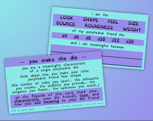
Absolutely beautiful. I love the metaphor of tearing my heart to pieces then putting it back together as I remember/remenisce about the people I care about (but maybe that’s less of a metaphor and closer to the truth the more I think about it…)
😭💖
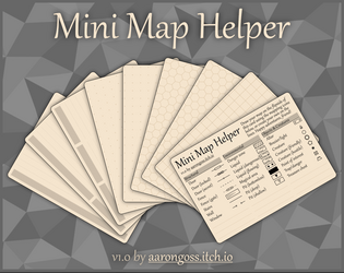
Ok I just tested this in Affinity Designer 2.5.5 and it works beautifully! It does prompt me that saving the template will update it to work only with Affinity v2 (and not Affinity v1), but for me, that’s not a problem.
Thank you for opening my eyes to a fantastic way of setting up hexagon grids in the Affinity suite, because it’ll definitely help me make some of the hex games I’ve been working on in Designer!
💖
What the heck?! I didn’t even realise this could be a thing.
I’ve made so many hex maps on pages and cards and every time I did, I had to invoke some kinds of deep, Eldritch magic to get it to work, and almost every one of those times I’ve ended up downloading a hex tile svg or something.
I will definitely try this out because it looks like it’ll be so easy to use!!
Thanks for checking this out, Mint-Rabbit! :)
Even though the game is set on the ocean floor and you are seeking out the source of an anomalous signal, the range of mysterious prompts that are included are not too horror-specific. It is very much up to you and your friends how scary you want the game to be.
For a more lighthearted but eerie game, perhaps the signal you all seek ends up being a school of spooky merfolk singing in an undersea orchestra! Or for a more scary game, maybe your robotic companions start losing their mechanical minds the closer they get to some sunken artefact, seeing all kinds of mind-melting things as they go!
So, you should go as scary or not as you and your friends like. ^_^
I hope this helps!
Thank you! I never thought it could be used for journaling, so that is really neat! And you’re welcome. I hope you enjoy it 🥰
I appreciate your thoughts on the prompts. It was tricky to think of them broadly, but perhaps they still need to be broader still. I do have a visual update coming soon, and I had already tweaked the wording of a few prompts for it, but that was done before your comment here, so unfortunately new prompts won’t make it in to that. However, I will keep your feedback in mind for if I do update the prompts later on!
Oh, embroidered patches would be so nice to see for this, and really make it live up to its namesake! 🤩
This is quite a fun little deep space campaign game. I particularly like the choose-your-damage feature where you can pick which modules get upgraded or damaged with each roll! It’s a neat way to manage risk and reward over the course of your voyage.
I was able to make my first jump after 33 rounds by wrecking one of my ships (scoring lots of points due to the upgrade card I drew at the start of the game). I’ll continue my campaign once I have done some more real-life stuff.
Thank you for making this, especially with the digital play space!
Oh, thank you for the kind words. You’ve made my day! 😊
I’m also excited to see one of my games in real card format! (If it gets chosen for the set, of course! 😅)
Being honest and open with the assets I use in my games is very important to me. I do my best to credit the authors of those assets where I am able to. And I really do try to be open and honest with my designs, too (which is why I show most of the content and imagery of each card, while still hiding some of it to encourage people to buy it to see the whole thing 😋).
And if this honesty of mine about where I got my assets from, and which software/tools I used to make my games, inspires somebody for their own game or project or helps them in their own process… well that would just be one of the best outcomes I could think of! 🥰
This is a very cute game and was fun to play! I enjoyed solving the puzzles of how to collect each item. The levers were tricky (until I figured out how to use them). At the end of the game, I chose the two flags and the ring. The door creaking was a bit loud but not as bad as the “Known Issues” lead me to believe 😂
I’d love to see more games like this! 💖🥰

https://aarongoss.itch.io/signals-from-the-deep
Hi, friends! I just released another game on itch.io!
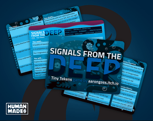
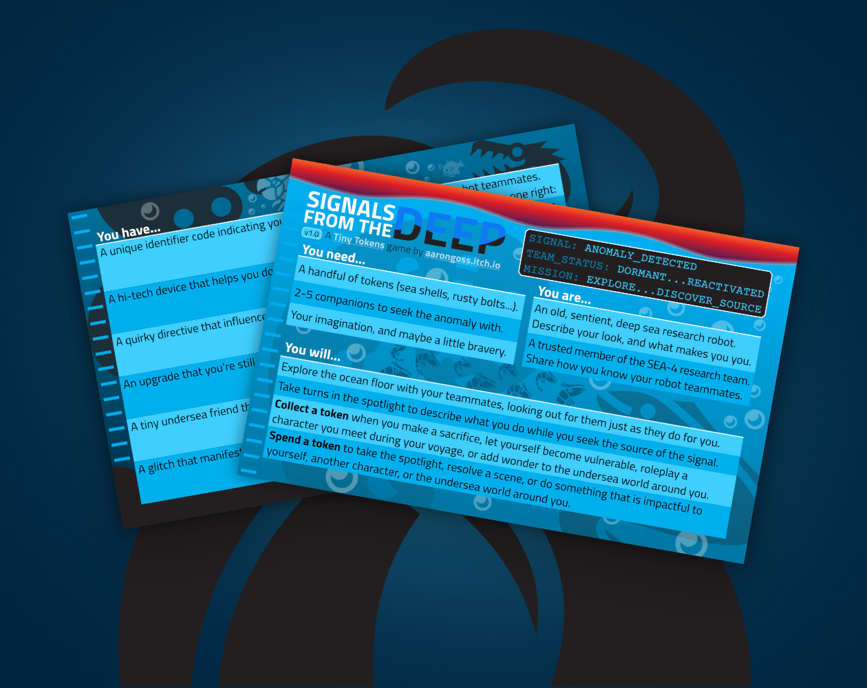
SIGNALS FROM THE DEEP takes you and the rest of the old, sentient, deep sea research robot team SEA-4 on a shared voyage across the ocean floor.
Explore deep sea wonders as you seek out the source of an anomalous signal detected way down at the bottom of the ocean.
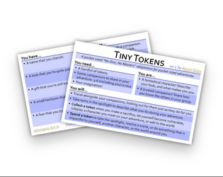
Built using my Tiny Tokens roleplaying game system.
Iconography from game-icons.net, used under CC BY 3.0.
I’d love to hear about anyone’s adventure across the bottom of the ocean if they make it there, or about any other Tiny Tokens games you would like me to make! Or why not make your own? 🤩
Enjoy 💖
Your voyage begins here: https://aarongoss.itch.io/signals-from-the-deep
Thank you! 🥰
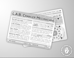
Yes, you can leave a patch on a module as long as you want. And if you roll that module again, the patch protects you from the effects of the glitch, making the roll a null result as you said.
But you may still want to take care and repair glitching modules because having all four modules glitching at the same time will the end the game!
Dicier is so beautiful and I’ve used it in a few projects recently. Thank you for making it!
I have a question: Are the “Dark” typefaces supposed to show a number on a die? It seems to turn the whole die a solid colour. Interestingly, it does seem to work for #_ON_A_D6 (from 0-9, you can colour the die’s number differently than its outline shape, and also for the D6 in “Dark”), but it doesn’t work on a D4, D8, D12, or D20 (which are the ones I’ve tried it on).
If this isn’t a feature/planned, and if it is even possible, I would like to put a request in for it, so that you can have a solid, dark colour for the die, and a second, different colour for the number.
Thank you for all your amazing work! 😊
Hi!
Firstly, thank you for making such an amazing font. It’s so useful and I’ve used it in a few projects already. :D
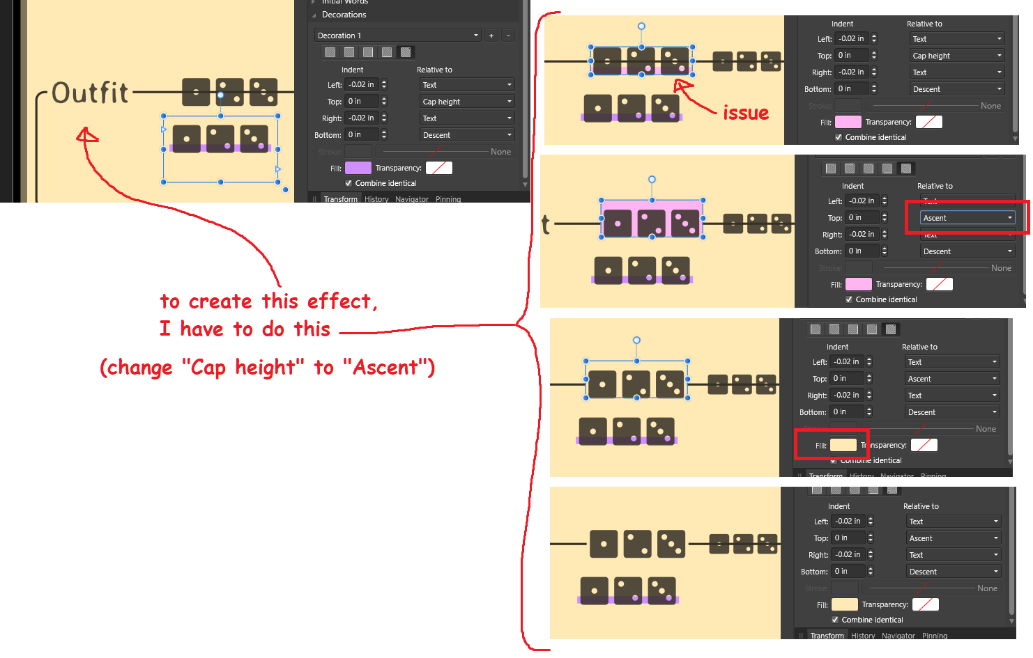
I have a question. Is there some way to address this issue with the font? (Please see attached image.)

I want to have a highlight (Decoration, in Affinity Publisher) behind my text so that it obscures art behind it (in this case, obscuring part of a horizontal line). I can achieve the correct effect by adjusting the “Relative to” of the Decoration to “Ascent”, but is there something to do to adjust it for “Cap Height” without having to adjust the Top Indent? At the very least, this is an interesting (yet inconvenient for me in this situation) aspect for the interpretation of the font in the program, and at the most an awkward annoyance because all the font styles that need this style must all be adjusted accordingly.
I’d love your insight into this.
Thank you!