
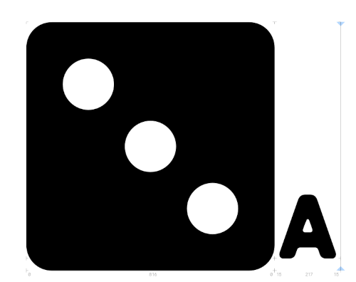
Yeah, it looks like this is due to Publisher (annoyingly, in this case) re-interpreting font metrics from the font curve data rather than using the actual metrics in the font file. The metrics in the file put the cap height and x-height at just below the top of the dice; looks like Publisher's taking the cap height from the height of the guide-letters instead (which isn't in the metrics at all). Compare the height of the guide-letter A to the lower-right pip of the 3-pip die in this image:
The top of the A is pretty much where the highlight stops in your example.
There's a simpler way of making a background for text, though: by using the 'Highlight' option under the 'Colour and Decorations' tab in the 'Character' section of the Edit Text Style menu. This option automatically uses the (app's interpretation of the) ascender height.
As for your current situation, you might be better served by making a single style that has the decoration/highlight and any other shared features that all these styles have, then making the individual styles be based on that style, so you can control the shared features in a single place.