Indie game storeFree gamesFun gamesHorror games
Game developmentAssetsComics
SalesBundles
Jobs
Tags
A jam submission

Purple DesertView game page

Conquer the Dark Side of the Moon, one card battle at a time.
Submitted by BOON (@BOONdev), ves, ViktorRKraus, vincentizghra — 15 hours, 46 minutes before the deadline
Add to collection

Play game

Purple Desert's itch.io page

Results

CriteriaRankScore*Raw Score
Fun#114.0264.026
Visuals#184.2894.289
Theme#303.8423.842

Ranked from 38 ratings. Score is adjusted from raw score by the median number of ratings per game in the jam.

Leave a comment

Log in with itch.io to leave a comment.

Comments

Viewing comments 22 to 3 of 22 · Next page · Last page
Submitted (1 edit)

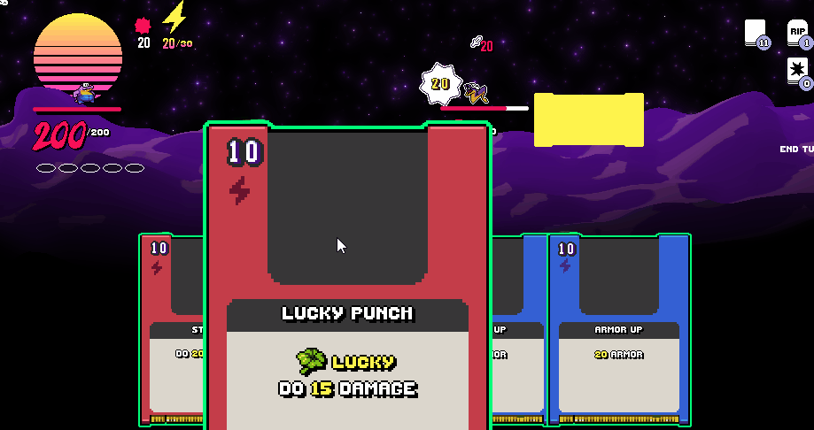
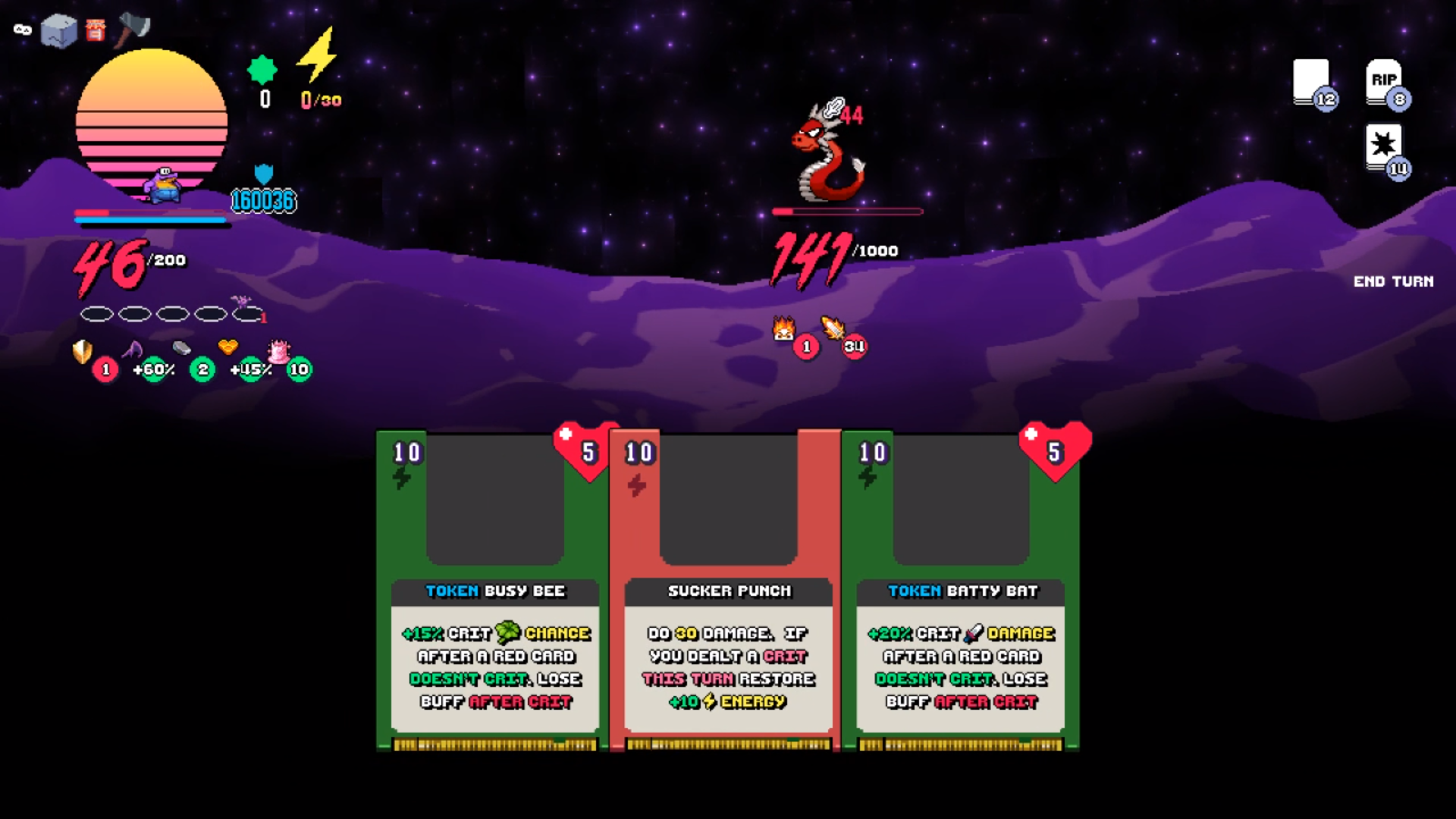
Sorry, my monitor has a high resolution, so your game is so small! I can't really a lot of it, nor see how awesome the graphics probably are.

The card zoom is really smooth and the music is wonderful.  I just wish I knew what I was doing. It would probably be much better if I could read the tiny text. I'm kind of randomly just clicking around and hoping something works. :/ 

I couldn't figure out how to change the settings for the life of me. I'm playing on a laptop with a touchpad, so maybe that's the issue?

However, it does feel well animated. How much game experience you all have? There's so much in here OoO.

Developer

does it work in windowed mode?

Submitted

It opens in a tiny window that I am unable to maximize (maximize button greyed out) nor change the size of. However, my husband recommended your game, so I asked him how to play, since I can still read the zoomed text. It's super fun! I just wish I could read it all. XD and DX.

Submitted

I’m not usually into deckbuilding roguelike games, but I thought this was a great submission for this jam! The UI/music/visuals are really well made. I thought it was a bit too easy to cheese, but it’s not as if there was much time to dedicate to balancing. I also think this really would have benefitted from some more tutorialization, since as someone unfamiliar with the genre it took me a bit to get into it.

Seems like a great foundation for further development though, hope you stick with it. Well done!

Submitted

Wow. This is an exceptional RPG. I love the presentation!! Great music, great graphics, great gameplay! Well done!

Submitted(+1)

Super fun deck builder! Had a blast playing it. My only criticism is that the size of the disk/cards is so big when zoomed in that I didn't realize I could target enemies for a while.

It is professional as for its aesthetics, UI, animations, zooms, so congrats! Reminds me of a mini-Wasteland 2. :)
However, when tried to fight the 1st monsta (a snake), it always healed itself to its max. 80 HP, and mine was draining unstoppably.  Though chose armor up +30, and strike +20 repeatedly.  What did I wrong?

Developer(+1)

I deeply apologize. I should have made a better tutorial. 


Try holding into a card and dragging up just a little bit until you see the spotlight on an enemy.

Thank you very much! Yes, the scope of your project is beyond (my) imagination and this Jam!

Going to try it and rate it, and you can see my entry too (now with an FHD++ gameplay video)!

Submitted(+1)

If there would have been more I would have played more. So far the title I had the most fun with out of all entries!

(+1)

I love this game so much holy crap.

(+1)

I'm too much of a sucker for card games.

Submitted(+2)

Wow! That was hard! haha I probably should've prepared more before trying to fight the boss (and also should've realized the big enemy was in fact the boss). I'm a total newb at this sort of game, but I still enjoyed it. Great visuals, interesting gameplay, and delightful music. :)

Developer(+1)

Thank you very much haha, Honestly I could have labeled it as BOSS when you hovered over t hat large enemy! I'll be sure to include that in the future!

Submitted (1 edit) (+3)

I had to play this game after my friend said it was a blast. I ended up playing it for 90 minutes haha. Though I guess I also had a really hard time finding the boss! Anyway, it was super fun regardless and incredibly polished. I have never played slay the spire before for some context.

Have some little nitpicks on this game. I really loved it so these things are pretty minor and nitpicky. 

UI Related Issues

  • Heart symbol on how many turns the token will last is a little confusing. The heart made me think of health rather than turns. Maybe something like an hourglass would read better
  • Had issues with dragging the card. Several times I thought I had dragged a card but I did not. As the card itself does not actually drag, it is also doesn't read quite well. When you drag the card, the targeting is not super prominent either so it is easy to be mistaken. Would almost prefer clicking a card and then selecting a target though I guess that can be seen as less immersive.
  • In the shop, the "Buy" sign looks like a button you can press. It did not read as a question, I think because the borders surrounding it look identical to the borders surrounding the "yes" and "no". In the store, I had clicked "Buy" a few time before clicking on "Yes". I think having the action be the button would read faster to most people. Their thoughts being "I want to buy something", and then seeing the "Buy" button. Think this is also trained because lots of online shopping website would have "Buy" as the button to press. Maybe just have the button read "Buy -40 gold" or something like that and the other button be "cancel" or "go back"
  • It's a little hard to tell if the map would expand. Sometimes I would see a monster on what seems to be an island with no other paths to it. It looks like a deadend. So some indicator of maybe fog or arrow indicators that there will be more to the island would be helpful. I nearly missed a path because of this. 
  • Wish the sprites were a bit bigger

Balance Issues

  • Went a total shield build (ended up with 16K shield and 46 health) haha. That card to make the shield permanent with double shield is super powerful. I didn't see much a reason to stock up on health because of how easy it was to get lots of shield.

Performance Issues

  • This is probably solely on my end but the overworld was lagging for me. Not sure why but lots of games in this jam have been performing poor for me .... I have a nice laptop but the current theory is that gamemaker games are running on my integrated graphics card on default for some reason

Things I really loved

  • Music was great! I spent such a long time in the game and didn't get a headache from it. It sounded good and worked well. I love the orchestral stuff in it. Really well done. It fit the game vibe well. 
  • Building up crit was a TON of fun. Really went wild on the tokens and gave such a sense of reward.
  • Final boss variety? I think I had a different boss from what my friend had and he played the game twice over as he really liked it.
  • the background effect on the battle screen was super cool.
  • Love the meep moop sound when there's no energy left haha
  • The screen that indicates a battle is starting is absolutely awesome
  • The floppy disc cards are a neat little touch that work well into the theme

When it comes to this jam, I think this game ranks one of the highest if not the highest on fun. What a blast with an addicting loop. Can't wait to see this expanded! If you do, are you sticking to this theme? Or branching out once the jam restrictions aren't in place? 

Honestly, super blown away by what you made in the jam timeframe. 

Developer(+1)

Wow this was the most in depth comment regarding our game yet, I really appreciate giving such as in depth explanation! The fact that you where able to get 90 minutes of playtime is such a joy as a game designer! I will definitely continue work on this project considering the reception!


Couple of things! 


Ui related issues

1. I agree I think when we see hearts we assume that it's going to have health /vitality. Like pokemon having a better way to make it easier to understand that it's a TURN would be a better addition, an hourglass/stopwatch etcl.

2. This seems like a really big issue that will be addressed PRONTO. There are many times where you misintend to connect a card. I'll find something that can do a better job for this problem.

3. I didn't even consider the buy button. I did test it out with my coworkers and they had the same response as you , that they wanted to press the BUY button. I think this is a great change!

4. Yeah currently the lack of the fog of war system sucks. You really have to look for the patterns and they are too subtle and easy to miss.
OOF

5.Sprites size was unfortunately a result of me needing to make the resolution bigger, it was terrible that it messed up the gorgeous sprite work as a result.


balance issue wise, I do sorta lowkey want to make sure you reach that point of ridiculousness when it comes to having a ridicolous amount of shield. The only con is that it should be really hard to achieve. I think right now it might be too easy. That might change by adding more cards into the pool and making it harder to find the perfect armor build cards. Or increasing damage on certain enemies.


Performance wise I do apologize, I really wanted to appeal to our Opera overlords, so I figured we should add as many gorgeous GPU effects as possible to really make our game stand out from other Gamemaker Games throught the use of shaders. As you can imagine, there are parts where we didn't really focus as much on optimization as we did on making the most beautiful and extravagant as possible to get people's attention, and I fully knew that some people would not get the best experience possible. This will be addressed in future updates, of course.


I strive hard in making sure our game is as fun as possible and moving the genre forward with roguelike deck builders. I'm really happy that it's receiving so much positive reception! 

It is my goal to make the best game possible, so being able to identify these nitpicks will help out future people down the line.


Submitted

"balance issue wise, I do sorta lowkey want to make sure you reach that point of ridiculousness when it comes to having a ridicolous amount of shield"

Super fair point. I can say I really enjoyed the ridiculous amounts of shield so it's a plus for my player fun. Feels good to feel powerful :D

(1 edit) (+2)

Wow I really enjoyed this game! Can certainly feel the 'Slay the Spire' influence but I think this stands up by it's own accord as well. I enjoyed the many card combos in the game, and was having fun finding new cards and thinking of ways they could be added to my deck to make stronger and stronger combos. I thought the animations and effects in the game felt really great and once I realized what all the UI elements were, it was really easy to understand the game state at a glance. After I beat the boss I kept playing to clear the entire map out of enemies because I didn't want to stop playing yet. I also ended up playing through a second time with my teammate watching to show them the game.

The only negative I will say is that I wish the player and enemy sprites were bigger during the combat section of the game.  

Overall, very impressed and I had a great time playing it. Nice job!

Developer (1 edit) (+1)

Thank you it was my goal for you to be able to reach the bosses and then we could put your builds to the test!

Character sprites are unfortunately small at the moment ever since I decided to change the resolution from 320 x180 to 960 x 540. This was done to have more space for the cards, more enemies to add to the screen, more room to add status effects. The small screen space was too limiting and ended up restricting a lot of game design things I wanted to do. 

Unfortunatly it made the character art tiny like ANTS! AAAARGH! I'll have to figure out a way to fix that in the future when I'm not so focused on the game design right now!


But yeah my big goal here was that I wanted to ensure that the legibility of all the UI elements and legibility of the cards were crystal clear.  Thank you for bearing with this hiccup! For now I just wanted to make sure that it was fun to play and to finish!

Honestly this is a game I'd love to continue working on so if you want updates here is a way to get them.

Thank you. Honestly it is apparent that I wanted to make a slay the spire game and try out ideas to see if I could push the genre forward.  The map exploration was a big one in my book to see if it would make the game loop stronger. Which I think so far it did! 


The other idea was the inclusion of token cards, which functioned similar to POWER cards in slay the spire with the exception of making their effects stronger than slay the spire, easier to stack, but they would have a turn limit.

The coco run I wanted to test out builds where landing critical hits was the main emphasis or trying to crit as little as possible (with the temporary attack buff that removes damage stacks after you crit). 

Honestly I'm glad how well received the game is so far. I really want to add more to it, add more floors for you to explore, so that would be one of my main goals for the future.


Glad you had fun have a wonderful day :D

Submitted

I love these kind of deck builder games! The floppy disk aesthetic for the cards is really cool. The pixel art is cute. Might be an improvement to increase the size of the character sprites during the battle sequences. It must have been a challenge to balance out a deck builder game, you did a great job!

Developer (3 edits) (+1)

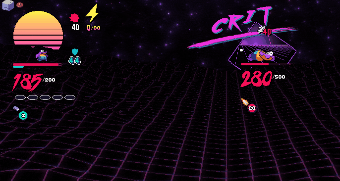
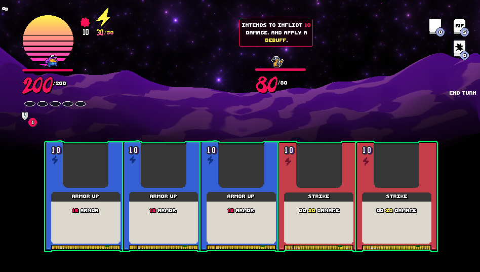
fun fact originally the resolution was much smaller 320x180 but it was extended to 950x540

Even though it made the pixel art harder to see it was a decision I think was in the best interest if the game.


Having such a small screen limited how many enemies we could display on the screen or how many status effects we could have at one point.


It was also hard to display cards alongside the game since cards had to be small enough to be in the small screen space.


Overall I made the screen larger to make it easier to display more info but then I noticed that it was harder for the small pixel art to look good. 


But you are totally right, atm the large screen space definetly isnt working in the favor of the gorgeous pixel art! We will find ways to make it work better in the future for sure!


It definetly was one of those decisions where it limited too much design space for the cost of aesthetics.

Submitted

That makes a lot of sense. Sounds like a challenging aspect of the design, but it sounds like you made the right choice. I didn't realize you were developing for mobile too, that's pretty awesome!

Developer (4 edits) (+1)

haha no I'm in bed right now and screenshotted this old  pic on my phone right now since I'm too tired to turn on my PC atm and get the original XD.

Submitted

I really like it! Obvs reminds me of slay the spire but with more overworld movement. The visuals are great and the effects are punchy. I think I just needed the enemies to be bigger because the cards took up most of the screen. 

I played about 12 battles and didn't find a place to spend my gold? Is there a shop in the game yet because I couldn't see it in the screenshots. I also felt that there needed to be more threat because I really didn't feel like I was going to lose at all.

The cards were good at there were nice synergies! Thanks for letting me play!

Developer

yeah there Re different shops right now. It sounds like the generator es ssnt too kind.


A card shop.  A place to buy your cards  


A card removal shop


A token shop (here you can permanently buff a certain type of token for the rest of your run)


Rest areas (restore hp or upgrade a card for the rest of your run)


Its unfortunate you didnt see any if you give it another chance I'm sure you'll get some.

Submitted (1 edit)

I saw two card removal - I'll give it another go now!


Edit: Had a rest stop and a chest!

Developer(+1)

every map also contains a  golden chest that can only he opened with a golden key. Inside it contains a really strong passive abilities.

Submitted

A nice concept, although playing on 21:9 aspect ratio (which the game recognized) makes playing a bit difficult for me, as some of the textures are a bit messed up and the end turn button isn't visible. Luckily the screenshots showed me where the button is supposed to be, so I found it even though I couldn't see it.

Probably works fine on 16:9 aspect ratio. :)


Developer

;___; sorry about that, I suppose keeping it windowed would help it for now

Submitted

A beautiful, interesting game!

I passed and did not see the victory screen. The entire map is open and there is no one on it.

Music becomes boring over time, of course, the graphics are beautiful, the gameplay is interesting. If the energy ends, it is better to automatically end the move, less movement to do through.

Good job! Good luck with development, if planned! =)

Developer(+1)

haha yeah the boss is currently the end of the game currently, Thanks for giving it a shot!

Submitted(+1)

Cool deck building game. Nice amount of juice in the ui !  Visuals where really good too! Was very fun to play :)

Developer(+1)

thank you

Submitted(+1)

A full-on roguelike card game made during a jam is impressive enough as it is, but it ended up being super fun as well. Congrats ^ _ ^

Submitted(+1)

Compliment Sandwhich!
- The Synthwave aesthetics are top tier
- It is too easyyyy
- I never played a game like this before, I found it easy to understand

Developer

I made it easier for this jam so people could reach the boss. I might have overdone it haha. If you want stay in touch with the mailing list and I'll make sure the next update challenges you .

Viewing comments 22 to 3 of 22 · Next page · Last page