Very good start. The art style you are going for is very nice. One thing that might be a challenge though, is that if you are comitted to use only black and white (and gray for that matter), I believe you will have visual clarity problems, so you will need to plan very well how are you going to display everything. I think the enemies can end up easely "blending in" into the background. Kinda of an issue already with the slimes. On battle two I didn't even realized there was one with the skelletons.
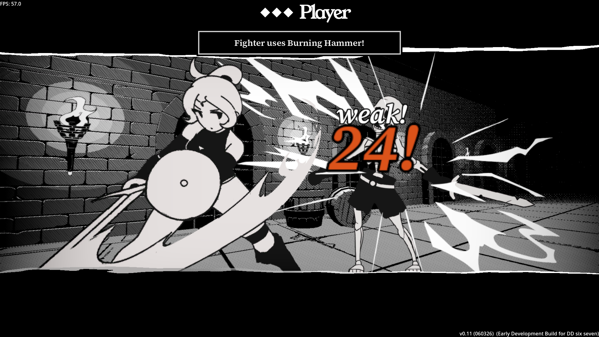
About the UI, I like it! I didn't see anywhere you displaying the enemy health. I don't know if that is intended, but I think you might want to at least, when I'm selecting the targets, show the same stat box as for the party, but to the enemy. They do that in FF Tactics:
Of course it's early yet, but I would like to seesomething "tangible" about what reducing enemy DR -1 does. Like maybe a negative % in damage increase? Show me the numbers! Would be nice also, if you figure out a way for us to check what the current status are doing to the characters/enemies. Like burn, blind, etc... I see the icons, but I don't know exactly what are they representing ingame.
I really dig the artstyle, I think you're really cooking with the black-and-white aesthetic.
I don't have that many complaints about the UI aside from what has already been said, but what I noticed after rewatching the VOD that the combat sequence is extremely disorienting. I don't think you have any movement frames (or they are barely noticeable) - so during combat it feels like the attacking character just spawns somewhere in the middle of the opposing party with the attack frame. I think maybe at least half a second of animating the movement (even if it's just a static sprite moving in position) would do wonders.
I'm very much looking forward to what you're gonna do with this, I feel like with the right SFX and VFX this would be a fantastic game.
It's clearly early in development but the game already has a lot of style which is important because Darkest Dungeon was 50% style and 50% gambling. The RPG elements weren't complicated.
Either way I think the UI is probably the biggest issue I found. Personally, I like chunky UIs with big portraits in them but some key information is missing here such as enemy health. I would argue some of the information on screen is unnecessary too, such as the money total and character primary stats. Especially when attack, defense and initiative are already displayed either explicitly or implicitly through the turn queue, which is probably too big as well.
Moreover, it would be nice if the game automatically selected a character that hasn't taken an action after exhausting a character's actions, and there was some sort of visual indication for attack range while aiming a skill.
Finally, the characters that are not taking part in combat during a specific turn need to be hidden or obscured somehow, probably with a fade or depth of field effect, because when a slime walks in the middle of the party to do an attack it looks kind of silly and it's not made clear what the player should be looking at.
Big fan of the Final Fantasy Tactics artstyle. I think you're capturing it really well here and it makes me happy to see it. Your character designs are solid and the black-and-white palette choice works better than I thought it would (and I imagine it makes it pretty nice for your workflow not having to worry about dipping into colors). I don't know what you have planned, but I'm curious if the black-and-white will tie into the story at all (and if maybe at some point we'll see some color)...
Everything worked together well. I got through all three fights (perhaps with a bit of ease; are you going to go for a more hardcore difficulty in the future similar to Darkest Dungeon?) and didn't encounter any gamebreaking glitches or bugs.
Art is great. Everything is cohesive and looks nice despite being grayscale. I think the music could be improved; it sounds a bit too plain and simple (I don't know much about music so I can't offer much criticism behind I think it would be nice to hear something a bit more orchestral paired with these visuals, but that's just my preference).
The below is a list of a few things I noticed could be improved in the game:
-At the title screen, you can select Swap, Details, or Equipment. If you select Equipment from the initial party view page and press the cancel button from that Equipment page it will take you to the Details page instead of back to viewing your party. -I'm unsure if any of the skills/attacks have an effect on turn order. It would be nice to how the turn order will be modified based off this before committing (and if not, then seeing the turn order for my characters in general before selecting an action would be ice). -After I select an action the character that is committed to an action is still selectable with the cursor. Not sure why this is, but it should move to the next character who I am free to selection actions with in my opinion (and they should not be selectable unless by another character's skills). -It would be nice to have a visual indicator for the range of an attack alongside its description that appears when I hover over it. As it is now I have to click on the attack to see its range in the form of cursors over the enemy. -The laugh track on misses is funny, but feels out of place. Would be cool to have it be something a bit more creepy/sinister sounding. -Would be nice to hold a button to speed up battle animations. -I defeated the last enemy with my first character's attack and the other characters kept on doing their attack animations while the results screen got brought up. I don't think I used any mana requiring skills that round, but afraid this might allows characters to eat up mana even after all enemies have been defeated. -The icon for "HEALED" is coming up when I cast spells on allies regardless of whether it was a healing spell or not.
I like hardcore roguelikes like Darkest Dungeon, which this seems to be going towards design-wise, and am looking forward to seeing how this game evolves in future Demo Days.
I beat the 3 fights and I must say the biggest appeal of the game is the artstyle because is very charming, obviously is lacking more VFX like in Darkest Dungeon but I know the game is in a very early state so that's expected. One thing that feels weird to me was the music: in the intro/main menu the music give a sense of adventure/fantasy but the one in the combat sounds... electronic/techno. Because of the game artstyle and setting, I think orchestrated music would fit better and depending on what you want the player to feel you can go for different styles:
- Want the player feel stressed? use music similar to Darkest Dungeon/Diablo 1-2
- Want the player feel a epic battle? go for music like in the old Final Fantasy games or Golden Sun
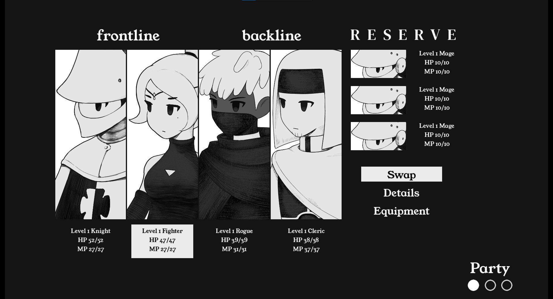
That's just my opinion, also I found a bug in the screen where you can read about the characters, the rogue do not display correctly the portrait.
In conclusion, a promising game with a charming artstyle, keep working in the game and I sure you will reach success. Keep up the good work!
Thank you for playing! Yeah, for the next build I'll probably put in my own playlist as reference for my composer. I was too worried about royalty-free music so I made do with a similarly themed but free to use soundtrack.
I played it for a bit, the UI is a little weird with selection options where I can select someone who has already done an action. The Music and VFX needs a bunch of work.
Can you move the unit giant portrait to the other side for a better view of the enemies? Seems weird it's on the enemy's side.
With attacks, Darkest Dungeon has the closeups which are effective with showcasing motion with less sprite work. This game really needs that sense of motion. Along with how attacks work in an order where enemies can interrupt your party's actions instead of setting up everything and having them attack between your actions anyways where you cannot respond. There is some bare basic tweening using spine for Darkest Dungeon too. I have a problem with adding that too, but I recommend it.
The game needs icons instead of text and a better icon placement for the enemy select arrows.
Has lots of promise, but I really recommend watching some videos and taking notes on Darkest Dungeon for exactly every tiny detail in the combat and UI for you to add, for example showing the skill and who is being selected when it happens before the attack happens, giving some time to process what will happen.
This is pretty good, everyone’s already praised the general art design but I’ll also point out that I really like the menu SFX in battle. I don’t know if you somehow got it from the same place, but the confirm option sounds exactly like ordering an attack in Medieval II Total War and now I want it for my own purposes.
I’ve never played Darkest Dungeon so I just played it like it was a Final Fantasy game and everything seemed to turn out alright, I beat all three battles without losing anybody though I did have to dance people around to make full use of the Cleric’s passive.
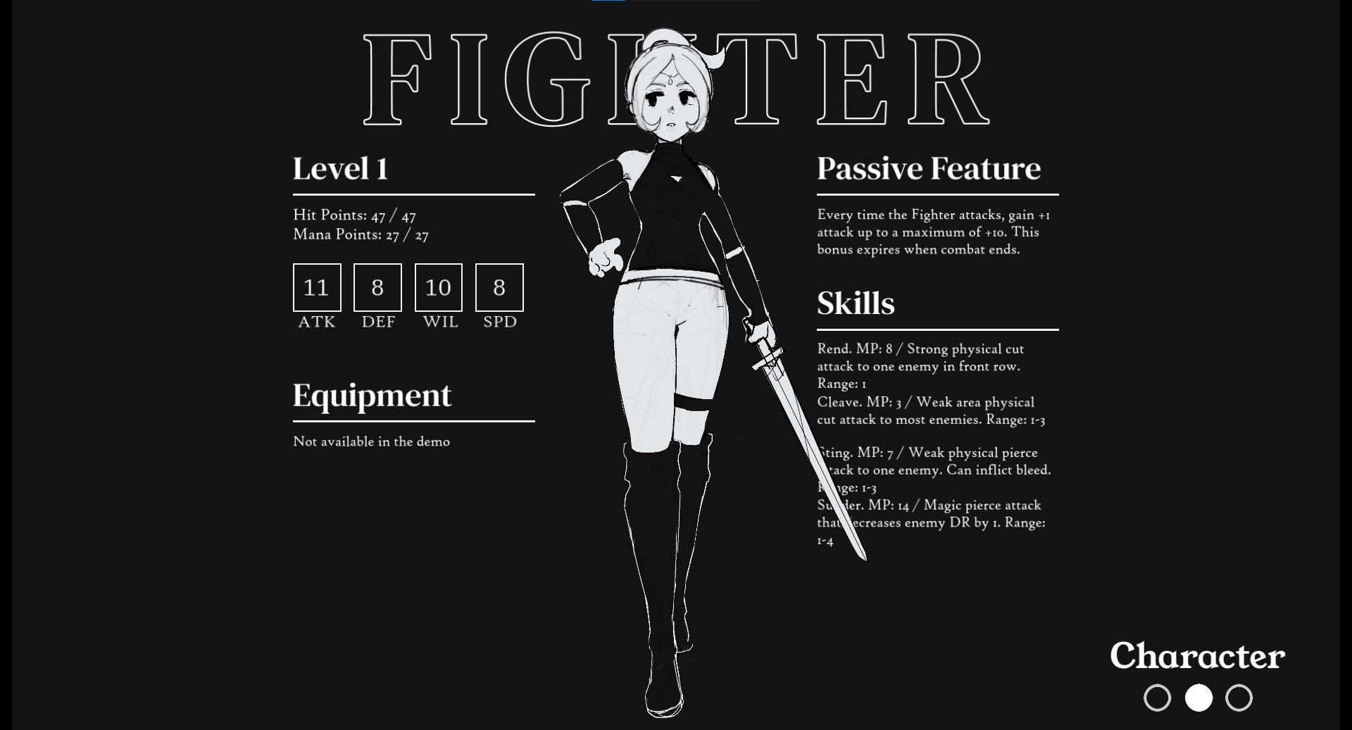
I couldn’t tell if the Fighter or Knight passives were actually doing anything, I wasn’t paying attention to the Fighter’s stats and was just sort of expecting to see a little buff icon or something.
Now that you’ve got battles working what’s your plan for the non-battle parts of the game? I feel like you could take it in a bunch of different directions.
Thank you for playing! Will definitely keep that in mind about the character passives, I do plan on making them their own thing like in Expedition 33. As for the immediate future, I will focus on UX and simplifying the game both under the hood and for players. We have the dungeon crawling layer working already, so that could be in the next build. We'll see
-Art is nice, though I swear there was a game on the DS with almost the same thing going on. For the character linework I mean.
-The Details portrait of the Rogue is a duplicate of the Cleric. Also, if you select Equipment, when you press cancel it will send you to the Details instead of where'd you expect. Also also, when you press cancel on the party screen, it sends you to the main menu instead of Party/Start screen.
-I'm not a big fan of the Darkest Dungeon combat, but it seems like you have the basics down pat. Though with missing sfx and lack of punchy visuals, it does fall flat right now during combat.
-I beat the first battle and went to level up, but I notice that my knight is Level 3? Shouldn't he only be at level 2? Seems like a bug, or else he gets a bonus first level.
-I keep seeing DR, what is that? Dodge rate?
-I lose my Cleric on the first turn of the 2nd fight, with 2 high rolls from the enemy. I also misunderstood, since my Knight healed from the level up, I assumed it was a heal after every fight, and I glazed over the other party member HP values. My Cleric was probably low.
-Luckily Clerics are nerds, so we slay the Manticore, with the 3 other members living to tell the tale.
-I level the knight again, and it jumped from 3 to 5. So most definitely something silly there.
Guess that's it. Cool looking game, keep up the good work.
I made them level in increments of 2 for this build, so it's definitely intentional but also probably weird to people. UX and proper VFX will be the priority for the next build now that we have a good amount of assets and project structure knowhow. Thank you for playing!
The visuals are very good, as many others have pointed out. Most of the complaints I have are more to do with UI/UX rather than anything else in the game design, but that's mostly because the battles here feel very early-game before any real strategy needs to come into play. Some of these can be helped with a tutorial to set expectations and explain some of the displays.
Enemy HP - if we're not meant to know the exact number, a description like "The manticore is panting heavily" could at least give some idea of the state of the enemies. Also, allowing the cursor to navigate over to the enemy side to look at the buffs/debuffs (same for the player side!) would be nice.
Auto-move to next character on action select. Probably already mentioned by others.
Recovering MP? At the very least, I think I would've liked to know that it doesn't recover at the start of the game rather than finding out after the fights.
No idea what the [1, 2] numbers mean. I vaguely think it's related to turn order, but I can't figure out what it's supposed to represent since the turn order on the left seems to update accordingly anyway.
I think the background being a slideshow noise texture isn't enough movement for the game. I'd like to see some more animation (or even just effects) on the characters as a keep-alive kind of thing, but I also understand that it's a lot of work to do.
Sounds and effects are needed for each action, like for healing.
Also, despite running out of MP early on, I ended up beating the manticore by just spamming attack on everyone.
The aesthetics are wonderful my only real "complaint" is that after selecting my character's move it would be nice if the cursor automatically moved to the next character. Also im not sure if it was intentional but i think the manticore was bugged with its positioning? it would dash to the back when the rouge would attack it.
Thank you for playing! Yeah I'll make sure the UX to be the best it can be for the next public playtest. I'm also aware of the manticore bug which is weird since it only happens specifically with him
I've been wanting to play this since you first posted the concept art/mockups, glad you finally put up a demo. Really solid visual style. The actual combat is mostly fine though it could use some improvements in displaying certain stats like enemy health, etc. I don't know if it's just me but I ran out of MP fairly quickly and it wasn't very clear at first that the stats carry over through the other scenes.
Somehow i missed the whole control scheme, because i was stuck in the second fight, trying to choose a skill for the rogue that had no MP left. After consulting the game page i read theres a back key, but currently its not intuitive at all.
The style itself is really really good and i liked the laughing audience on missed attacks a lot. However, currently it looks pretty chaotic in fights and can be confusing at times. In the first fight i didn't really see the slimes at first and wondered what im fighting. The same goes for HP/MP information. I never really knew what enemy to attack since i didn't know how healthy they are. Another little thing (especially for that easy slime fight) is the fact you have to actively go to the next party member to choose an attack. If an action is chosen, it would be nicer if the game brought you to the next in line by default, just to speed things up once you got a flow.
The class image bug in details was already reported, but i saw it too. In fight number 2 i think i saw that the second skeleton was named "Skeleton2". Since its Godot i'd bet you just took the name of the node. For Plunderground i gave objects with tooltips/displayed names a title attribute, so generic goblins can all be called "Goblin", even if there are hundreds in the scene.
My god the visuals are pretty. This looks fantastic and you will be able to sell it like hotcakes based on that alone. I do not like the music, at all, sorry, messy and annoying.
Gameplay seems to be a bit of a mix between classical RPGs and darkest dungeon, what is on display here so far is neat. The miss attack sfx haunts me.
Cool prototype, looking forward to see this kind of gameplay and these visuals in a bigger context.
Thank you for playing! First I've heard someone complain about the music haha, but it'll be promptly replaced once I can commission my favorite composer, hopefully that one will be more welcome to your ears!
I really like the aesthetics! Not sure what to comment on since it seems pretty early in development so here are some random things:
- Would like it you can cancel commands you already issued. It's weird that you can't since it doesn't even move to the next character right away
- Would like to see less starting skills/party members at the start of the game so that it's a bit easier to jump into and maybe you can manually unlock all the skills later
- Not a fan of my heals missing, every single party member missed their spell and ran out of mana in the third fight and I got murdered. It reminds me of Fire Emblem 5 where healing staves could miss and everyone Hated that
Looks good so far, I'm curious to see what this turns into
- Hmm, I'll think about it. I can see why it's info overload, though.
- You can't miss heals! But maybe you were out of mana and I forgot to disable the skill selection for healing when that happens. I'll have to look into it.
For reference I've never played Darkest Dungeon or any of its clones so if a lot of my complaints are established conventions of the genre you can probably safely ignore them. Incoming spam:
Not a fan of the grain effect in battle. The animation is just horizontal flipping. The layering of it could be better I think. It's hard to explain but since the backgrounds have a bit of perspective (so you can tell some parts of the ground are suppose to be "in front" of the player), the way the grain effect is layered makes the scene look more 2D than I think it should. I get why you have it like this, to keep important stuff less obscured but I think you should either have the grain effect only selectively cover things, (i.e. only the trees behind the characters in the forest background) or have it cover everything but with a reduced opacity. Also you should add more distinct frames for the grain animation to make it look more like an old film reel.
If the last enemy is killed early in the turn, remaining characters still perform queued moves on nothing. Battle should probably end immediately after the last enemy dies.
There's no way to cancel a move selection using "BACK". Since moves execute only after all selections, you should let the player be able to cancel earlier moves to correct misinputs or if they change their mind.
I noticed the knight's spear sometimes obscures the action select menu. You should update your code to ensure ui elements always render on top. In Godot, CanvasLayer is really good for this if you're not using it already.
After selecting a move for one character, the cursor should auto-move to the next character who hasn’t acted yet.
You probably already know this but Rogue and Cleric portraits are the same in the character/details menu.
I think the turn order display is unclear. If its pre-determined by speed, maybe just display the full turn-order at the start of the player's turn so they can strategize around it instead of having it gradually display as each selection is made.
Pressing BACK on the party menu returns to the title screen instead of the battle / progress menu.
Pressing BACK from the equipment menu goes to the character/details menu, not directly to the party menu.
There's a minor ui inconsistency in the character/details menu. The bottom-right label says "Character" but the button that takes you there is called "Details". I feel these should both be named the same thing.
During the last battle I noticed character sprites were being positioned strangely around the place during their attack animations. Like the boss would suddenly appear behind the knight as they do their attack animation.
Anyways that's all I noticed while playing. The sprites and artwork are gorgeous btw. Very nice stuff.
Noted, thank you so much for playing and the deep feedback!
A lot of things could've been done better and I agree with your critique :') It is my first time programming a game of this scale but I have a much clearer picture on how to structure project now.
Also yes pressing BACK only brings you back one step to the left of the entire menu screen, since people found it confusing the first time around when I had BACK close the menu. I'll definitely consider reorganizing the menus.


Comments
Very good start. The art style you are going for is very nice. One thing that might be a challenge though, is that if you are comitted to use only black and white (and gray for that matter), I believe you will have visual clarity problems, so you will need to plan very well how are you going to display everything. I think the enemies can end up easely "blending in" into the background. Kinda of an issue already with the slimes. On battle two I didn't even realized there was one with the skelletons.
About the UI, I like it! I didn't see anywhere you displaying the enemy health. I don't know if that is intended, but I think you might want to at least, when I'm selecting the targets, show the same stat box as for the party, but to the enemy. They do that in FF Tactics:
Of course it's early yet, but I would like to seesomething "tangible" about what reducing enemy DR -1 does. Like maybe a negative % in damage increase? Show me the numbers! Would be nice also, if you figure out a way for us to check what the current status are doing to the characters/enemies. Like burn, blind, etc... I see the icons, but I don't know exactly what are they representing ingame.
Good job, keep it up!!
I really dig the artstyle, I think you're really cooking with the black-and-white aesthetic.
I don't have that many complaints about the UI aside from what has already been said, but what I noticed after rewatching the VOD that the combat sequence is extremely disorienting. I don't think you have any movement frames (or they are barely noticeable) - so during combat it feels like the attacking character just spawns somewhere in the middle of the opposing party with the attack frame. I think maybe at least half a second of animating the movement (even if it's just a static sprite moving in position) would do wonders.
I'm very much looking forward to what you're gonna do with this, I feel like with the right SFX and VFX this would be a fantastic game.
Darkest Fantasy... that came out wrong.
It's clearly early in development but the game already has a lot of style which is important because Darkest Dungeon was 50% style and 50% gambling. The RPG elements weren't complicated.
Either way I think the UI is probably the biggest issue I found. Personally, I like chunky UIs with big portraits in them but some key information is missing here such as enemy health. I would argue some of the information on screen is unnecessary too, such as the money total and character primary stats. Especially when attack, defense and initiative are already displayed either explicitly or implicitly through the turn queue, which is probably too big as well.
Moreover, it would be nice if the game automatically selected a character that hasn't taken an action after exhausting a character's actions, and there was some sort of visual indication for attack range while aiming a skill.
Finally, the characters that are not taking part in combat during a specific turn need to be hidden or obscured somehow, probably with a fade or depth of field effect, because when a slime walks in the middle of the party to do an attack it looks kind of silly and it's not made clear what the player should be looking at.
Keep up the good work.
Big fan of the Final Fantasy Tactics artstyle. I think you're capturing it really well here and it makes me happy to see it. Your character designs are solid and the black-and-white palette choice works better than I thought it would (and I imagine it makes it pretty nice for your workflow not having to worry about dipping into colors). I don't know what you have planned, but I'm curious if the black-and-white will tie into the story at all (and if maybe at some point we'll see some color)...
Everything worked together well. I got through all three fights (perhaps with a bit of ease; are you going to go for a more hardcore difficulty in the future similar to Darkest Dungeon?) and didn't encounter any gamebreaking glitches or bugs.
Art is great. Everything is cohesive and looks nice despite being grayscale. I think the music could be improved; it sounds a bit too plain and simple (I don't know much about music so I can't offer much criticism behind I think it would be nice to hear something a bit more orchestral paired with these visuals, but that's just my preference).
The below is a list of a few things I noticed could be improved in the game:
-At the title screen, you can select Swap, Details, or Equipment. If you select Equipment from the initial party view page and press the cancel button from that Equipment page it will take you to the Details page instead of back to viewing your party.
-I'm unsure if any of the skills/attacks have an effect on turn order. It would be nice to how the turn order will be modified based off this before committing (and if not, then seeing the turn order for my characters in general before selecting an action would be ice).
-After I select an action the character that is committed to an action is still selectable with the cursor. Not sure why this is, but it should move to the next character who I am free to selection actions with in my opinion (and they should not be selectable unless by another character's skills).
-It would be nice to have a visual indicator for the range of an attack alongside its description that appears when I hover over it. As it is now I have to click on the attack to see its range in the form of cursors over the enemy.
-The laugh track on misses is funny, but feels out of place. Would be cool to have it be something a bit more creepy/sinister sounding.
-Would be nice to hold a button to speed up battle animations.
-I defeated the last enemy with my first character's attack and the other characters kept on doing their attack animations while the results screen got brought up. I don't think I used any mana requiring skills that round, but afraid this might allows characters to eat up mana even after all enemies have been defeated.
-The icon for "HEALED" is coming up when I cast spells on allies regardless of whether it was a healing spell or not.
I like hardcore roguelikes like Darkest Dungeon, which this seems to be going towards design-wise, and am looking forward to seeing how this game evolves in future Demo Days.
I beat the 3 fights and I must say the biggest appeal of the game is the artstyle because is very charming, obviously is lacking more VFX like in Darkest Dungeon but I know the game is in a very early state so that's expected. One thing that feels weird to me was the music: in the intro/main menu the music give a sense of adventure/fantasy but the one in the combat sounds... electronic/techno. Because of the game artstyle and setting, I think orchestrated music would fit better and depending on what you want the player to feel you can go for different styles:
- Want the player feel stressed? use music similar to Darkest Dungeon/Diablo 1-2
- Want the player feel a epic battle? go for music like in the old Final Fantasy games or Golden Sun
That's just my opinion, also I found a bug in the screen where you can read about the characters, the rogue do not display correctly the portrait.
In conclusion, a promising game with a charming artstyle, keep working in the game and I sure you will reach success. Keep up the good work!
Thank you for playing! Yeah, for the next build I'll probably put in my own playlist as reference for my composer. I was too worried about royalty-free music so I made do with a similarly themed but free to use soundtrack.
I played it for a bit, the UI is a little weird with selection options where I can select someone who has already done an action. The Music and VFX needs a bunch of work.
Can you move the unit giant portrait to the other side for a better view of the enemies? Seems weird it's on the enemy's side.
With attacks, Darkest Dungeon has the closeups which are effective with showcasing motion with less sprite work. This game really needs that sense of motion. Along with how attacks work in an order where enemies can interrupt your party's actions instead of setting up everything and having them attack between your actions anyways where you cannot respond. There is some bare basic tweening using spine for Darkest Dungeon too. I have a problem with adding that too, but I recommend it.
The game needs icons instead of text and a better icon placement for the enemy select arrows.
Has lots of promise, but I really recommend watching some videos and taking notes on Darkest Dungeon for exactly every tiny detail in the combat and UI for you to add, for example showing the skill and who is being selected when it happens before the attack happens, giving some time to process what will happen.
Thank you for playing! Yeah, I am going to polish the UI/UX and VFX for next time.
I'm very interested in where the game goes. I wish you luck.
This is pretty good, everyone’s already praised the general art design but I’ll also point out that I really like the menu SFX in battle. I don’t know if you somehow got it from the same place, but the confirm option sounds exactly like ordering an attack in Medieval II Total War and now I want it for my own purposes.
I’ve never played Darkest Dungeon so I just played it like it was a Final Fantasy game and everything seemed to turn out alright, I beat all three battles without losing anybody though I did have to dance people around to make full use of the Cleric’s passive.
I couldn’t tell if the Fighter or Knight passives were actually doing anything, I wasn’t paying attention to the Fighter’s stats and was just sort of expecting to see a little buff icon or something.
Now that you’ve got battles working what’s your plan for the non-battle parts of the game? I feel like you could take it in a bunch of different directions.
Thank you for playing! Will definitely keep that in mind about the character passives, I do plan on making them their own thing like in Expedition 33. As for the immediate future, I will focus on UX and simplifying the game both under the hood and for players. We have the dungeon crawling layer working already, so that could be in the next build. We'll see
-Art is nice, though I swear there was a game on the DS with almost the same thing going on. For the character linework I mean.
-The Details portrait of the Rogue is a duplicate of the Cleric. Also, if you select Equipment, when you press cancel it will send you to the Details instead of where'd you expect. Also also, when you press cancel on the party screen, it sends you to the main menu instead of Party/Start screen.
-I'm not a big fan of the Darkest Dungeon combat, but it seems like you have the basics down pat. Though with missing sfx and lack of punchy visuals, it does fall flat right now during combat.
-I beat the first battle and went to level up, but I notice that my knight is Level 3? Shouldn't he only be at level 2? Seems like a bug, or else he gets a bonus first level.
-I keep seeing DR, what is that? Dodge rate?
-I lose my Cleric on the first turn of the 2nd fight, with 2 high rolls from the enemy. I also misunderstood, since my Knight healed from the level up, I assumed it was a heal after every fight, and I glazed over the other party member HP values. My Cleric was probably low.
-Luckily Clerics are nerds, so we slay the Manticore, with the 3 other members living to tell the tale.
-I level the knight again, and it jumped from 3 to 5. So most definitely something silly there.
Guess that's it. Cool looking game, keep up the good work.
I made them level in increments of 2 for this build, so it's definitely intentional but also probably weird to people. UX and proper VFX will be the priority for the next build now that we have a good amount of assets and project structure knowhow. Thank you for playing!
The visuals are very good, as many others have pointed out. Most of the complaints I have are more to do with UI/UX rather than anything else in the game design, but that's mostly because the battles here feel very early-game before any real strategy needs to come into play. Some of these can be helped with a tutorial to set expectations and explain some of the displays.
Also, despite running out of MP early on, I ended up beating the manticore by just spamming attack on everyone.
The aesthetics are wonderful my only real "complaint" is that after selecting my character's move it would be nice if the cursor automatically moved to the next character.
Also im not sure if it was intentional but i think the manticore was bugged with its positioning? it would dash to the back when the rouge would attack it.
Thank you for playing! Yeah I'll make sure the UX to be the best it can be for the next public playtest. I'm also aware of the manticore bug which is weird since it only happens specifically with him
I've been wanting to play this since you first posted the concept art/mockups, glad you finally put up a demo. Really solid visual style. The actual combat is mostly fine though it could use some improvements in displaying certain stats like enemy health, etc. I don't know if it's just me but I ran out of MP fairly quickly and it wasn't very clear at first that the stats carry over through the other scenes.
Yeah it's a UI issue I feel, I'll add an easy way to see the party overview at a glance on the "overworld"/progress screen. Thank you for playing!
Very sweet prototype!
Somehow i missed the whole control scheme, because i was stuck in the second fight, trying to choose a skill for the rogue that had no MP left. After consulting the game page i read theres a back key, but currently its not intuitive at all.
The style itself is really really good and i liked the laughing audience on missed attacks a lot. However, currently it looks pretty chaotic in fights and can be confusing at times. In the first fight i didn't really see the slimes at first and wondered what im fighting. The same goes for HP/MP information. I never really knew what enemy to attack since i didn't know how healthy they are. Another little thing (especially for that easy slime fight) is the fact you have to actively go to the next party member to choose an attack. If an action is chosen, it would be nicer if the game brought you to the next in line by default, just to speed things up once you got a flow.
The class image bug in details was already reported, but i saw it too. In fight number 2 i think i saw that the second skeleton was named "Skeleton2". Since its Godot i'd bet you just took the name of the node. For Plunderground i gave objects with tooltips/displayed names a title attribute, so generic goblins can all be called "Goblin", even if there are hundreds in the scene.
Keep it up, looks promising!
Thank you for playing! i'll be prioritizing all of the UX related issues you and the others have mentioned :)
I did have a system in place to prevent more Skeleton2s from happening haha, but I probably forgot something somewhere
My god the visuals are pretty. This looks fantastic and you will be able to sell it like hotcakes based on that alone. I do not like the music, at all, sorry, messy and annoying.
Gameplay seems to be a bit of a mix between classical RPGs and darkest dungeon, what is on display here so far is neat. The miss attack sfx haunts me.
Cool prototype, looking forward to see this kind of gameplay and these visuals in a bigger context.
Thank you for playing! First I've heard someone complain about the music haha, but it'll be promptly replaced once I can commission my favorite composer, hopefully that one will be more welcome to your ears!
here's some footage
fun demo, I love the art style. I don't have much to add that hasn't already been said and I'm looking forward to all updates.
after playing more I did find one new bug: sometimes on the turn a character dies, they will still do their attack after they're already dead
Thank you for playing! Yes, I'm aware of that bug lol
I really like the aesthetics! Not sure what to comment on since it seems pretty early in development so here are some random things:
- Would like it you can cancel commands you already issued. It's weird that you can't since it doesn't even move to the next character right away
- Would like to see less starting skills/party members at the start of the game so that it's a bit easier to jump into and maybe you can manually unlock all the skills later
- Not a fan of my heals missing, every single party member missed their spell and ran out of mana in the third fight and I got murdered. It reminds me of Fire Emblem 5 where healing staves could miss and everyone Hated that
Looks good so far, I'm curious to see what this turns into
Thank you so much for playing and the feedback!
- Yep, that is a planned quality of life to add.
- Hmm, I'll think about it. I can see why it's info overload, though.
- You can't miss heals! But maybe you were out of mana and I forgot to disable the skill selection for healing when that happens. I'll have to look into it.
For reference I've never played Darkest Dungeon or any of its clones so if a lot of my complaints are established conventions of the genre you can probably safely ignore them. Incoming spam:
Not a fan of the grain effect in battle. The animation is just horizontal flipping. The layering of it could be better I think. It's hard to explain but since the backgrounds have a bit of perspective (so you can tell some parts of the ground are suppose to be "in front" of the player), the way the grain effect is layered makes the scene look more 2D than I think it should. I get why you have it like this, to keep important stuff less obscured but I think you should either have the grain effect only selectively cover things, (i.e. only the trees behind the characters in the forest background) or have it cover everything but with a reduced opacity. Also you should add more distinct frames for the grain animation to make it look more like an old film reel.
If the last enemy is killed early in the turn, remaining characters still perform queued moves on nothing. Battle should probably end immediately after the last enemy dies.
There's no way to cancel a move selection using "BACK". Since moves execute only after all selections, you should let the player be able to cancel earlier moves to correct misinputs or if they change their mind.
I noticed the knight's spear sometimes obscures the action select menu. You should update your code to ensure ui elements always render on top. In Godot, CanvasLayer is really good for this if you're not using it already.
After selecting a move for one character, the cursor should auto-move to the next character who hasn’t acted yet.
You probably already know this but Rogue and Cleric portraits are the same in the character/details menu.
I think the turn order display is unclear. If its pre-determined by speed, maybe just display the full turn-order at the start of the player's turn so they can strategize around it instead of having it gradually display as each selection is made.
Pressing BACK on the party menu returns to the title screen instead of the battle / progress menu.
Pressing BACK from the equipment menu goes to the character/details menu, not directly to the party menu.
There's a minor ui inconsistency in the character/details menu. The bottom-right label says "Character" but the button that takes you there is called "Details". I feel these should both be named the same thing.
During the last battle I noticed character sprites were being positioned strangely around the place during their attack animations. Like the boss would suddenly appear behind the knight as they do their attack animation.
Anyways that's all I noticed while playing. The sprites and artwork are gorgeous btw. Very nice stuff.
Noted, thank you so much for playing and the deep feedback!
A lot of things could've been done better and I agree with your critique :') It is my first time programming a game of this scale but I have a much clearer picture on how to structure project now.
Also yes pressing BACK only brings you back one step to the left of the entire menu screen, since people found it confusing the first time around when I had BACK close the menu. I'll definitely consider reorganizing the menus.
CONTROLS
Z / ENTER / A(GAMEPAD) — CONFIRM
X / B (GAMEPAD) — BACK
ESC — PAUSE
ARROW KEYS — MOVE
Got soft locked cuz no MP and can't cancel the menu selection haha
Some feedbacks:
- After attack you should auto select the next character.
- Stats are cool, but I just spam AOE all the way when dealing with mobs.
I think you should still be able to go back with X? But I'll look into it. Thank you for playing!
Ooooh, I didn't know it was X, it wasn't mentioned anywhere! Or I missed it somehow lmao
Might be my bad! I'll leave a comment here for controls as well
Here log https://www.mediafire.com/file/2f8j9acf6oxzsky/PERISH_PARADE_LINUX_Log.txt/file
Sorry, you can't yet :(
Well, here a bug, if you run out of mp and try to use a spell, you block youself