
Play game
Mothership: Foreign Bodies's itch.io pageResults
| Criteria | Rank | Score* | Raw Score |
| Usability - How "pick up & play" is this for a Warden? | #20 | 3.382 | 3.600 |
| Favorability - how much do you personally like the submission? | #24 | 3.319 | 3.533 |
| Overall | #25 | 3.335 | 3.550 |
| Theme - How well does it match the Jam's Theme? | #26 | 3.569 | 3.800 |
| Polish - How is the overall look/vibes/writing & design? | #26 | 3.068 | 3.267 |
Ranked from 15 ratings. Score is adjusted from raw score by the median number of ratings per game in the jam.
Judge feedback
Judge feedback is anonymous.
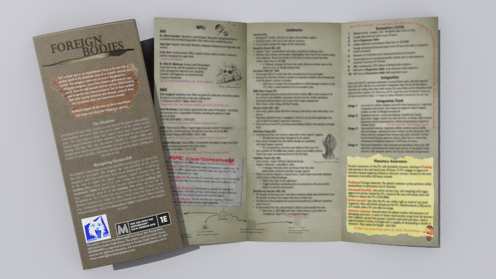
- I really like this submission. The twist on the theme is great. My favorite aspect was probably the organisms table. My primary critique is that the layout/formatting could be improved. Some of the sections such as "Navigation" were a bit tough to read. Some added art in the margins could really make it pop as well. I hope I get a chance to give this one a whirl with my party!
Leave a comment
Log in with itch.io to leave a comment.
Comments
hiya, here are some stray notes i took while reading this one!
love the race setup, and especially love these MMC dirtbags. and some of the more alien aspects of the ASA were unexpected and v cool (walking in only cardinal directions, e.g.)
the random organism table feels great. and MMC countermeasures escalate well.
the contrast of the natural beauty of the planet and the danger hits real well.
i like the integration table, especially stage 2 -- introduces really cool RP opportunities at the table.
great stuff here! i am a big fan of the "pretty/deadly" vibe, and the barely understandable intelligence of the planet. nice work!
Lots of juicy details between the organisms table and the multiple clocks - this feels like it would be a blast to explore as a player. I feel like the landmarks would benefit from a small node map or even an in-world screen or blueprint keyed to show where everything is in relation to each other. I like your layout overall, but I personally found the color combos and the stroke border around header text lead to readability issues. Overall a very interesting scenario that I think would be a blast as a player, but that could be easier to parse as a GM.
Though the 'living planet' trope is tried and true I feel this stands out as special due to the deep really well though out use of real biology. The organisms generator is really really awesome and I *LOVE* the MMC. A handfull of well written rotten bastards to hate is always a plus. All in all this is really great! Less experimental, but what it lacks on that front it MORE than makes up for in the amount of love and care that has gone into the game design, world building and text. Amazing job!
Very solid and content dense scenario, I could see myself improvising and running a session or two based off of this with relative ease. I'm admittedly not the biggest fan of the presentation, but there seems like there was a conscious choice to pack as much info as you could regarding actually running the adventure which I appreciate just as much as a fancy layout.
Polish - 3.5/5
The layout aesthetically is a bit rough but otherwise doesn't get in the way of the content, not a huge fan of the purple/green on black color choice though personally. Writing is good and very descriptive, I really liked the NPC descriptions in particular. Landmarks also have great descriptions, but part of me feels like they could be edited down a bit for better readability at the table. Bullet points could go a long way for some of the info being presented. I'd probably want to reorganize the information present in this for my own notes vs running it straight from the pamphlet with how it's presented right now.
Favorability - 4/5
This has great "gold rush" vibes to it that could easily attract the attention of the player crew, has a natural ticking clock in the form of the surveyors/planets, and there's enough content here to get a game running while being evocative enough with its living planet concept to allow easy improvisation. Docking a point just purely because of table readability being an issue, particularly when I'd be scanning the landmarks for relevant information to convey to the players.
Usability - 4/5
There's a lot here that's usable right off the bat and I feel like I can run this with only a little extra legwork to piece it all together. In particular the planetary awareness/integration mechanics are fantastic and serve as this looming clock ticking in the background that the crew won't even be aware of until they've likely already started integrating. Inclusion of the random "organisms" table was a great way to pack in a lot of enemy variety without having to devote the space to several different unique monster types.
My only big gripe is with the point-crawl aspect of the pamphlet, although this might just be confusion on my part. In the Navigation section it seems to imply that the way you progress through the landmarks is in sequential order: so 1-2-3-4-etcetera. It works, I just think it'd more interesting if there's diverging paths the crew can decide between taking and reasons they might want to take one versus another. This is where I feel like the space for a small map could have helped a lot because my first impulse if I ran this was to spend the time quickly mapping out my own, it's not really something I'd want to come up with on the fly during an impromptu game.
Theming - 4.5/5
Again, love the gold-rush surveyors feel to this. The planet itself being a super-organism as well as the overall threat players face from integration is a clever take on the overall theme.
Really like this one and the multiple ticking time-bombs it presents! Here is my feedback:
+ Concise and thematic descriptions
+ Nice variety in the monsters used!
+ Clear layout and format
+ NPCs/ rival factions are fun and evocative.
- minor typos and spelling mistakes (location 4 title, for example)
- hard to picture the layout of the region, even a node map would help a lot.
- Bolded text and titles are slightly too garish in the colour version.
- The ticking clocks are great, but the rate of progression of each is a bit vague; it is hard to know how much time these things take, and it is easy to overdefine, but I think these are slightly too vague time-wise.
Thanks for this! The feedback on the typos is deeply aggravating - I specifically did a couple passes to resolve those because I instinctually kept typing "MCM" instead of "MMC"...
A contender for Best in Show from the dozen or so I've seen so far. I think you'd want to work with an artist and/or designer to make the presentation a little more professional if you plan for a commercial release, but the content is probably the best I've seen so far and the layout is easy to use, which is the most important thing.
As far as living planet setups go, I absolutely love the damned-if-you-do, damned-if-you-don't approach you went with here, where you're either becoming part of the planet or being attacked as a foreign invader. That, along with the "multiple ticking clocks," as you put it, gives it a really nice sandbox feel. Maybe not the most approachable module for a novice group, but with self-directed players and a veteran Warden, I think this one's going to be a blast, and it's the one I'll be most excited to run with my group maybe once they have a little more experience with the game.
I like the colors and the offset double-outline for the text boxes. I think they need a little more interior margin, especially the one on the cover, where the text is smushed up at the top. It also bothers me that the rounded corners are all a little different in their curvature and the green one on the front cover is particularly "pointy." I'd just make them all perfect quarter-circles. Stuff like that and a logo that looks less like "I typed some words and played with Photoshop layer effects" would be the kind of polish that you'd want to focus on for a commercial product, but it's absolutely not a big problem for a jam entry.
Mechanically, I love the mix-and-match monsters.
The only substantial content complaint I have is that I'd expect a point crawl to have a node-and-connection structure not just a fixed series of encounters. I really don't care for linear scenarios as a player, especially in an otherwise sandboxy world. There's nothing in the story that makes it seem like the players have a powerful reason to pick one direction and head straight away from their base camp for 21 hours without side treks, so I would feel I was being railroaded for no reason as a player if my choices were only ever "forward or back."
There are a number of ways to make sure the players get to the places you want them to get to, while still giving them meaningful choices and a sense of exploring an open world, but I've already written quite a bit here. Let me know if you want more detailed suggestions, but one way or another the main change I'd suggest to the content is to de-linearize the environment.
Thanks so much for the feedback! I would love to hear anything else you have to add. You're welcome to DM me on Discord (@Buzzahfoo).
I'll put my ideas here in case others are interested. At a glance, I see two ways to handle navigation in this module that should be doable in a trifold format but maybe with some design challenges/compromises elsewhere.
1. Normal-ish point crawl with hinting and repeated locations
Just give the Warden a straightforward "numbered circles with lines connecting them" map, but use narrative cues to make sure the players know where the unique locations are, roughly speaking (e.g. the other factions' camps might be sighted from a hilltop, or during the crash landing). It's then up to them if they visit. If some of the planet-based locations are particularly important, they can appear in multiple places. E.g. all the outermost regular nodes could have open branches going outward and the module could say if they venture past that point in any direction they'll encounter a Simulacrum Garden.
If you put the duplicates far apart, it's somewhat unlikely that the players will visit multiples, and the Warden can vary the repeats if they do. E.g. the second occurrence of Cerulean Falls might not have a waterfall, but just a pool with a now-familiar-looking structure at the bottom.
2. Randomized map plus linear "Plot Locations"
Keep your current locations as the "Plot Locations" that will be encountered in fixed order, but don't tell the players that. Direct the Warden to have the players keep a map, or keep one for them. They start at the ship and each time they travel for an hour, you roll on a table. Something like:
1-4 Various single-line prompts that the Warden can just use as scenery they're passing through or possibly short encounters if the players engage.
5-6 Common hazards like bogs or tangled growth that make the node take twice as long to cross.
7-8 The players catch sight of the next Plot Location at an adjacent node (or otherwise receive clues about its existence, like tracks to follow), and can choose whether to head towards it or change direction to avoid it. Place it on the map whether or not they go there.
9-10 The players stumble across the next Plot Location. Place it in their current node and begin the encounter immediately.
The nodes and connections could be placed organically with boxes and lines, or you could be building a square- or hex-grid map as you go. But either way, you still get the players everywhere they need to go, but the relative positioning of all the locations depends on how they go about exploring, and might present shortcuts between the locations at later stages.
Additional rolls of 6-10 once all the Plot Locations are on the map could trigger attacks or advance the clock faster, to hasten the endgame if the players are wasting too much time wandering around.
This module gives me a lot of Annihilation/Scavenger's Reign vibes which is good as hell! It's got an engaging hook and the ongoing "starve or further your assimilation" push/pull is an AWESOME dynamic to get players role-playing and interacting with your NPCs. It's all organized well and it's dense without being difficult to read.
I do feel that the visual treatment, while solid in its own right, doesn't really mesh with the content or themes. Following the "field journal sketch" aesthetic direction alluded to by the illustrations would make a lot of sense and communicate the themes visually as well as textually.
When it comes down it though, the writing is what matters here, and you've got some winning writing. Lots of fun levers to pull and likely multiple sessions of evocative alien wilderness crawling. What's not to love??
I read through you jam entry. Here's my written commentary on your adventure content and layout:
---Cool concept with a self aware planet trying to integrate the players
---Simple generator for making unique organisms
---It was a little unclear the PCs have crash landed. I had to read it twice to make sure.
---I feel like the ASA members are missing stats, or guidance on what stats should be
---I like the integration mechanic but it feels like the adventure would conclude before it gets full use
Thanks for the feedback! I intend to revise the module after the jam, so can tighten up the language around the crash. The lack of ASA stats was intentional as they are intended to be more passive and I didn't want to waste space, but I get the critique!
The organisms give me the creeps : good job
The organism table is really cool for creating unique monsters. The green highlight on some the text might be a bit too faint - I had to strain my eyes a bit to read it. I like that the module has several elements that escalate overtime such as the integration tracker and the awareness table.