
Play Module
<<JAM VERSION>> Calypso - A Pamphlet Adventure for Mothership's itch.io pageResults
| Criteria | Rank | Score* | Raw Score |
| Theme - How well does it match the Jam's Theme? | #15 | 3.881 | 4.000 |
| Usability - How "pick up & play" is this for a Warden? | #29 | 2.910 | 3.000 |
| Overall | #38 | 2.759 | 2.844 |
| Favorability - how much do you personally like the submission? | #39 | 2.365 | 2.438 |
| Polish - How is the overall look/vibes/writing & design? | #39 | 1.880 | 1.938 |
Ranked from 16 ratings. Score is adjusted from raw score by the median number of ratings per game in the jam.
Leave a comment
Log in with itch.io to leave a comment.
Comments
This is a great addition. I think it balances simplicity, mood, and choice very well. There is plenty for the crew to interact with and enough well-crafted, sparse description to fuel the Warden's storytelling.
In terms of Polish, the writing/vibes portion is much stronger than the visual style and I think this could really benefit from another layout pass. A few things that can be improved which I think will take it in a much stronger direction:
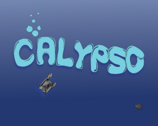
1. Title logo. It's in a bubbly font, which fits with the water theme but comes off as a bit whimsical. It's jarring when paired with the content of undead, vengeance, and imprisonment.
2. Font and spacing pass. The text layout does a fair disservice to the strong writing, making it difficult to parse some of the details and confusing to read. This is most evident in the CONTOL DECK section. Ultimately, giving this a strong layout will provide more space in the doc, either for white space, creepy details, or additional art to support the theme.
3. Background art. There is a real opportunity here to give the backdrop a sickly, polluted feeling. I can practially see the shape of a hulking wreck in murky, disgusting slag water as the backdrop. There's a lot of vibe to work with.
4. Clarity on the Corpse of Calypso. Is this a person named Calypso? Is this simply a random crewmember's body that is inhabited by the NSS Calypso's lonely ghost? A little clarity here will prevent the issue from being distracting. If the intent is to be vague, I think walking the reader through that thought will give them permission to answer the question in a way that supports the story. Right now it raises the question in a way that feels like I'm just missing the answer.
OVERALL: This has some enormous potential. It just needs some additional polish and editing and I think this could be a very popular module.
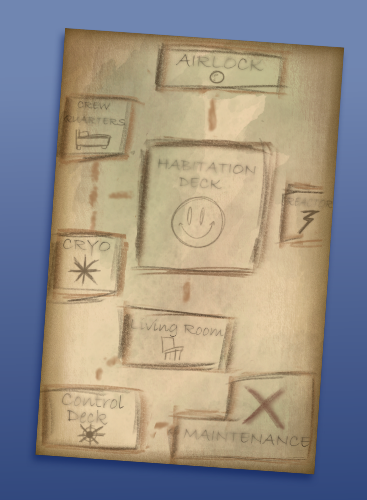
This has a lot of thematic ideas and I especially love your map. The overall layout is simple but makes it easy to read. That said, the text layout with the indentations isn't bad, but there is probably a better way to use the space available while still allowing for visual hierarchy. Try bullet points or callout boxes like you used for the encounter table. I also like the visual design, but it doesn't do much to sell the vibes: it's just "ocean" themed instead of "scary shipwreck in the ocean" themed. I appreciate the page references to the PSG. Overall a fun read and something I could see myself running.
Hello!
Great job on the Pamphlet! I really like how creepy all of the encounters and monsters are, super evocative. I also really like how you tied it all into the theme of the jam. I think the polish could have been better but overall a great concept and good theming. Good job!
You've got a solid pitch that keeps PCs focused on the exploration + drags them deeper into the wreck, a solid horror, and lots of juicy encounters in the D10 table to terrify the table. With a visual overhaul (many folks here have already mentioned some pain points) and some writing tweaks (I'd love to see more expansion of the "it's actually Earth" twist) I feel like this could really pop. Solid foot forward, well done!
Thank you! This is my (and Devins) first module so im still getting my footing, especially when it comes to the graphic design aspects and flow of ideas
You have some really fun and clever encounters as some of them give me a real vivid picture. There’s a lot of really fun ideas here and most of my feedback would be what others have already commented so I’ll spare the repeating. My original idea for this jam was to have a watery ghost figure and lean into the supernatural so I’m happy someone took up that idea as it’s a really fun one. Really I think the trifold just needs to dial into its themes and make everything cohesive. From reading it the two main pillars are the conspiracy about earth and the ghost on the ship. Connecting everything to that and expending on it can really make this adventure pop since you already have all the fun and crazy cool encounter ideas. I hope you keep at it as there’s definitely something really creative here if you keep pushing some of the core ideas.
Another commenter talked about this as well and I agree, I think a few simple changes and additions can really tie everything together with the themes. Thanks!
This one is highly polarized toward "strong concept, weak execution."
I love that there's a ghost, which is I think an underexplored niche in sci-fi horror. People tend to shy away from the supernatural because of the genre expectation that everything's going to have a (pseudo)scientific explanation, but Mothership seems like the perfect place to explore a straight-up haunting in a sci-fi context. Maybe there's a bit too much else going on at the same time in terms of random monsters... might be better to have more encounters that are different manifestations of the same spirit.
I like that the Planet of the Apes-style twist is well-disguised. I could see players getting sufficiently caught up in the other stuff that they're blindsided by the revelation that this is Earth.
Polish is really the issue here because it's not just a matter of aesthetics, it gets in the way of usability. Formatting of the text is particularly an issue, especially in the bullet lists. The size of the indents is way too big for such narrow columns, and then it's not continued onto the next line, so you've got an extremely ragged left edge. It's even worse where you have nested lists.
There's also some lack of attention to mechanical detail. Calypso has five wounds but no hit points, so it takes exactly five hits to destroy (in a single round, or more with regeneration), regardless of whether those hits are punches or grenade explosions. It'd be weird for it to survive a single powerful assault but then die to five players ganging up on it barehanded. The "kraken wearing a submarine" sounds cool but also way too big for the setting. Outside, sure, but I think it'd stretch plausibility to have it randomly turn up in the living room.
If you want to polish it up after the jam, I'd suggest starting by thinking through the encounters a bit more to fit the theme and environment better, and after that, take the time to learn how to use the text-formatting features in whatever software you're using, and either look at some published trifolds or read some articles about pamphlet typesetting to get a sense for how to make things easy on the eyes in a narrow format.
Thank you for the insights! I do plan on cleaning this up, the indents issue was brought to my attention and Ill be fixing that in a later release. The kraken originally had text stating it began assaulting the outside of the ship but it was removed at some point - I see that was an error. I think I will follow on advice and make the encounters more thematic and in line with the ghost. Again, thank you for the review to make this the best it can be!
Hey there, I think you have a fun idea for an adventure on your hands and I would love to give you some thoughts on how I think it could be improved if you are open to that. If yes I’m happy to post them here or we can chat about things in private if you prefer!
Regardless congrats on having some very fun concepts in your adventure!
My apologies if you get like 10 of the same comment from me! Itch did something weird when I was trying to post. I have deleted all that have popped up and they stopped popping up now but if you see duplicates, my bad! haha
All feedback is appreciated! Feel free to post here
Okay so others have pointed out the formatting and execution issues so I won’t harp on that (although as a former graphic designer I’m happy to chat with you in the future as you bring this up to a more readable/pleasant to use level); what I want to focus on is story (which is my day Job) and ultimately I think you have a bunch of good pieces but you have missed a trick or two by the end. The most important of these in my opinion is why the Calypso was shot down in the first place… to keep the truth of the planet hidden… so if thats the case the realization of the secret should bring with it a dread of the players own ship meeting the same fate! This could be as “Epic” as having an ending The PCs are assaulted by a secret Cabal, or as simple as the mere existence of said Cabal creating a ticking clock for them to get out/away in time (and maybe Hunted into future one shots?) there is a lot you can do with this story thread.
Second is the Kraken, as it stands now its interesting flavor but you could easily use this as a mechanism to screw with the ship/flood areas etc. (i know the whole ship is flooded but you could easily have some rooms that flooded while others sealed off… just moving through the ship could create massive water movement etc…). I feel there is a way to tie this in better which i’ll hit on in just a second.
Last is the “Ghost” itself, This is a fun premise as it stands but again I feel like you missed a trick. right now you have the ghost like creature being (if i’m reading it correctly) a link between the ship and a long dead host who has been kept alive somewhat artificially. So to take this aspect (and a few others) up to 11, I think you need to focus on what makes Ghosts Ghosts… it is a resonance of strong emotion that can’t let go. So right now you have the “ghost” and the body it will possess if it needs to.
So my proposal is this: diving into what a Ghost is, It appears that the Ghost is the Ships AI, gone “crazy” being without people for years… Lets use this. (this next part is me spitballing something take or leave it as ya feel!) Before the crash the ship was transporting incredibly important cargo, the incredibly sick daughter of some Hypercorp CEO frozen in a cryopod - being sent for life saving treatment in what was, at the time, a state of the art ship… its AI’s one overriding command was “Protect my daughter at all costs” and even after being shot down that is what it has been doing for hundreds of years. It has kept her pod safe. The others, the crew, have been possessed and sacrificed time and time again in an effort to keep the one important cryopod working. So instead of the ship “…[doing] everything in its power to prevent crew from leaving.” I think its the opposite! I think the Crew arrive and almost immediately the AI “Appears” to them in holograph form, telling them to leave… they don’t they plunge into the depths of the craft to find their treasure, and as such the ghost moves from warning to hostile. it has limited resources, the mutated crew are now more shambling mounds of flesh than anything with thought… so it reaches out with its cyber-pathic link and calls forth the Kraken right as the crew find their prize the Warp Core that has been altered to power the AI and the Girl’s Cryopod for a Millenia or more… now the crew are in a bind. they have a large object they are trying to pull from the ship as the Kraken starts to rip at “non vital” parts of the ship (an escape sequence) and then whats worse? in desperation, the power source being stolen, the AI sends out a signal and has called the Cabal, the PC’s might have the Warp Core but it comes with far more than they bargained for…
Thats my pitch for what to do with the super cool story pieces you already have there, obviously its a lot, but i think its all very doable if it sounds like the direction you want to take things.
Again i think you have great “bones” of the story, really cool ideas here, I just want to help guide them into the coolest story I think possible with what you already have. Hope this helps in some way! and feel free to contact me anytime if you want to chat story ideas here!
Ye, I think youre very right on the cohesion aspect. Given me lots to think about with those suggestions, might steal an aspect or two of those. Thanks!
A fun use of our planet as the residence for an incomprehensible horror.
+ Very unique and thematic encounters to fill the garbage covered sea
+ Interesting NPCs to contrast against oppressive and run down environment
+ Objective is well defined with a clear asset to search for.
If you're looking for feedback, let me know and I can expand further.
All feedback, positive and negative is appreciated!
Certainly. The overall adventure has a solid premise, so I have no main point of feedback to give. However, there are minor points that can elevate the module to be really strong. I will do my best to not repeat anything that has been said by others.
- The history of the Calypso and the ghost residing in it feels too vague to understand its purpose. I would love to see discoverable information pertaining to what the Calypso learned and who this ghost is, which can be a cool reveal that this planet used to be Earth
- Although functional, the map needs more clarity to show its rooms and its connections, as many of the lines are very faded. Just have to cut back from the blending.
- Similarly, the Corpse of Calypso's set up feels confusing. Its statblock makes it seem like there are many of them present on the ship, since it is very weak to damage. Yet, the map states there is only one. It begs questions like why there is only one corpse, where are the rest, etc. I think the Corpse should lean heavily to be one tough and persistent threat, or many fodder-like threat to overwhelm the crew.
Overall, I enjoy the supernatural premise of this adventure and how this spirit has poor intentions for wholesome reasons. However, I would like to see the existence of the location and its denizens be explained so the players too can learn about it and the fate of their origin.
All very good points I hope to address in a future release, map didnt look so faded in Indesign but after printing it out I see that it can be hard to read. The Corpse being so weak is also a mechanical oversight, giving some health instead of just wounds should help alleviate that. Thank you for your feedback man!