Play game
BEETLE RUSH's itch.io pageResults
| Criteria | Rank | Score* | Raw Score |
| Audio | #27 | 3.727 | 3.727 |
| Overall | #36 | 3.841 | 3.841 |
| Gameplay | #48 | 3.545 | 3.545 |
| Authenticity (Use of resolution restriction) | #57 | 4.545 | 4.545 |
| Graphics | #64 | 3.545 | 3.545 |
Ranked from 11 ratings. Score is adjusted from raw score by the median number of ratings per game in the jam.
Leave a comment
Log in with itch.io to leave a comment.


Comments
Fun little game, with lots of little things to learn as you go. Nice graphics and sound. As has been mentioned though, the camera is really weird, very shaky and sensitive (maybe I was using it wrong?), could be better if that was handled by keyboard?
Thank you! Your right, camera is terrible, i will fix that in the future. And i will try navigation with the Keyboard. Thank you for playing and the feedback!
This is a really cool puzzle game. The only thing that is bit offset is the way camera moves, it's too sensitive to the mouse movement, the rest is great! Well Done!
PS: If you have the time, please try out my entry https://itch.io/jam/lowrezjam-2018/rate/293637 (don't forget to rate it : ) )
Cheers
Thank you very much for the feedback. I will work on the camera post jam and add new things :)
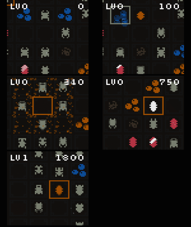
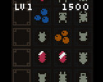
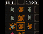
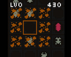
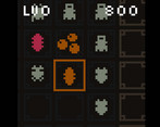
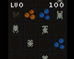
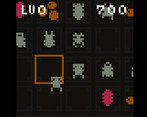
A more complex game than it first looks. The premise is simple; identify identical pairs of beetles in the 4x4 grid and drag them together, which causes them to explode, clearing part of the playing field. But this is quite a lot harder than it looks because all the beetles look roughly the same! You have to watch them move fairly closely to tell which ones are actually pairs… and if you pair up two non-identical beetles, they turn into a sort of pupa which blocks up a square on the board. And then once you get the hang of that, right-click drag moves the playfield and you realise that the 4x4 grid you were seeing is actually just a 4x4 section of a much larger grid, which is completely full of beetles, all madly moving and needing pairing up. This is clever stuff; the realisations of each of these things gave me quite a surprise as to how much bigger the game was than I first anticipated. I do have a few small issues to think about, though. Incorrectly pairing two beetles turns them into a sort of red pupa, which is bad. But it doesn’t look bad; I didn’t realise at first that I was doing the wrong thing! Perhaps that pupa could look a little more… incorrect, somehow? Also there are two issues that others have brought up: moving the camera to show a different part of the playfield is way, way too sensitive, and the score at the top of the UI sits on top of the top row of the grid and makes it hard to see. The developer has already acknowledged these, and I’m sure they’ll get fixed. Even despite these, this is a really interesting puzzle game, and fits really nicely into the 64px pixel restriction. Great work!
oh wow, thank you so much for your constructive and detailed review. Yes i am aware if the problems and will fix them in an updated version. And thank you for mentioning the issue with the "pupa". I will work on that :) Glad you could get some enjoyment out of my game.
Hey nice puzzle game! Takes a while to get used at seeing the similar beetles, but I guess that's part of the challenge. Had a little trouble moving the camera because I was trying to drag it like in a tradiotional RTS but then realized it was about leaving it pressed to accelerate.
Good game :)
Thank you for playing and for the feedback. Yes the camera is an issue. I will fix it somehow. Hope to add more things in general. Thanks. :)
very nice idea. i could see this developed into a multiplayer game (for instance, where different types of bugs had different scores, or you have to eradicate your opponent's bugs).
my biggest issue with this game is the camera/mouse control. it might have been easier if the user could select locations with the arrow keys.
Thank you so much for the feedback. I think I will tacke some time to improve the jam build for something more solid.
Yes your right about the camera, i dont like it eather. Arrow keys is a good idea. Thanks.
Fun idea. Love the retro design. Did you experiment at all with differentiating the bugs by color as well? This may have made it too easy, but just curious. This could have helped with the UI on the top row too. The camera, to me, was a little too sensitive. Nice entry.
Thanks for the feedback. Yes, definetly camera is something to work on. I will try different thing in the future for a proper version with more features and improvements.
Really nice mechanic, it's fun and satisfying. Only significant problem is the score hides the top row of bugs so it's a bit hard to distinguish them on the top row. Nice work!
Thank you so much ! Yes, i agree, there should be a better solution for the UI.