


Play game
MossMuss's itch.io pageResults
| Criteria | Rank | Score* | Raw Score |
| Theme | #16 | 4.056 | 4.056 |
| Sfx / Music | #23 | 3.722 | 3.722 |
| Design | #24 | 3.889 | 3.889 |
| Overall | #27 | 3.578 | 3.578 |
| Innovation | #61 | 3.167 | 3.167 |
| Gameplay | #94 | 3.056 | 3.056 |
Ranked from 18 ratings. Score is adjusted from raw score by the median number of ratings per game in the jam.
Leave a comment
Log in with itch.io to leave a comment.
Comments
Very cool art style! I liked the feel that this games gives! Nice, bro!
We are very happy to see your comments on our game. Because we hope players can relax. Thanks for playing and commenting.
That's a bit relaxing, really cool ^^
We are very pleased to hear that you are relaxed. We made it because we wanted everyone to feel relax. Thank you for playing.
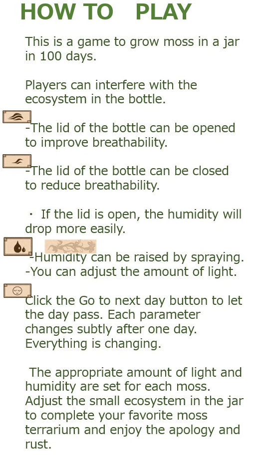
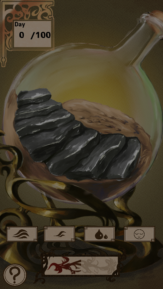
Omg this makes me want to start my own moss terrarium in real life! I found this game to be incredibly charming and relaxing and even helped reduced some of the anxiety I was feeling because of how much I could focus in on very clear game mechanics to watch my moss grow. It was fun being able to play with all of the different parameters and once I got a better grasp on what kind of moss requires what environment I felt like I could really curate my terrarium to how I wanted it to be with it being different each time across multiple plays. Great work! Loved this entry!
Thank you for understanding and enjoying our game so much. We realize that our game has become a little unfamiliar, but we would like to learn easy-to-understand UI and game mechanics in the future. Thank you for enjoyed the moss terrarium. We were happy to comment.
Relaxing, and I like the visuals, although it's hard to tell how 'well' I'm doing. Most days I advance some moss appears, but I don't know if I could be getting more / better moss, etc.
We think we couldn't implement a way to give the player a big picture of the game as we were just before the deadline to prototype. However, thank you for playing our unfamiliar game. I would be very happy if you could relax.
It was not clear at the beginning what to do, but then I understood the logic. Cool game!
Thank you for playing. Indeed, we may not have built in a mechanism to clarify what to do from the beginning. But thank you for understanding how to play. We should have enriched the explanation of how to play the game
Nice and relaxing. Well done.
I wanted you to relax, so I'm glad you played. Thank you.
Very relaxing!
Thank you for growing the moss and relaxing. I'm glad.
Thought this was super chill and enjoyable. I didn't realize the bottom slider was for brightness, I thought the game was just dark at launch, haha. Only criticism would be the styling of the game's title font and submission thumbnail really don't match the in-game aesthetic. But great job on all the other visuals.
It may have been difficult to understand that the slider at the bottom of the screen was for adjusting the amount of light. We feel we didn't have enough time to get the UI optimally designed. Also, we didn't study enough about title fonts. It looks like we've chosen a font that isn't very popular. In the future, we would like to learn fonts that will be enjoyed by English-speaking people. By the way, what kind of font do you like? Thank you so much for playing.
Well it depends, it's not so much a question of what fonts I like, because it's a decision that needs to be made in the context of its overall use, right? Like in the case of your game, the in-game color pallet and design motifs read kinda like a late 1800's - 1910's, old-timey vibe. You used warm colors, golden surfaces, and organic swirling shapes for the structure that hold the glass terrarium and UI elements. It feels like an ornate, or refined script may have been more in line with the game's tone, than the contemporary, casual feeling font you did select in the end. Another thing to note, the color selection for the thumbnail and title treatment is also off because again it's very bold, modern feeling colors: pure white, vivid green, and an orange color; colors that aren't really featured in the game itself. So, making these kind of design decisions is more about putting two things side by side and asking, does this go with that? And in order to bridge the gap between two elements, they need to start to share design qualities, whether is color or line weight or flow and shape. I hope this is helpful.
Thank you for your kind and detailed reply. Indeed, there are many complex and very important factors that determine a font. For our art designers, what you have taught has been a very valuable suggestion. We understand that we must study to create game visuals that are consistent in design and consistent in quality. Thank you for your devoted advice. It will be a great opportunity to learn from now on.
The visuals and audio are very good and satisfying! The gameplay could be improved a bit by importing new variables what alter the gameplay, and maybe some bugs.
We think we are able to maintain a very good visual thanks to the efforts of the excellent designers. we are really happy to have fun. We also think there is room for improvement when it comes to gameplay. Next time we are going to make a more playable and interesting game.
Nice art!
Thank you for enjoying the artwork.