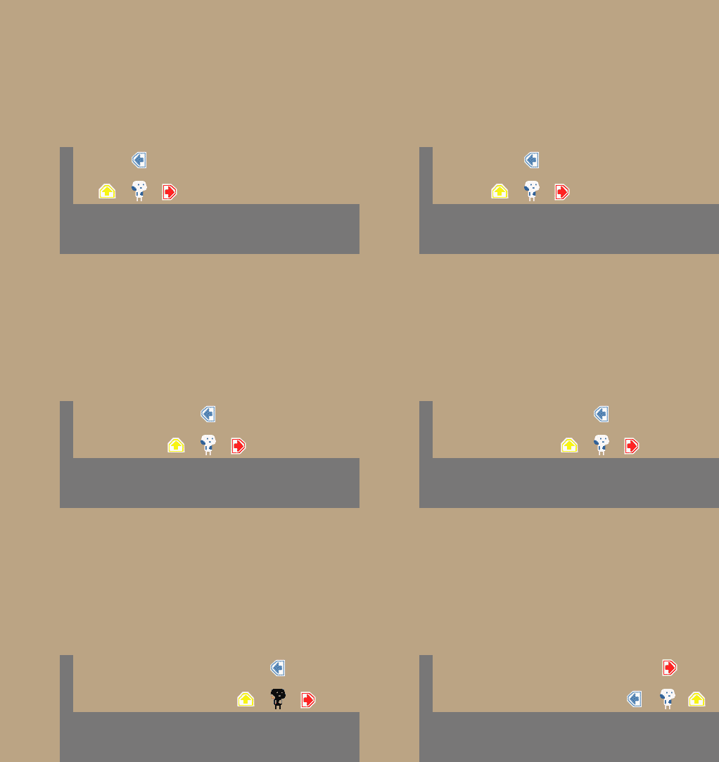
Fun concept but definitely bordered on frustrating.
Play game
The Random Robot's itch.io pageResults
| Criteria | Rank | Score* | Raw Score |
| Design | #415 | 3.026 | 3.026 |
Ranked from 39 ratings. Score is adjusted from raw score by the median number of ratings per game in the jam.
Comments
interesting concept, but way how you indicating what need to be pressed need some changing. First to see controls you need look away from characters whats slows player down. You need remember of peripheral vision, controls is too important and need analyzing (here more about it
its about vr, but still basic knowledge). Add more types of indications, reading is very complex task and in platformer you don't have time for this. Below i put my idea of hud, i left your arrow but i think better will be some more simplistic one or use symbls.
Though game but a welcomed challenge and I love the little warning given as to not make it unfair yet it is still difficult but in a good way. Do agree the hitboxes are a little large and die here and there not really feeling like I was ever touched. ;P
I like the concept, but the actual controls were a little frustrating. I realize you are trying to tell me what to press in the top corner, but something about it was just incredibly difficult to figure out. I had immediately assumed that the button shown on the right would make me go right, the button shown on the top would make me jump, and the button shown on the left would make me go left, but this was clearly not the case. Whenever I thought I had the button associated with the movement down, I found I was mistaken, and it almost felt like sometimes it would lie to me, though I'm sure I must be missing something. Also with it in the top right I felt like I had to constantly focus on that instead of on the game. Maybe consider overlaying the controls on the character so our focus is always there instead.
All in all I would like to see a version of this game that is more fleshed out, as I do like the concept.
I do enjoy the concept. However it gets very frustrating when your controls switch up and you get killed before you can grasp the new controlls
I like the concept and love its music. It is frustrating but funny at the same time (like life). So, I think the idea was to make a platformer where the controls are constantly changing, and because of that, I'm not sure if that fits the theme of the game jam, because controls are a core mechanic of a lot of genres, not for a specific one. But maybe I'm wrong.
_φ( °-°)/ We'll appreciate if you rate or game: Slow Ride.
I fell like this game is fun because it is frustrating however I'm not a fan of the frustration from the misaligned enemy hit boxes. Being unable to tell when it's safe to jump ruined it for me. I love the concept though and would like to play a more focused version.
I've always wanted to play/make a game with randomized controls, I like the premise of it switching every 5 seconds.
However, as everyone else has said, the UI is a bit unintuitive. I would just get rid of the words from the display and use the arrows to represent the keys as opposed to the direction, i.e. If pressing up makes you go right, show the up arrow in the right slot. If pressing left makes you jump, show the left arrow in the upper slot. That way you can always look at the same place every time to see what key will let you, say, move right, as opposed to having to search the three slots to find the one with the right arrow.
This is an extremely unique and fun concept! You should develop this further!


Leave a comment
Log in with itch.io to leave a comment.