Play game
Delver of the Depths's itch.io pageResults
| Criteria | Rank | Score* | Raw Score |
| Originality | #22 | 4.217 | 4.217 |
| Theme | #73 | 3.696 | 3.696 |
| Gameplay | #98 | 3.304 | 3.304 |
| Overall | #136 | 3.391 | 3.391 |
| Music | #169 | 2.739 | 2.739 |
| Art | #186 | 2.957 | 2.957 |
| Black and White | #241 | 3.435 | 3.435 |
Ranked from 23 ratings. Score is adjusted from raw score by the median number of ratings per game in the jam.
Leave a comment
Log in with itch.io to leave a comment.





Comments
THE GOOD PARTS
I liked the general idea of this game. It kinda reminded me of the dungeon generator in The Legend of Zelda: Link’s Awakening, which is kinda nice and solving the puzzles in your head before attempting a run felt sufficiently rewarding to keep me going.
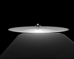
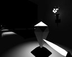
The ambiance is good enough. I felt that the ambiance would have been better with some improvements to the whole “blackness” that generally governs the skies of this dungeon but the setup does the job correctly; I felt immersed and wasn’t really distracted from what the game had to offer.
THE BAD PARTS
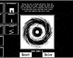
The puzzle generator is not too clear at the beginning. I’m not saying there should have been a tutorial for it but I do think that maybe spending some time in the dungeon generator would have worked wonders regarding what the player can expect when the decide to “delve”. Maybe showing a top-down preview of the generated map would have helped a lot with this, but I understand that it’s a jam game and there’s not too much time to implement everything.
The pacing feels too slow. I know repeating the newly generated level is part of the LOOP interpretation of this game but sometimes I felt like it was a drag; I can’t really put my finger on to what’s exactly causing this friction but I’d say it’s a mix of “secret” areas not being thoroughly communicated and not being able to preview the level [remember that this is a jam an people will spend 5-30 minutes in your game TOPS, unless they become REALLY engaged] so knowing that I was expected to look for those areas with a lamp that barely lights anything was a huge deterrent for me [I know this is highly subjective but I’m aiming to comment on the game feel].
CONCLUSION
This is a fine jam entry with some room for improvement. I really like the idea of having a “dungeon creator” so to speak and it’s something I’ve always wanted to build on my own. This idea resonated with me and I felt the potential that this game has.
Beware of its caveats, though, play this game with patience and you’ll enjoy a great jam entry!
Thank you for your excellent feedback, and I appreciate you taking the time to play as well.
I agree with everything you said, I definitely resonate with the pacing comment. I noticed it in playtesting but didn't have time to redesign the puzzles/rooms.
Appreciate the kind words!
This is fantastic.
thank ya :D
Super lovely game in all categories! If I were to get super duper nitpicky, I'd say maybe an option to turn off the screen warp when you sprint - it gave me some potential motion sickness vibes. Which also makes me think you could make something like this into a really neat VR game? Think about it. I'm rambling.
Thank you for playing!
Turning off the FOV change in a menu is not a bad call at all. Little accessibility type feedback like this is the best, thank you!
Really nice game, congrats!
Thank you for playing :)
I love the concept! I thinks is pretty original!
I'll suggest to make the Effects a little quiet compared to the BG music.
Love the run effect and the fire effect!
Nice done!
The mix always needs some fine tuning :D
Thanks for playing! I'm glad you enjoyed it.
solid 5 star game
Thank you for playing!
It's the first time I've seen a mechanic like that! Pretty neat. Caretaker's path was annoying as hell to go through though xD.
100% agree on the path. I wanted to change it but it's against the spirit of the jam to change something like that before voting is done. In the future I will though.
Thanks for playing!
The main idea is really cool and original! However, I wanted to finish it, but because of the bug where the view tends to move itself on the right, I didn't want to try more in order to finish it (even if I like a lot the game). Apart from that it is a nice game!
Thanks a ton for playing!
hmmm, you're the second person who has mentioned drifting. I have been unable to reproduce the issue. Can you say more about what happens?
I noticed these steps in order to get this bug:
1. In First Person phase, move the mouse slightly
2. Then stop the movement with the mouse
3. Notice that the view moves itself on the right
5/5 on my side
Moreover, I noted that the bug stopped if I moved again the mouse but faster on the left, then stopped the movement -> The bug disappeared.
Thanks for taking the time to walk me through it. I'm unable to get the issue to reproduce on mouse or trackpad, or between the two machines available to me, or between browsers, etc.
I'm not entirely sure what it could be, but I'll be on the lookout.
Thanks again for your help!
No problem! It might be specific to the equipment, which is quite hard to fix properly unfortunately.
However, it reminded me a bug, that I had a long time ago, where the values from camera movement input weren't properly reset after stopping using it. I shared to you this information just in case, it might help you.
Ah, very nice concept. I died several times because it was hard to see.
Maybe give it another try, I've lightened things up a little bit in the spaces that aren't intended to be dark. :)
Thanks for playing!
Alright, thanks
I love your story line and the design of the game that connect each other room together. this is so smooth! but something it's a bit dark to see or memorize the room. Great game!!
Thank you so much for the kind words and thank you for playing!
I've made the default brightness a touch more forgiving, so you may have an easier time now.
I really liked the idea of mixing and matching the rooms!
There was a bug which made the platforming very frustrating - the camera would slowly and constantly turn to the right without any input. I had to keep jerking left to see what I was doing.
The idea of the key and the lantern were great!
Thank you for playing! I tried your game and it is very funny and inventive :)
Unfortunately I was unable to reproduce the drifting issue you're talking about :( If you have any more information about that I'd love to hear it so I can potential fix whatever is wrong.
My gut feeling is that it's because I've got two monitors. Maybe it's not measuring the screen space properly?
Great idea and unique take on the loop theme. I had fun but got stuck and wasn't sure what to do once I unlocked the solarium. Might have to come back to it later.
One point of play testing feedback: scrolling to take out the key is very finicky when using a trackpad with inertial scrolling.
Thank you for playing the game! :)
I didn't even consider laptop users! Your feedback inspired me to add a quick swap feature with Q and E. So hopefully that will help you out a bit.
Also, explore the entryway again with the lantern ;) delve deeper
Very cool concept also you presented it well, you can still work on your player controller probably tweaking some values to make it feel much better but overall great job :D
He is definitely a slippery and floaty boy. Thank you for the kind words!
Very fun. Very comfy game. Nice aesthetic. Designing the level with each run is very fun. One critique is the time to die which you addressed in someone else's comment. It's important in these types of games to get you back in the action without too much time to feel bad. Other than that, I enjoyed it a lot
By popular demand I have lowered the time required to die by falling. It should be much more comfy now. Thanks for playing!
This is a really interesting concept for a puzzle-platformer. Turning the act of "designing" the level into a puzzle was really clever
Thank you for playing :)
The idea, concept, implementation was super good. I loved dragging rooms into the portal and making all different looping combinations. Really neat!!
I just I could die quicker. Having to fall off the map every time I wanted to build a new map was kind of annoying. Maybe making the kill box higher up so when you fall off you restart quicker or a button.
Really good job!
Thank you for all the kind words :)
There is a reset button in the pause menu, I definitely need to make that more obvious as it seems like folks are missing it. Thank you for you feedback!
Love the concept of this game, really creative and original! Amazing work!
Thank you very much! It was a lot of fun to work on. :)
The concept is so creative I have no idea how you came up with it, but it works so well
Thank you! I just like puzzles :D