Play game
Grow BIG (or go home)'s itch.io pageResults
| Criteria | Rank | Score* | Raw Score |
| Originality | #27 | 4.229 | 4.229 |
| Presentation (graphics, audio) | #52 | 4.250 | 4.250 |
| Theme | #88 | 3.813 | 3.813 |
| Fun | #92 | 3.542 | 3.542 |
Ranked from 48 ratings. Score is adjusted from raw score by the median number of ratings per game in the jam.
How does your game represent Mode?
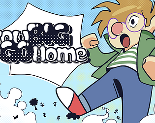
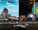
The first thought that came upon seeing the theme was "Bigmode". So we implemented that idea literally, featuring 2 gamemodes: Bigmode and Smallmode.
This game is created around the following mode definitions: "a way or manner in which something occurs or is experienced, expressed, or done." and "a particular form or variety of something".
Leave a comment
Log in with itch.io to leave a comment.


Comments
subscribe for more
crushing people simulator 2024
literally so much fun, I got 5 star wanted level and got a new highscore
Now this game was fun. The art is cute and appealing. Amazing job. It was so creative and I haven't played anything like it.
The presentation is great. I thought the concept for big mode is really creative, it feels very chaotic in a good way. The hitboxes felt a little off fo small mode though, was sure I was out of way of the cat. I also felt the camera made it difficult to keep track of the cat even with the sensitivity adjusted. Still great job overall!
Love the art style and the way you end up with 3 different panels in big mode that you can use to navigate, it felt like playing a comic book. It was also incredibly difficult to avoid stepping on people. I like that smallmode is a second game, not just the reverse of big mode, it's really difficult to get away from that cat!
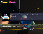
That police department is surprisingly well equipped to deal with a giant wandering through their city streets.
That cat is far more competent than it has any right to be.
I love how big mode ramps up the complexity by giving you multiple views to manage concurrently. Awesome job!
Nice polished entry. Couldn't make BigMode work left-handed but that's fine, I managed to get around in SmallMode alright! And I could definitely enjoy the fun story and great art direction, whether I could do well or not. Great job, team!
Great stylish art and surprisingly a lot of it. I found the cat evasion game mode basically impossible, I could never seem to dodge a third attack in a row and it's killbox collision shape seemed bigger than the red circle indicated.
The godzilla mode was much more fleshed out and more fun with good escalation of scale, the three camera angles were really cool although I honestly would have preferred having one camera angle that I could actually tell where my limbs were going to three that kind of worked. I couldn't seem to avoid squashing countless innocents underfoot (goddamn why aren't these idiots running for cover, where is their sense of self preservation?) any more than I could avoid becoming a cat treat in the other mode. Also the only direction helicopters attacked me from was behind, so neither swinging my arms left nor right seemed to work.
Woah this is an awesome entry, I love the idea of a like reverse, polite Godzilla game. Trying to avoid stepping on people and bumbling your way through a massacre is a very cool idea, though I imagine there will be players who just go out of their way to stomp on every civilian they can so they might experience a bit of a dissonance lol. I think the split screen developing over time is also a really cool idea and is well implemented. Arts cool, ideas cool, execution is cool. I definitely enjoyed bigmode more, but the smallmode feature is a nice addition. Great work!
Awesome game, especially the Bigmode part!
Excellent gameplay, art, audio!
Great job!
Really ambitious idea for a game jam, but very well executed! I was having fun playing this. Your team did great work!
Really enjoyed this one! Especially Bigmode! Artwork is super cute. Great job!
Really impressive how you managed to create two different game modes for the same concept! Especially when they're both visually impressive and have some solid variety!
Admittedly I gave up on not stepping on people pretty quickly in big mode, though in my defense they did keep running under my feet as I was stomping, so that's really on them!
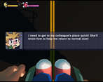
I love how you used the concept of mode! It's very unique. I also liked how you did the cutscenes, I hadn't thought of making cutscenes in that way before!
Big mode was really fun, there's a certain satisfaction of destroying things and swiping at the helicopters. I liked how the mechanics were slowly introduced. Trying to balance not stomping on things, the police cars, and the helicopters was fun but challenging for me. Same with small mode, it was challenging but a fun challenge.
What a cool concept! Super unique game and it is definitely very fun to play. Very good use of cutscenes and camera angles, the presentation in general was very nice!! Thanks for sharing :)))
This is a very cool and unique game! The way that the mechanics get layered on in Bigmode reminded me of my favorite level from What Remains of Edith Finch, and I always wonder why more games don't use that type of multi-tasking gameplay since it's such a special experience and has so much potential, and that potential was used perfectly here, love to see it! The character art and story cards are adorable, the music is a perfect fit, the controls are tight and easy to pick up, and the multi-camera presentation is executed flawlessly.
Very fun! I love the layering of mechanics in big mode, and the extra camera angles give it a (fitting) comic book feel. Sounds like you ran out of time for small mode which is a bummer.
On another note, it looks like you included some “Do Not Ship” folders in your build, one of which is over 600MB in size!
Oh flip, I hadn't noticed that in my haste to submit. Thanks for letting me know!
This was a neat concept, I really liked the intro cutscenes! Big mode definitely felt more developed, it was fun seeing how chaotic things got as more and more layers were added in. Great work!
Amazing game , drawings feels really cool and big mode's gameplay is smooth , when in small mode camera clips to the table but i can be fixed. Great job!
Big mode reminds of those multitasking flash games I used to play, except all prettied up in a great-looking and thematically unified package. But even with that similarity, I don't think I've played anything quite like it. Really great job. Small mode also looked great, but I found it much more frustrating to play. I don't know if I'm just really bad at it lol but it seemed like there were some attacks I just couldn't get away from. Overall though this is a great game, and works with the theme nicely. Hard to imagine a better realization of "Big Mode" :)
P.S. great job with the story illustrations, and even better job bringing the 2D art style to the 3D models
I absolutely loved the big mode! As it kept getting more hectic, I was yelling at my screen. It was so funny. :D