Thanks for playing!
Tower Illusion II
Creator of
Recent community posts
I like the core concept here. Based on the game story, I envision each number next to a character drawing that matches the enemy. As you click the weaker one, they transform into the copy of yourself. That will help unify the zones, too, once they change to your color as you progress. Since this is set up as a sort of puzzle, what could help make this more challenging is making multiple answers a right answer, so the player has to look ahead to plan more. If you didn't want to make it number based, you could come up with a sort of rock-paper-scissor system of winning, but use elements (e.g. fire beats earth and air) or something like that.
There are definitely lots of possibilities depending on the direction you want to go. Then you can add some really nice audio and flesh the rest out. Good luck!
This was a very cohesive game. All the aesthetics and dialogue made sense together and fit well together. I appreciated the how the gameplay was explained both in text and with visual cues.
The only part that wasn't clear was exactly how the sincerity bar worked. I saw the countdown, but I still wasn't clear when I was supposed to speak. When I was reciting the text, sometimes the bar would still bounce back and forth, so I had no indication that it registered that I spoke. I did get the bar to turn red and the character banner would show on the screen, but in both scenarios there was a delay from the time I finished speaking to the time anything happened.
So, it may be that I just wasn't "sincere" enough, but I would have loved to have more of a clearer indication that it could indeed "hear" me. Maybe a meter showing the audio waves would be good? Or even have something flash, maybe the words "good" or "great" or whatever text is appropriate, the way the DDR games used to do to indicate if a step was timed correctly.
Lastly, great job to the character voice. It was a nice way to exemplify what the game was looking for, if anyone didn't know.
I liked the thoughtfulness with the backstory to the puzzle game and why the artwork is what it is. The music was very fitting for the gameplay, too, and very soothing and enjoyable.
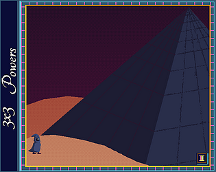
I was unclear what I was supposed to do. Make lines with the same colors? Make larger squares? I was also unclear what the powers were. I learned white destroys, pink and aqua also destroyed when stacked with their own. I also found that I could slide squares into other squares at times, regardless of color. I wasn't sure if that was a bug, or some property of the way I arranged the colors. Some starting gameplay guidelines would be useful. If the player is to learn as they go, maybe having text pop up as they achieve special things would be helpful as well.
It's clear a lot of great work went into this. Nice job!
This was a lot of fun! It looks like I have played your updated version. I found the difficulty to be very forgiving, because I didn't die until I hit the boss, and I lasted a lot longer than I thought I would. That's a plus for me in this style of game. I really enjoyed the power up mechanic and being able to choose which one I got. I also appreciated the visual cue aspect with the enemy coloring to indicate difficulty and that the player is progressing.
I do think the information boxes and text need to be larger. I thought there was no information about the power ups until I realized it had been there, it was just too small. I also think that the menu pop up for the power ups could be optimized further, with larger text, maybe a UI design that gives the information in fewer words, like boxes with images that have a short phrase for each. Maybe even reducing the number of choices to three would help simplify the display of information for those? I would start with making it bigger, though. That might be enough.
Lastly, I would love to hear some music and sounds. Different sounds for the power ups, maybe a sound to signal when new level enemies show up, and especially boss music would all be nice polishing touches for this.
Great work!
This was so hard! But I think that's part of what kept me coming back to try again. This is a well put together game from the art to the mechanics. Those bunnies are very deceptive, too.
I wondered if the character moved too quickly, but maybe it's set that way to give reprieve and outrun the bunnies. I also really wanted a wall hike maneuver. I get the cliff hang is supposed to kind of give that feeling, but this feels perfectly set up to earn that ability, even if for just one use.
Great work!
This was a wonderfully polished work! I really loved the twist of the magical girl element, in that it was a part of the character, but not the main mechanic or point. I know a few of us on our team are fans of point and click puzzle solvers, so that feature was a delight here. We're also fans of moody pieces like this. The world built here is very captivating and immersive, and I was impressed with the amount of backstory and world-building that was put into this chapter. There was clearly a lot of attention to detail here, too, from the different fonts to the ease in which the player is given instructions for how to play and where to go.
My only (small) complaint was that I wish June had a sprint option. June's walking speed is fine in the beginning because the room is small, but once the walking areas grew, her walking speed immediately felt slow. I understand that a sprint feature would go against the point of the nightmare chase scene, but in an instance like that, I could completely accept that feature becoming unavailable for that section, especially since it's clear that the game adjusts the nightmare's speed toward the end to give the player a chance to hit the switch and get to the ladder.
Also, great soundtrack and overall sound design! They were great details to make this whole game a cohesive work.
That's good to know. There's a lot going on in the residential area, computationally, and you have given me some ideas for how to improve. The experience. I may try a shader instead of GPU particles and progressive activation of the enemies rather than per sector.
Smart on being selective about downloaded executables.
Thanks again!
Thank you for the comprehensive and insightful feedback!
We have updates planned - very soon - to give a control option; absolute (the current one) and isometric (basically W+D to move northeast). Any other suggestions are welcome.
The performance thing is interesting. We have been working on optimizations and there are some quirks on different platforms that I haven't been able to solve for. Are you running in the browser or installed?
We are also working on the multiple endings/ environmental story beats to better clarify what is happening and how it is a marriage of magic and sci fi.
Your feedback is super helpful!
Everything here is so solid! The opening story, the graphics, the music and the overall visual and audio experience is very unified. The setup of the keyboard controls are a little different than what I'm used to, so that was an added level of difficulty for me. This is a great retro pixel game vibe. Nice work all around!
I liked this idea! It was fun figuring out the different combination of spells. I enjoyed that the spells worked on the crowd, and I appreciated that the AI left me alone sometimes so I could figure out what to do. I wasn't clear if just the spells caused damage, or if the effects also caused damage. I could envision the drumbeat eventually counting into a fun fastpaced tune. Great work!
This was quite fun. I loved the categories of the compared objects. It would be fun to see more difficulties added the longer you play. For example, maybe the amount of each object in the box increases significantly, or the choices the player has goes up to nine.
Also, I tried it out on an Android device in addition to a desktop. It worked, but I couldn't interact with the box.
Nice work!