On Sale: GamesAssetsToolsTabletopComics
Indie game storeFree gamesFun gamesHorror games
Game developmentAssetsComics
SalesBundles
Jobs
TagsGame Engines

Solo Man Games

58
Posts
17
Followers
33
Following
A member registered Jul 25, 2024 · View creator page →

Creator of

Recent community posts

(1 edit)

My apologies! I uploaded a broken build where only the wind was enabled and the other enemies were disabled. It's been fixed now.

I appreciate your feedback about the difficulty of the wind. It is definitely something I will rework in the next version. Also noted about the blocky shadows. Cheers!

(1 edit)

My apologies! I uploaded a broken build where the other enemies were disabled. Thank you for letting me know about the bug. It has been fixed and re-uploaded.

I'm not using wine. I'm on Windows 11.

Thanks for clarifying the files. Itch allows you to hide files from download so perhaps hiding the Proto files would be less confusing.

I'm not sure what GMTK2025FINAL appears to be skipping the configuration menu and is just stuck on the message about switching libraries.

An extremely well-scoped concept executed flawlessly. The flow of the levels feels very smooth and intuitive. You did a great job introducing the mechanics gradually one at the time so that they are easy to understand. The game is a joy to play! The QoL features  are very much appreciated, especially the reset button/key combo.

The graphics and sound are good examples of being simple, but still fitting the game really well.My only suggestion is that a bit of variety with the color palette from level to level could help make your game look more appealing in screenshots to visually convey the variety your game already has in its gameplay.

This is probably the shortest review I've written and it's because I don't really have anything more constructive to say ;)

I tried to take a video of the "click to unfold" bug, but it didn't show it well because you can't see in the video when I am trying to click.

The bug appears to be erratic: It doesn't happen all the time, it happens about 1/3 times when I try to click a square that is on the non-folded side of the fold line.

Also, one more thought about the demo: If people are saying it's too short, that's potentially a good sign because they're wanting more ;)

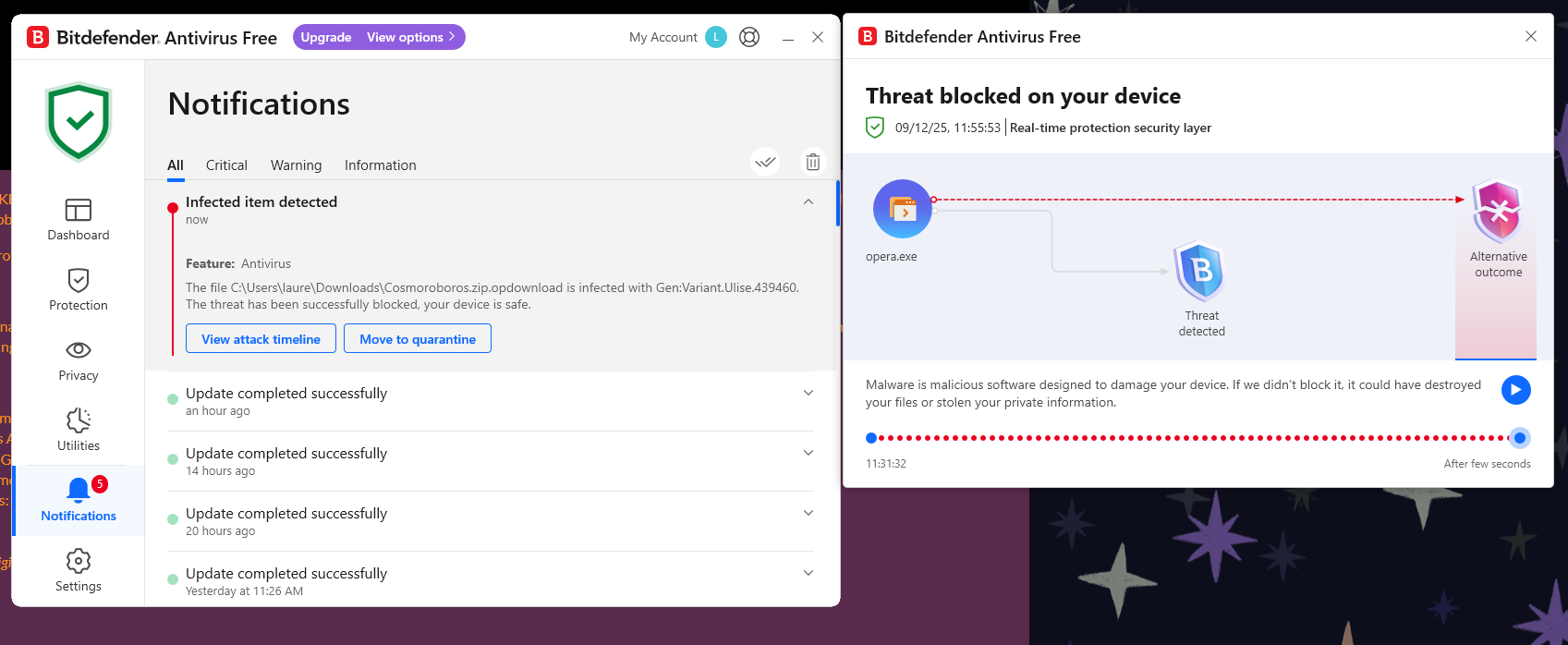
Ah, thanks bene. Sorry for the scare, I don't download many games from Itch, but this was the first time I got a threat warning. I looked up the name of the threat and it does appear to be a false positive:

"Bitdefender's detection of "Gen.Varient.Ulise.439460" is likely a false positive, a common issue with antivirus programs flagging new or unsigned executable files, especially indies or personal projects, as threats. This happens because antivirus software often uses heuristic or generic pattern detection to identify malware, which can mistakenly target legitimate files that do not have an official or paid digital certificate.

Antivirus programs frequently flag Godot executables or embeds (like single EXE with packed .pck files) as suspicious due to their uncommon file structure and behaviors such as manipulating save files, even though the files are clean."

Anyway, glad to see the web build is working now! Looking forward to playing it later :)

That is very helpful, thank you for the feedback!

(1 edit)

I also got the same error running on Windows 11 / Opera browser when I tried the WebGL version:

"Error
The following features required to run Godot projects on the Web are missing:
Cross Origin Isolation - Check web server configuration (send correct headers)
SharedArrayBuffer - Check web server configuration (send correct headers)"

When I tried to download the file, I got an infected malware warning!


I can't tell if the game is working as intended or not, but it appears unplayable in its current state. First I downloaded the "GMTK2025FINAL (X64)" but when I ran it I just got a command prompt message saying that  you switched libraries; there was no way to start the game. Then I downloaded "GMTK2025FINAL (X86)" and the same thing happened. Then I downloaded "GMTK PROTO 1 (X86)" extracted it and copied over the files form "GMTK2025FINAL (X86)" thinking the former was an update to the latter, but I just got the same message. Then I re-extracted "GMTK PROTO 1 (X86)" and finally got a screen asking my desired resolution/window mode and the game launched!

However, the game is currently a green square on a textured yellow background. Clicking on the screen moves the square around. Pressing any key whatsoever exits the game immediately. I tried several times, but couldn't figure out if this was a bug or what you intended.

All in all, there was a lot of user friction and not a lot of game so I don't feel like I could review or rate it fairly.

I'm really impressed by how far this has come along since PJJ10. You should be super proud!

How is the difficulty curve?
he difficulty curve feels much better than PJJ10; much less friction because you've introduced the game mechanics more gradually this time.

On Level 2, where to "Click to Unfold" is a bit unclear. I tried clicking anywhere first, then to the left of the UI hint, then tried clicking and dragging, before finally realizing I had to click on a specific side of the fold line. Perhaps highlighting the valid column of clickable space for the tutorial would be helpful. Or perhaps the star effect could be on the side of the line you can unfold; that would make it universally clear each time where the unfolding can and will occur.

I also got stuck on Level 5 for a while because I didn't realize I had to jump to solve the puzzle. I only figured this out by reading a comment that some puzzles require "coordination". I think hinting at this will prevent player frustration. The difficulty curve after Level 5 was quite smooth, after learning I could compress space while jumping. I didn't get stuck again until Level 16.

Did you have any trouble understanding the folding limitations? 
Honestly, yes. It's still not clear-cut when I click which row of tiles will remain and which row(s) of tiles will disappear. I learned it through trial and error, but it wasn't clear from the UI alone. The arrow when dragging does help though. One idea would be to highlight the two rows that will remain after the fold while you're clicking and dragging.

Is the demo too long/short?
I feel like the demo could be shorter. You want to give players a taste, but leave them wanting more. I feel like Level 16 is a good stopping point for the demo.

How is the performance of WebGL build?
It was great! Hardly any hiccups. A lag spike here and there when folding, but smooth otherwise.

If you had found this demo while browsing would you want to check out the full game after playing?
Yes, definitely!

At wider aspect ratios the game remains the same width, but the height gets cut off. If you're using Unity there is a setting on the Canvas Scale component where you can set it instead to keep the height the same and have the width extended instead. Some games will just do black bars on the sides, other games will expand the canvas so there's more usable screen space.

Thank you for the feedback! I've nerfed the wind now as a stop gap until I can add a fan model and better telegraphing.

There are some really cool bits in here mixed with lots of frustrating bits. 

The Good Stuff: 

I love the idea of picking up friends and having the stylized cars join your train. Also love the music which fits really well into the vibe and theme of the game. The music and characters definitely add to the fun. The rest of the art (color palette, stylized filter) does this too, albeit to a lesser extent.

I also really like that each character has a unique mechanic that you have to figure out how to use to unlock new areas.

The Funky ;) Stuff

I almost wanted to quit because I couldn't figure out what I was supposed to do in the beginning. I played the Puzzle Quest first and kept seeing the Red "X" when trying to pass through the first gate. The gate had no indication of why it was blocked and what I needed to do. 

I was also constantly fighting the camera. Since this is a game where you have to see what's ahead of you, camera control is very important, but I felt like the camera control was wrestled away from me and I had to keep dragging the screen to readjust. The frustration compounded because while the camera turned away, I would miss turns or clues in the distance so then I would have to do a loop multiple unintended times. Additionally, because the levers are controlled by dragging the mouse and the camera is controlled by dragging the mouse, I would often unintentionally do the opposite of what I wanted, again causing me to miss turns or clues and having to repeat tracks multiple unintended times. This is also why I missed the first friend at the train station (also because the friend is a 2D spite so he can't be seen at all angles).

I ended up quitting the browser, downloading the executable and playing the Jam Quest to see if things were clearer. That's when I saw that the gate required a friend to pass! Then I went back to Puzzle Quest and started looking more closely for the friend

Here's a few suggestions:

  • You can use onscreen markers (like a floating arrow) to point down at the friends (or at least the very first friend
  • Make the first gate sprite communicate that you need a friend to pass (the one in Jam Quest worked well enough)
  • You could replace the follow camera with a camera that is always controlled by the mouse (like an FPS, with no dragging needed) and then make the levers controlled with keys like W/S for speed and A/D for track switching. The push/pull levers are cool, but only work well if your camera is very very good so it doesn't need manual adjustment.

 Hope that helps!

I'm really impressed by your games B-Deshi! Nice to see Compress(space) getting more and more polished and now seeing another really cool prototype for Cat Shift Operator. You have a great sense of style even in the early prototype phase. Cat Shift Operator reminds me of if Patrick's Parabox  had a baby with Baba is You.

I love the simple, but effective graphics and the soundtrack fits the game perfectly!

I managed to get up to the level about "baths and reverse psychology" and then got stuck. Granted I am not a real programmer and don't know about bit-shift operations, but the game always felt smarter than me. The game definitely shows how smart *you* are, but I think with these types of puzzle games the holy grail is if you can make the player feel smart(er than they actually are).

I'm embarrassed to say I didn't even understand the 2nd tutorial level and only managed to advance through levels by luck and trail and error. Shifting along "positive axis" and "negative axis" confused me. Is it the positive/negative axis of the screen? relative to the cat? Relative to the UI "A" and "D" arrows? To my smooth brain the shifting controls seemed to act inconsistently; when I thought I understood it, the behavior of shifting changed depending on the platforms in the level. Additionally, shifting is confusing because "A" and "D" are always relative to the cat, but "W" and "S" aren't? Thank you for the undo button, it made the confusion less painful.

Take this with a big grain of salt, but my proposed solution would be to have the controls always relative to the cat and consistent in expectation by making the cat always upright in screen space and rotating/flipping the level  in relation to the cat.

Overall, brilliant game as always, but for me the fun comes with understand the rules/mechanics of a puzzle game and successfully applying them, which I wasn't able to do without trail and error.

Nicely done! Duly noted on the Wind being not fun, thank you for your feedback!

  • The Cutting Board can tilt using WASD/Gamepad Left Stick and can spin using Arrow Keys/Gamepad Right Stick. By "tilt" I mean rotating the board on the X/Z axes. By "spin" I mean rotate the board on the Y axis.
  • In Singleplayer, dodging enemies and collecting stars  is done indirectly by tilting/spinning the Cutting Board. In Co-Op mode, players 2-4 control the food and can dodge/collect directly.
  • Right now sadly there's only one level, I'm still working on the other level in the screenshot. I plan to make 20 levels for the full game.

Thanks again and great idea on the fan mechanic. I like it. I did some of the graphics (facial animations, textures, UI) and character voices, but the 3D models and music are licensed assets.

Congrats on finishing the PJP game jam and continuing to work on it. Your stated concept is intriguing: "seeing through the eyes of a child", but I feel like you haven't yet executed on your promise. 

Perhaps you could expand on what looks or feels different through the eyes of a child. For example, one of your core mechanics appears to be changing the gravity of crates when you switch to a child, but it's a tough sell for me. What if instead, the crates turned into balloons when you switch perspectives? Or another idea would be that everything looks bigger when you're a child so what if the crates were larger crates when you switch to the child? If you're intending for the concept (rather than specific gameplay mechanics) to make your game special, I'd spend time listing out all the different ways kids see things differently from adults then build your mechanics around those ideas.

Player movement feels good. Pushing the crate up slopes doesn't feel great though, there's too much friction up slopes which can make them tedious to move. Also, the physics simulated crates can make it feel unpolished when using the crates on the catapult. Try locking the crate's rotation when on the catapult to make it feel smoother.

Nice work on the tileset. The gopher is cute! I like the bobbing idle animations too.

I don't understand why you need stamina in this game. Perhaps you're planning on using it later, but I feel like implementing limited stamina in a puzzle game can make it feel frustrating. Although, I ran out of stamina as an adult and there were no apparent consequences.

Lastly, regarding the puzzle design. It is fairly good, but the communication of mechanics is sometimes unclear. In particular, why can objects move through certain floor tiles in one direction, but not the other (i.e. the one above the catapult)? The tile should be clearer about which direction objects can flow through it to minimize player frustration. Same goes with the ground tile and lasers next to the gopher; it's unclear what the rules of the game are from the visuals.

Overall, good effort. My advice is to be crystal clear on your concept first and make sure your executive aligns with your concept so that you don't continue working on mechanics that you might have to scrap later.

Thank you for the very insightful feedback! I really appreciated the break down of which enemies you liked/didn't like. 

I agree the wind needs contextualization (i.e. open window or desk fan) and you made a really good point that the wind blowing when the food is near an edge seems unfair. I will modify it or remove it from the level.

P.S. the game works great in 16:9 aspect ration (720p, 1080p), but doesn't scale properly with wider aspect ratios like 21:9. Not a big deal, but just wanted to let you know the UI gets cut off at wider aspect ratios. 

I know you wanted feedback on the new ships, but how do I unlock ships? The game doesn't seem to explain how. Apparently I'm not very good because I couldn't get past the 4th or 5th flux rounds. I played about 10 runs, but didn't unlock any ships. Sorry!

The roguelike gameplay loop is tried and true and works well here. Upgrading the ship is fun and the randomness makes the runs not feel too repetitive.

The art is not bad! I think the easiest ways you can improve the art are:

  1. Implement visual hierarchy in your UI. Limit the number of fonts (try limiting to 2) and font-sizes (try limiting to 3 or 4). Use the largest font for the name of your game or menu titles, the large font for card names and important gameplay UI, the medium font for menu buttons and UI, small font for card text.
  2. Increase contrast. Some gameplay elements like spawn portals and barriers are hard to read. Use darker colors to contrast the background. Add drop shadows to your UI text.
  3. Iterate the visual/particle effects. Try longer engine trails for the ships that trace out the movement. Add subtle screen shake when your ship is hit. Add a screen overlay effect when your ship is hit.
  4. Add an accent color! The blue/purple color scheme works, but add a contrasting color (like yellow or orange) to give the screen more pop. Use the accent color to highlight important gameplay elements (like your health bar or enemy portals)

One gameplay critique: Make enemy ships have different movement patterns and speeds, don't always chase the player because otherwise the gameplay is just kiting enemies (running backwards while shooting) which can get boring quickly.

Overall great job! Keep it up. 

The presentation/visuals are impressive! It looks and feels like an actual Sega game. Nice work!

I was able to play versus mode with two controllers, but unfortunately didn't have anyone to play with so I just played by myself taking turns with each character. Reimu seemed to have a full set of attacks, but for Marisa I could only do one basic attack, throw, and block; the other basic attacks do not seem to work and the LB button seems to do a basic attack instead of a special.

The moves/attacks are nice, for Reimu there was a good variety of moves/attacks and it felt fairly satisfying to play, even alone.

Please take this with a grain of salt since my experience with fighting game is basically Street Fighter 2 and Mortal Kombat 3; it felt like the animations were too prolonged and the fighting was not super responsive. I feel like it could be played at double speed to make the game feel more responsive. My only other criticism is the voiceovers for the different moves/attacks can get repetitive pretty quickly. Maybe not every attack needs a dialog line? Or perhaps there needs to be a variety of lines for each attack.

Other than that, great work! It shows you've put a lot of effort into this passion project. 

Honestly, I felt pretty frustrated playing. Partly because I don't play a lot of platformers, partly because of the control scheme, and party because of the lack of the difficulty of the first level and lack of guidance.

For me jump is always space on the keyboard and shift is dash so I couldn't overcome the muscle memory of dashing  with spacebar when I wanted to jump. There also isn't any guidance on what to expect. Am I supposed to be able to reach the orbs by dashing and jumping? Am I supposed to sequentially wall jump to reach the orbs? Additionally, once I got to the next character the "rules" of the game were still unclear: Does my current character affect the physics of the previous character?

The platforming itself was already difficult, but adding the additional layer of timing with past selves was even more difficult. Trying to time jumps with your past selves was more frustrating than satisfying. I ended up reaching the green orb without the help of the yellow guy and then gave up on the blue orb because I couldn't get the timing right.

My recommendation is to tutorialize the player. Set the rules/expectations of the game world (what can and can't be done so the player isn't guessing if they're doing something wrong or if the game is broken). The speed and slipperiness of the characters also makes coordinating movement with past selves not fun. Perhaps the movements need to be slower and more deliberate. Lastly, I know it's a pain, but setting up different control schemes would be highly appreciated.

I was super excited to play this when I read the description , it instantly reminded me of Rollercoaster Tycoon and Planet Coaster and it's a pretty brilliant idea to hone in on the scope of one ride. Sounds like a solid hook to me.

The audio definitely reminds me of those old games, especially RCT. It's simple, but nostalgic.

I love the art style of the mascot and the UI. The art style kind of reminds me of 90's cartoons, while the UI reminds me of Please, Don’t Touch Anything. The format of looking through a monitor also conjures up feelings of a horror game like Five Nights at Freddy's. I'm not sure if that is what you're going for but the console terminal with the masked mascot makes it feel slightly eerie (that and I keep killing passengers on the ride by accident lol).

I can see potential in the gameplay loop. It feels like the seeds of something that could be hectic and fun where you're keeping spinning plates in the air; it seems chill at first, but becomes more challenging as you progress. It feels like it could be a rollercoaster, Papers Please.

That said, the current state of the gameplay loop is more frustrating than fun. The fundamental problem seems to be that you can only go as fast as the first car. If the first car is a snail, any cars behind it can't go faster unless you wait a significant amount of time. This could be interesting since as you wait, the line gets longer; but I think you'd need to make the rollercoaster shorter so that waiting is a more feasible strategy. 

Perhaps start with a very simple rollercoaster (like a kiddy coaster with that goes in one loop) where you can see at a glance how long it will take for cars to finish, then gradually make the coasters more and more complex with each level passed.

There also need to be some meaningful stakes involved. Right now nothing bad seemingly happens if the line gets too long or if you don't cater to customers needs. I tested it by setting all cars to speed 1 and never letting anyone new get onto the ride, I also intentionally crashed several cars and still ended up with a score of 1400 and "your customers were happy".

First, I acknowledge that unlike some other projects in Post Jam Jam, DuskMiner has not been worked on as long and so it is quite impressive how much you were able to implement in such a short period of time. So good job finishing the jam and good job getting in as many features as you did. That said, in the spirit of giving constructive feedback to help each other improve, I am going to be very honest here.

* How does combat feel?

Combat was more frustrating than fun. Having LMB be both "walk to" and "attack" was frustrating because the game often walked somewhere when I wanted to attack and attack when I wanted to walk to somewhere. It's nice that you implemented ranged, melee, and tech combat, but there wasn't anything particularly interesting about the combat that would make me want to continue engaging in it. Also, I only encountered 2-3 enemies each playthrough so there wasn't much to base my combat impressions on.


* What is your impresson of online play?

I wasn't aware that it is an online game. I just tried it right now by launching the game in 2 separate browsers and it worked.  I can definitely see how online play makes the game more fun and interesting. Combat is more dynamic when you can attack as a team and use different weapons.

* Would the game represent well as mech-based combat?

The game does not currently represent as a mech-based combat game (at least visually). If you're asking if it could be a mech-based combat game I don't see why not.

* What would it take to make it 2v2 or 4v4 or any other small team deathmatch?

I was under the impression this is more of a co-op, PvE action RPG game. If you wanted it to be a team deathmatch game I guess you would need a scoring system, good arena level design, perhaps power-ups?

* Do any of these new features sound interesting?

Heat management and salvaging defeated enemies sounds like it would add depth to the gameplay.

Concluding thoughts: It seems like the game doesn't know what it wants to be and from your questions, it seems like you don't know what you want the game to be either. My advice would be stop development and start designing. Write a Game Design Document, figure out what you want the game to be on paper before you put in countless hours developing it. Right now it seems like you're going about it backwards and trying to design the game as you develop it which is going to lead to a lot of wasted time and the lack of clear direction showing up in the game itself. I hope this feedback helps and good luck to you!

  • Really cool puzzle concept that is well-executed
  • Tutorial does an excellent job teaching the mechanics
  • New mechanics are introduced at a good pace, but I think each newly introduced mechanic needs more time to breathe so the player can better grasp the concepts better. By Level 10 I felt like I was able to pass levels partly through understanding the concepts, but also through luck of just dragging everything until I got close to the solution.
  • It might be nice to add Ctrl+Z to undo last action as a QoL feature
  • The puzzles are fun; good brain teasers, good variety
  • The jump from 2D to 3D puzzles was really cool and trippy; I felt like my brain was going to melt since it was already challenging in 2D
  • Free Look and 3D mode are helpful in understanding the puzzle, but the controls weren't super intuitive. 3D mode was more intuitive than Free Look mode. Honestly, I think it may be better have one or the other since having both makes navigating the puzzles more confusing (remembering three different control sets) and slightly more dius; whereas switching back and forth between 3D and 2D mode seems more seamless. Plus you can't move in Free Look, which makes 3D mode the winner for me.
  • I feel like puzzle 16 should come before puzzle 15 as it is easier to understand
  • The music is generally calming and inoffensive, but I found it to be repetitive after a while

In my humble opinion, puzzle games feel the most fun when they make you feel smart and not so fun when they make you feel dumb. I think if you hand-hold the player a little more and smooth out the difficulty curve the game will become even more fun than it already is :)

(1 edit)

WOW. This game is incredible. I played it for about 40 minutes and got to the second zone.

  • Feels very polished; feels much more like a Steam game than a game jam game :)
    • Beautiful, crisp, graphics with well-thought out color palette
    • Super cute robot, I love him!
    • Ambient sounds are nice
    • Weather effects add lots to the mood
    • I accidentally hit the poor pigeon with my hoe and it went flying LOL! Nice touch.
    • Nice bite-sized tutorials
    • Quest log is very helpful
    • Intriguing premise; I like how the bits of story-telling are paced which allows for me to enjoy playing the game without getting interrupted by walls of text
  • I don't normally enjoy 2D side scrollers or farming games, but Rombo surprisingly held my interest due to the cute art style and bite-sized progression
  • Lots of friction for me in the beginning
    • I was unsure how to clear debris from the field
    • I feel stupid, but it took me a minute to realize I needed to speak with the terminal again after the tutorial in order to get instructions on how to clear debris from the field
    • Control screen doesn't currently show keyboard controls (all keys are *); I was playing the WebGL version
    • Eventually figured out that "HOLD DOWN" meant hold down the mouse button
    • Would be a nice QOL feature for the inventory to have tooltips or labels for each item/slot
    • Some UI broken; too large and cut off or too small

I'm so happy you tried the multiplayer mode, thank you for your comments 😊 I just uploaded a new build fixing the power-ups not working correctly after reset.

Duly noted that the Supermarket is confusing. I'll add a tutorial in the future.

More power-ups will be coming soon!

Positives:

  • Nice sound design; the situational background music and sound effects really added to the mood and feeling on the story
  • Very competent writing. Good motivation for the main character at the start, sufficient backstory, and the story flowed well and didn't overstay its welcome.
  • Hand-drawn pictures also do well in immersing the player in the story

Potential improvements if you choose to continue working on it:

  • Text formatting could lend to polish (i.e. different font sizes for headers, different styles when characters are speaking, perhaps even animating some text effects for emphasis)
  • There were a few places in the text that sounded anachronistic like talking about "dumbass coworkers", "peanut butter jar", "chocolate cake", "friendly neighborhood cowboy", "first-degree homicide" (some of these visuals are hard to imagine in a wild west setting). Although these things are perfectly fine if you're aiming for more tongue-in-cheek humor

This is really helpful feedback Sword Fan, thank you so much for taking the time to play and write back. Agreed on the need for telegraphing and more power-up feedback.

  • May I ask what you think would make the game more skill-based? Is it just about telegraphing attacks like how the knife rotates before chopping?
  • And by "coyote time", do you mean slowing down time at the edges of the board?

This game is Neat ;)

  • It feels very fleshed out with lots of content; your 2 years of work definitely shows in the game
  • Beautiful graphics with soothing color schemes
  • Fun bosses with interesting mechanics
  • Interesting world that makes me want to keep exploring
  • The difficulty feels good (coming from someone who doesn't play metroidvania's mind you)

A couple humble suggestions:

  • Remappable buttons (I used an Xbox controller and it felt unconventional to press Y for interact and B for melee)
  • Ability to re-initiate dialog (in case you forgot what the NPC said)
  • The beetle is a cool enemy; it would add a little interest if it could only be damaged from the rear since its face looks pretty tough and armored
  • The graphics are beautiful; I understand the aesthetic you're going for, but perhaps adding more contrast to a small number of elements may help it pop out in the screenshots (this is assuming you're going for a commercial release)
  • A quality of life feature would be to have the interaction button hints match your current control scheme (when I play with gamepad the hints are for the keyboard keys). I saw a tutorial on this the other day: 

Here's an extreme example of what I meant by the camera rotation: https://imgur.com/a/20s4uNx

I don't know exactly what's causing it, but I can usually reproduce it in the first level by hitting the first guy then aiming at the ceiling.

Really cool game! It's so pretty—the visuals remind me of Tron and the music helps you get into the zone. The roguelike progression system with choice of upgrades is pretty fun too.

Some suggestions if you're open to them: I know the upgrade screen is integral to the gameplay, but it really stops the flow of the game. I feel like your game wants to be a game where you get into the zone and can go for an hour if you get really good at it, but the upgrade screen works against that goal. I'm not sure what the solution would be, perhaps having realtime upgrade screen that doesn't stop the action?

This goes into my second piece of feedback which is that I think the upgrades are perhaps too complicated. There's usually three stats being modified per card. Honestly, I would try cutting this down to one stat per card. Maybe have two rounds of card picks. One for the positive stats and one for the negative stats. That way the player can quickly read the cards, react and choose, without breaking the flow of combat.

Just some humble ideas. Cheers Darko!

Pretty decent game. Nice use of the Synty assets and I was impressed by the systems you incorporated in the short time period. Even though there was no sound, you did a good job telling the story through the dialog!

It looks like you got a lot of work done this month, UI is no joke and designing dynamic UI sounds like a pretty big handful. Congrats on getting this far! 

Lovely art style. Saving this one to play it later tonight.

LOL. I won't write much here, but jus say I was entertained.

One suggestion: For the 2nd round of questions, it would be nice to have better feedback on which questions were answered right or wrong. According to the UI it felt like I answered every question wrong, but Linda told me I got some right. Also, maybe make the left and right buttons positioned on the left and right instead of up and down to avoid confusion. Cheers!

Came back to play again and I gotta say it's quite amusing. Definitely best played with a mouse; playing with keyboard or gamepad is quite frustrating.

Great job making progress on this game, it looks like you managed your time really well and hit all the major things you wanted to accomplish in your GDD.

The ricochet mechanic is pretty interesting. Is it intentional that the camera rotation changes when you ricochet? Also, it feels like there should be a counter-balancing mechanic. Right now the ability to ricochet makes it very hard to lose. Perhaps you get a limited number of ricochets? Lastly, I think its hilarious you can shoot yourself on accident. I thought the guy in the biker helmet was a boss and didn't realize it was me! hahah

Wow, I can't believe you made this in a month. This game is so cool!! I love the cute cardboard aesthetic and the music is very soothing (great for a puzzle game). The game's systems are very intriguing and you do a good job slowly introducing the systems to the player. I can't quite put my finger on it, but it's fun! I think it's because the game is greater than the sum of its parts and it just has a great vibe.

Okay, enough gushing about it. Here's my one suggestion (take it with a grain of salt): The "Action" "Target" card could be a little clearer. For example, with the hourglass and button drawing, does this mean "Wait for the button to be pressed" or "Pressing the button executes a wait"? It took me a little bit of time to figure it out, which could be part of the design, but perhaps it would make for a better user experience if the diagram or instructions were laid out more clearly.