
Hey, Pakkkanen! Thanks for taking a look and providing feedback. Appreciate you!
RuneforgedGaming
22
Posts
12
Followers
7
Following
A member registered Apr 03, 2024 · View creator page →
Creator of
An 8-bit inspired Shadowdark adventure for 8th level characters
Recent community posts
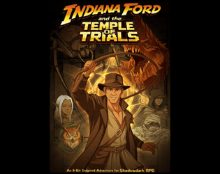
Indiana Ford and the Temple of Trials jam comments · Replied to QuestForQuests in Indiana Ford and the Temple of Trials jam comments
Hey, QuestForQuests! Thank you so much for taking the time to read through my adventure and give feedback. Really glad you enjoyed it!
Yes, you are 100% correct. The Temple Guardians being immune to damage from non-magical sources could be a big problem for a one-shot like this. After the jam is over, I'll go back in and decide how I want to handle that. Thanks for bringing it to my attention!
Heroes' Journey II: The Prism of Courage jam comments · Replied to Connor McCloskey in Heroes' Journey II: The Prism of Courage jam comments
Indiana Ford and the Temple of Trials jam comments · Replied to A Light in the Darkness in Indiana Ford and the Temple of Trials jam comments
Indiana Ford and the Temple of Trials jam comments · Replied to GhostwoodHotel in Indiana Ford and the Temple of Trials jam comments
Heroes' Journey II: The Prism of Courage jam comments · Posted in Heroes' Journey II: The Prism of Courage jam comments
- Vibes: Great!
- Bonus points for NES booklet format AND embedded music.
- Art/maps/general aesthetic very 8-bit.
- Simple, clean layout.
- Staple marks in center of spreads was a nice touch.
- I love the simple, classic premise. Perfect for a game jam entry.
- Inspiration: Clearly shows through and is well/concisely explained.
- I would have preferred if the inspiration was up front, but I understand putting it at the end is probably better for actual use vs. game jam reviews.
- I appreciated the shoutouts to other creators in the inspiration section - classy!
- Usability: Solid, but some quality of life improvements might have helped a bit.
- I like the clear, concise adventure overview right at the beginning.
- Role-Playing tips (e.g., Wise woman, page "1") are a nice touch.
- Hyperlinks to referenced items/creatures/page numbers in same document would be helpful.
- Instead of suggested level, I saw you used "12 HD worth of Shadowdark Characters". I'm not sure how I feel about that (i.e., does it work?), but it's definitely an interesting idea!
- Would prefer if relevant stat blocks were directly on the relevant page or (because I know space was limited, especially in the booklet) hyperlinks to the stats in the back would have worked too.
Final Thoughts: Really solid adventure, great 8 Bit vibes, and inspiration shows through and is explained clearly. Would benefit from a few some quality of life changes, but looks like it would be a blast to run as is. Good job!
Indiana Ford and the Temple of Trials jam comments · Replied to WatcherDM in Indiana Ford and the Temple of Trials jam comments
Mega Mana jam comments · Replied to The Department of Unusual Observations in Mega Mana jam comments
Hey! Glad you found my feedback useful.
To answer your questions, yes I do tend to prefer generic fantasy (though I'd use the word classic), and I think there's a balance to be struck between aesthetics/flavor and mechanics. My preference is slightly more spelled out mechanics than what you see in core Shadowdark, but it's definitely a hard thing to balance, and a lot of it is personal preference.
- Vibes: Immaculate
- Great art & aesthetics. Clear love of 8-Bit vibe. Especially liked the creature art. Simple, but made with care.
- Hex climb is a cool, fun idea. Great premise, especially considering the inspirations.
- Intro text explaining the adventure is well-written and concise.
- Story is simple, but classic, thematic, and right up my alley.
- Feature, Encounter and Hazard tables are cool and thematic.
- Monsters are very on-brand, drawn from inspiration. Mountain King abilities seem really fun.
- Cool, bespoke items, many of which tie directly into the adventure itself. Nice.
- Inspiration: Clearly shows through. Well and concisely explained. Not just window dressing, but built into the core of the adventure itself. Awesome!
- Usability: Very good, but I did find myself wishing there was more meat to the adventure itself.
- Appreciate that the recommended adventure level is called out right away (on the cover).
- Stylish fonts are cool, but hurt readability (only a minor issue), as they're sparingly used.
- Very functional (and aesthetically pleasing) layout. Helps a lot with readability.
- Given that a lot of the "juice" in this adventure is decided by 2d6 random tables, I'd be a little concerned of seeing the same 2-3 features/encounters/hazards showing up multiple times per run.
- I appreciate the creature stats being directly in the adventure AND that there are hyperlinks to the stats (and items) in relevant areas. Nice!
- Good use of back page with Frozen Treasure table. Many treasures have a real use in the adventure (not just fluff).
- I haven't done the math, but it does seem a little unlikely that the PCs will encounter the Mountain King, or might encounter him in an awkward spot (like... right away). I would be tempted to have him start stalking the characters once they reached a certain point in the climb (I recognize this is probably personal preference). He just seems like too cool of a creature to not show up near the climax, especially for a one-shot.
Final Thoughts: While I did find myself wishing there was a bit more to it, this adventure is really great, especially when it comes to vibes and inspiration. Layout and art also really well done. Talk about understanding the assignment - you crushed this!
Indiana Ford and the Temple of Trials jam comments · Replied to Connor McCloskey in Indiana Ford and the Temple of Trials jam comments
- Vibes: We're definitely vibin'.
- Bonus point for NES Booklet Format
- Interesting premise (competing gangster brothers)
- Whole thing feels very thematic. The Glove/Powerball/Zappers are *chef's kiss*.
- Nice, thematic, bespoke art.
- Formatting/layout is pretty basic, and may hurt usability in places, but it's functional.
- Writing is concise and evocative.
- Gangster names table is great.
- Dungeon map is simple but effective. Points for creativity.
- Inspiration: Comes through clearly, and is well and concisely explained.
- Would have preferred to see this at the beginning so I know what to look for, but I understand this probably works better for people interested in running the game vs. evaluating it for the jam!
- Inspiration come through clearly and is explained well (and concisely) in the inspirations section.
- Usability: Okay, but would benefit from some quality of life improvements. Formatting and choice of NES booklet format may have hurt usability slightly.
- Solid, concise adventure introduction up front. Really helpful as GM/rater to orient myself.
- Would have preferred all creature stat blocks be present in the adventure (ideally on the relevant pages) BUT 1) I understand space is a huge issue and 2) props for putting the Shadowdark Rulebook page numbers. For the creature stats blocks that are included in the back, hyperlinks to them from the relevant monsters would have been nice (not a huge deal).
- Solid, escalating (?) encounter table with clearly called out danger level, per Shadowdark norms.
- Minor, but don't love that the rooms header is on page 5, but the rooms don't start until page 6. Hopefully an easy fix, but space may have been an issue.
- Hyperlinks when (same document) page numbers referenced would have been a nice bonus.
- Room descriptions are a little light, but I understand this is preference + space issues.
- I feel like the table of contents should be up front, instead of the back. I do appreciate the hyperlinked page numbers though!
Final Thoughts: Usability may have suffered a bit due to layout and choice to go with NES booklet format, but overall its a cool, thematic adventure. Great vibes, and has clear and well-explained inspiration. Good stuff!
Disclaimer: I consider Gabriel/WatcherDM (one of the creators) to be a friend. Regardless, I've tried to be as objective as possible. Also, if you ever get a chance to play in one of Gabriel's games, DO IT. He's a phenomenal GM. Also, go check out his YouTube channel Watcher DM.
Against the Dark 3: Legend of the Archfiend jam comments · Posted in Against the Dark 3: Legend of the Archfiend jam comments
- Vibes: Great!
- NES Booklet Format.
- Gorgeous, thematic Art/Aesthetic/Hex Map (I LOVE the hex map aesthetic)
- Simple but effective story.
- Cool items (relics).
- I did find the Dark Castle dungeon map to be uninspiring, but it's functional (and I understand time constraints probably played a big part).
- Interesting imposter mechanic.
- Inspiration: Clear and concise (maybe too concise?).
- Love that inspiration clearly called out right away.
- Inspirations clearly shine through, but would like to have seen the inspiration explanations a little more fleshed out (I definitely understand that space was an issue).
- Usability:For my GM style, I’d probably want a little more detail/support in a few areas to run it smoothly.
- Cover fonts tough to read (maybe just bad eyes though lol)
- Thank you for including a very clear adventure introduction/background. This helps me immensely as the reader/rater.
- A recommended level for the final dungeon would have been appreciated (I could have missed it though!)
- Good inclusion of XP rewards (helps the GM).
- Not a ton of meat in the region descriptions (space constraints probably hurt here).
- The tombs are interesting, but a little too light on details I think. Plus, no maps.
- Dark Castle room descriptions are better, but still pretty light (maybe just personal preference).
- I appreciate that creature stat blocks are included, but would be nice if they were on relevant page or linked to in the main text (same for items).
- Monsters seem cool and thematic. I like that they have abilities and aren't just bags of HP.
While I appreciate the ambition, I think the scope of the project may have been too large for a game jam like this, especially when opting to use the NES booklet format.
That said it is a very cool, thematic entry. Great vibes, clear inspiration and a very pleasant read. Thanks for sharing!
- Vibes: Great
- Cool premise (escape the gas). Love a good timer + clear hook/motivation.
- Cool, thematic monsters with some simple but interesting abilities.
- Interesting, thematic rumor/encounter/why are you here tables. Cool special items.
- I didn't see a ton of "8-bit" in here, but I get what you were going for (I took a similar approach). It feels very Shadowdark, which I really appreciate.
- Art was fine. I understand time limitations probably made it difficult.
- Maps look good, especially given AI generated (I assume). Curious how much time that took to get right!
- Inspiration: Clear and concise (too concise?)
- Like the concise callouts right at the beginning.
- Wouldn't have minded seeing these be a bit more fleshed out, but understand space was an issue.
- Usability: Solid, but could use some quality of life improvements.
- Love that recommended PC level and the fact this is a one-shot is clearly called out right away.
- Love the inclusion of an adventure summary at the beginning. This helps me as a reader/rater immensely.
- Good explanation of gas/visibility mechanics. Seems very usable + adds tension.
- Love the telegraphic danger callout on page 2. Great for GM accessibility.
- Very cool escalating Random Encounter table. I may have missed how often to roll on it though (aka danger level).
- Would prefer to have seen creature stat blocks on the relevant pages for usability (or at least links to relevant stat blocks).
- It did feel like you were trying to fit A LOT of stuff into 16 pages. I applaud the ambition, but I wonder if readability suffered slightly (very likely just personal preference). I can't give specific examples (which is why I'm hedging), but I did find myself skipping large sections as I was skimming.
Really solid entry - very thematic. Solid layout - professional looking (especially given time allotted). Looks fun. Great job!
- Vibes: Great!
- NES booklet format.
- Gorgeous art/map/aesthetics.
- Literally added staples in the middle... bro, you're making us all look bad (great job =P)
- Lots of interesting little mechanics (e.g., river rafting, exploration, signs etc.)
- Inspiration:
- Appreciate how directly these were called out right away. Clear, concise. Would have preferred a 'bit' more meat here, but I get space was an issue.
- Usability:
- Appreciate the clear/concise background section. Simple, but effective.
- Good use of hyperlinks (including on the map itself - very nice)!
- Not sure how I feel about using multiple d6's for the navigation checks. I'm sure you had a good reason, but it feels fiddly to me (maybe just a preference thing).
- A lot of this is very short/simple, but it just works (not overcomplicated).
- Creature stat blocks on relevant pages. Great!
Great entry! Could see this winning the whole thing. Good job!
Gristle & Vine: Crypt of the Child jam comments · Posted in Gristle & Vine: Crypt of the Child jam comments
- Inspiration on point. Love how clearly and concisely you called these out. Easy for me as reader/rater to understand.
- Immaculate vibes.
- Very cool premise.
- Gorgeous art/map/aesthetics.
- Consistent tone.
- Great delivery of exposition (to players) through omen tables, rumors etc.
- "Umbrella Lugosi" got a chuckle out of me.
- Usability: Great.
- Great, escalating (?) random encounter table.
- Excellent formatting throughout. Easy to read, love the monster stats in the side margins (?). Great use of space, easy to use for GMs.
- Interesting use of keywords at the beginning of area descriptions!
- It may be embedded throughout, but I think it would have been nice to get an overview of the adventure at the beginning. I don't think we learn who Malory is until a bit later. We get references to her, via other characters, but she's not listed in the factions section (I know space was probably an issue). I think you're trying to give exposition more organically (which I can appreciate), but I personally would prefer a short section on "here is the definitive version of what happened just before this and what's happening in the dungeon now". As the GM, I don't want to have to piece this together as I'm reading through. Maybe just a personal preference thing.
Great job, dude! I could easily see this entry winning the whole thing. Well done!
No problem! No, you don't need to add a new line. Sorry - what I wrote was confusing =P
I was just saying a clear, concise overview of the adventure at the very beginning of the document might help the GM orient. Bonus points if the parts known to players at the beginning are clearly called out as well.
About reprinting stat blocks: Required? Probably not, but really useful for GMs so they don't have to have another book open, keep flipping through to find the right monster etc. There is a trade off in terms of space. A middle ground might be providing the page number for the monster in the SD books.
Regardless, best of luck!
Indiana Ford and the Temple of Trials jam comments · Replied to tabletopconspiracy in Indiana Ford and the Temple of Trials jam comments
- Immaculate vibes! Art, font, maps, all right on theme.
- Megaman inspiration shines through really well. I didn't see any mention of the other two games you were given though.
- Usability: I think I would have a tough time running this as is.
- Wish recommended # of PC's/PC level was prominently included.
- Map and dungeon rooms descriptions should probably be numbered. At first, I didn't even know I was reading room descriptions (Ancient Weapon section, page 6).
- Encounter table is varied and thematic, but how often do I need to roll for an encounter?
- Creatures are cool but are lacking several of the typical Shadowdark stats. Most don't have interesting abilities/traits or aren't well explained (e.g., constrict limb).
- Character sheets are gorgeous (not sure how functional though).
Gorgeous looking entry that would probably benefit from a revision to increase usability. Very cool!
- Interesting premise (rival cults) and maps!
- Vibes on point, especially the NPC/monster art, retro color palette etc.
- Inspiration: I think you got a really tough draw here! I do think you could tighten up the inspirations section at the beginning (for Metal Slader Glory in particular), which starts off with filler/fluff about how the box art wasn't useful (funny, but as a reader/rater I want clear/concise info on how this adventure drew inspiration from the games you were assigned).
- Usability: Not bad!
- I appreciate that the monster stats are in the adventure.
- I appreciate you mirroring the standard Shadowdark formatting for dungeon rooms, random encounters etc. Made it easier for me to parse
- I would have like a more fleshed out GM facing overview of the adventure early on (who kidnapped Phaedra and why). Also the recommended # of PCs and PC level should probably be somewhere prominent.
Overall, a cool little adventure. Thanks for sharing!
Cool adventure + premise! Can clearly see the inspirations coming through. Usability suffers a bit because of formatting (e.g., blocks of text with minimal bolding, highlighting etc, no clear breakdown of player vs. gm facing info via formatting), relevant stat blocks not being reprinted in the adventure, random encounter info not being presented in the typical way (i.e., how often to roll for random encounters. Might have been in there, but if it was, it was buried).
I did like that mini-maps were on each relevant page and, in general, I like the maps! Cover page especially also very 8-bit, nostalgic.
Good job!
Thanks, Xyncht! I'll take a look at this. The intention is definitely that the random encounters chip away at you slowly until you run out of health and ultimately have to exit the dungeon (or lose).
The Goblin Caves are designed to be the first area a player goes into and, thus, is a bit easier, so I'm curious if you had the same experience (felt like you could grind random encounters infinitely) in the Crypts, given that it's designed to be harder.
Thanks again for playing and leaving feedback - I really appreciate it!