Indie game storeFree gamesFun gamesHorror games
Game developmentAssetsComics
SalesBundles
Jobs
TagsGame Engines

MuffintreeGames

94
Posts
8
Topics
4
Followers
A member registered Dec 12, 2022 · View creator page →

Creator of

Recent community posts

I think this was a pretty well done project! The use of telephone boxes as a combination checkpoint/shop was a pretty elegant way to approach the 'checkpoint' theme, and while calling xp 'cross points' just to set up the 'cross path' was a bit of a stretch, it was also too funny to not respect it.

The combat was simple but it got the job done; some more enemy variety early on would've been nice though. Maybe instead of just putting increasingly large numbers of the basic enemies near the end of the first level, there could've been one or two bottle throwers in those fights? The combat definitely got more engaging once they showed up, and same with the 'elite' guys.

Using time as a lives system was clever, and gave a good reason why you could get more of it throughout the game. I did notice that I didn't seem to actually be losing any when I died though? I died about once a level going through the game, but the end of level summary always credited me as losing 0 hours from deaths.

Overall this was a quick but cool game, and definitely see room for it to grow just by building up on what's already there.

The standard of quality in your studio's work is clearly on or nearly (if you would rather be modest :P) the professional level with both Employee Of The Month and your previous game, The Long Jump. I really enjoyed playing both of them and will definitely come back to Employee of the Month again later in the week, as I am a sucker for tile based strategy/tactics games. Kudos to maintaining beautiful and consistent art styles in particular, as well as cultivating memorable experiences with significant polish.

You clearly have the technical ability to make your games available via WebGL and unfortunately The acceptable barrier to entry for the average person is sadly low. Your work deserves more attention, but its a sisyphean task if you don't support playing in browser. I'd also love to see what your studio could do with a longer time frame for developing a game one day, because there is no lack of ability to execute. Thanks for making this!


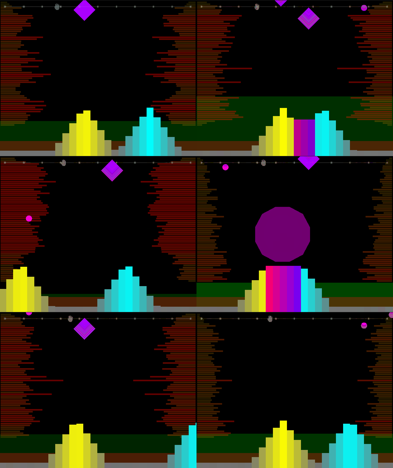
We made a short custom level to show off what kind of things you can expect from our level editor!

MP3 used: Background Loop Melodic Techno #03

Song chart: https://pastebin.com/sbr9SDCT

You can either play this level (Level Select -> Custom Levels), or even open it up in the level editor and edit it yourself!

(1 edit)

Thanks for the detailed criticism! It really helps to get honest feedback like this, and we're definitely aware that our game still needs some polish after our mad scramble to finish it in time.

I think your comment about potentially misunderstanding how the wave crossover mechanic works may be right, as the only purpose of crossing the waves is meant to be the 'clap' mechanic. The small purple notes can be caught by either wave regardless of colour; the waves don't need to be put together to catch them. That being said, it's pretty easy to see why you'd make that mistake, given the way the other small notes are colour-coded. We definitely should have made this more clear to the player by either choosing a different colour for the normal notes, or else having a message in the tutorial clarifying that the small purple notes ignore wave colour.

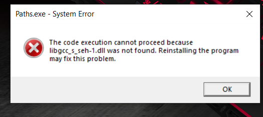
Unfortunately, I think there might be an error with how you uploaded the game files. I got this error when I tried running your exe file.


I think this was a cool idea! I love these kinds of simple, enjoyable logic puzzles. I was a little confused by the implementation of the checkpoint mechanic; I was expecting a system where you had a limited number of "take-backs" before you had to restart from the beginning, but it seemed like you got your checkpoint uses refunded as soon as you used it? It felt like it kinda defeated the purpose of not being able to freely move your pieces that way, so it would've been nice to see a little more done with that mechanic.

(Also the level of volume that you let people reach with your music slider is evil lol, I blew out my eardrums when I first tried setting it.)

This is really cool! I like the moody ambience created by the dreary scenery and especially the sound design. The last leg of the game also got me pretty tense, which I certainly wasn't expecting going in. If I had to pick out one thing I would've liked to see, it would be more sections that did something with the idea that your character stops when they hit a checkpoint; there were only a couple points where this really mattered, with most of the game being more focused around timing your jumps. Other than that though, this was a pretty well put together experience!

(5 edits)

Leave a comment below with a link to your game and we'll take look at it ASAP and leave detailed feedback!


Our submission is Groove Junction, a fast-paced rhythm game which features a level editor to create your own charts to your favorite copyright free  songs! Beyond the normal hunt for ratings/feedback, we're hoping some players will try out the level editor and make custom levels to share with everyone. If you do end up making any custom levels in the game, please post them in our game's comment section so we can give your level a try! Further instructions and details about our game are provided in the description. Stay groovy!

So this is a more weird question. For our rhythm game, we're planning on making a level editor accessible to users, and we'd like to encourage people to make and share their own levels synced up to the music of their choice. Since we don't have access to a server or anything to store the music people are using, our plan was to have players share a link to the mp3 file that matches their level in our comments section. Other players would then go to the link, download the mp3 file, and load it into our game to play the created level.

We're aware that this could result in players sharing copyrighted material, and so wanted to check ahead of time that this would be alright. We plan to include messages discouraging players from sharing copyrighted songs, as well as moderate our comments section + any song sharing threads we make to remove any comments linking to copyrighted mp3s.

(1 edit)

We saw in the jam rules that:

Credits must be accessible from starting the game. Display them on the title or include a button/key/menu item to access a credits screen from the start of the game.

We have a credits screen accessible from the title screen, but we also planned on having a menu before the title screen where the player can pick a name for themselves. Would this be fine, since technically it's not quite accessible from the start of the game? It's probably only an extra 5 seconds of delay, so it still feels fitting with the spirit of the rule, but wanted to make sure that was okay.

We're working on a rhythm-ish game where each level is set to a different song. Would this qualify for the "In a Song" diversifier? We were mostly unsure of if the "single session" mentioned in the description of the diversifier could be a single level, or if the intent was that the game should end/reset in some way when the song does.

I think this is pretty good for a tech demo! The concept is cool, and I can definitely imagine a full game using the snap mechanic well. The monochrome art style fits really well with the idea of only "seeing" things through echolocation, and the minimalistic sound gives a good atmosphere. The main criticism here is just how little there is to the game; in a full game, it would be cool if there were some mechanics which take advantage of the fact that your character is blind, like noise sources which effectively blind you due to an excess of sound. Also, while I appreciated the note that the letters were originally in braille, it was probably unnecessary to put it at the end of all the notes; I assumed as much after the first one. Other than that, looking forward to seeing if this gets a fully realized version down the line!

This game has a really fun concept, and I think the fisheye lens adds a lot to the look of the game. My main criticism is how tight the timing is to hit the light when you catch up to it. It's hard to tell when I should be hitting the attack button, since there's no attack animation or anything, and getting it slightly off means that I completely miss my opportunity to attack, which is frustrating after chasing the light for ~15 seconds. That being said, if it was trivial to hit the light whenever it's coming at you, then the game would probably be way too easy, since it's not too hard to corner the light. Maybe it would need to have more health or go faster as it takes more hits to balance it out? Also on a separate note, there was one time that I was on one side of a wall and the light was on the other side, but I still got hit and stunned by it, so there might be an issue with the size of the light's stun hitbox. If you can come up with a good way to lessen the annoyance factor of the light constantly stunning you without making the game too easy, then I think this will be a really good game!

This game has a pretty interesting idea; I like the sort of "legacy game" approach you took where each round is self-enclosed but has a permanent effect on the game. I felt that the actual battle part of the game could use something else to make it more tactical/interesting though, since as far as I could tell the best strategy was to just grab all your orbs and throw them at the most isolated enemy orb. The building blocks of a solid game are all here though, so I have faith this could improve a lot with some more work!

This is a super cool concept! This is a very powerful mechanic that offers a lot of replayability and interesting scenarios for the player to naturally encounter. My main issue with the game as it is though is the balance. The variance in what enemies you're given and how many of theme there are means you can pretty easily be put into a no-win scenario. One that I ran into quite a lot was getting a large number, like 7-9. Since every letter you type causes enemies to advance one space, and there's only 10 tiles on the board, typing a 9-letter word without clearing the entire board guarantees you're taking damage. Then even if you've gotten the 9-letter word done safely, you've now given the enemies 9 chances to spawn, which can easily leave you with at least 10 more. It feels nearly impossible to keep up with the enemies given how quickly they spawn and how random the letters they give you are (vowels don't feel like they show up especially often even though every word needs at least one). This was probably the intention, to avoid the game going on forever, but it felt especially punishing. Maybe enemies could advance once per word, plus one for every 2 letters to make long words less punishing and give more of a chance to clear the field? As long as 1 letter = 1 enemy move, I don't know how you could realistically prevent enemies from overwhelming you without killing at least 1 enemy with every letter. That being said, I think your issues are very fixable, and if/when they do get fixed, I think this game will be amazing!

I think this game is pretty well done! There were a few interesting puzzles in there, and I liked the approach of using optional items to provide challenge; this gives an inherent 'out' if people get stuck, which is always important when making a puzzle game. The gimmick of controlling the aliens with your own movement was interesting. I didn't really like the way the aliens behaved when they weren't directly following my moves, however. The way their movements mapped to mine was very unintuitive, and I found myself fumbling with the controls a lot on the last level trying to get the aliens out of the way. I probably would've preferred the controls to be reversed in that circumstance rather than the weird control scheme that was used. I also noticed the alien movements seemed pretty glitchy in those cases; it looked like they were trying to match my moves, but then jerked in a different direction, which also seemed to sometimes cancel out their moves if I moved too quickly. Those complaints aside, this is a pretty respectable base for a solid puzzle game.

I think this is a pretty cool and unique idea for a core gameplay mechanic! The sprites also look amazing, and I really like the music you used in the game.

Gameplay-wise though, I had a pretty game-breaking bug that I kept running into (at least I assume it's a bug). After attacking for a little while, I would abruptly become unable to attack at all by left or right-clicking. This lasted between rooms, and the only way I found to fix it was resetting the game from the start. This happened consistently; I saw it 4 times in as many attempts just by attacking enough. It didn't seem to have anything to do with the light/dark gauge, since it was always roughly balanced when I froze up.

Apart from that bug, I wish there was a little more done with the light vs dark mechanic. As far as I can tell, there was no real reason to use one over the other besides managing the gauge, so the mechanic boiled down to "use left click to attack until the gauge is too far one way, then use right click until it's balanced again".  It would've been nice to see a more dramatic difference between the two, like if the dark magic was a melee-type attack to force you to get up close or something.

This is definitely an idea worth working on more; I look forward to seeing how it looks if you do!

The jam rules specifically mention adding new methods for playing your game as a valid reason to update it, so you should be safe.

The game feels dramatically better now, nice job! I did notice though that on level 6, touching spikes seems to cause me to lose a lot of hearts? I got there with 3 hearts, touched a spike once, and got a game over.

This game's really cool; definitely has the feel of something that could be professionally released with some more content! It looks good, sounds good, and plays good for the most part. I've seen the "stay out of the light" gimmick in a few other games this jam, but I think the alien twist you introduce in the final level is a really interesting idea that proves this game is more original than the pack. The only real critique I have of the game is that I found myself wishing there were some mid-level checkpoints. I died a couple times late into a level and it was a little draining having to spend a few minutes getting back to where I died. Apart from that though, everything else about this game really shines! (pun intended)

I think this is a simple, but pretty well done game. It's an interesting twist on a runner game, as I don't think I've seen one where the goal is to keep something other than yourself alive. The art is also basic but looks good in its simplicity. I did notice that there's a somewhat unfair aspect to how you spawn obstacles though. Since the slime jumps so slowly and the ground moves so fast after even 20 seconds or so, it's pretty easy for you to jump over a bullet when there's no danger on screen, and then have a pit spawn underneath you and kill you while there's nothing you can do about it. If you were to keep working on this game, maybe you could try increasing the speed of the slime's jumps as well as the bullets to match the speed increase for the ground? That would help keep the game feeling skill-focused and higher speeds rather than being pure luck. Other than that, nice job!

The jam rules mention "After the jam is over, you can fix bugs and add new ways to play (web build or any other), but not radically change the game". So I think you're safe as long as you're making pretty minor changes.

Thanks everyone for putting your games here! I think we've reviewed all of them; let us know if we accidentally missed you! And any newcomers to the thread, feel free to add yours to the pile!

This might be my pick for best game in the jam, and that's after seeing quite a few games. This game feels exactly how a speed-based platformer should; simple controls and mechanics with a high ceiling of mastery. As I played more of the game and got more familiar with how to use the bouncing and how to maintain momentum, it got more and more addicting to try and spin my way through the whole level. The level design was also on point, with each level introducing new gimmicks, and changing the color palette and music with each level was a great touch as well (clown music is impeccable). The only real criticisms I can come up with is that the difficulty spike in Hell is pretty noticeable (with all the hazards near pits, it's pretty easy to get hit once and die for a minor mistake), and that the light/dark theme isn't super ingrained into the gameplay, mostly just serving as a difficulty toggle. I had to stretch a little bit to come up with these critiques though; if it wasn't for the relatively short playtime, this could be on Steam tomorrow and I wouldn't bat an eye. Amazing work!

This is a really cool and unique concept for an fps; I like it! Although I might've preferred if enemies had fewer numbers in their sequence in exchange for you having to do the numbers in order; I did notice that I was mostly just spraying with one number until the last instance of that number was finished, then spraying the other number until they died. It was still pretty fun as is though!

As for critiques, I got stuck on the "virus speaks the truth" puzzle my first time through because the password I got was "0000". This was the default state of the switches, but the door wasn't immediately open; as a result, I thought that 0000 wasn't actually the password and was searching everywhere for something else. It only worked after I changed the switches to a different combination and then re-entered 0000. It worked fine on a second playthrough when I got a different password, so I assume this was just an unexpected case. The time I spent on this puzzle also led me to run into the lag issue another person mentioned, since so many robots were spawning in the area I couldn't reach.

All the same, I think this is a concept that could expand into a full game really well; nice job!

I think what you have here is a respectable start for a game! The visuals look pretty good, and the day/night cycle provides a potentially interesting core mechanic. As is though, there isn't a whole lot to the game; it's pretty much just a couple minutes of walking between crystals and the ship, and the battery mechanic barely matters as a result. If you were to keep developing this game and add in some extra elements like hazards, other missions, and what have you, this could grow into something solid!

I think this game has a lot of promise. I'm a fan of roguelikes and puzzle games, so anything that tries to combine those two genres already gets points in my book. The main gameplay mechanic is interesting, and the way it's used to create mazes is fun! The cost of ability upgrades feels pretty restrictive though, especially on the health side. Dying in one hit is very punishing, especially given how persistent the basic bat enemies are, so I would've expected to be able to upgrade past that point quickly. Instead, it takes 500 coins to get that, when it tended to take around 5 minutes of gameplay to get 100 coins. I couldn't get very far without a second heart, so my gameplay consisted of grinding coins through the first 2-3 floors, dying, and then repeating without being able to improve my character at all. This got repetitive pretty fast as there's not much to do other than the mazes, and I ended up quitting before I could get that upgrade. This always makes me sad, since I can tell there was a lot of effort put into this game and there may have been cool new experiences past this point. If the upgrades were cheaper or the player started with more than 1 heart, I think I would've been much more willing to continue onwards. Most of the rest of the game felt good other than the need to grind for coins, so I'm hopeful for the future of this project!

This is a pretty simple, but clean game. The graphics are effective, the music choice is good, and the *clonk* and animation whenever I step into one of the spinning traps shouldn't be as funny as it is. I do wish there was a little more to the actual gameplay than there currently is though. There's no real unique gameplay mechanic other than the flashlight, which is basically just a glorified time limit. This, on top of the fact that the house layout and key locations aren't randomized or even changed between the difficulty settings, means that the gameplay mostly boils down to memorizing the key locations and beelining for them. It's fun for what it is, and there's no real issues or bugs that I could critique from an implementation level, but I think you could have benefited from a more ambitious design choice like randomizing the key locations or adding another gameplay mechanic. Really well done for your second game though; I hope you'll keep doing well in future jams!

This is a pretty simple, but clean game. The graphics are effective, the music choice is good, and the *clonk* and animation whenever I step into one of the spinning traps shouldn't be as funny as it is. I do wish there was a little more to the actual gameplay than there currently is though. There's no real unique gameplay mechanic other than the flashlight, which is basically just a glorified time limit. This, on top of the fact that the house layout and key locations aren't randomized or even changed between the difficulty settings, means that the gameplay mostly boils down to memorizing the key locations and beelining for them. It's fun for what it is, and there's no real issues or bugs that I could critique from an implementation level, but I think you could have benefited from a more ambitious design choice like randomizing the key locations or adding another gameplay mechanic. Really well done for your second game though; I hope you'll keep doing well in future jams!

I think this is a game that, with a little more polish, could be really solid. Like many others said, the complete silence is pretty jarring, and some music and sfx would add a lot. Other than that, the core mechanic of using your light source as an attack is pretty neat. I do wish that it wasn't quite so costly to fight the dragons though; it takes pretty much the entire un-upgraded light bar to stun a single dragon. Since the whole game is about looking for keys and that's impossible without light, it feels a little frustrating to lose all my light because I wanted to fight one enemy. It would also be nice to have some checkpoints; getting most of the way through the game only to die in a single hit from a dragon is pretty disappointing. This is a very workable game concept though, and I think if you could resolve these issues then this would be a very enjoyable!

This game has a really cool concept with the "get extra challenges for power-ups" angle, and I don't think it's physically possible for a game to have connected to the theme harder than yours. As some other people said though, I think there's some issues with the control and feel of the platforming at the moment. In a platformer, especially one where you can only get hit 3 times before having to restart the whole game, control and precision is pretty important, so it feels painful to die because I jumped high enough that the ground was off-screen. I also noticed that on the brave version of level 4 (the first double-jump level), I seem to die randomly when jumping near the end of the level. I can't see anything I'm hitting, so either there's something outside of the light range which I can't possibly see, or there's something invisible killing me there. If the controls and camera were tweaked and this issue was fixed though, this game seems very promising!

This is really well done for a game jam game. The execution of the 1-bit design was done in style, and I think the puzzles were just complex enough to still be pretty easily solvable. I think the ring one was my favourite; the way you gave the hint to the solution was really clever in my opinion. My only complaints are relatively petty things; I wish there was a little more to the alien fighting rather than just being a minor chore on my way over to the next puzzle destination, and I also noticed the melee attack hitbox was pretty finicky (sometimes I had to move pretty far away from an alien to get the attack to land). Other than that though, this is a really cool experience which I'd be interested to see more of!

From an artistic standpoint, I really like this concept. It's a very unique take on the theme, and I can pretty honestly say I've never seen anything quite like it. The use of minimal music and sounds is also extremely effective; the gentle yet intimidating music when the ink monster showed up unsettled me pretty well. From a gameplay perspective though, I found the lack of visibility pretty bothersome. I know it's kind of a silly thing to complain about when it's the whole point of the game, but the fact that I couldn't see much of the game world made it hard to understand exactly what was happening when I was interacting with objects. For example, it took me a while longer than it probably should have for me to understand that the ringing bell was closing a gate because I couldn't see the gate shutting when the bell rang. I ended up getting stuck in the area with the ink monster and the waterwheels since I couldn't tell exactly what the waterwheels were doing; it seemed like they were draining water, so I assumed the goal was to activate all of them and drain the river, but then it looked like some of them were resetting after a while? Ultimately, I couldn't get enough of an understanding of the area to really know what to do.

I'm not really sure what could be done to fix my problem with the game, since it's so closely related to the core mechanic of the game. Maybe if the ink trails lasted longer/indefinitely until removed so that
I could see more of the screen at the time? This might also just be a "me" issue though, and like I said I really like the gimmick from an aesthetic view, so don't take this to heart if nobody else complains about it. This is incredible for a first published game, keep up the good work!

This game's art style is wildly cool; when I saw your pictures, I was thinking "No way is this a 1-bit game", but I was proven wrong when I got in game and saw how you did it. The environment is also really atmospheric and creepy. The gameplay itself is also pretty entertaining. The limited ammo really pushes a "fight vs flight" angle, and I had a constant unease about running into enemies, especially looking out for the big blind guy. The first time the blind guy caught me, I nearly jumped; he's pretty effectively intimidating... until he started chasing me and I realized that his attacks were slower than my ability to move away from him. That kinda killed most of his intimidation factor, since I knew from that point onward that I could just walk away from him and be completely safe. If you were going to keep developing this game, (and I think it'd be worth doing! This game is sick!) I'd recommend making him more dangerous and then compensate by making him easier to notice (he's nearly silent and his hearing range seems about the same as your flashlight range, so it's hard to know that he's nearby before he hears you). That aside, this game is really great, and one of the highlights of the jam so far.

This is a cute little pseudo-horror game; wouldn't have thought that cockroaches could be so unsettling. The basic gameplay is simple but fun, and the different roach varieties keep things engaging enough to not grow old too quickly. I don't have any major criticisms, but a few minor ones: I wish the score tracker was always visible rather than needing to deliberately shine the light on it (maybe similar to the roaches where it's white normally, then black when lit up); there's no real feedback to moving around, making it feel like I'm standing still (maybe a simple ground texture would help); and while I like the ambience of the roach scuttling, I think it started to sound glitchy at points, possibly due to the sheer number of roaches. Overall though, I thought this was a strong effort, and with a few tweaks could be really solid.

(2 edits)

Since we've had a fair amount of players mention getting stuck on level 28 (the level with 3 stars at the top of the screen, with the black hole in the top left and the white hole in the top right), we wanted to provide a basic guide for how to finish the level. If you'd rather solve it on your own, DON'T LOOK FURTHER!


1. Go towards the larger platform on the left side near the black hole. Use the black hole to tip the star onto the platform and collect it.

2. Lower the black hole out of the top left corner (there is a gap), and make a hole in the wall blocking you from the middle of the screen. Jump into the middle area, then repeat to get to the right side of the screen.

3. Use the black hole to create a hole for the star in the top right to drop through, with you in position to catch it.

4. With the black and white hole now both available, you should be able to collect the final star by covering the center hole with the white hole and using the black hole to drop the star.

This game honestly looks and plays great; the procedural animation really paid off here. The difficulty curve is also really satisfying. I started off the game thinking "no way am I ever getting hit", but by level 12 there were so many enemies incoming that I was dashing from crate to crate desperately trying to finish each level before I was overwhelmed. I think the only real critique I can give is how the default game window isn't big enough to show the whole play area; I spent a while stuck on an early level because the crate spawned off-screen and I couldn't see it. This is fixed by playing in fullscreen, so I'd recommend either adding a comment to the game page telling people to play in full screen, or else editing the default game window size to be bigger. Other than that though, this is really solid!

This was a really cool experience! As someone who hadn't read the original story, the ending hit me like a truck lol. I think the least enjoyable aspect was probably some of the interactions at the beginning/middle in the room; there were a few different prompts where it wasn't clear what furniture to interact with based on the previous line. For example, it doesn't really make sense that "He wanted to go everywhere and show everyone his suit" is followed by going to bed. That being said, when it was clear what to do next, the interactive elements of the game added a lot to my enjoyment of the story.

Wow, this blew up! We just woke up, so we'll get started heading down the list now.

This is a pretty unique game; I wouldn't have thought to mix typing with platforming! It's an interesting mechanic that the keys you have to type disappear partway through, makes it somewhat of a memorization challenge as well. One issue I did notice is how the music resets every time you win or lose a level; considering how short a level attempt is, I felt like I only ever heard the first 10 seconds of your song, which got kind of repetitive. Apart from that though, fun game!