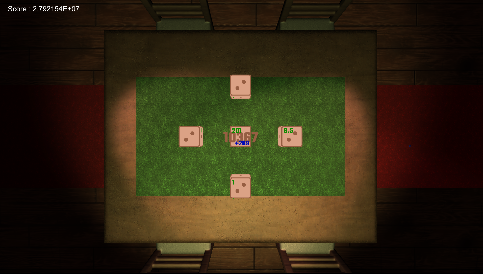
Well hello, Geometry Dash.
The good:
- You made a game that works! Congratulations!
- I like that you made a menu including sound options.
- The visuals are ok, I like that there's some movement going on in the background.
- You've got a backing track/sound! Nice.
The bad:
- Said backing track is a bit repetitive.
- What's up with the amongus cube / police officer as a design choice? Bit weird.
- There are spikes falling from the ceiling that you cannot dodge and that don't really add much.
- You could have leaned further into the theme. Have chess pieces instead of spikes, have stacks of poker chips instead of nondescript white cubes etc. Currently, we have white with pink, an amongus cube and a police officer. The design is a bit bland and chaotic.
- I'm virtually certain that there are instances where I cannot make the series of jumps necessary to continue the game, because the end of one obstacle overlaps unhappily with the beginning of the next.
Ideas for improvement:
- Add my current high score in a corner somewhere so I know how well I'm doing.
- Don't move the camera up and down, keep the floor at the same level. You could move the camera vertically if you actually have obstacles that require me to climb/jump out of the current view, but since everything is close to the floor, a fixed camera would make things calmer.
- You could add "zones" so that the entire world design or the background colour changes after a certain score. So 0-500 would be black or "poker themed", 500-1000 would be green or "chess themed" etc. These are obviously just example numbers and themes, you get the idea. The point is that that would strengthen the sense of progress made by the player, far more so than a number counting up.
All in all, it's a solid game, and a tighter grasp on graphics/design decisions in the future would bring great dividends to the technical expertise you already possess.
Thanks so much for participating. I hope we'll see you again next year!