

Wish I could go back to the alpha version that had the ball roll over, the aim recommendation, and the 36 levels :/ any chance we could get the older version while we wait for the full release?
MasterMilkX
111
Posts
37
Followers
80
Following
A member registered Mar 29, 2015 · View creator page →
Creator of
A roguelike made at Dagstuhl in a day with generative art and procedural enemy AI
Adventure
Play in browser

Do what you want 'cuz a pirate is free!
Action
Play in browser
Visit your friendly neighborhood cryptids on this fine evening!
Adventure
Play in browser
HELP WANTED: Rogue with a passion for breaking into NPC houses
Adventure
Play in browser

Recent community posts
What did this game do well?
****************************
I love the aesthetics and the feels added to the game. They have an eerie feeling which are complemented by the various effects.
Love the various effects on the background image, especially the grain one! This game has interesting effects.
I really enjoyed the aesthetic, it gave of the feel of a horror game with the sounds and visuals and it was interesting to see how the balls react when large amount are spawned in.
So much, the feel was amazing when everything was turned on. spooky, haunting, heavy.
This game idea is very novel. The background and the setting is very detailed, and I see many unique game feel component that is integral in this game.
I find the ground crack effect especially interesting and unique. This really give me a feeling that this ball is very heavy.
This game is ball simulator. I really like the film grain effect and the ambient noise that make it more like looking from a monitor. The particle system, ground cracking and Camera Shake effect all make the impact from the balls vivid.
The effects of the game really emphasize the heaviness of the balls, which feels really good. The visuals also make the game feel much more immersive and interesting.
========================================
What could this game have done better?
****************************
Maybe instead of having all of the feels to be on the aesthetic side, some effects could have been added that change the way the balls spawn or something that affects the physics of the ball. It would have been nice to convert this into something that is playable (like pinball)
I definitely want to see how this will be implemented into a game! Probably more interactions with the ball by player are need.
Sound effects are a bit too loud and only tied to the ball touching the ground so some background music would be nice. Also I don't really see the effect of toggling ambient noise on and off.
not sure it was very good
This game is using the physics engine Unity provided there. However, the physics it shows there doesn't give me a feeling of that ball is that heavy, but the game feel is creating a heavy feeling for me. I think maybe modifying the physics a little bit will resolve this problem.
The sound effect is not good. And currently, I can only spawn a ball with no angle or position to adjust. This can be extended later.
The sounds are a bit jarring when there are multiple balls in play. Maybe lowering the volume of each ball as the number of balls increase could add to the game feel instead hearing constant thuds.
What did this game do well?
****************************
The game has an interesting premise. The visuals of the game is very pleasing. The camera shake effect works very well. The sound effects are also very interesting.
The visuals and sound effects are very cute, and the camera shake did a great job of emphasizing the magnitude of the collision.
The cat animations feel very fitting to the aesthetic. The sakura petals are a nice touch that give a feeling of place to the game.
I really like all the aspects of this game. I think the controls and effects are really good as they do everything they need to do and work really well. Nothing is broken and it does exactly what is advertised.
The physics are very nice.
========================================
What could this game have done better?
****************************
The trail effect is very confusing. It feels like the cat is just emitting white particles all over the place without any reason. It would be cool if the trails has a physics effect that looks more like something the cat left behind as it travels. Also it would be interesting to make the background more vivid, such as adding a tree sprite so as to make the appearance of sakura petals more interesting
The 'trail' effect feels a little jarring, and doesn't seem like a trail, since it's emanating from the cat.
Some of the effects seem to be tuned a little too high- the camera shake is very strong, and the particles go everywhere.
I wish the background had a bit more involvement in the game. It feels a bit stagnant and could use a bit more flair.
...it's not much of a game yet. I know the point of this week's projects was game feel, but it's difficult to judge gamefeel when the audiovisual effects don't actually correspond to meaningful gameplay consequences. For example, the camera shake when touching the trashcan - does that mean it's bad to touch the trashcan? It doesn't seem like touching the can does anything.
What did this game do well?
****************************
I like the explosion effect of the game. The driving mechanics and map generation is very impressive. The particle efffects of the car also looks very cool.
The gravity and physics are very cool, and I really like how the barriers react to the force with which you hit it--this feels like a detail that could've been easily overlooked. The driving speed feels natural, and it's very fun to play.
The procedural generation is a good fit for a game like this, even if it's just a straight line. Effects like clouds and other cars help to sell the feeling that I'm in a car and moving forward.
Driving felt nice and I enjoyed the choice of music.
I really like the mechanics of this game reminds of crazy taxi driver. I like the elements you've added with the Background radio, cars, clouds, etc.
========================================
What could this game have done better?
****************************
The sound of the game while driving is a bit confusing. It would be better in my opinion if there are sound effects for other cars and when two cars collide. It would also be more interesting if the sound of the car engine isn't so intermittent
The visuals are a little glitchy, and the car seeps into the ground if you flip over. There's also a potential bug where if you end up facing backwards, there's no way to turn back around. The mechanics of crashing into cars also feels less natural than it could be.
The level loading in is a bit distracting since it's so visible- a fog effect or depth of field could help to hide it while still being immersive. The crystals look more like something that I intuitively want to avoid, which I did at first.
Collisions could use some work as they were the buggiest part of the game and what lead the player out of bounds or slightly glitch out when colliding with a car.
I wish this game had a bit more sound effects and more particle effects to really make the background pop. It felt like when I was playing the sky was a bit bland and some weather effects would go a long way.
What did this game do well?
****************************
The game looks very pleasing visually. The sound effects are very immersive, and it has a nice and relaxing feel to it (without turning on the lighting and post-processing).
This does a great job of showing how multiple small effects can come together to enhance the way a game feels. The background scrolling especially adds a lot, and really sells the sense of place of a level taking place on a train.
Love that I can see the background moving through the windows, along with other subways passing by.
Really captured what it is like to ride on the subway. Sound effects and art look great too.
The Graphics is very good processed, and the background just give me a very strong feeling of 'This is a real subway'. I think is really well-done and the graphics is the most highlighted part in this project that drag me.
This game really simulate what I felt on a train with various visual effects. The background transition is the most impressive part. I really enjoy the atmosphere created by the light and the audio.
========================================
What could this game have done better?
****************************
The audio effect of the game (specifically the background PA system and train noise) does not match up with the visuals. The game would be even more immersive if the visuals would match up with the audio, such as adding some rumbling noise when the camera shakes, or stopping and opening the subway doors when the audio announces that the train has arrived at a station.
Some of the effects look a little strange individually (particle effects, sprite animations.) Some effects feel a bit overtuned and could be more subtle (camera shake, post processing).
I would love to see more actions for the player!
Dashing and attacking doesn't really make sense with the concept of the simulator like game especially since there isn't any scenario that warrants their use.
As a GameFeel project, I think this project is very well done. IF this game is further developed as a game project, I think maybe adding different object into the game as enemy or prop and supply with game Feel element on them as well could works pretty well. So basically as a Game Feel project, this is pretty well-done.
The character seems to be unrelated to the background scene. I feel the character is later added to the scene, and putting them together makes me feel unharmonious. Why a character on NYC subway will slash? And just controlling the character to move help not with the interaction.
What did this game do well?
****************************
I love the small camera shake when the player is shooting because it adds a bit of intensity to the game. The glitch effect for when the player takes damage was also really nice to look at since the color scheme fit the game theme.
This game isa good example of how certain aesthetics could transform the fundamental play mechanics of a game pleasingly and engaging to the player. The feels really show how the game feels without them.
All the game feel effects are implemented great. Great that the game has various effects.
Everything as well, super insane depth, the abilities look really good and feel really good, the enemies and movement all feel good to interact with. really deep.
This game has excellent game feel. The sfx for the shooting and hitting the enemies really feel like you're doing some damage. I also love the glitchy visual effect that happens when the player is hit.
This game is in top-down spaceship shooting game, and I think this idea is very clear. The particle effect included there is very visual and very well-implement. The most highlight part I will comments on is the particle effect.
the simple shapes make the game cute, the game feel is good
The SFX of this demo is amazing. From glitch effect, play hit effect to die effect of enemies, the particle system and shaper makes the game feel like a science fiction adventure. The SFX and audio source really help create a great game feel. The UI also makes how to play the game clear enough.
The game feel effects add a crazy amount of game feel to the game. When I toggle all of the effects I can feel the difference really well. My favorite effect was the glitch effect. It really gives the game a unique feel.
========================================
What could this game have done better?
****************************
I think it would be cool to see this be developed into a full game. Maybe you can add collectibles such as health potions. I would also be interested to see how adding a timer to the game would feel along with the current camera shake, especially since the music is fast-paced, it might add another layer to the game where players feel rushed.
I think the glitch and the player hit effect could just be a single effect instead of two as both perform the exact same function.
I definitely want to see more abilities and effects as you mentioned in the presentation.
not sure, super good, just more
The game's toggles could have been always present on the screen, this would've made it easier to switch the game feel elements on and off. Some of the toggles also didn't seem to work, they could've been removed or the functionality could've been added.
The game might considering using some different graphics, but considering this is a game feel project, I'll take that as a future-implementation task. Overall, this is a good Game Feel Project.
maybe make the shapes more effects?
I think the game is great enough. No obvious problems with it.
Some of the effects are a bit out of place such as the screen shake when you are shooting.
What did this game do well?
****************************
The game captured the feel of a fire flame really well, especially with the wind effect! I like how the game also included a flickering light effect to make it feel more immersive. It really felt like I was sitting by the campfire!
I think the choice of feels for this are great. They achieve the vicarious sense of satisfaction that comes with being with a real campfire.
the fire looked really good, it was super clever how it generated the effects using the shapes and colors, some of the effects were really nice too
Pretty good textured-particle-based fire effect.
I feel like this game did the sound and lighting effects really well. I also think the ember effect was done well. These game feel effects really added to the fire animation, without them the fire feels purely like a visual effect, but with the game feel elements the fire feels like a real object in the scene that is tangible.
the fire is cute tho
The game feel effects are very fitting with the flame. The wind effects and particles effects are particularly nice.
========================================
What could this game have done better?
****************************
I think it might be interesting to have more player interactivity with the flame. Maybe you can have a player sprite roasting marshmellows by the campfire, and depending on how close the player gets to the fire, their marshmellow melts or they take damage
Some of the feels are not working as intended in the webgl build of the game. They are mere technical glitches in an otherwise nicely implemented game.
missing some features, not quite interactable. adding the eyes you mentioned would go a long way to making the experience more spooky and exciting
It's... not really a game. Just a fire. This is a good example of feel, but not GAMEfeel, y'know?
I wasn't sure what the eyes effect was supposed to be, It seemed like big rectangles just filled the background. Also, I feel like the ash effect was not done as well as the ember effect. Finally, I know the prompt didn't necessarily call for a game, but I would've like at least some level of interactiveness.
like the game feel but maybe I want more particles or effects for it!
Some more player interaction would be nice.
What did this game do well?
****************************
The particle effects are really cool! It played a huge part in the game feel since it set the space atmosphere. I also like how the player movement for the fast fall feels floaty since it matches the space theme.
The gameplay is very fun, and the effects make it feel very responsive. I especially like the magnitude of the screen shake, because it's not too jarring, but makes the impact feel much stronger.
Does everything super well, all the effects are super well done are add something to the game feel. Not to mention there is a game behind it which is awesome.
Great example of gamefeel! I love that there's options that affect the game physics too, not just audiovisual stuff.
This game had great game feel. The game feel elements chosen added to the game in a meaningful way, not just elements that were thrown in to satisfy the requirements of this week's assignment. The game feel elements for the player's death works really well.
The whole screen's particles keep rotating and looks super cool! I also like the game feel!
========================================
What could this game have done better?
****************************
I think it would be cool to add a post processing (filter) to add to the game feel and help set the atmosphere of the game. I love the sound effects in the game, but I'm also interested to see how the atmosphere will be like if you had a white noise sound effect ( to make it seem like you're in space)
The speed of the jump feels almost not fast enough, which makes it difficult to get past some of the spikes that are closer together. Even with the fast fall, it feels like the hangtime is a bit too much.
Not much, but I there was one thing a score system would be great just to know how many spikes i jumped over
It seems strange that the player sprite rotating in jumps is part of 'Particle Effects'. It should be its own checkbox.
I think this game is great, however, if I had to nitpick I would say that the collisions could be tweaked so that the player has more leeway in terms of making the jump. Sometimes I felt that I cleared the obstacle but I would still die.
Great game to me lol
What did this game do well?
****************************
This was so fun to play! The concept is quite interesting, and I like how it's turn-based. It's simple in its goal, but the generated layout is large enough to explore the mechanics and develop and observe strategies.
The use of PCG was clear and interesting layouts were generated.
The room generation was well done. I felt like I was playing a whole new level every time I restarted. The AI for the slimes was also nice touch.
This game offers very interesting turn-based experience and enhances it with PCG mazes. I really like the style of the game.
The procedural generation of levels was done very well. The slime objects to be collected also spawn and move around the level in tandem with the newly procedurally generated level layout which is nice.
Really cool level design, felt really organic and dungeony
========================================
What could this game have done better?
****************************
The visuals are a little bit jarring, by the nature of a turn-based game that is changing the layout of slimes each turn. Moving about the screen multiple turns at a time is a bit hard to watch--I wonder if it's possible to make the transitions a bit smoother.
Collecting slimes wasn't made too clear that it was the objective of the game and sometimes one would spawn outside the world so it'd be impossible to finish. The slimes behavior wasn't very clear and I never felt the need to use spacebar to wait.
I think the wait a turn could be interesting, but as it is right now, there is no incentive for the player to use it. Maybe another mechanic could be added with the wait a turn so it has some other benefit.
I think this kind of turn-based game should have a more UI telling players what has happened, especially for this game lacking animation and effects. Having a more attractive UI would be more appropraite for it.
I feel that even with the PCG element being used in this case to enforce replayability, i found the game to be generic and disengaging. This is mainly because the core mechanics of the game were simple enough that an additional layer of complexity in game mechanics integrated with the PCG level generation would have augmented and enhanced the player experience.
needed more enemies
What did this game do well?
****************************
Great tutorial. Fun concept that is self-explanatory to a certain degree (tomb raiding). Good choice of music, especially in the tense escape sequence. The use of lighting adds a lot to the visuals.
Love all the mechanics. They are implemented great.
Good music, animations, and sprites. Very clear tutorial that was also fun / funny. Looks to have some complex mechanics
Really well made tutorial and all around game. Felt really fun having to memorize the escape route especially since not ever run is the same.
This game has a huge engineering scale for a demo. The sprite arts and animations are all fancy. It even offer a tutorial level that's also of a lot of work. The tution on the ground is a great to teach players while not disturbing them much. I also like the periphery darking effect showing in the camera. For the PCG part, the game has random generated rooms as well as equipments that making it rouge-like.
This game is very good at the room generating and it complete many stuff that is not even required in this prototype.
The game sounds, game prop, and light effect. Everything is complete so well in this game.
I love the tutorial level. It doesnt have PCG implemented which makes sense but is a wonderful introduction the game. I really like the surprise element of finding chests with unknown elements inside them like a powerup or a de-buff item. The PCG works in favor of the game's design approach thus allowing replayability and enforcing player engagement.
========================================
What could this game have done better?
****************************
Some additional sound effects could enhance player feedback (attacking, pickup up and using abilities). Different enemy designs that aren't clones of the player would be more interesting. A visual measure of your score would make the game more compelling to replay.
Burning up my ability was not working well.
I wasn't able to play the main game. I was stuck on 'Dungeon Loading' for a few minutes before I gave up.
I'm not sure what the abilities did or if they even worked, at least when I was trying to right click or even burn them and weren't very integral to beating the game. Also sometimes when killing enemies the chest would spawn outside the map.
Currently, the game is a little bit empty in its PCG level. And the effect of loots are not clear to the player, since they are randomly generated. I think maybe there should be a UI cluing the effect the items acquired.
This is already a great game, and if I have to say something, then I think many I want to see more variety as a player: for now the prop I collect seems not that novel to me after several tries.
There are times when the player is stuck at the walls without being able to move. It is a small bug that needs to be fixed. The main level takes a lot of time to load. Sometimes it is a bit confusing for the player to find their way. Maybe diagetic markers in particular parts of the level could have helped.
What did this game do well?
****************************
Good aesthetic choices with the player character and enemy sprites. Easy to tell the difference between platforms, background, and actors.
Love how the player can choose one of the three abilities.
Level and enemy generation felt good and the aspect of powering up as you explore was nice.
The game feel is very good. The sound effects and visual effects really help convey player movement, player damage, etc. The theme of the game is also very nice and consistent throughout the game.
I love how PCG works in this game! I feel the fire guy is really cuuute!
This game has a very cute sprite animation for both the player avator and enemies. The music is also very relaxing. The level generation works very well. And upgrade system also make it interesting.
I like the exploratory aspect of the game. The player has to explore the procedurally generated world and find special powerups which seem procedurally curated as well. This complements the exploratory approach to the game design and works well with procedural generation. The system of abilities to find and use is well done.
========================================
What could this game have done better?
****************************
The player movement is slippery and feels hard to control. The enemy bullets are small and blend into the background, and it feels unfair that they are able to pass through the terrain.
It was kind of hard to jump up the platforms.
Player movement felt a bit to slippery and the enemy hitboxes felt slightly too large, especially if they were a step above me but I was still getting hit. I ran into and got stuck on the walls often. The color of the green moving platform was really hard to see.
I think the game's content generation could be expanded a bit. Maybe more variety in the different chunks could lead to mor e variance in the level generation.
Good game!
I think the camera should follow more fast. Currently, when player is falling down to lower levels, he has no idea where he will fall on to thus having no reaction time for it. The sticking-to-the-wall mechanism doesn't make the gameplay better, instead players may often stuck to wall when they are trying to jump.
There is an issue with the camera of the game. There were many instances where i could not see certain parts of the level to determine the right course of action. This lead to occasional annoyances in an otherwise fun experience. Also the level design does not allow backtracking which could lead the player to be stuck at a particular place and would be forced to restart the game
What did this game do well?
****************************
The game is very easy to understand and minimalistic. The game also has a good use of random procedurally generated levels and mechanics. The graphics is simple and easy to understand. The description of what happened in each room is concise and easy to understand.
It's an interesting minimalist approach to a rogue-like. Expanding on the concept of being the 'dungeon master' could make for a very fun twist on the genre.
I have never thought of making the player use console. I think it is smart.
I could not get this game to run no matter what. Tried pressing tons of buttons, tried multiple browsers, didn't find anything in the console. Didn't find anything in the instructions or the slides
I think the PCG for building the 'map' or like path was done well. I think the changes between different generations of paths or mazes were significant in that it really affected the gameplay.The graphics for the path and connections i think were also done well.
The game provide rogue content
This game did a good job in using the random map generator. The game looks clean and not let me feel too messy.
Simple aesthetics with a clearly laid out goal. The game conveys what on screen is the player, the beginning, the end, and the exact pathing of the maze without a single word or tutorial.
========================================
What could this game have done better?
****************************
While the idea is cool, the game does not really feel like a game to me since the player cannot actually do anything or perform any meaningful actions other than clicking a button so the story can proceed. It would be more interesting if the game could incorporate some elements to make it more interactive.
The level of player interaction feels minimal. Letting the player choose some part of how the dungeon generates could add to the experience.
I am not really sure what I am supposed to do.
Work. I missed class so idk if I missed some crucial instructions but the game does nothing but show me a couple squares.
The game could've benefited from more mechanics being introduced. As it was when I played it there wasn't a lot of control the player had over the outcome and I felt like I was just clicking a button to roll a dice. The game's events could also have been displayed on the game screen itself and not on the web console.
Somehow i cannot open the console window...
First, I'm not really understand this game honestly. Maybe including an instruction or start page to introduce the attack and health in this game, because for now I'm not really sure what is happening, and the only thing I can do is clicking the encourage button.
Also, sometimes the map generator will generate the map outside the screen, and I think it might because either the itch-page resolution or Unity resolution problem.
Last, I think maybe giving players some feedback will be better, either with sound effect or visual displaying the attack.
Maybe I'm just misunderstanding, but it seems like there's no actual game here. There's no threat, or puzzle, or strategy. The levels generate and then you click 'encourage' until the player makes it to the end. Again, it may be me misunderstanding the goal but I never lost any health and never did anything besides press a single button, so I was a bit confused. As far as level generation goes, it would have been nice if the upper/lower bounds of where tiles could spawn were tweaked so that they wouldn't go off screen- even in full screen mode I would sometimes follow a trail that wasn't fully visible on camera
What did this game do well?
****************************
The visuals of the game are really cool! I love all the small details such as the shadows because it makes the game feel more immersive. I like how the player has limited amount of bullets, making it so players can't continuously shoot bullets until they hit the target.
The 3D perspective is cool, and the goal is easy to understand and straight-forward.
The concept of the game is very fun. The objective of the game is made clear through the colors and floating targets.
Super cool 3D game, and I even see theres a simple but cool enough reflection there!
Theres a huge maze and I love it!
Can't run the game
So so good, super addictive, i love simple aim trainers and this was that
========================================
What could this game have done better?
****************************
I think adding a timer could be a nce touch since players might feel a sense of urgency to hit the target with a limited amount of bullets. It might also be interesting to enemies so players have to avoid or shoot the enemy to survive and complete the level.
The physics don't feel super smooth, but that could be from running it in the browser. I'm not quite sure if there's a platform near me whenever I jump, so it feels like a trust fall every time. Perhaps visibility of the platforms and targets could be improved.
The controls feel a bit too harsh. Maybe lower the sensitivity might make the game feel better. Some powerups and other pickups that are procedurally generated would also be nice.
maybe give more teach for players~
I dont know why but it seems the screen stuck and not smooth when player is moving
Can't run the game
I wish all of the targets were spawned at the beginning because waiting for new platforms is a little frustrating. the jumping could have a little more weight to it
What did this game do well?
****************************
The overall aesthetics of the game is really fun! Having the enemies spawn in random area makes for a good challenge. I also enjoyed how in each level, the train gets bigger, making the players feel that they are advancing to the next train cart.
The graphics look nice. The movement and shooting is smooth. The theme is interesting. The sprite work is amazing and fits the theme well. The use of PCG to randomly place items and enemies is also very interesting.
The controls are very smooth, and it's intuitive to play. I liked how accurate the aim was, and the feedback provided by the health bar.
I think this game's attack mechanic, both for the player and the enemy was done well. Especially how the enemy can rotate while attacking which adds some spontaneity. I also think the art for the background of the train was great. I think the PCG for enemy spawning and potion spawning was done well.
the environment is cool
I like the game elements like the shooting running and environment it feels really well done
Good randomized spawning and health pickups. A consistent aesthetic
really cool, visuals really well done, isometric feel was interesting
========================================
What could this game have done better?
****************************
Since the game layout is isometric, I think the camera could be zoomed in a bit more on the player. I think the collisions could also be improved because sometimes the players cannot move, even though the isometric view shows there is room for players to move.
The game could have incorporated more feedbacks. The enemies' rotation could be locked so they won't spin around like crazy when you hit or walk into them. Adding audio feedback and music can make the game improve a lot in my opinion. The use of PCG can also be applied to other things, such as map generation, to make the gameplay less stale in my opinion.
I wasn't sure what was supposed to happen after I killed the enemies. Did I win? New enemies don't seem to spawn (at least...within a reasonable wait time), but there's no indication that the game is over, or that it's advancing to another level. It's unclear if there's an overall objective in the current state.
I feel like the PCG could have been done better. I'm not sure what the differences in the train were from one generation to the next. If there were changes it went unnoticed and did not impact the game very much. I also think the game could have benefited from different enemies and different potions. Also, I think the game needed more feedback on when the player beat the level.
probably you can make the hp bar relatively static
I think the one thing this game needs is music with this style of game I was really expecting some techno beat kind of music. I was also a bit confused on the objective.
For mainly focusing around procedurally spawning enemies, I would have liked to have a bigger area to play with. It seems as if the room only really spawns 1-3 people, it would have been nice to have a larger area to see the generation flex its muscles a little more. It would have also been nice to have a tighter loop- the collision detection is off, enemies rotate when chasing and firing, you can stay out of their sight cones and shoot them from far away and they'll just take it, and you can outrun bullets that are shot at you. While none of these are PCG related, the central idea of replaying this level with different configurations falls short when the gameplay has this many holes. Not to be discouraging- I mainly just want to see what this would look like if it were cleaned up a bit
PCG felt a little limited, i also kept getting stuck on walls
What did this game do well?
****************************
I think the game has a good replayability! The timer and the large maze makes for a good challenge. I also enjoyed the sound effects and fast background music as the timer almost reaches zero.
I like the sound design of the game. The country guitar really fits the theme and I like how the tempo of the song gets faster when you're about to run out of time. The sound of footsteps moving through grasses is also very satisfying to listen to and it also makes the game more immersive. The word play of the game title is also very well done. The randomized maze also works very well and make the game more replayable.
Cute art and sound effects and music. Seemed to generate a functional maze.
This game's PCG for generating the maze itself I think was done well. I like how the music changes when the time was getting closed to finished, it adds a sense of urgency and thrill that I think the game needs because of how minimal the gameplay mechanics are.
I like the funny ui, cute corn character, and the maze generation is good
This game is using a great map generator. I can see the map is changing each time I play.
The sound effect really create the sense or nervous when timer hit 30sec.
I think the maze and the sound effects are great it works well and gets the job done. It's a full fledged game!
A nice, cute little concept with a lot of charm. Really easy to understand where to go, and the limited FOV helps invoke the same feelings as real life corn mazes where you only have minimal information in front of you and need to keep previous details in mind to escape. The time limit is a good driving force and the music change is really fitting
========================================
What could this game have done better?
****************************
Although the zoomed in camera adds in a good challenge, I think it would be nice if the camera was zoomed out a bit so players can see a bit more of the layout. Making the player move a bit faster would also be a nice addition since players can navigate throughout the maze faster.
The game could have done a better job at conveying the goal of the game. The game could also incorporate some other elements, such as enemies, to make reaching to goal more interesting.
- Better camera size / map positioning, it was hard to keep track of where I was or even see nearby walls
- Clearer goals, was not sure if I was in danger when the music switched or what
- More mechanics. Just walking around slowly was a bit boring
This week's focus was on PCG and I think this game does a good job on focusing on it, however, I do feel like there could have been more gameplay mechanics aside from wandering around the maze. Also, a point brought up in the presentation and one that I noticed while playing is that the exit seems to always be at the bottom, which hinders the game's replay-ability.
more interactive objects can be added
Maybe add some animation to the corn, and find some asset online for the boundary and the background.
The game seems not that hard after a few tries, and it could be good and bad. So I'm looking forward to see more levels.
I wish the background was a bit more colorful theres a lot of green on green, and some movement animations would be nice as well
While the point of the extreme close up camera is clear, it also makes the game feel a little barren and flat. It would be cool if you could make thicker bushes with more detailed textures so you could increase the real estate they take up, allowing you to zoom the camera out a bit more without compromising the small FOV. The generation could also be improved just to get the exit to appear more often on the sides or at the top instead of almost always at the bottom
What did this game do well?
****************************
Good level design that teaches all of the movement mechanics. The theme and aesthetic is nice, with opportunity to further flesh out.
The simple aesthetics make the goal very clear, and the movement is quite intuitive. The difficulty being in the landscape itself was also interesting, instead of being concentrated on fighting opponents. It made for compelling gameplay with great potential for skill depth.
A good core concept where everything feels thematically appropriate. The movement is easy to understand but there's endless possibility with the level design. Highly scalable without becoming too complicated. The levels currently in place do a good job at showing the breadth of the movement system.
Straight forward mechanics that make it a clear platformer type of game.
The tutorial level introduces the core mechanics with effective feedback to the player. Each new mechanic is introduced in such a way that it incorporates the previous mechanics that were introduced thus reinforcing the game mechanics to the player's control.
The game's minimalist approach was very effective at focusing on the mechanics and level design. The controls felt smooth to use and the mechanics were easy to pick up on.
I feel like the animation of the frog jumping up and down was done well. I also liked how they used layering with the simple game elements they set up to make the game challenging. The game mechanic I enjoyed the most was the wall climbing you could do with the frog's jumps.
========================================
What could this game have done better?
****************************
The movement feels somewhat off- the dash especially feels like not enough of a burst of speed compared to the standard movement.
The dash does not always seem to work, which was a little frustrating. It would also be nice if more of the landscape were visible at once, which could also potentially foreshadow areas to come.
Jumps can be exploited to the point that you're essentially just walking up walls. On one hand it works with the 'stickiness' of a frog, but it makes some sections significantly easier/more exploitable than they otherwise would be. Camera might need a bit of tweaking as well, a little more zoomed out to see obstacles better and know where you're jumping at all times
The mechanics and instructions for the wall jumping tech could be better since it wasn't mentioned you have to hold into the wall and the window to perform the wall was small since letting go first just takes away your jump.
I think the level after the tutorial level was a little too challenging for a beginner player. The jump in difficulty could have been streamlined.
The dash mechanic is a bit unclear as to when you are dashing. Some sort of feedback to indicate when you are dashing would be nice. Some additions of guidance or weenies would be great to help the players navigate the levels.
I feel like this game could benefit from a more clear tutorial, I mostly had to figure out the game mechanics on my own which was still fun but could be frustrating. I also felt like some of the parts of the level were not totally visible to the player so you had to make like blind jumps sometimes which was also frustrating to die from.
What did this game do well?
****************************
A fun platformer with some really interesting movement mechanics. The visuals are clean and make it clear what is intractable, an enemy, etc.
The gameplay mechanism is good, allowing the player to climb vines. The design of the tutorial level is well done, allowing the player to learn skills step by step. The increase of difficulty of the game is well-balanced.
The rope-swinging mechanic is interesting, and Salsa is very cute. The tutorial level does a good job of providing low-stress areas for practicing the controls, without any pressure of time or attack, which was very useful.
The swinging mechanic was a great choice, it works pretty well (some weird collisions notwithstanding) and I like that a lot of thought went into how to work in vertical movement through double vine jumps, it definitely makes the levels more interesting. The roar mechanic helps add a bit of dexterity into the mix as well.
The game's tutorial level is incrementally introuducing the player to the game mechanics thus allowing the player to get acclimated with how to play the game.
The game's tutorial level felt very good and was easy to understand. Each mechanic was shown clearly and effectively. The grabbing system of the ropes is also very nice and allows for some skill expression since you can quickly let go and grab again to readjust.
========================================
What could this game have done better?
****************************
The vine physics are pretty inconsistent. I think it might feel better if the vines themselves were intangible, and the player 'snapped on' to them when interacting.
The player movement could be smoother, and the screen blinks once in a while. Could apply more graphics and animations to the game.
The controls are not very intuitive, and it's a bit hard to maneuver. The physics of the vines could also be a bit smoother in a final version, because at the moment it feels like hard rods, instead of vines.
The skill jump from level 1 to 2 is pretty hefty. It's also mainly made more difficult by way of awkward angles and razor thin margins with enemies. I think the game- if expanded- would be most enjoyable when you kind of hit a zen state with the movement, so instead of opting for small timing windows the levels were designed to just flow nicely and maintain your movement
I think the choice of input buttons can be changed. They were uncomfortable to handle. Also in the tutorial level there were some parts where the player gets stuck with no point of recovery if he makes a mistake. The tutorial level can be made more accomodating to mistakes made by new players
For the catapult mechanic, a indicator for the direction in which the player would launch would be nice. In addition, a longer second level would be nice as well to give players a more interesting challenge.
What did this game do well?
****************************
The core mechanic is really fun and feels good to use. The graphics make great use of color and lighting to expand on a simple visual style.
The game takes unique aspects of design while successfully keeping it minimalistic. The storyline is very intriguing and the gameplay mechanism is quite different from other games. The instructions for the tutorial level are well designed and neat.
mechanics felt so good! really pretty and level design is great
The game's lore is creative and fantastic and ties in neatly with all the game mechanics and character design. The game also has fantastic visuals with the interesting 2D lighting. The game mechanics is also very satisfying, such as when you squash a spider or go through the level very fast without making any mistakes. The music is also very fitting of the theme and mood of the game.
The guiding light concept was very intuitive, and gameplay was honestly really fun. The visuals are nice and clear, and I really like the backstory of Albert (it makes the gameplay feel more purposeful).
The game teaches the player really well how to play the game. The tutorial level has diagetic elements in the UI that are inserted at the perfect place to provide intuitive feedback to the player on how to play the game.
The game design is of amazing effect. The levels are pretty complex and big showing the hard work of it. The game also involves background story in the gameplay which is appealing. The pixel arts and light effect are proper as well.
========================================
What could this game have done better?
****************************
It can be frustrating if you get stuck and are only able to move in one direction. The level design feels somewhat restrictive. There could be a couple more sound effects.
It could introduce more background stories for the player to understand how the game works. The player movement could be smoother and the enemy patrol could be more random.
Few minor bugs
Sometimes I get into situations where I put myself in a position where I don't have any viable next moves, which effectively made me lose the game even though I have many lives left. The camera turn is very well done but might be nausea-inducing sometimes. The game can also benefit from more audio feedbacks, such as adding a sound when the player kills a spider.
There are some spots where I got stuck (there was nowhere within the valid angles of motion to go without hitting a spike), so maybe the mechanics could be slightly smoother. There are also a few glitches (ex. pressing reset at the beginning freezes Albert in the middle of the screen), so some polishing would be great for an expanded version of the game.
There are some issues that cause confusion to the player such as the following:
The movement is not flexible enough. Some leeway should have been allowed here for the player to explore the level more freely.
There is a general lack of direction for the player as it is confusing as to where the player should go and what he should do.
The rotation makes me feel a little dizzy. In my point of view, the tutorial level is way more complex as a tutorial. Make it more simple will be more appropriate.
What did this game do well?
****************************
The graphics are so good. The sprites of the player are great.
Large levels with a lot of optional routes. Clearly laid out instructions and a cool aesthetic. I like that there are a few gameplay options off the bat, it allows for levels to really open up and breathe while still challenging you at times.
The art design is very well done and vibrant. The tutorial was very informative.
The tutorial level was very well done. The gradual introduction of mechanics was a nice way to teach each mechanic. The visuals of the game were also very clean and added to a nice game feel.
The game did great with the art assets and the level design is good and the abilities work well, I also like how there are characters that interact with and give you your abilities.
I liked this game's art style and theme. I felt like the movement was really smooth and so were the attacks. The game's level 2 was fun and challenging, and I also felt like all the mechanics introduced were integrated to level 2 in a meaningful way.
The sprites and the style are super cool! I don't test all of the skills but they are already super fun!!!
========================================
What could this game have done better?
****************************
The first thing I was stressed is that I cannot go up the uphill. Also, the chats from NPC are kind of slow.
Clearer goals especially during the main level. I didn't know why I was doing things and whether it was better to take 1 path over another (for example, are there collectible items down some paths?) There doesn't necessarily need to be a story, but some visual explanation as to why I want to keep moving would go a long way, even if it's as simple as getting to a building for the (hypothetical) next level.
Enemies aren't really a problem especially since you can run right through them and sometimes I would get stuck on an upward slant.
I think some parts of the level were a bit frustrating to play because of the spacing between different platforms. The melee weapon also felt very unrewarding. There was no incentive to go up to an enemy to use your melee weapon. Maybe increasing the damage or slightly increasing the range could be nice.
I think it would have been better if I was forced to talk to the characters, I decided not to talk with them and couldn't make I jump. In addition I wish when you hit an enemy or got hit there would be more of a visual queue
I feel like the tutorial could have been more natural, in other words, I feel like the level design could've been tweaked in a way that allowed the player more freedom in the way they discovered the game mechanics. I also feel think the dialogue slowed the game down a bit.
Love the game! So maybe nth to complain!
What did this game do well?
****************************
I like how players have to change their game play based on the remaining arrows. I found myself playing the level a few times to pass it. The visual effect of when the torches light up in the dark room was also enjoyable.
Good Level design
The game is simple in design and fun to play. The tutorial level has clear indicators for what to do. The graphics and animations look nice.
Good gameplay loop, engaging potential for puzzles. Graphics look nice too and are generally clear on what they do
The concept is very easy to understand. The game also has a certain level of depth, such as having to avoid shooting the moving waterfall and the mechanic that allows players to ignite multiple torches with just 1 arrow. The game also have interesting lighting and graphics and the music choice is fitting and good.
The gameplay is pretty easy but interesting. The flame effect is great, and will be removed after pulled over by the water -- such detail makes me feel comfortable. The game also leverages people's intuition of using bows which to me a great game guide design.
========================================
What could this game have done better?
****************************
I think the game can be approved by adding in audio feedback when the players light up a torch. The location of the torches were a bit difficult to see since the level is dark so it might be helpful to slightly brighten up the room more.
better art and shooting effects
The graphics, especially the water blocks could be improved so that the player knows when to avoid these obstacles. Could also add more complexity to the main level.
Make it clearer that the water puts out the arrow fire not the torch fire
The difference in difficulty from the first level to second level is a lot. The player has not been introduced with the 1 arrow 2 torches mechanic, which is required to pass level two. Some feedbacks of the game also can use some improvements, such as telling the player that the reason they failed the game is that they used all available arrows
The level can be more complex. Currently, the arc angle is fixed, I guess in future they can add shooting angle adjustment in it.
What did this game do well?
****************************
I like the background music footsteps sfx when the player is moving since it makes the players feel more immersed in the horror game. I also like how the enemy isn't as fast so players have a chance to run away and escape
Procedural Generation Map, Visual Effect
I did not expect to have the slender in the main level. It was really surprising but loved it.
Always impressed with people able to do 3D, level generation was cool as well. Clearly took a lot of work to put together. Atmosphere isn't bad either
The game is scary. The choice of texture of the walls and floor and the first-person perspective makes the game very immersive. The sound used in the game is also very good. The randomized level generation also makes the game more interesting.
Very cool that the game was 3d and it works well I was very happy to see that the pathfinding algorithm worked effiently.
This game offers a great atmosphere of horror. The maze and dark environments are rendered properly. And the tutorial level is easy, showing all the mechanism clearly. And the actually level with monster added is of good difficulty increase. The PCG generated maze really make it a interesting one.
This is a 3D game! It's a ambitious game and it works great! Love the sprites style!
========================================
What could this game have done better?
****************************
I wasn't sure when the tutorial ended and thought I died when I opened the door and 'fell off'. I think having some sort of visual text that lets players know they completed the level would be helpful.
Better enemy design and control experience
I sometimes got stuck in something but there was nothing around me. Also, once I complete the tutorial level, the options 'start tutorial', 'start game', and 'quit' popped up.
Better hit collision with the enemy. Sometimes it hits me from way far sometimes i walk right through it. and a clearer tutorial ending.
The game mechanics is confusing. Why doesn't the slenderman kill me instantly when he touches me? the door is also very finicky since sometimes it open from the wrong direction. Also the depth of this game is a bit shallow in my opinion, since all you can do is to find the key and the exit.
I wish the game was a bit scarier and that I could actually run in the game instead of just walking at a slow speed I also wish the objective of the game was made clear at the start
Maybe the levels can introduce more traps or interactables in the mazes
As always, maybe introduce the whole game more clearly to the players.
What did this game do well?
****************************
I thought the concept of using magnets was really interesting. Once I got used to the controls, I found myself replaying the level until I passed it. I like how the game used relaxing background music.
Interesting magnet design idea
I think the concept of using magnet was great. The attract and repel work really smoothly.
Very cool mechanic and idea of playing as a magnetic and controlling magnetism for movement and puzzle solving.
I liked how the magnets worked, I also think the assets were good and worked well with the environment
I feel like this game's physics were well done. I really like the concept of a player controlled magnet and I enjoyed moving across the level using the attraction force of the objects around the level.
The game mechanism seems really interesting, I like how this game is designed!
========================================
What could this game have done better?
****************************
The physics/game mechanics were hard to understand at first. It might be a nice touch to include a UI in the background letting players know that you have to get the magnet to the door to advance to the next level. I thought you had to use the magnet to get the ball to the door.
The translate between the platform should be more smooth.
I feel like the second level is too short. Also, in the second level, I immediately got pushed by the ball and died. But then, the ball spwaned right next to the button, which seems weird. After that, everytime I die, the ball gets spawned next to the button. I feel like there should be some sort of hint that the ball needs to fall down to complete the game. Also, the ball starts puhsing the magnet immediately, so I feel like there should be some grace period at the start of the level.
Tutorial wasn't very clear that you could use magnetism to move the player itself by utilizing the metal plates.
I think this game could have done a better job of explaining the controls of the game I was struggling to progress as there was a learning curve to beating the levels which I struggled to figure out.
I feel like the tutorial could have been more clear in showing the player how to actually play the game. I had to restart the game multiple times to just understand that I needed to pull the ball to the objective to pass the level. It's almost too much freedom, maybe throw in some direct communication to the player.
Maybe explain the whole game more clear to players?
What did this game do well?
****************************
It was great that there are more than one way to reach the green square. Also, the limited vision is implemented so well.
The art style and music choice and sound effects are consistent and attractive. The player movements is natural. The lighting is cool
I like the art style and the light management elements in this game.
Players will be given with a vision every certain time and this enable player to either 'play safe' to wait till next luminary or 'play aggressively' with limit vision.
Basically including platformer game element with light management is a new way to thing, and this remind me of some platformer game I've played before when character enter a cave or something.
This is fun to play and it will be a good game.
This game has very great animation system and graphics effects. The visual effect showing the darkness is great.
Lighting and atmosphere felt great, and I appreciate the time put into the models and design of the level
Visuals are very satisfying, movement feels good
The game looked very nice, both the player and enemy animation and the background.
I think this game did the theming well. The art and music makes the player feel like they're in this big dark castle. I also think the player's walking animation is done well and is pretty fluid.
========================================
What could this game have done better?
****************************
This game might be better if there are several green squares so that the game can be played longer. Also, I feel like it is kind of easy, so probably having more enemies or traps might be good.
The game's objective is not clearly stated in the game. It is also way too easy and does not require any skills to finish the game. Sometimes the player can finish the game without the flashlight ever turning off
Currently the level seems too easy for me: cause player is able to do multiple jumping on the air and this significantly decrease the level of difficulty. Maybe add a limitation for player in this circumstance? or either only enable jump when on ground might also be another consideration.
Next, as a new player, I'm not very clear about what this game is going to do. I know the mechanics, but I don't know what the goal is. Maybe add some instruction in the game instead of add them in the description, for example said reach the treasure point or find the treasure somewhere in this map, will help.
For the enemy, currently only the vision is help to detect the enemy movement. Maybe add some source audio effect to the enemy so that when enemy is reaching, the sound is getting louder will help: In this case, players will be nervous and they have an alternative way to learn something is approaching. For now, notice enemy with vision and disable players vision regularly seems a little bit conflict to me is not an alternative alert is provided to player.
As summary, this game will be fun to play when several things is updated. Good job on this!
The game's goal and the controler can be more compatible. Currently, the jump has no cooldown, making the map very easy to explore in a fairly short time without much penalty.
It was a bit confusing playing the game like I didn't really know what the main objective, also the controls felt a bit heavy and hard to control so I think a little brush up would really benefit you.
unclear goals
Dying instantly reloaded the scene which felt a little jarring so added a death screen would help transitioning. Felt pretty short too.
I feel like this game could've explained the game's rules better. As I was playing I wasn't sure on when the lights would turn on or off, and it would sometimes seemingly happen at random. Also, I'm not sure if the player is supposed to be able to jump as much as they want (like an infinite double jump), if so, I suggest that they should consider limiting the player's jumps to have them think more strategically about the jumps they make. Also, I feel like the player's speed could be adjusted (it feels slow) and the enemy collisions could be fairer.
What did this game do well?
****************************
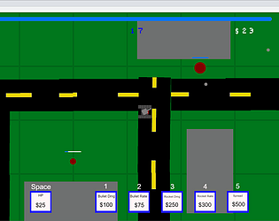
A 'mini' version of a town-building, resource generation game is ambitious and really interesting. I think the basic concept is pulled of well here for a quick prototype. The visuals are clean and easy to read, the simple point-and-click controls are responsive and intuitive, and my goals as a player are easy to understand.
The game stresses a lot on strategy which I think is interesting. The player are given a lot of actions to do which I think is interesting. The UI is simple and easy to understand.
The game mechanics is good, and this reminds me of those strategy games such as 'Civilization IV'. The management between component and make decision with the time limitation is a good consideration, and I feel like this game could gain many fans after few changes.
The instruction page is clear and give players a lot of choice of play style to this game.
This game has a very simple but interesting mechanism which is essential for resource management games. The UI is effective but simple enough. This game also offers a tuition on how is the game working, which is good.
The game functioned well liked seeing all the different models and game assets available it felt like I was building my own little town, and it was great to see the numbers going up.
Great simplification of the resource management gameplay loop. It manages to be high intensity despite requiring low dexterity, and there are enough resource tradeoffs for each action to keep you engaged.
The game is very strategic in a way that pushes the player to think which objects to put first and which ones to put next. The game also considers a variety of objects for the player to use, adding complexity of the game.
The aspect of picking and placing buildings while managing resources to create your village felt nice.
========================================
What could this game have done better?
****************************
I think there are just a few small tweaks that could have made big improvements. The resources should update more regularly, but in smaller amounts, so it isn't as much of a surprise when the player loses suddenly. It also feels like some of the buildings have somewhat unintuitive effects that can make it difficult to understand where one made a mistake.
The game mechanism is not very easy to understand and needs more explanation. Like why would the society collapse if there's a surplus of production? Does the placement of the buildings on the map affect your chances of surviving?
First, I think a balance and time-progression could be added for later version: maybe the enemy attack starts with a low level and regularly build up, and if this functionality is ensure, the game will be more 'new player friendly' and give players more choice of playstyle to master this game.
Next, I think building a single-person strategy game with a timer might be a little too much for player. The idea is good, but it might just be my personal feeling that strategy game is not going well with the timer elements. I think the reason of adding a timer is to limit the thinking depth of player or to faster the game speed when multiplayer is performed, and this might not be a good element to add to this game. As alternatively, adding a button to let player say that they are ready for the next attack might be better.
Some minor change such as add music might also helps.
One more thing, I think instead of labeling everything on the right-end screen, it will be better if all data are display at the top and all buildings at the bottom with cards that specify the cost and effect. Because right now as a new player, I'm feeling too much information is coming to me and I need to keep look to the right side and the game is over somehow. Plus, maybe states player is losing because they do not fulfill which requirement, such as they do not have enough army power, will help as well so that players will be able to adjust their strategy for the next try.
The statistics can be polished further. Currently, the game is so hard to continue. I think there might should be an auto increase in the money, since population lives with economy. And I think in most of the cases, I don't know the exact reason for game ends. Probably you should add the reason of failure on the game end screen or add some warnings on the ui during the game.
The game didn't fit in my resolution so that was an issue, I wish there was a bit more player feedback and control felt like I didn't have much playing time.
I think the player should have a tiny bit more time at the beginning to take things slow and understand what each building/item actually does. The game can end in 10 seconds if you don't make the right moves immediately, and there's no moment of reprieve for you to even sit and understand the full effects of what everything does. This can make the game feel more random than it likely is. A short tutorial level or a slower pace at the beginning would go a long way
The game could be a little confusing at the beginning because the player might not know what to do in order to win. There could also be more feedback on how the player loses, so that the player could improve next time. Adding animations could make the game look more fun.
The UI felt very boring as it was just the default box and text from unity. Not a lot of feedback on certain elements to the game. I couldn't tell if I was going to reach the cap or not and would die out of seemingly no where. The goal of the game wasn't very clear even after reading the how to section
What did this game do well?
****************************
I like the basic concept of the game, since a 1v1 boss fight can show off characteristics very well. The boss's moveset has an impressive amount of variety, and the barrage of bullets is a visual spectacle.
The visuals are very interesting, and moving across the screen feels nice and smooth. This definitely feels like a game where practice would surely make a better player. I liked the feedback provided by the health bars, which made it easy to see the progress.
The game is easy to understand. The enemy has varied attack styles which is interesting. The animation of the enemy attacks are also very well done. The introduction level is also very well done since it allows the player to test out all the different actions.
This game did a well boss fight mechanics, and Player will be able to practice more to get a better score, which fits the prototype theme accurately.
I really enjoy the UI and mechanics as a big Binding of Isaac fan. I also love the dash mechanic.
Really good art choice and enemy attack patterns. Projectile patterns were very effective at looking imposing/difficult to handle, but were ultimately manageable with good timing. I liked that some could be outmaneuvered directly while other forced you to use your dash ability. Scoring system using simple metrics is also a nice bonus
Enemy's attacks are unique and very fun to watch. The boss room design and the character design are good, and the rating system encourages the player to play more.
The boss fight feel was very well done. Definitely like a 2D Elden ring esc fight with dodge and moving around. Challenging at first but the more times you play the better you get at it.
I really enjoyed the unique movesets of the boss. It made for a different challenge every time. The scoring system is also great, giving players incentive to preserve hp and clear the boss as quickly as possible.
========================================
What could this game have done better?
****************************
The difficulty seems very hit-or-miss. Sometimes I'm able to burst the boss down in 5 seconds without taking a hit, and other times they do multiple full-screen attacks that are very difficult to dodge. I think a few tweaks such as invulnerability frames, attack cooldowns, and a more normalized attack pattern would help a lot.
The kill condition didn't seem super clear, and often times it felt like the round was ending when I thought there was still health left. The win screen, visually is also a little bit misleading because it feels just like the lose screen at first, with the bright red.
Having audio feedbacks would make this game a lot more satisfying. The grading system could also use some explanation. The attack and dodge mechanisms are very fun on their own but the game could use some other mechanisms, such as obtainable items placed on the level or making the map larger and have a more interesting level design could make the game more fun.
First, the game could add a score displacement or timer to the in-game UI so that player will be able to view their current score. For now, I'm only able to view the score when the game ends.
Next, I notice the dodge function only works for a very short time period, which might be too hard for new players to get hand on but could get used to it after practicing. This is like a double-edge sword, where it ensure the practice-more higher score things, but it also decrease the player's interest when first playing this game.
The boss needs to telegraph the attacks better. Also as a twin stick, I expected to have momentum carry on the projectiles.
It would be nice if enemy attacks, other obstacles, or changes to the landscape would push you into moving around the screen a bit more. As is, anyone with fairly decent timing can stay in 1 corner, shoot in 1 direction and take of 90% of the enemy's health if they positioned themselves well (occasionally dashing but mainly staying put). For the week long restriction the limited arena movement is understandable, but if the project were to evolve I think the first thing to sort out would be how to force the player to engage with the entire arena instead of staking their claim in 1 spot.
Enemy behavior could be more balanced to give fairness to the player on each play. The player could also have more attack methods to give the game more combat elements.
Definitely a replay button, it was annoying having to reset the browser when dying and repetition was a core mechanic. A clearer indication of the scoring system would be nice too, maybe something in the corner that shows my current rank.
Although the randomness of the boss's moves are nice, it makes some runs significantly easier than others. Maybe a more deterministic moveset would make the game more fair. I would also like to see a level progression instead of just one boss to give players a challenge.
What did this game do well?
****************************
The premise for the game is really compelling. It's satisfying to get upgrades and become stronger so quickly as you traverse the level. It's easy to identify what each upgrade does based on its icon. The tutorial screen at the beginning of the game is also very informative, telling you everything you need to know without wasting any time.
The implementation of the variety of features was impressive, and they move and interact well together. The mechanics feel smooth, and the power-ups really made it feel like I was making progress as I could feel the movement speeding up and changing. Movement was also intuitive.
Simple graphics but very cute! The game is smooth between moves and the game's timing mechanics are very interesting! Makes me want to play it multiple times!
The game has a lot of interesting mechanics. I enjoy upgrading your character over time.
Good mechanics and level design
The range of powerups and abilities is nice, with layered goals (fight enemies but also gain more abilities throughout the levels to improve your character). I like the general idea of the gameplay loop and creating an open level that can be tackled however you like.
Instructions are very clear, and camera movement is smooth. The collecting of the objects are very satisfying along with the music and sound effects. The gameplay mechanisms are creative and diverse.
The upgrade system felt very smooth and the player could notice a significant increase with each upgrade. The controls also felt very smooth and I could easily navigate through the game.
========================================
What could this game have done better?
****************************
The controls feel somewhat imprecise, especially how floaty the character is. The enemies are arguably very unfair, either shooting faster than you can dodge or moving towards you too quickly to avoid or shoot. There is also a lack of feedback as far as how much damage you do to the enemies, since bullets go through them and there's no other visual to show that they're being damaged. Some additional color coding for the player upgrades would also help differentiate them quickly.
The sheer number of possible interactions upfront was a little overwhelming, and it was hard to remember which blocks did what. Also, green as an enemy was a little bit misleading, because green is often associated with good. There were also some points where it was easy to get stuck. For example, landing on top of an enemy made it difficult to move away, because jumping didn't quite work the same way, so the player was kind of stuck losing health over and over.
I don't have any drawbacks to bring up, but maybe giving the player a clearer tutorial would help the play experience a little bit!
The screen is way too zoomed in, it is hard to tell what is happening. There's almost too much visual clutter in the level -- upgrades feel a little meaningless.
Location determination and attack determination are fuzzy
The collisions and enemy tracking/behavior can make the game fairly frustrating. Enemies will non-stop shoot at you even when you leave their range and return, and given their rate of fire and your limited range it's almost impossible to fight enemies that you don't instantly beat when entering their viewcone. The powerups also sometimes felt like they made too much of a difference too quickly, after picking up a handful of items I felt like I was completely out of control and had a difficult time maneuvering even though it should be when I'm the most overpowered. Overall, good concept, but the mechanics need to be rebalanced for a more enjoyable gameplay loop.
There are a lot of things for the player to remember to do, which could be tedious. The enemy behavior could be improved more. The goal of this game isn't very clear as there is no indicator of a certain spot that the player needs to reach.
I think the game leans into the speedrunning category so I would like to see that expanded. With all the different powerups, it becomes a lot easier to defeat enemies and reach different platforms.
What did this game do well?
****************************
I like how there is a countdown as soon as players start the game and the game doesn't immediately start since it gives them more time get ready. Adding a pause button to the screen also gives players a chance to take a breath and see the enemies' locations.
The concept is simple to understand, and the color-coding of the bats was especially useful for visually recognizing progress in defeating them. The visuals are nice, and really add to the cave theme. Feedback provided along the way, from the sound effects, to the red-tinting of the bats, really helped to understand what was happening.
The jetpack movement and aiming mechanics are fun to play. They gave a sense of thrill to the player. The incorporation of game characterists based on depth and entropy definitely improve the gameplay experience of the player as there is a lot of opportunity for the player to improve his skill with repeated playthroughs.
Showing what variables are changing at the start of each round is good. Having a special movement option (the dash) is also fun!
I love the art style of this game! This atmosphere of being in a cave puts me right in the middle of it! The feel of the shooting is also satisfying to me!
The aesthetics is super fun, and the UI is pretty clear cut and informative. Gameplay is very repeatable and I love chasing a high score.
Good design and flexible character
The gameplay lends itself to a lot of depth and skill expression by using fuel as health. The dash mechanic was also very nice, giving players some room for error. The music also fit the game really well.
========================================
What could this game have done better?
****************************
Sometimes the enemy sprites blends in with the background making it difficult to see. Adding in some bright colored enemy sprites among the dark colored sprites could be helpful
The movement could be a little bit faster/more reactive to improve game feel. Additionally, the delay between when you kill a bat and when it disappears is a bit confusing at times, so it would be nice if the bat could disappear as soon as it has been defeated.
I think the maximum health could be increased to provide a fair challenge to the player. Also Enemy variety could be improved to include diverse mechanics.
Some kind of player feedback when an enemy gets damaged
Perhaps providing a tutorial would allow players to get started with the game more quickly, also, some of the keys in the game conflict with some of my browser's key functions, perhaps this could be taken into account in the future.
I think that there needs to be a better handling on the controls. Moving the character through the space is not very responsive and it is hard to aim.
Reduce the rate of descent
The game felt very difficult right off the bat. Maybe a more gradual difficulty curve would let players learn the game better. Some indicators for when the player gets too close to the bottom of the screen would be nice.
What did this game do well?
****************************
The graphics of the game are really cute! I love how the sprite changes depending on which elements you combine together. I also enjoyed the freedom that players have in being able to manipulate the elements themselves.
The idea of combining elements is great.
The combinations mechanics is good approach to characteristic game design. I like that the player can choose and experiment with different combinations to see how their choices affect the game environment.
Great gameplay concept! I've always been fascinated by the Doodle God concept of combining elements, so I love to see creative ways of combining that with other genres...
I must say I'm intrigued by the mechanics of the game, it looks full of creativity and this little ball rolling gameplay makes me feel like I'm back in my childhood
multiple strategies
I really like the element mechanic, very deep and creative. tons of potential. made me want to solve the puzzle of the level
I feel like the combination of different elements lead to a lot of choices that the player can take when playing the game which is one factor for depth. I think the art for the sprites are well designed and the mechanic of dragging elements on top of each other is done well.
========================================
What could this game have done better?
****************************
I think having the platforms change color depending on what element is added could help players visually see that the element was added. Adding a tutorial level could help players understand the game mechanics, especially when mixing elements together
I could not figure out the way to win. I guess the game would have been better if there are more guides. Also, I am not sure why but the elements disappear when it touches the white platforms.
I think the webgl buildshould have been corrected as it doesnt show the entire game. Also it seems like there is no clear direction that the player has to pursue. This could be because of the webgl build as well but it is a flaw nevertheless.
...I couldn't see the entire game window on my device (Browser: Librewolf (firefox fork), OS: Windows 11)
I encountered a few bugs while playing, such as the ball not moving when it should be rolling forward, or the ball suddenly falling and not winning. I think the developers need more time to improve this game!
unclear rules
ball physics a little janky i guess but this is one of the best concepts
I did not understand this game. Even after reading the instructions and going through the presentation I still was not able to play the game in a meaningful capacity. When I created items to place on the map, I would drag them to position them on like the platforms and they would just disappear. When I pressed start game the ball would just come into the screen and fall out. After pressing the start button the first time, it seemed that nothing would happen after. Also, the screen is positioned in a way where you can't see the wizard so that further contributes into the mystery of what is supposed to be happening.
What did this game do well?
****************************
I think this game did really well in making players want to replay the game since each time you restart, the puzzle changes. I also think that having the puzzle stay the same if players die helps the player memorize the puzzle and makes the game more fair as opposed to having the portals randomized after each death.
The difficulty of the game was great. At first I was struggling which portals were connected, but as I play the game, I was able to remember some portals.
The game mechanics were amazing, The dynamic interplay of various game design characteristics including stochasticity, observability and more has been implemented nicely.
The inherent strategy of staying at a far-away portal to lead the enemy towards there so you can safely teleport is cool.
This game has a very smooth controler and avator animation system. The pixel art is great. The portal mechanism is also interesting. I think it allows much dexterity and strategy which is fun.
Thought the animations and art were really good and the game worked well the portals took you exactly where you needed to go.
Great potential for puzzles
I really like this game's theming and artwork. I think the overall game concept is fun and there are mechanics used that players can get better at like remembering where each portal takes you. Another mechanic I like is you can drag the enemy towards you and then enter the portal to juke it.
========================================
What could this game have done better?
****************************
I think adding a tutorial level could help players get used to the mechanics of the game. The current level has a lot of portals which may be challenging for new players.
It could have been better with lives count and some animation or indication that I am dead.
I think the amount of portals in this level makes it confuding for beginner players, so a tutorial level or a level with easier challenge would have been helpful
It would be useful if every portal looked a little different (such as by color) so that it would be easier to remember which leads to which once you figure it out.
I think maybe it can have some more compatible sound effects and visual effects when portalling between two gates.
I think it was a bit confusing at the start what you needed to do to win, also I felt lost on the steps of how I needed to get to my objective.
Unclear what was an enemy vs a portal. Unclear which portal connects to which
I feel like this game could've improved how it shows where the player moved visually. Sometime I went through a portal and I sort of had to scan the screen to see where I landed. I suggest adding additional visual feedback after entering a portal would improve the game. Also, I feel like the goal of the game could've been explained better, I'm still not too sure what the items on the platforms do.
What did this game do well?
****************************
I really like the approach of applying procedural generation to player traits. This is a really interesting concept that could make for fun roguelite gameplay.
The idea of this game is so awesome. Getting so much fun on it even if I don't know what am i doing when playing it.
I liked how this game had a lot of different effects that layered on top of each other. It was chaotic but fun to mess around with, and it would be cool to see it implemented in a more fleshed out game.
Even though there is no goal and this is just a sandbox, this is by far the game I enjoyed playing the most (and probably spent the most time on). It is so fun and lighthearted, I would love to see this fleshed out and have to attempt to actually complete tasks with these effects in place.
A cute idea and a unique take on procedural generation. It's a fun little sandbox with a good amount of variety.
I like the different effects. Each effect makes the gameplay completely different and fun. The variety also keeps everything fresh.
The game is definitely not lacking the juicy elements. Depend on effect combination it can be very satisfying.
A refreshing game set apart from all the PCG for maps. Never though of effect generation can have such an impact.
Very funny and great random effects
========================================
What could this game have done better?
****************************
The generation does not feel very procedural and more random. Unless there is an algorithm for deciding traits based on certain preferred/restricted combinations of traits.
If you could make the game be more changeable by adding some more enemies animation or traps, that is more complete.
I think adding some sort of small objective to make the game more fun to mess around with (I understand that the description says that it's more of a toy than a game)
I don't totally see how this is PCG... it seems like the effects are just randomly generated each restart. And there aren't other elements which seem to be procedurally generated...?
Overall the game is a little janky and buggy, though this is probably due to the random combination of abilities. A way to customize the character would be a cool showcase of some combinations as well.
The effects do get a bit hectic and confusing.
It's all good, only thing might be done better is it's a bit too primitive. Since the game only concerns effect. Not much of a game really though serves its purpose perfectly.
Some additional effects
What did this game do well?
****************************
I loved the way galaxy map was generated because of the way it adds replay-ability and more possibilities for expanding the game. It really reminded me of FTL or Stellaris which use similar generation techniques but at a much larger scale.
The whole system of this game is so complete. Literally, cannot find any drawback on it.
The UI is great; the battle system is fun.
This game did a great job about making the player really think about their actions before doing them. At a broader view, you can vaguely see all of the events that the journey consists of, so you can kind of plan your path. However, you don't know the specifics of the events (how many enemies, what upgrades, etc.) until you actually take the path to the event. This along with the auto-chess feature making the player wait with anticipation to see the results of their action makes this game fun to play.
I really like the automatic combat part. What the player really has control over is choosing which path to take. It feels like a strategy game.
I really liked the animations and strategy aspect. The game also has a lot of depth with the different fighters and upgrades.
The graphics of the fleet is so smooth.
Love this game's aesthetics, and the ship flight is great. The path choosing is fun and makes you feel in control
========================================
What could this game have done better?
****************************
There could have been more variations in what each location offered. Additionally, the player rarely loses.
It would be better if you make the game feel more direct. But so far so good.
More weapons, modules and events to explore
I could just be lucky, but it felt like I got the random beneficial events too frequently. Maybe random negative events could occur as well
I think I can win the game no matter which route I take. So maybe the game could be balanced more about the system.
It would be nice to be able to enter the shop at any time.
The level generation can be a bit more progressive (players can improve their skills
Some more opportunities for player strategy, although that would take more than a week to fully flesh out.
What did this game do well?
****************************
I like the ways that the islands and enemies are generated. I also like the enemy behaviors; the AI was well designed.
The ship interacted with the map gave a direct sense of how to play the game.
Enemy ai are clever.
I think the map generation adds a lot to the gameplay of this game. The islands feel like a kind of obstacle on the map, and we can use them to avoid enemies.
I like the theme of the game. The fact that you have to defeat all the other ships whether they are friendly or not in order to conquer the islands fit well with the pirate theme.
There are resources, and attack.
The islands looks great and I like how the generation works. The ship's movement is very smooth.
I like the different types of ships/enemies. The different enemy types makes the player choose where to go and what enemies to fight first. For example, I would fight the red ships first because they are the most aggressive and would actively try to attack me. Then, I would attack the yellow ships, then the green ships.
========================================
What could this game have done better?
****************************
The island generation could have been more varied and interesting. It would be cool to see different types of environments and biomes on islands.
The map edge could be implemented with a boundary on it. That would be much better.
Weapons do not have to be exactly same DPS. They could be also balanced in other ways.
I noticed in some areas ships can get overcrowded. Maybe the game can limits the number of ships in center area.
The movement could be tweaked to make it seem more natural or shiplike.
The map can also be PCG. The connection between the resources, map, attack and moving mechanism can be more coherent.
The bullets bounce off away from the enemy ships which feels weird. The battle can be more exciting if add more types of ships and firearms.
It seems like the player can sail right off the game world. Maybe you could add some borders to keep the player within bounds. Sometimes the player spawns with a lot of red ships nearby, making it harder at the start.
What did this game do well?
****************************
The map generation fits well with the pcg theme. It's interesting to explore the map. The asset style is also cohesive and fits well with each other.
A nice prototype, generates the rooms in dungeons and spawns enemies in them.
Not a lot to do since there's no goal, but being able to see the generated map every round was a nice touch. The maps generated were fun to walk around in and can definitely be used to make something big.
The room mapping sets a solid foundation for a dungeon game. Effects can be added to different rooms.
I like how the player can switch between the full screen mode and player camera mode.
It's clear to see how rooms are generated.
The pcg'd map is really cool. The collection between rooms works greatly. each room has its own enemy to fight with.
The animations / camera changes were cool.
The dungeon is generated differently every time so a new maze like dungeon is created each time. That makes sure the game isn't the same every time.
========================================
What could this game have done better?
****************************
I think it would be good to have doors that leads to different levels or maps instead of having the players click generate. There is a lot of potential and you can add a bunch of things to the game: you can make it into a traditional dungeon crawler, or even an infinite maze game.
Long passageways, definitely needs some improvements there.
The game needs more enemies now.
I think we can add more game play to this game, such as different enemies or different weapon types.
The levels are a bit sparse
The game can be more exciting if more enemy types and weapons can be added to the game. The direction where player attacks seems off a little bit.
I felt like the game didn't really have a goal or an objective, it felt like it was all just very meaningless interaction and if you just thought to stand there, then you wouldn't die.
Maybe adding some goal for the player would be nice or having a dungeon entrance or exit?
What did this game do well?
****************************
'It felt like a fun little mindless mobile game that does the illusion of choice quite well! You shoot things, numbers go bigger, animations go brrrrr, you mash the button, things die. It's not a challenging game, but not all games need to be challenging. There are plenty of games that work by making the player feel like a powerful master blaster without too much effort!
I couldn't tell you what the PCG is off the top of my head in this game was, though I would guess the enemy waves are randomly generated? They felt themed, though, so if that was PCG'd it was smoothly done!'
The gameplay is simple to understand and pretty fun to play. It feels really good to get all the buffs as the wave goes on and watch you become stronger. I also like how there is a lot of variety of different power-ups.
I really love how quick it is to get stupidly broken -- as a big fan of roguelikes, this is basically the stuff I live for! Putting the procedural generation on the upgrades you get offered and the enemy buffs that appear per wave is really neat, and definitely made this a fun experience.
A simple game with a lot of options! Different builds were fun to try out. Good level progressions.
I enjoyed the game and liked the option to choose upgrades when a wave was defeated. Combat system was well implemented.
The game feels really exciting and fun. I like different ability applied to the bullet.
The variation in power-ups / levels was quite fun, and provided ample challenge to the user while playing the game.
I like the many power-ups we could choose from. I got so strong that the enemies didn't stand a chance. Choosing different power-ups and seeing all the different effects it had was fun.
========================================
What could this game have done better?
****************************
'The core gameplay loop is pretty good, the animations and music are pretty good... and everything else is pretty aggressively terrible. The UI/UX is just atrocious. I literally cannot see most of the enemies and my tank at the same time due to the scaling of the vertical screen. There is literally a block of text blocking the left third of the screen. Right-click is for some reason the primary action button, despite left click being used for nothing. Homing will cause your shots to actively miss their intended targets sometimes, and spiral around a completely different target. After a certain point, enemies will literally just stop spawning.
So many aspects of this game are really good, but so many others just make you ask 'WHY?!''
The UI layout could have been better, it is a little hard to see the enemies sometimes with the text blocking. Maybe you can have the option of minimizing the stat display. It might be personal preference but I think it's better to have shooting as space bar instead of right mouse click or have the player choose to cater to people who don't use a mouse.
I think that the audio levels may need to be balanced a little bit (when you stack up attack speed, shrapnel, and scatter shot it gets very loud). Speaking on balance, the upgrades offered probably need some as well as some more effects to know what is happening (I wasn't really sure if the burning was burning or doing lightning, despite having not picked up chain lightning until later).
The player became too overpowered after a few levels.
Increase attack speed - get chaos amplifier - increase range and you'll be able to clear levels even before you know it! Definitely needs balancing.
The upgrades are true random, chance based events. Probably control the randomness so that the game does not get too easy as level progresses.
Game became chaotic and easy as the waves progress. I felt that less choices would've been cleaner to play.
I think the balancing can be better. It seems like the game is easy given the strong attacks that the player have.
I felt like the speed of the game was a bit slow and clunky and that the levels were sort of randomly spam generated rather than generated with intent.
I think I became so strong through the power-ups that the game became too easy. The game screen also was a big too large in my opinion.
What did this game do well?
****************************
A simple concept but very interesting. It definitely feels very good and gives you a good rush when you're able to fall down a large depth.
'A genuinely fun game! The core gameplay elements are really simple, but really well executed. Eating dirt creates a neat soft permission system where you effectively have unbounded movement, you can get to literally any tile, but there's clear incentives to take the take the clean path down to the point where it's easy to forget that you're really not bounded at all, except by time!
The unbounded movement also helps cover up a lot of the jank created by the PCG, where you might otherwise get really frustrated at being blocked off, or spawning in the wall.'
This game does really well on the pcg part, fits well with the game design. The gameplay is simple but also has enough depth to make it interesting: like making the player choose whether to eat through the tiles or try to look for a better route. I like the idea of allowing the players to eat through tiles, it gives an extra option.
The generated maps are really fun to traverse -- it reminds me of discovering caverns in Terraria! The ability to move up and down but also choose to drill through the walls is also a nice touch. It justifies the time limit well -- do you choose to take the long way or drill through a thick wall?
It's nice that the player has the ability to eat the tiles if they ever get stuck instead of just navigating through the tiles. It lets the player to strategize whether they should eat tiles or find another way to go down and the timer definitely adds to that strategy process.
Nice concept, a new take on maze solvers. Addictive! Before I knew it, I had spent 20 minutes on the game!!
The PCG is in line with the game concept, would love to see this developed further.
Simple controls and simple concept.
Its a fun game to play. I really enjoyed using the eating tiles mechanism. Generation of map procedurally gives the player excitement while choosing a path.
I really like this concept. I also like the fact that an eating the tiles thing was added in case I got stuck.
The gameplay was varied and you had to be creative in your timing of jump, smoothness of actions in game were solid.
========================================
What could this game have done better?
****************************
It does get a little repetitive after a while, but this game definitely has potential for more!
'A lot of the problems with this game were just things that need polish. There's lag whenever you load the next level, which just feels terrible. Sometimes you'll just spawn into a wall, and need to dig your way out! Sometimes there's a bunch of time-boosts that you just fall into, and sometimes there's nothing in sight!
The other thing I'm concerned about is where exactly the skill cap on this game is. This game feels like it has a high skill ceiling: you can go infinitely deep and there's a bunch of branching choices. However, most of the choices you're making are random. The thing that determines if you get a high score is much more so luck than any real improvement in player skill. I wish I had an easy 'Make your game skill-based with this one easy trick!', but I don't. It's just something that you should keep in mind as a problem-to-solve should you develop this game further.'
I didn't really understand what the checkpoint was for, is it supposed to respawn us when we die? It would also be nice to have some other mechanism to guard against levels that have a big block of wall. Perhaps to further develop this game, you can add some items(like bomb or something) that would add some complexities. This can add to player's choice: whether or not to spend time to get the bomb that would help them later on or just spend the time to go further.
I noticed that its possible to spawn directly inside of a wall, so spawn position may have to be shifted to accommodate that possibility. The background being pure white also felt a little weird -- some repeating cave background tile would go a long way.
It would be nice if there is other way to eat the tiles like using bomb and put the bombs around like a collectible. Other than that, it would also be fun if the tiles change their appearance as you go deeper
Control the randomness of the crawler by not letting it spawn tiles around the player spawn area. A lot of times, I was spawned inside walls and had to eat my way though.
Ensure that there is atleast one path from spawn to goal - there were few islands with a huge layer of walls and getting out of it was difficult.
Increase the size of the levels as the game progresses.
Little more gradually generation rather than abrupt change of screen.
Maybe make sure there's a path from where the slime starts because it seems unfair to have to use my eating power (since it's limited) when I get spawned inside a block of tiles and am forced to use up resources.
The overall game itself felt a bit too simple / one dimensional - it could have been a bit more exciting in terms of perhaps special effects or power ups.
What did this game do well?
****************************
The control is quite simple.
I liked the music and the sound effects! It felt really satisfying watching the asteroids grow, and just moving the player and endlessly colliding with asteroids felt nice somehow.
A genuinely (out-of) atmospheric experience. The music + the PCG works really well in creating an environment that feels like bonking your way about in the endless reaches of space!
I like how the initial planets are generated and spread apart and grow over time. It's also really cool to see more things generated as you continue to move!
This game feels fun to play and is a little addictive (for me). Traversing in the space and destroying the asteroids feels smooth and satisfying.
The growth of the asteroid was pretty consistent. I like that the asteroids you already discovered keep growing in size while the asteroids at the edges you just discovered started to grow so each of them grow independent of each other.
Blue noise randomizer works in a cool way generating objects around the player.
It's very cute! It randomizes the asteroids depending on the seed which is cool.
I love the face that it was strategy based with a simulation aspect that marriage made the game feel very deep.
========================================
What could this game have done better?
****************************
This game lacks a specific goal and it seems that there isn't much PCG-related element: simply using some random generator to determine the location and size of objects is not enough.
You could keep zooming out, but the box just stays the same, so it just felt kind of extra being able to do that.
'A couple things. First, this didn't really feel like a game. Experience is a better term for it than game, because there's literally no challenge to it, you just go around bonking things. This isn't nearly as much a criticism as it would be for other weeks, because this is a successful PCG experiment and that is the goal, but I can't help but think a Game Design project should still be a game!
On a more micro-level, there's a whole lot less stuff in space than this experience has, and it should reflect that feeling of vastness instead of bonking into everything. Not literally as vast, of course, the game would be empty if you did that, but there should be a bit more freedom of movement to accelerate and enjoy the experience.'
I'm not really sure what's going on -- part of it feels like you're a space monster consuming planets, but the really relaxing music makes it feel like a really relaxing buffet. I think settling on a tone and taking the consumption mechanic a bit further would be really neat.
This game has the potential to be an actual game instead of an explorer. I'm looking forward to seeing it coming out as a real game.
This game could definitely be fleshed out into a real game as for now you can just eat any asteroids. It would be nice if there is other things other than asteroids or you have to eat the asteroids before they become too big and eventually kill you
Game felt bit out of place. There can be few more elements to make the game more engaging or interesting.
The camera should move with the player. It's kind of hard to figure out which buttons to press depending on which way the player is facing.
The simulation looked so fun that I wanted to play it :)!
What did this game do well?
****************************
Nice background music.
Lots of different levels!
The map/level is procedurally generated. There's no pattern in the map generation so it doesn't feel repeated.
I like that the controls of the car reflects real life control of the car, it feels nice and more of a casual vibe. The maze was also well done
Fun racing game where you can try different tracks by changing the map. And these tracks are long and challenging.
I like how driving backwards is the best strategy. It makes me feel smart for doing something that doesn't feel intentional (even if it could have been intentional).
It's great to make racing games with maze.
It's a cute concept a new map is generated each time.
I did a similar thing to this for my project so I really like the idea:) driving felt good.
========================================
What could this game have done better?
****************************
You could consider hiding the seed number in the top left corner: it is somewhat irrelevant to the player. Also, the left and right arrow keys seem too sensitive so it is very difficult to control the car. Lack of sound effects.
Controls were difficult. The game wasn't very intuitive and didn't really have a good mind-mapping.
The control feels janky and it's a bit frustrating to play with it. Maybe it can tweak the parameters to make the driving experience better.
I feel like the controls were a bit weird for a top down view. It would be better if its more of a first person view. It would be more fun if there's traffic so in addition to navigating maze, you also have to avoid colliding into cars
I think the map can be scaled so that players can see the whole track, and can add a time limit to push players to reach the end as soon as possible
The driving feels clumsy, and that in combination with the maps being a maze makes it extra frustrating.
The controlling is not so confortable for it use UP as forward in a 2d map.
The controls are not intuitive. The car often spawns where the road is going vertically and there is no space to go forward so you can't turn easily.
More variance among levels wouldve gone a long way I think.
What did this game do well?
****************************
It was fun to control the chicken, and all the different variations of maps generated were fun to play around in and try to find the turtle.
The visuals are great: trees, bushes, chickens, and turtles all have their unique textures. The background sounds give you a sense of nature.
Super engaging and fun sound effects, the water level rising is a nice touch and adds a lot of game feel. I also love that the sound effects are interactive and gets louder as you approach certain objects.
The game is smooth and wholesome. Everything fits together. The islands are procedurally generated with natural obstacles such as trees and rocks.
This 3D prototype is so cute and I like the relaxing BGM. Every time you died, it can generate a new map to explore.
I love the assets and controls! Very sleek and smooth.
I liked the low-poly graphics and the clumsy jumping was actually kind of fun.
I like the sense of pixelized 3d world, just like the Minecraft.
Really enjoyed the concept thought it was creative.
========================================
What could this game have done better?
****************************
The turning controls could be a bit smoother, I found it hard to know exactly how the turning worked. Also, it could be a little more clear what the goal is when you first start the game.
The rotation effect feels weird: the chicken, instead of the camera, is rotating, which sometimes makes you fail. Also sometimes you start on top of a tree, which is a little bit weird.
I wish the game would tell you the objective (to find the turtle) to let the user know what they're supposed to do and there could be some sort of mini map or guidance to locate the turtle.
I think eliminating the generated maps that don't have a way to beat the level may help improve the gaming experience.
I think the maps are a little bit small and simple, just have grass, waters and some small objects. If have time, it can add some enemies or other terrain to let players explore.
Sometimes you spawn in a a'bad' spot and can't see, like behind a tree. Not sure if it is possible to make sure a person is only spawned in a visible spot. I'm also a bit confused on what the objective of the game is.
It was really hard to find the turtle and the camera often got in the way.
I have no idea why the game used tank controls, or why the tank controls rotated the character off axis resulting in a lot of deaths because I wanted to turn around.
It is weird that the chick always faces to the front even when it moves horizontally. It can be better if we can change our views as we want.
Thought the game mechanics seemed a little bit rigid, maybe a little more juice wouldve fixed this.
What did this game do well?
****************************
I liked how the maps generated a road for you to follow, but still allowed other ways to reach the goal. The scenery was also nice.
I like how the car color also randomly generates and the sound effects are fun and fitting to the game.
Nice path generated every level.
It's a cool game and i like its minimalism. The randomized map is a classical PCG to make the game more flexible.
I like the map generation for this game!
The level generation engine works to create a unique level every time, and that's good.
Having a random car is my favorite feature, because it really drives in the point that it's a procedurally generated video game.
It's a really good idea to use PCG on racing map generation.
The game is 3D with very nice graphics and map layout. The movement of the car is very well made especially when accelerate and stopping. The background music and sound effect creates better perception about the car movement and I think the game will be very boring without these details and factors. The gameplay is simple but controlling the car can sometimes be challenging.
========================================
What could this game have done better?
****************************
I feel that the game could have had more than just one road to follow. These roads could intersect or go in different ways to let the player find other obstacles and ways to reach the goal without going on the grass.
It's very hard to control the navigation of the car, so that could be improved and sometimes you're stuck and you can't move. You're also not technically punished for going outside the lane, so I'm not really sure what the lane is for. There could also be a winning message or sound effect every time you go through the blue flag to give the user some sense of achievement because the sudden change of map without any signal feels empty.
Direction of the controls isn't really good once the car starts rotating, if the camera was behind rotating with the car it would be nice
well, you can try to make the maps more complex like add some obstacles or other paths options. And adding gas source can make player to choose a shortest way to reach the destination.
The camera orientation makes the controls a bit tricky, if it were following the vehicle it could be simpler.
The car doesn't feel wheel great to handle.
Also, the camera makes it hard to see where I'm driving.
The controlling is a bit confusing. It makes me dizzy when the car faces at different directions.
The game can add a timer or scoring system to make the player competes for more points. Sometimes the player can also cheat by driving across the fields instead of following the path so maybe adding a barrier that bring the car back on track every time it goes to the field can add more balance to the game.
What did this game do well?
****************************
I really like the layout of this game and the concept of having multiplayers. The bombs are also a nice idea to remove the blocks. A very cute and unique idea. Haha I love how the player also dies after being bombed if too close and turns into food. I guess the players can kill each other this way.
I like the multiplayer aspect of the game, it adds to the fun. The different powerups are also cool to play around with as well as the bombs.
Well designed game, super fun and nostalgic! The different buffs to the game make it very entertaining and adds a nice touch.
simple bomber man with 4 players.
I love these types of games! The procedural portion of the game works really well, it forces you to change your strategy for placing bombs for each level you go through.
It's Bomberman -- so almost by default the game is pretty well-designed. The sound effects and artstyle are both also effective.
The game makes a good use of map generation as well as item placement. It is also a multiplayer game with up to 4 players place at each corner. The gameplay is similar to the classic bomb game but I still enjoy playing this version very much. The sound effect and items resources blend well and balance the gameplay.
This is an extremely polished game where it deliver the sense of complete. There are lots of items in the game that have different boosted effect, with local multiplayer support.
========================================
What could this game have done better?
****************************
The time it takes for the bomb to set off is a bit too long. I feel like if you guys add more levels or expand on the map of the game, it'll be a really fun game to play with friends. I'm also not sure if the player 4 keypad is working on my laptop.
I think the game could have done more to stand apart from Bomberman, maybe with other mechanics or theme to make it unique.
The music could be added to the game itself to make it more lively and there could be an indication of each player's current HP and maximum number of bombs and number of bombs used currently.
there seems to be a glitch where if the player spams the bomb button as the bomb explodes it creates a constant instant bomb and glitches the game, and has a weird interaction with items as well. (held 1 direction and the bomb button)
Some of the controls for the 1st and 3rd player did not work for me (moving and bombs). Not sure if it is my device or the game. Also I think this may work well as a single player game rather than multiplayer.
As you all alluded to in class, I think the procedural generation here actually hurts the game a fair bit, since it upsets the balance between each of the four players. Maybe you could investigate some kind of symmetrical procedural generation that affects each player equally? As a minor note, I also sometimes would get stuck on the edges of walls. I think you all added a little bit of slipping to help alleviate this, but a bit more would be good.
I think having an option to place multiple bomb in a row will make the game more intense. An additional of background music is also more fun. A character select page with a choice of default bomb that has different effect can also be an extend option of the game.
The map generation is more or less random, for one player might gain access lots of space easily(while only one or two bomb)while others are trapped in the corners (full stack walls). It would be a great game if the random generation can be controlled in someway so that it can provide balance while maintain the same 'perceivable difference' between each level.