
This game is so cute. It has such a sweet and cozy vibe to it. The art is wonderful and the animations are delightful. I really enjoyed wandering around, and I loved getting to feed Nessie.
The exclamation mark during the fishing animation confused me at first. I thought it was an indication of a quick time event and so clicked again. My partner pointed out that I didn't need to do anything else once I started fishing, and that getting a fish seemed to be based on the fish jumping animation. Adding a quick time event or other interaction could be a nice addition to the fishing.
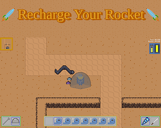
I think it might be nice if you used a different background color for the cave. The dark green color works really well in the forest, and worked well in the yurt, but it stood out to me in the cave. It made the cave feel less natural, and made it feel smaller. Using a similar color for the background that you used for the top of the rocks could help it feel less square and box-like and more cave like. The sharp lines between the rocks and the background may also be part of why it stands out to me. The transition between the forest and the background has a leafy feel and the general shape of the play area felt nice, and the yurt has curves that match the shape of it. The area you can walk in in the cave felt natural and cave like; continuing that shape instead of turning it into a square could be another way to make it feel less jarring.
Overall, you have a really good start for a game, and you did a lot of really good work. It would be fun to see where you take it if you keep working on it. (I love the idea of having a garden to interact with! Maybe you can feed Nessie more than just fish?)