
Indie game storeFree gamesFun gamesHorror games
Game developmentAssetsComics
SalesBundles
Jobs
TagsGame Engines
(+2)

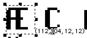
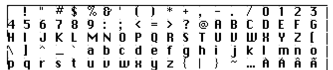
1. Decker supports a limited set of unicode characters within text, and unrecognized characters are turned into character 255, "UNKNOWN", upon ingestion. You can, however, very easily customize how this character appears in a given font using the font editor. (The font editor is part of a larger deck All About Fonts that contains a variety of other notes you might find useful).

2. It isn't possible to use a different font within a field exclusively while text is highlighted, but you could certainly make intentionally illegible custom fonts that could still be copied to the clipboard as ordinary text. This would be mechanically a bit different, but might still preserve a similar idea. Perhaps there could be some affordance within the game for giving a player a "scratchpad" field they can paste into? You could alternatively build a contraption of some kind which encapsulates swapping out the font of a field when it is clicked, but it would be difficult to provide this kind of behavior on a granular level and still permit selection. In a locked field, links could be used to trigger arbitrary scripts when particular text fragments are clicked, but they do have a recognizable visual appearance: a dotted underline.

3. You cannot select text within a locked field, but there are a few subtle consequences of how field and text patterns work which might allow you to accomplish something similar to what you're describing:

  • A transparent field on top of a black background (with text in the default pattern 1) will appear to be invisible until it is selected, in which case it will appear white.
  • If you change the pattern of a span of text within a "rich text" field to white (rather than changing the default pattern for the entire field), it will appear to be invisible until it is selected, in which case it will appear white within a black selection highlight.

As a general note, some of the limitations of text and selections within Decker are a consequence of its approach to ensuring that fields are usable on keyboardless devices like tablets. The "touch input" mode (which can be manually enabled via the Decker menu) will interfere with some kinds of nasty text obfuscation tricks.

(+1)
  1. After some slight experimentation, I was able to figure out how to edit character 255 to be an all black blank character; however, I’m a tad lost on what to do next. How do I exported my edited version of the font I want to use into my Decker project? Do I have to add the font editor as a resource in order to edit in my .deck? Additionally, I theorized that because Decker fonts are bitmap, I would be able to export my glitched fonts to bitmap (pngs?) and then import using the FontImporter tool. Unfortunately, this poses another pair of problems: 1) When I imported my sheet, it came up blank, and 2) I am unsure if I need to add the FontImporter as a resource to my .deck in order to add fonts to the project.

  2. Thank you for the recommendation, but contraptions are very much beyond my ability to understand right now. However, based on ahmwma’s tip about the Interior Contraptions, an idea came to mind. By using me.toggle[“solid”], I presume I’ll be able to have it so that if a player clicks on the field it can switch out with a version of the same field that has the text “highlighted” (ie. white text with black background)?

(+1)

Quick answer for your first question: If you've got a .deck with a font saved (e.g. if you save a copy of the font editor), you should be able to drag it onto the deck you want the font in (like literally drag the file into an open Decker window), and then use the Font/DA mover that pops up to move the new font into your deck. The same goes for moving around different colour palettes, sounds, contraptions, or modules, when you get that far.

Looking at your second point, yes I think that should work - it's pretty easy to write code that hides or shows a widget based on a click

(+1)

To make sure I understand what you mean: I can edit my font in the Font Editor and important that .deck into my project to get the edited font the same way one imports any other Resource? If so, I believe I understand how to move forward.

(+1)

Yep, pretty much. Either by dragging and dropping another deck file onto your current project or by choosing a deck file when you're already inside the Font/DA mover you can move a variety of resources between decks (including fonts).

If you're editing one of the basic fonts that are always in Decker (body, menu, mono) it's probably best to copy them (inside the font editor deck, with the button option there) and give them a new name so they're easier to transfer over.

(And there's also another sneaky way to move fonts between projects. If you use a font in a field inside of the text editor deck and copy the field into your project, the new fonts it needs should come with it into your project too.)

(1 edit)

Hey again. I’ve made a ton of progress, much more than expected, but am now running into two separate problems.

The first: While trying to use the Mac Windows Contraption, I’m unable to figure out how to embed a button into the rich text field as the original comment posits. My goal is to have it such that a player scrolls, reading the field, and finds the button at the end—within the field, and not like this post. I don’t want to break the contraption by fiddling around with it too much as I already have a copy adjusted for center aligned text (ie. MacFieldWindow.center). If this is not possible, I believe I can just change the font to a smaller size and add the button on top so it just looks like it’s embedded in the window.

The second: I’m struggling with how to get the bitmap I extracted of the fonts I want to convert into a usable format for Decker:

When I try importing through Font Importer, all I get is an empty box and an inability to actually change anything. Please let me know if I’m missing something, but as far as I can tell, all you need to create a font is the bitmap image, no?

(+2)

You can’t put an active widget into a rich text field, but you can put a link into a rich text field, and there’s a link event that fires when the user clicks on a link, so that would probably be the easiest way to deal with it.

If you really need a button, you could put a few blank lines at the end of the rich text field, put an extra button inside the contraption, and have an event handler that continually adjusts the position of the button based on the field’s .scroll property. You’ll probably also need to use the maxscroll helper function from that post to figure out whether you’re within (button height) pixels of the end of the content. You may also need to mess with widget ordering to make sure the button appears above the rich text field but behind the horizontal scroll bar.

For the second question, when you say “Font Importer”, do you mean the deck described in this post? For the font you describe, you’ll need the deck as described in the OP, and the changes to support sizes other than 8x8, and the changes to support modern versions of Decker. You should also have your font as black text on a white background - if you want it to appear in white, you can use Decker’s text formatting tools later. Lastly, importing a font adds it to the list of fonts embedded in that deck - to use it anywhere else, save the deck to a file, then open the deck where you want to use the font in Decker, drag-and-drop the deck-with-the-font onto Decker, which should bring up the Font/DA Mover where you can copy it across.

(1 edit)

Hmm, I did try adding the aforementioned script to try and have the button appear when the field has scrolled down all the way instead, but could not get that to work as it was not targeting the field inside the contraption (I presume). Ultimately, with this I’m mainly trying to have a link that caps off the end of the field when scrolled down that links to the next card—and based on your advice it seems that a link in the rich text field is most hassle free way to accomplish that.

However, while linking some text at the end to the next card works, I’m still trying to parse out how to use the link feature to call an alert[] when some text is linked in the field. From what I understand, I canwrite alert[] or go[] into the scripting area to fire the event directly. Where the confusion stems is regarding if I can link to an alert that displays on the same card, then click Okay and be redirected to the next one.

(+2)

When you click a link in a field, that sends a link event to the field. If the field doesn’t handle it, it bubbles up to the card the field is on - in this case, the contraption’s prototype. If the prototype doesn’t handle the event, it bubbles up to the default event handlers, including this one:

on link x do
 go[x]
end

If you want clicking a link to anything other than go straight to the target, you have to add your own on link... handler to interrupt the default handling.

The easiest thing is just to put it into the prototype’s script, especially if you always want clicking a link in one of these text fields to display an alert before moving on, something like:

on link target do
 alert["You have clicked a link. This will be reported to the authorities."]
 go[target]
end

If you want different contraptions to have different behaviour, you’ll want the link event inside the prototype to become a link event on the contraption, by putting something like this in the prototype’s script:

on link target do
 # forward the event to the contraption
 card.event["link" target]
end

Then you can put different on link... handlers on different copies of the contraption, for different behaviour.

(+1)

The macFieldWindow contraption is designed for displaying "rich text", which can contain hyperlinks, inline images, and text spans with customized patterns or fonts, but cannot contain arbitrary embedded widgets, like a button. It would be possible to add buttons to the contraption by editing it, but I recommend sidestepping that route for now if possible.

I'm not clear on what you mean by "the font importer". In this tutorial post I describe steps one could follow for building a special-purpose tool for converting bitmaps of glyphs from a particular font collection into Decker fonts, but it makes a variety of simplifying assumptions: assuming glyphs are a particular size, that they appear in ASCII order, that the imported image is a black-on-transparent image that's already completely ready to use, and so on. The image you posted contains antialiased white-on-transparent glyphs; you'll have a much easier time importing and editing them as black-on-white or black-on-transparent, and they will need to be flattened into 1-bit color.

If you have a set of glyphs as an image, a somewhat more general approach to building a font from them would be to use the Font Editor that comes with Decker (examples/fonts.deck) and which I linked previously. The "sheet" mode of this tool is designed to break the card background image into uniform-sized glyphs based on the boundaries designated by the invisible button named "workzone". The grid overlay and "snap to grid" mode can make it easier to select and reposition glyphs within this tool so that Decker will understand which DeckRoman character they each correspond to. You'll need to make sure your new font's glyph size is set properly and that "workzone" is positioned to enclose all the glyphs before you can "Apply" your changes to the sheet, and if you don't want a monospaced font you'll probably need to make additional refinements to each glyph's sizing in the "glyph" tab.

Sorry, when I refer to the Font Importer, yes I’m talking about that post. I can’t for the life of me remember where I got it from, but I’m using a deck of it someone packaged up alongside a set of fonts. A quick test with (what I believe were) 1-bit black-on-white versions of my bitmap images resulted in black and/or missing boxes in place of characters in the importer—so I’m guessing the Font Editor will be my best bet.

Oh, I think I see. Let me see if I have it correct: with “sheet” mode and grid, can I import my image, draw/move/adjust the placement of characters to align with the DeckRoman ones, and then export that image to the Font Importer tool? Or do I select apply on the Font Editor once I have the characters in place? In that case, once my characters have replace the template model, can I just drop the deck onto my project to import the font? I feel like I’m making it sound a lot easier than it must be, but that is my understanding so far.

(+4)

I've poked around a little bit and I suspect you got a version of Font Importer from this font pack that coral nulla imported. (Just connecting the dots for the curious)

This is a long post for a relatively short process, I promise.

Preparing your image of your font:

• To import from an existing image of a font you'll need your image to be plain black pixels on white.

An anti-aliased version of the font (where there's gray or semi-transparent pixels to soften edges and corners) just won't import well -- there will most likely be strange or missing pixels as Decker will have to decide how to interpret those grays into black and white.


• The image of your font should also ideally be able to fit on a card.

Without modifying the font editor deck to be bigger I'd say the easiest maximum width to import directly onto the Sheet card would be 370 pixels wide. Up to 500 pixels wide is okay if you're importing on a second empty card and then copying them over to the Sheet editor after importing them.

If the current image you have is bigger than that maybe you can take a slightly narrower sample of your font (not by resizing the glyphs, just by arranging it into more rows and fewer columns). Or alternatively maybe you could cut your source image into several smaller images which all fit on a card and then copy and drag them into the correct position inside Decker.

The last thing we're going to need as preparations are the measurements of the size of a glyph inside the font. 

We need the absolute maximum dimensions that any glyph will ever need for the width and height. This might include accents above letters, descenders below letters for lower case characters or the full width of the dark rectangle of a blackout version of a letter. (Or not including those things, if your font doesn't need them)

You can measure this in another program using your source image, or measure it inside of Decker once you've imported an image. If your font doesn't use accented characters or have separate glyphs for lower case then just pick a size that works for the characters you do need.

Slightly larger than needed is easier to work with than slightly too small.

----

On measuring in Decker:

This an example of measuring a glyph of the Menu font in Decker. I'm getting the information about my selection box using [View > Show Cursor Info] . The first pair of numbers is the location of the top left corner of the selection on the card (not important for what we're doing) and the second pair of numbers is the size of the selection box. So I might set this font to be at least 12x12 if I was editing it. That's probably a little too wide but it's an okay place to start and gives me a little extra white space to work with. (Actually it seems like this font is 13x16! Huh! Good to know! Definitely give yourself a little extra space.) Your font will probably be a little bigger than this.

Again... a pixel or two bigger than the ideal size is easier to work with than making it too small.

The last thing is a bit of a tangent but I wonder if it would be easiest to start by importing the non-blacked out font first, and then you'd have the option of creating a blacked out version easily inside decker rather than going through the import process again. It's up to you though, and I'll come back to the idea of making your own version of the blacked out font at the end of this post.

----

Okay, let's go into examples/fonts.deck, and click the Font Editor button.

The first step would be to make a New Font and name it something recognizable.

If you already have your glyph measurements you can enter them now on the main Font Editor card and click the 'Set Grid Overlay to Font Dimensions' button. 

If you need to measure it after importing a image of your font then you can come back and do this once you have it.

Clicking on "Sheet" shows us an example of glyphs in a grid, probably using Decker's Menu font by default (unless you've previously erased or replaced it).

If we go into Widget mode on this card we'll also see there is a widget (it's an empty button) surrounding the area of the card with the font in it. This empty button widget is the guide Decker uses to define the area of the workspace, so it can identify where your glyphs are and turn them into a font. You can see how the letters fit inside the grid overlay and the grid overlay matches the size of the working area here:


We're going to use the Grid Overlay to make it easy to fit the characters of your font into this work space. The order of glyphs will matter, but we'll make a guide for that soon too. And you don't need to do anything about accented characters if you don't have any of them in your project.

I'd recommend turning on the Toolbars because we'll be adjusting things in Drawing Mode at first and it makes all of the relevant tools more available. You can do this with [Decker > Toolbars]

We'll mostly need the selection tools, but also the top two buttons (pointing hand and button) will switch us into interact and widget modes when we need to go to them. I just find it really easy to use that while working, so I always recommend it.

----

When importing your font image:

Drag an image from your file system onto your open Decker window or use [ File > Import Image... ] in the menu.

While it's still in the first selection box after being imported -- if it seems smaller than it should be -- you can use [Edit > Resize to Original ] to make sure it's at the original full size. 

We're going to want to import your font image into the empty space at bottom of the Sheet editor, or make a new card if you need more space to work with it before arranging it on the Sheet.

If you haven't measured the maximum size of a single glyph yet, do that now. Plug those measurements into the UI on the main Font Editor page and click the 'Set Grid Overlay to Font Dimensions' button. We're about to use the Grid Overlay.

----

Setting up the working area:

Go into the [ View ] menu and select [ Show Grid Overlay ] to make the dot grid appear.

We'll set up the working area widget with [ View > Snap to Grid ]

Go in to Widget mode and select the workspace-marking empty button widget and move it a little so the top left corner is lined up on a grid dot. Because of Snap to Grid the widget will position itself that way whenever you move it, but you do need to move it once to force it to snap into alignment. 

Resize the widget, giving yourself a comfortably big workspace without bumping into the other UI elements or going off the side of the card. Again, this widget will snap its dimensions to the grid because 'Snap to Grid' is active.

Count how many columns this is and we'll use that number make an easy guide for glyph placement.

This is the character list for the DeckRoman character set in order.

 !"#$%&'()*+,-./0123456789:;<=> @ABCDEFGHIJKLMNOPQRSTUVWXYZ[\]^_`abcdefghijklmnopqrstuvwxyz{|}~…ÀÁÂÃÄÅÆÇÈÉÊËÌÍÎÏÐÑÒÓÔÕÖØÙÚÛÜÝÞßàáâãäåæçèéêëìíîïðñòóôõöøùúûüýþÿĀāĂ㥹ĆćĒēĘęĪīıŁłŃńŌōŐőŒœŚśŠšŪūŰűŸŹźŻżŽžȘșȚțẞ¡¿«»€° 

Keep in mind that the first glyph in the first row is an empty space!

If your working area has 15 columns, then you can copy that list of characters and split it into 15 character long strings to give you a guide for positioning your glyphs. 

 !"#$%&'()*+,-.
/0123456789:;<=
>?@ABCDEFGHIJKL
MNOPQRSTUVWXYZ[
\]^_`abcdefghij
klmnopqrstuvwxy
z{|}~…

The original font that was there on the card won't be set to your grid size. It's still an accurate guide for the order, but not the for exact placement in the grid overlay.

----

Okay! Whew! 

• We have a nice big area that fits a grid overlay that can contain our glyphs! 
• We have the images of our glyphs! 
We have a guide for their positions!

Everything gets so much easier from here.

Time to move the glyphs into the grid overlay.

Some optional adjustments you might want to make while moving things around:

You may want to turn [View > Snap to Grid] off now, so you can choose the size of your selection boxes while you're moving things. (Or you can use ctrl + p to toggle this on and off, if needed)

You may want to turn [Style > Transparency] ON so that the background white of the card will be treated as a clear transparent white while you're moving things around. (Or use Ctrl + T to toggle this on and off, if needed) 

And remember that you can 'nudge' selections by a single pixel at a time with your arrow keys.

----

Set up is done! Time to arrange some letters.

Just use the selection box tool (or selection lasso, if you prefer) to move your glyphs into the right locations, according to your guide. You'll be working in Drawing mode until you're done with this process.

If they're not lined up perfectly inside their section of the grid overlay don't stress out too much. It's very easy to adjust that later in the Glyph editor. Getting the glyphs in the right grid overlay spots is the most important thing right now.

Got them all in place? Switch to Interact mode and click the "Apply" button on the right side of the Sheet card.

Congrats, you have a font! I'd recommend saving your progress now, if you haven't!

(By saving the deck from the menu, like normal)

You can take a peek at the font as it currently exists in the field on the bottom right of this card. Some letters may be too high or low or otherwise weirdly spaced. You can adjust their placement here on the sheet and "Apply" it again OR you can adjust them in the Glyph editor. Either way is fine.

----

Glyph  Editing:

Everything in the Glyph tab is used in Interact Mode.

You can move to specific letters with the "Go to Char..." button, or by scrolling with the 'characters' slider that's just below it on the UI.

Usually Glyphs start along the left side of the glyph editor box. but you may prefer more space because of the blackout version of this font. You can adjust the whole glyph's position within the area with the buttons on the sides.

And you can narrow the area of letters that take up less space with the 'width' option in the top left of this card.

(Like "I" vs "W", if you don't intend for your font to be monospace -- I'm not sure if you do or not.)

If you narrow a letter too much and snip off a pixel of it, you might need to draw it back on after re-widening it. You can click squares in the glyph preview (still in Interact Mode) to edit the pixels of your glyphs if you need to.

----

Okay, yay. That's one font possibly done.

So let's talk about a way to make the blackout version without going through that process again... while also making it match pixel-perfectly with the first one.

On the main 'Font' tab of the font editor, "Clone" your existing font and give the clone a new but related name.

Go to the Sheet Editor and click 'Load' -- this will pull the currently existing versions of your glyphs into the grid overlay in the correct locations for you.

In drawing mode, create selection boxes and use [ Edit > Invert ] (or ctrl + i on your keyboard) to create the blackout effect where you want it on your letters. Possibly just replicating their locations on your original font.

Click 'Apply' to apply these changes to your second font.

And now you have two fonts. Neato.

Save the deck again.

Go back to your actual project, drag and drop fonts.deck onto your open Decker project and transfer your two new fonts into it.

And then... hopefully enjoy your fonts? If you're confused about anything here I'm happy to try explaining it again.

(1 edit) (+3)

My gosh, this is such a helpful guide. I was able to make my own font, which is a cool achievement for me. I thought it would be much harder, but to my pleasure, it really wasn’t. Here is what it looks like in my project:

Of course, it doesn’t look perfect, but it is a promising start. I was not able to get a plain black-on-white pixel version of my original bitmap, likely because my starting image was too small. I tried converting it to plain black and white in clip studio, but that didn’t get rid of the semi-transparent pixels fully and only made the image blurrier. Importing directly into Decker and inverting made the problem worse in that I kept losing clarity/details of each character. Either way, now that I know what I’m doing, I hope this should be a quick fix to get those details back and make the font look much better. Thank you so much.

EDIT: Oh, and yes, I believe you are correct that I got the Font Importer from Coral Nulla’s pack.