


To start with, you probably need the "Show" attribute. Specifically to set things to .show:"none"
Invisible buttons are more useful for things you want to be able to click that don't look like buttons (for example, navigating around a scene in a point-and-click game). And a "None" button is truly hidden and unclickable until you change their setting, so that seems like what you might be after.
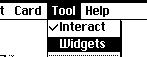
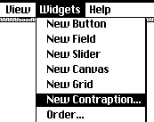
To set a widget to "none" visibility you can do it in code or with the menu while you're editing.
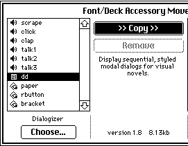
While Editing you deck: Select a widget and use the menu [ Widgets > Show None ]
And in code, this sets the visibility of a widget:
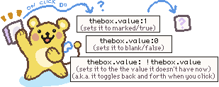
widgetname.show:"none"
To make it visible again you would need to set it's show attribute to one of the other visibilities, so this...
widgetname.show:"solid"
...would set it back to the default visibility it had when you made it. (Other options: "transparent" and "invert")
Just a thought, but if you only need to track the progress on one card for now and you don't need to check back on it later you could just make things appear one by one in the button scripts.
For example, here's a simple example script for a button that sets some text in a field then makes the next button visible:
on click do
myname.text:"Pyrefly Studio"
favefoodbutton.show:"solid"
end
and then script in the next button (favefoodbutton, which just became visible) could be something like
on click do
favefood.text:"Blueberry Ice Cream"
coolfactbutton.show:"solid"
end
etc, etc. These widget names (fields: myname, favefood / buttons: favefoodbutton, coolfactbutton) are made up, of course, so you'll want to make any names match the widgets that actually exist.
But I hope this helps you get started changing widget visibility and setting the text of a field using scripts.