Play game
Into the swarm's itch.io pageResults
| Criteria | Rank | Score* | Raw Score |
| Graphics/Animation | #175 | 3.000 | 3.000 |
| Technical Implementation | #199 | 2.583 | 2.583 |
| Music/Sound | #200 | 2.583 | 2.583 |
| Fun/Design | #209 | 2.667 | 2.667 |
| Overall | #219 | 2.617 | 2.617 |
| Theme/Limitation | #276 | 2.250 | 2.250 |
Ranked from 12 ratings. Score is adjusted from raw score by the median number of ratings per game in the jam.
How does your game apply the limitation (and optionally, the theme)?
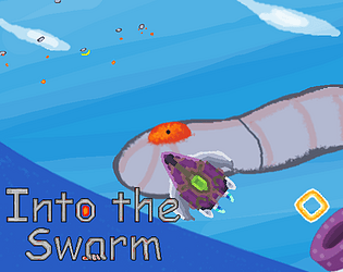
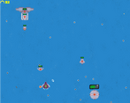
The term "boss" I saw them as a hierarchy (from the lowest and highest, the highest being the boss), and straight to me about a swarm that got out of control by the boss and you go out to replace it. You, as the one who controls the shooter who separates from you, have to control 2 different things at the same time, like a management chain, and the shooter has to protect the boss, which is you from the swarm (and that's the name of the game). The only problem is that the shooter is at the edge of the screen (on the edge) and can not be moved back or forth, so you have to control 2 things: the player, called B.O.C.C (Bionic Operational Control Center) with the keys and the shooter, with the mouse. And around this I tried as much as possible to build around the theme [for example the snakes are too strong and are like bosses]. One swarm acts like a boss stage, which is my attempt to move the subject.
Team Size
What main engine/tool/language did you use to construct the game?
Godot
Which diversifiers did you use, if any?
endless, i think
Leave a comment
Log in with itch.io to leave a comment.


Comments
GG!!!!!!!!!!
Some feedback:
Well done, especially for a first game ! (°-°)//””
Thanks so much for the review!
Right off the bat, immediately appreciate the option to switch to having both the player and method of attacking move as one. The default control scheme would definitely be better for dodging and more accurate attacks, but it also really screws with my head, so thank you for the option. The music is neat, though a bit much for me. Graphically, everything is nice and readable except for the blue bullets and green triangles. They're not the easiest thing to see on the background. Overall though, really cool concept and game. It's just a shame I can't process it
This is very smart!
Rather than just one thing to concentrate on, the player now has two! I would have appreceated it if it was possible to control via WASD but that's really the only criticism I have.
The music's good as well and the graphics are brathering.
It was originally WASD, but for some reason, HTML5 disrupted it so badly it didn't work here at all, so the pressure switch was out of choice an hour before closing (and it worked fine before)
I like the pixel art of this game! I'm a bit annoyed by the controls tho, combining mouse click + arrows + space bar is too complex for me to enjoy it.
Music is a bit too loud too in my opinion.
Congrats for publishing it!
fun game very simplisitc good game all together good job
I love the variety of enemies and the effects. I have to say controlling both is pretty crazy but overall I thought it was well done!
You added music which is nice. You also put work into the page. Sadly I could not wrap my head around the controlls. The fact that you are required to use the mouse, arrows and space makes it hard to be efficient : P
The arrows were supposed to be WASD originally, but unfortunately, something particularly strange happened during the last tests that HTML5 decided to completely turn off the W hours before the deadline and no matter what I did, it did not help anything, but what makes it weirder is that the same code falls on The arrows and it worked great (it's just one simple sentence), so I had to turn off the WASD completely. I have no choice and it pretty much ruined the game. In retrospect, this may not be the best idea.
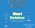
Jo! :D This game is the lord of all mindfucks. But i enjoyed it! Never saw a spaceinvaderlike that way. And it realy brings a new lv to the gameplay. It was a little (super) to hard for me, but thats just a question of balancing. I liked the animations and the feedback seems super fitting for that game. The startscreen is a little overloaded for the size of the game. increase the canvas and it`s fine. Overall: Very nice entry and the first of it`s kind for me :)