Play game
The Blood Region's itch.io pageResults
| Criteria | Rank | Score* | Raw Score |
| Story | #35 | 2.667 | 2.667 |
| Enjoyment (Best Game) | #45 | 2.833 | 2.833 |
| Aesthetics | #67 | 2.889 | 2.889 |
| Horror | #80 | 2.222 | 2.222 |
| Sound Design | #86 | 2.222 | 2.222 |
Ranked from 18 ratings. Score is adjusted from raw score by the median number of ratings per game in the jam.
Leave a comment
Log in with itch.io to leave a comment.


Comments
Interesting concept! The Barnster died really early and often.
Iron lung really was an inspiration for this one, hey?
It's overall a good game, every mechanics is polished so it's pleasing to play, however there's very few horror elements to it.
It really was. I played Iron Lung just a week prior to the jam :D And yes, I wasn't able to implement a lot of the horror stuff that I wanted. All my efforts went to making sure the systems were all working, and before I knew it, time was up! Lol
Cool!
I liked the general atmosphere of the level. The vast space could use some fillers, but other than that, fun entry! :)
Liked the setting and atmosphere on this. The interfaces are designed well. Would be nice to expand this further in the future!
I thought the gun was some kind of stun gun at first just because of the SFX and the low damage. Also, the text at the beginning went by a little fast. It should probably also not play every time I retry. I know it said press any key to continue but that didn't work; I assume since it automatically went away that you had some issue and made a last minute mend.
You placed loot past a lot of enemy crowds, I assume because it was meant to be replenishment for the player after using up their resources but for me I was already out and had to run past the enemies to get the ammo before turning around to fight them.
You can kind of just run past the blood pools. I wonder if maybe making the enemies drop loot would better encourage fighting them. Like a risk vs. reward thing. Also, there was some kind of bug with the aiming where my character will just stop responding to my look input sometimes for a tiny amount time.
The level, while a little bland, was still aesthetically pleasing. I like having to knife them when I'm low on ammo. Overall a pretty cool game.
You're totally right, that was a last minute mend. The opening screen had an issue where Unity's new input system refused to cooperate with the webgl build so you couldn't press anything at all! I had to remove the script that handled that :( Thank you for playing and for the feedback. I agree with all the points you raised.
This was cool. I didn't read the instructions fully in the beginning and I just ran to a big red spot thinking there was something I had to pick up there and then I got ambushed lol. Second try I read everything and I managed to get on. But I ran out of ammo so fast :O. Cool game map was a little big or I was a little slow. Would like to move faster. But maybe that would take away from the horror aspect a bit.
Cool atmosphere and story. The resources were well spaced out and I had to use the knife sometimes when i ran out of ammo which made for a tense moment. The map could use some more filler as it is quite large and empty. Nice entry!
I very fine entry for this jam! Liked the ambient, the music and the idea!
I agree with the other comments, the knife needs a little work, the map is a little empty and I didn't know I was in a lift at the beginning. Even so, for only a week of work, I only can say "Good work!". Please, expand it, and you will have a very fine game in your hands. Congratulations!
It took me a while to realize that at the beginning of the game I was in an elevator. I couldn’t move, and I thought that the game was broken :D. Nice design, especially the gun and knive.
I unfortunately died on the win screen. Regardless, I didn't find the map size to be annoying. Fun game!
Hey, I like color palette and style.
I agree that map is too big and weapon sounds feel a little uncomfortable
But that is a great foundation for cool game
I enjoyed this quite a bit, but I have some caveats.
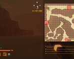
- The map is just too big for what the gameplay loop is. Leads to a lot of empty, pointless wandering that really is only broken up by the pools, which... well, are frustrating.
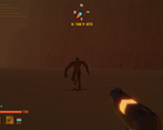
- My biggest gripe is with the knife. It is supposed to be a last resort, but the complete lack of solid feedback on it (including the weird buzz and electronic noise happening on misses as well as hits) leads to the weapon feeling pretty bad to use.
- It's a personal thing so take this with a grain of salt but the chromatic aberration gets really rough on the eyes after a bit ;;
Overall though, I did really enjoy this, and it's clear to see you have a good grasp of what makes a first person shooter feel good, especially if you can pull this off in a week. Nice job!
I appreciate the honest feedback :D And I agree with all points that need to be improved. The knife especially requires tuning. Lack of time forced me to release it as is :( And the map originally was going to have more stuff to do like destroy the actual pools using explosives you collect and a teleport system. It ended up being mostly empty though since I did level designing last and ran out of time. Thanks for playing, I'll keep your feedback in mind when I improve the game :D