Play game
Stand Behind the Chair's itch.io pageResults
| Criteria | Rank | Score* | Raw Score |
| Feel | #28 | 4.200 | 4.200 |
| Aesthetics | #104 | 4.100 | 4.100 |
| Overall | #127 | 3.700 | 3.700 |
| Innovation | #236 | 3.200 | 3.200 |
| Theme | #355 | 2.800 | 2.800 |
Ranked from 10 ratings. Score is adjusted from raw score by the median number of ratings per game in the jam.
How does your submission match the theme?
=== WARNING - HEAVY DUTY SPOILERS BELOW, I STRONGLY SUGGEST PLAYING BEFORE READING ===
The game does not focus on multiple purpose _mechanics_ but rather multiple purposes and ambiguity in different areas of game _design_ like character development, plot and level design.
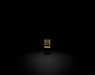
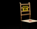
Because of the very limited, yet still vague and misleading, exposition throughout the game, the chair - despite being the only actual object within it - plays multiple roles in the game world. At times it seems like it's tied to the protagonist, another person, an event, at other times - to a painful memory. Sometimes it seems to be the villain of the story or a represantation thereof, at other times it seems more connected to the protagonist (or is it the protagonist itself?) and it feels soothing to finally see it intact. Maybe it's an allegory, maybe it's not, maybe it doesn't even matter.
Other than that, the title is also the objective at every stage of the game - the only one you need to progress, contributing to the overall minimalism in gameplay.
Third-party resources
Engine: Unreal Engine 4
Graphics: paint.net
Audio: Audacity
Assets from outside sources:
a) Graphical assets:
- postcard clipart (CC0, https://openclipart.org/detail/267431/postcard-airmail-with-stamp)
- blood decal clipart (CC0, https://openclipart.org/detail/192066/blood)
- pattern wallpaper image (CC0, https://pixabay.com/pl/wz%C3%B3r-t%C5%82a-linie-paski-%C5%BC%C3%B3%C5%82ty-tapety-1604717/)
- Wooden Chair model (CC0, https://etechstudios.itch.io/assets-woodchair)
- Wood Oak, Glass, Ground Gravel materials, Fire particle system (UE4 Standard Assets, https://www.unrealengine.com/eula)
b) Sounds:
- "Bluezone Abyss", "Bluezone Dspace", "WI- Log thrown on wood bunch", "Just Whoosh", "HumBuzz_Buzz" audio clips (from the Sonniss Game Audio Monthly packs, http://www.sonniss.com/gameaudiomonthly/)
- "Rain_Light", "roll_over_01", "wood_large_shatter_01", "roll_over_01", "roll_over_03", "confirm_01", "cancel_01", "cancel_03" audio clips (from the Madison Pike Audio Kit Asset Pack, acquired from a Humble Bundle, https://pastebin.com/Jc4YAeGt)
Contributors
Kacper Ciepielewski
Leave a comment
Log in with itch.io to leave a comment.


Comments
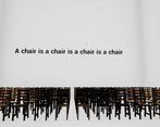
Whoa, after finishing the demo, I thought, how does this approach dual purpose? I like seeing games that approach it in a more thematic/narrative/rule/system kind of way since I thought of it in a more mechanical/input sense. It definitely was creepy and comical at the same time haha. The chair makes sense as it evokes the sense of a human popping up somewhere or the chair being sentient and maybe, potentially taking revenge (because of the wood arm and chair messages). Anything can be read from it. Took me some minutes to figure out how to trigger the next moment but I got it. And I really like how the end has [Spoilers for anyone else potentially reading]
2 chairs back to back to further indicate that you've reached the end, as you cannot go behind any of those chairs. Mixing this with some mechanical dual purpose, like the zoom in triggering certain things might make this fulfill the theme to the max!
Thank you! :) The zoom fulfilling a double purpose is a cool idea - for this project, though, I decided to stay away from mechanical multi-purposeness as it tends to be the most in-your-face one (not saying it's a bad thing - in many cases it may be exactly what you want!) and, the thematic ambiguitiy in this game being a bit in the background as it is, I feared it may completely steal the focus off of it, resulting in the game being locked in the "yeah, that game where the zoom also does X" shelf, without diving too much deeper. Glad you liked it, thanks for playing! :)
Pretty atmospheric and moody stuff. Unthinkable how much story you could fit into a game about chairs! Short and sweet although I'm not sure how it fits the theme (even after the explanation above). Nice artsy feels, like I explored a museum of sorts.
Thank you, glad you liked it! :)
Unfortunately I haven't been able to play it (UE gives me a fatal error), so I'm very glad you put a walkthrough! It's a really great experience of minimalist and abstract story-telling. I enjoyed how it succeeds to express a lot of ideas and emotions while showing so little. With its pretty neat sense of presentation, it's like wandering through settings in a museum.
Thank you very very much for the kind words! :)
Really weird, really good. Only why is it 391MB? :)
Thank you! :) Yep, the file size surely is on the heavy side which is caused by tons on Unreal Engine starter content that gets packaged but isn't used anywhere in the game (like textures/materials of various rocks, grass, metals, what have you). Normally, you trim down the size by deleting all the unused stuff by hand before packaging (as there isn't really an easy, automated way to remove all the unused assets :() but because of time constraints, I had to made a decision of either adding more stuff to the game or spending that time on size reduction. I wanted to make the game as good as I could in the tight timeframe so I went for the former but I absolutely agree that it is a lot, for which I'm sorry ;)
Although I don't think it quite fits the theme of mechanics serving dual purposes (though the chair certainly symbolizes a lot, I don't think that's really a mechanic), I have to say that I LOVED this. I got a Stanley Parable sort of feel somehow, and it felt really creepy but enticing, like a horror game. I am sooo glad you didn't include any kind of jump scare, I hate those haha - nice concept, well done! :)
Thank you very very much for your feedback, I'm very glad you liked it! Don't like jumpscares either, I feel like they're the lazy way to create cheap thrills and so I avoid them at all cost :) As for the theme, I went for a slightly different approach to it since it was Dual Purpose Design and not mechanics specifically - thus, I decided to focus on other elements of design, such as the plot, character (or rather - chair ;)) development or level design, leading to the general ambiguity. Thank you very much again :)
WTF was that ! Don't really know if it fits the theme but was nicely done, was cool to play !