Play game
Dice Out's itch.io pageResults
| Criteria | Rank | Score* | Raw Score |
| Presentation | #339 | 4.135 | 4.135 |
| Overall | #1183 | 3.362 | 3.362 |
| Enjoyment | #1574 | 3.043 | 3.043 |
| Creativity | #2629 | 2.908 | 2.908 |
Ranked from 141 ratings. Score is adjusted from raw score by the median number of ratings per game in the jam.
How does your game fit the theme?
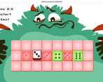
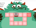
You play as a dice
Did your team create the vast majority of the art during the 48 hours?
Yes
We created the vast majority of the art during the game jam
Did your team create the vast majority of the music during the 48 hours?
No
We used pre-existing audio
Leave a comment
Log in with itch.io to leave a comment.


Comments
Hah- awesome presentation and nice twist on the concept :)
I could have done with a dice-side-guide (this jam has taught me that I just cannot remember the sides of a dice!), but without a move limit this wasn’t too much of a problem :D
I liked not having a turn limit! Would just like to have a guide for the other sides of the dice
I'm really grateful you didn't add a turn limit, made the game significantly less stressful!
This is a fun challenge, I managed to finish all the levels, and now my brain is hurt haha
But seriously, this looks very polished, the dice mechanic is implemented well, and the presentation is so slick. I also love the multiple floors you have to land your dice on, very nice touch. Maybe limit the number of roll a bit so players dont roll randomly to solve the level. Other than that, excellent job!
this was a fun little puzzler!
I'd be interested in a grading system for "number of moves to complete each level", because if felt like I flopped about randomly a lot, with no encouragement to actually strategize.
Fun little dice roll puzzle with a really cute aesthetic. Really like the visual style and that's what sets this experience apart from the other dice roll puzzles in this jam.
The game reminds me a lot of old flash games, especially the intro. The puzzles are really well designed! A bit of a shame how many games this year have pretty much the exact same concept.
The visuals are great, and the puzzles are much more achievable than several other similar games.
Great work overall, good job!
The visuals add a lot of charm. Some other puzzle games in the jam have had similar gameplay, but the art and story help this stand out.
Would help if we could see the sides of the die.
Still, very polished execution! Your team should be proud.
Nice game. Amazing graphics. Please check out my game.
Great, simple game. I love the animations and the music. Not too hard to beat all levels. Very fun with all the effects and sounds :)
I don’t why, but I couldn’t launch it((0( After launching the game, an error pops up… What a pity!
Windows build was reported broken. Have you tried HTML5 version (in-browser)?
This is a great game with an unfortunate flaw - a lack of an indicator of where all the faces are. Without it, the game is a bit frustrating... but otherwise, this game is great. It has charm in its details, be it the little dust cloud the die leaves when moves, be it the monster's eye always pointing towards where the die currently sits. Nice entry.
It's a fun puzzle game, with its own identity =)
A lot of games went with this gameplay, but yours has a little story instead of a blank die on a blank board, so it stands out from the crowd thanks to this!
I really liked Gnargle follow the die in the background, and the plucked string victory sound ^^
Good submission! =)
Very relaxing and enjoyable game. I had fun with the puzzles. Good job
I loved the game and the art was amazing!
Super cute. I love the butt wiggle in the beginning! I wish Gnargle made sounds as well. Game was great fun. Very similar to the style of our game.
First off, the windows build didn't work for me (HTML5 was fine), something about a PCK file?
I had fun playing it! It was a weird juxtaposition between the fantastic mid-century modern look of Gnargle and the title screen, and then the pixel text of the UI? It sounded lovely though!
Nice game!
Ooops, I never actually tried Windows — I only have Mac, but I hoped Godot would do the right thing. Glad I uploaded HTML5, hopefully most people would play that. You are also absolutely right about pixel font — we started from pixel art but then decided against it. Having enough time, we would certainly change the font and probably level select screen
Super cool style -- love the aesthetic and having Gnargle watch your every move definitely added to the fun. Not being able to see adjacent faces of the die made it more challenging to solve some of the later levels, I usually find myself kinda guessing until it eventually works which seems to be common for this kind of puzzle. Maybe introducing a sort of "par" system would encourage players to solve each level with as few moves as possible. Overall a really polished game that was fun to play, nice work!
Indeed our game is quite similar! I really loved the art, animations and the story! The puzzles are real solid and a real joy to play! Seeing Gnargle twerk was real eye candy :-). For people who don't really know their dice, it would have been cool to have the option to preview the other sides of the die, but I guess this is part of the challenge! It is a lovely game about constipation... oh I mean "Roll of the dice" :-) Really awesome work!