Play game
TINY LITTLE LIGHTS's itch.io pageResults
| Criteria | Rank | Score* | Raw Score |
| Graphics | #103 | 4.125 | 4.125 |
| Overall | #261 | 3.526 | 3.526 |
| Innovation | #290 | 3.484 | 3.484 |
| Audio | #331 | 3.313 | 3.313 |
| Theme | #381 | 3.625 | 3.625 |
| Game Design | #390 | 3.453 | 3.453 |
| Fun | #601 | 3.156 | 3.156 |
Ranked from 64 ratings. Score is adjusted from raw score by the median number of ratings per game in the jam.
In what way does your game fit the theme?
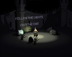
Stronger together - You are a little soul who needs the help of the other losts souls to escape the darkness by lighting the way out. More souls equals more light (to avoid falling our touching the obstacles). This is a game about companionship and kindness. 'Will the light of your soul be enough to light your way out of the abyss?'
Did you write all the code yourself and made all the assets from scratch?
Original music, art and game mechanics were all made from scratch for this game jam!
We used and idle and a walking cycle from mixamo, plus some fonts from DaFont!
Leave a comment
Log in with itch.io to leave a comment.



Comments
Oh my god! Can't belive this is a jam game... I love it from grafics over music to atmosphere! It's just amazing.
I need to stop playing to rate the game (clearly 5/5) but I want to play again... great job!
This is graphically amazing, that low-poly 3D pixelated look works amazingly well, and does help a lot to the mysterious atmosphere of the game, now I want to play a whole game with those visuals! Also, when I realized I could make my little friends follow me or stop, I was immeditely reminded of some of my favourite games, the Oddworld series for the PS1. I did feel like I didnt need to use those orders that much, tho.
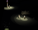
Judging by the other comments, I feel like you're probably already aware of what the main issue of the game is: when traversing the world, falling off is just too hard to avoid right now, mainly because is really hard to distinguish between the floor and the void. Maybe a subtle color change, or even just changing the constrast between colors a little bit, could fix this. I'm confident solving this little thing can make your game a rather enjoyable experience and remove some of the frustration.
With all that said, this is still and amazing entry, with gorgeous visuals and very nice idea, great job!
Oh wow! Thank you so much! We def put our hearts and souls onto the graphics! Mostly because I wanted to try this 3D pixelated effect, this was my first time trying that way of rendering cameras, so it really means a lot that the graphics were the thing that worked perfectly!
And just reading that you would play more games like that... it inspires and motivates me to keep trying more games! Because I do have more ideas and art styles to try with this 3d Pixelated effect, thank you so much for that <3
And yes! I've read all the comments and Im already working on fixing a lot of things! The map and light especially, I actually read a lot of good ideas to implement! so Im excited to try all of those! A color change for the map would work too! Overall the map needs a good polish.
To be honest, I do like to frustrate my players a bit lmao, of course not to the point to make everyone mad, now I know that I still have to learn how to make games balanced between frustration and fun :) its all about the user experience after all!
Thank you so much for your feedback <3 for playing the game and for your kind words :')
This really means and helps a lot!
I like the art style. I fell off a lot because I couldn't see the holes until it was too late and sometimes my followers would walk into a hole if they were too far behind me and I went around a corner, maybe you need to implement some pathfinding.
Thank you so much for playing!!
Yes! The game was meant to be hard, but not that _hard_
We are working on fixing a lot of things, thank you so much for playing and for your comment :) <3
First of all: The atmosphere of the game is awesome! The Sound is really good. The art is really nice, too.
I like this approach on the theme. fits very well.
The core mechanic of the maze is a nice concept and fits the game but could be polished a bit more, as mentioned before. It is sometime really hard to see where the ground is and where the holes are. Even with more lights near the player.
Great Work after all! Thanks for sharing.
Thank you so much :D
We are working on the lights and the map! Hopefully the experience will improve!
Thank you so much for playing and for your feedback <3
The game was very hard. A good use of the theme, but the difficulty could be lowered a bit. I found myself getting more mad then having fun. Besides all of that I like this game. With some work this game could be a lot better.
Thanks for playing!
I do wish I had more time to test it, but the game was made for a game jam afterall and time is not always our best ally hahah
Im already working on making it a better experience cuz we want to release it on a bigger platform, like steam :)
And again, thank you so much for playing and for the comment <3
I really have trouble to see were I go... It sad because the art and the ambience are great.
Oop, sorry to hear that! Thanks for the comment :)
Your game is awesome! I really like Art, Sounds, Game design. Good job!
:'D thanks so much! YOU are awesome!
Realy eary setup, you feel with the player, it fellt imersive!
Thank you so much!!! c:
Wow !! Such a cute game ... I like it a lot , especially the graphics ... Well done bro !
Thank you so much!! C:
Show post...
NICE ONE
Wow!! Thanks for the playthrough:'D and thank you so much for playing <3 It really means a lot <3
please rate ours too
cool game
Thank you!!! <3
Ohh this looks really cool! The graphics are amazing <3
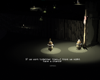
I really like how every soul had their own dialogue and having them all follow you was really cute~
Thought my biggest complaint was that it was really hard to see... Even if I recruited like 4 souls I still had problems seeing so they didn't really help me with lighting the way :( Also when a soul was talking to me I had no idea who's saying which line...
But I loved the graphics + music, those were amazing
Thank you so much :D Im gonna change a bit the part of the lights, instead of just increasing intensity, Im gonna increase range. Also the map could do some polish! No more troublesome edges!
I haven't considered that about the dialogues, you know! Thanks for the idea, maybe some color labels that match the souls texture?
Thank you so much for playing and for the feedback! :)
The visuals are fabulous, have never seen anything like that before. Who are those creatures we play as?
Thank you so much!! that means a lot :')
They can mean a lot of things! But, in the game those are lost souls! They are trapped in this limbo-like place, where the exit is only reacheable if you have a light!
For me tho, they can also represent someone that feels in a dark place in their life and the only thing they need is a bit more light to know they are not alone <3
Can't play it... It was built for 64bit, mine is 32bit ;-;
Oh no D: do you have a discord? I can send you a 32 built if you want :D
I do! Seyblai #1864. If you can send me, I would really appreciate it!
Fun adventure with some cute characters!
I don't know if its the brightness of my screen (I put it to max brightness) though it was still hard to see the edges if I would fall of a cliff or not. I think it makes sense for the theme of the game of "lighting your path," though wondering if the graphics could be tweaked (maybe the platforms)? I ended up falling & dying from the same places quite a lot (I could be playing it poorly too haha).
Nonetheless, a fun adventure. <3
Thank you so much for playing! Im gonna add a gamma slider so the visibility can be adjusted, hopefully this will make it easier to see those troublemaker edges!
Thanks for this positive feedback :D <3
Thanks again for sharing, and hope you continue growing & developing your great game! <3
Unfortunately, I killed them all in front of the door. I still picked YES.
I really enjoy the vibe of the game. Especially the mystery music fit the game quite well.
RIP to those guys! lmao dont worry! I will make it more user friendly and easier to navigate :)
And thank you so much for playing!<3 Our sound designer really did a great job!
amazing game, i really like this pixel 3d look keep it up!
Thank you so much! We are def not done exploiting the 3D pixelated effet!
Good concept it fits perfectly with the theme and it was pretty fun to play, it had a few problems but with a bit more work it can be really good, I think the light system could work better if when you get more people the light range also increased and if you fall to the spikes make them either stop completely where they were or make a better pathfinding i found myself watching all of the little guys falling to their death while trying to go back to the spawn after I died, but really good concept and execution, great job.
Thats a nice idea! instead of just increasing intensity, range could work better. And also yes! I need to check the spawner points of those guys! I hope it wasnt too frustrating!
Thank you so much for playing and for this feedback :) it means a lot!
I really like the graphics.
Thank you!! :D I like yours as well!