Play game
ToukAerb's itch.io pageResults
| Criteria | Rank | Score* | Raw Score |
| Graphics | #72 | 4.247 | 4.247 |
| Audio | #134 | 3.688 | 3.688 |
| Overall | #253 | 3.558 | 3.558 |
| Fun | #327 | 3.468 | 3.468 |
| Game Design | #331 | 3.532 | 3.532 |
| Innovation | #452 | 3.286 | 3.286 |
| Theme | #703 | 3.130 | 3.130 |
Ranked from 77 ratings. Score is adjusted from raw score by the median number of ratings per game in the jam.
In what way does your game fit the theme?
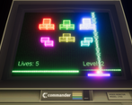
I took the mechanic of the old arcade classic breakout and turned it backwards, blocks are built up instead of broken down. The playfield is rewound ^.^
Did you write most of the code yourself and made all the assets from scratch?
With the exception of the monitor frame and music all the assets and code are indeed created by myself. Credit to these assets is given in the description.
Leave a comment
Log in with itch.io to leave a comment.


Comments
Great game sadly the ball sometimes glitched throught the block. Also in level 3 there was one last square that I couldn't hit for some reason.the second time I played it this wasn't the case.
Thank you!
Ah yes, level 3 has an issue where blocks do not activate their collider properly and need to be entered and exited by the ball in a specific way to actually activate their collider. That sadly slipped through and makes certain shots in that level very frustrating.
Reversed breakout is so damn fun, and the coooool music and visual effect make this game even better.
Aww thank you, I'm glad you enjoyed it! And likewise for yours, your concept blew my mind, just awesome xP
I like it! The idea was implemented very well. Graphics and sounds fit the theme, too. And the most important thing: It was very entertaining :D
Thank you, I'm glad you liked it! :D
Beautiful, also commander haha love it. I like how you took a well known concept and flipped it on its head. Would like to see some other mechanics added, power ups maybe a sound blast to fill in blocks next to the vertical line to give it a reason to be there.
For the commander name I gotta give credit to the asset creator in the app store as the frame was not done by myself. Powerups were planned but didn't make it (yet ^^) And you gave me a good idea for how to honor the wiggly line without completely having to cut it, thank you! :D
Really fun game, the music is incredible! I found the post-processing effects a little excessive though.
I had a little too much fun with the bloom settings, I admit that xD
Thanks for playing and thank you for your feedpack. Really appreciate it
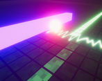
Wow, doing things this way feels a lot tougher than classic Breakout! The look of the game is spot-on, and the audio definitely matches the look. I had a good time playing. The vfx were overall positive, but I personally found the vertical oscillating beam coming out of the paddle to be a bit distracting at times; looks cool, just a bit intense.
Yes. I must say that it's actually really playing into my hands that the difficulty goes up towards the end of a level just natureally due to the mechanic. The squiggle line needs tweaking xP Thank you very much!
Very solid aesthetic that gives vibes of Pac-Man CE. My only suggestion would be some sort of audio-visual indicator for each level you beat, similar to what that does, as well as a restart button.
I really wanted that but ran out of time. That is why the level transition is so simple. Imagine explosions and cyber-glowy-pixels fly everywhere xD
Thank you for playing and your feedback!
The Graphics and aesthetics are pretty amazing. And the pretty clever. Well done.
Thank you very much, I just played yours and love the idea too. :D
Nice concept, but dump the vertical line, dump the scan line and offer a volume or mute for the music. All three combined were making it hard to enjoy what is otherwise a pretty interesting idea and mechanic.
Thank you for your feedback. The vertical line is indeed an issue but getting rid of all the effects would defeat the purpose I was going for as to introduce distracting factors to make it more challenging. Volume controls are needed, just didn't make the cut anymore xP
This game is sick, graphics are top tier, mechanic is unique, and the aesthetic of the whole thing is amazing, great job. I especially loved the pixel draw line that went down the screen. I think something that could make this possibly better would be changing graphics or power ups. things to mix it up a little after the start.
Powerups were planned but had to be scrapped sadly. I'm glad you liked it. There are also other ideas for level design such as moving objects and the like to mix it up. I will certainly continue on this and see where it'll go ^^
Pretty fun trying to put the ball in the hole rather than hitting a small brick. Nice job!
Thank you, I'm glad you liked it!
Really cool idea. Graphics are both really cool, but can be obnoxious especially the squiggly line going from the paddle constantly. It does sadly seem to be missing that same satisfaction of breakout where you destroy all the blocks. Great job for a week!
I agree and the playtesters agree too. The squiggly line needs a different style.
And it needs some big event on level completion to reward the player. Thank you for playing and feedback! :D
Super Cool Game!
Hey there, thank you! :D
Definitely a good take on the theme that I haven't seen before. The graphics are cool too. Although I'd say the graphics are the biggest hurdle holding this back. The lights feel way too bright for the ball and the center indicator and horizontal flashing line can be distracting.
Hey there, thank you for trying it and I'm glad you liked it. With the graphics, I had so much fun seeing that I could that I didn't stop to think if I should xD
Loved the way you combined the old classic and rewind to a new and interesting game. The green light for indicating mouse position sometimes made it hard to see otherwise it was really fun to play :).
Ah yes, the oscilloscope line. I never got it to look just right. I'm glad you loved it! :D
Very nice take on the theme!
But please, remove that vertical line, the only thing it does is hide the ball and bricks.
PS: Free lives for the win!
Some form of indication needs to be on screen but I agree with you as it's too agressive. I'm glad you liked it! :D
PS: You found the easy mode xP
I think the game was very fun and consistent, although it is very easy to make endless loops up and down that never end, so we need to end up sacrificing a life for it! But overall it's a really cool game! Great job!
Did you try to move the paddle to get out of it when the ball returns or do you mean loops where the ball never returns? If it's the latter then I got good news for you: if the ball gets stuck and won't return for 32 collisions it's just stuck back to your paddle without any penalty. It was my quick and dirty fix to avoid deadlocks. xP Thanks, I'm glad you liked it! :)
Good unbreakout clone. not a fan of the "play the game backwards" to incorporate "rewind" into the game.
I was hoping to also put it into the graphics and audio more but just ran out of time. The concept asked for backwards sounds, animation and particle effects as well. I might be adding that in the future. I had the same criticism with myself that, as of now, it could have more "rewindy" elements. ^^
I like how you've fit this to the theme. Very nice looking game. Only criticism is when there are a lot of flashing lights around the paddle it can make the ball a little hard to see. Great work!
Thank you very much! I was carried away with the flashy fanciness of the whole electron beam thing, I think I overdid some of them xD
Extremely clever concept, game looks nice and feels fun to play!
Hey there, thanks a lot for your feedback, I appreciate it! :D