Not a fan of the artistic direction but it's a matter of taste, it looks polished. Reminds me of the end levels in Ecco the Dolphin. Feels slick to play. I would have liked some more playthrough before that first boss/big dude but it was still manageable.
Play game
Sipho's itch.io pageComments
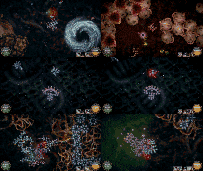
Reminds me of the spore game. A ton of fun with good ways to express your creativity in your little germ killing machine.
Ran into the same issue as korpiroot.
Put your files into a folder and .zip that, not the files themselves. Every fucking demo. First menu leaves good impressions, lack of sound is very obvious though. The options menu doesn't appear evenly spaced. Unless the game is entirely mouse controlled, which it isn't, let me press Escape to go back in menus. Transitions between types are too slow, use 0.3s. First time entering the building mode bombards me with loads of types and their descriptions, my memory is shit, which makes me forget all of them, it's much easier when they're introduced, and used, one by one. On hover text stands out from UI in an inconsistent way. I forgot what I pressed to enter the growth mode, indicator for that at least initially would be helpful to keep. Don't tell me how to do things in growth mode without being in it or needing to do it, I'll forget within 10s. I would be helpful to see my orientation when building. I'd prefer relative movement to absolute as a default. Escape doesn't bring up the menu. Space is a bad choice for growth menu, I keep using it in an attemp to use boost and there's no rebinding. The MENU button makes it feel way more like a cheap mobile game. Death screen is very basic.
Seems like a 90% complete title in terms of polish. I'd keep playing if it was maybe 50% faster (make the game speed an option?). You'll do fine.
The game's starting to look and feel really polished. Nice work. I like how you've changed the eating, it's a lot less of a chore now.
One issue I ran into was a nearby enemy regenerating parts managed to get tangled into me, and the only way to fix the mess was to use the growth mode to move my parts. You should probably be a bit more strict with when and where parts can be regrown.
Hey, thanks for playing!
I'm glad to hear we're headed the right direction. Our hopes the eating change did not trivialize Zooid placement too much.
I'll take a note of this mangling up issue, this should be fixed.
Could you answer a few questions:
- How many times did you play this game before?
- How long this session was?
- When did you decided to stop playing this session?
- After eating change, how do you think Zooid placement matters compared to other factors like skill/movement actions, actual decisions on Zooid types/breeds?
Nice to see a returning player. Thanks again!
- I think this is the 4th time, I started following the game after the first native Linux builds, 0.62 in DD19 I think? Pretty sure I was the one to request the port back then.
- About 1 hour maybe, I wanted to clear the game but died a few times at first and then got almost killed at a boss and had to use some cheesy strats to beat it, which took some time.
- After clearing the game, as in getting to the sandbox level at the end. Will probably play a bit more later to unlock at least one of the other breeds, as they seem to be locked again.
- I think there's more freedom in the creature design now. Before the change I was usually placing that one obligatory eater somewhere safe, usually the rear, and ignoring the skills they provided in fights, as losing the eater would often result in a situation where you'd need to break down your creature (usually mid-combat) just to be able to eat again. With the new changes you're free to place them wherever you want, or where you need those special defensive skills they provide, like protecting your melee combat zooids with electricity and such. Overall it's a positive change, though the eating part feels like a secondary function now, so the name "eater" feels now a bit misleading maybe.
Hi,
Could you contact us through one of these sites:
https://twitter.com/sipho_game
Dominas#6068 on Discord
Or by email: sipho@allpartsconnected.com
Itch doesn't have private message functionality, so that's why I'm writing here.
A neat, pretty highly polished, little craft/survive game. It's pretty slick and it looks like you're more or less geared up to go - just needs a little more sound design packed in.
Additionally, if you color blended the creatures to match the tones of the environment they're in, it'll look that much more polished.
Controls well, plays well, has challenging combat, and reminds me of Warning Forever in a lot of ways. I've nothing but praise and positive suggestions. I'm looking forward to seeing this project being sold en masse and will be following it to track its progress to that ends.
Very nice work!
Hey, thanks for playing our game and your kind words!
Yeah, the game is pretty mute at some parts. We are planning to fix this by add missing skill sounds, main theme music, player hurt sound and that bubble-rumble boss spawn sound you can hear in your head. There's more on the list, but those we think are more important.
We are currently using post processing (in standalone builds) to add some color-shifted-tonemapping to different environments. Sea is a bit blue, Plants are greenish, Body is red and I can't remember Alien one, its look is to be designed. If we'd do another pass on Zooid shading, this could be a nice thing to add. Mask the blend out only for certain areas for Zooids, or simply gradient edges. I'll take a note of this, thanks.
I haven't heard of Warning Forever before. The idea of enemy adjusting its shape to players playstyle sounds neat. This could be interesting vector for boss design or procedural part of regular enemy growth. I'll take a note of this too.
Could you answer a few quick questions: How much time did you play? When did you decide to stop playing? How many playthroughs did you have?
If you have any more comments or critique don't hesitate to spill them out. Thanks again for your review!



Leave a comment
Log in with itch.io to leave a comment.