Oh wow people playing my half broken jam project. I’m happy you enjoyed it though!
A member registered May 29, 2023 · View creator page →
Creator of
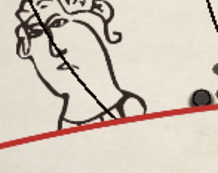
An atmospheric almost-interactive fiction grimdark character creation game.
Interactive Fiction
Play in browser
Pack textures into image color channels optimally in your browser
Run in browser
12 pixel font. Alien robot cowboys.
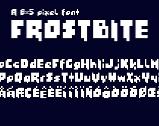
5x8 pixel font. Cool vibes.