

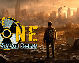
Sorry, that I missed this during the jam but... holy fxxx. This is such a great game! Super addictive, so polish... I had to see all content and even though, I still wanted to continue playing. AMAZING! Everything in it is just great, and fit perfectly to elevate the core experience, which is already very solid.. Best game of the ones I tried by far! Congratulations and 200% deserved the rating.
A member registered Sep 26, 2022 · View creator page →
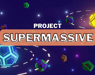
Creator of
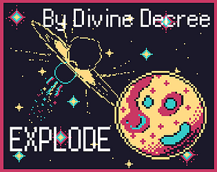
SMASH PLANETS together in an interstellar game of BILLIARDS
Puzzle
Play in browser
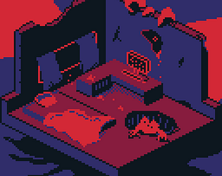
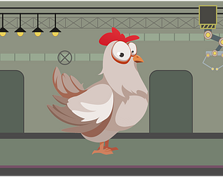
Told you not to play
Play in browser
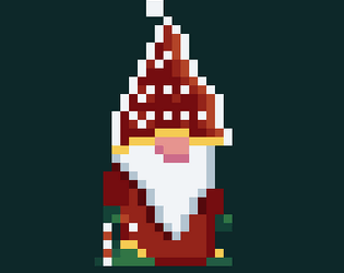

The Grinch strikes once again, Santa must defeat him and Save Christmas !
Play in browser
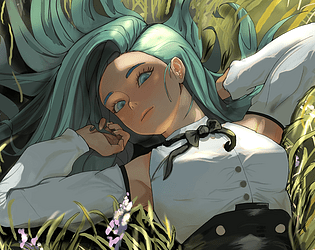
Is Beauty Power or Disease? The Romantic Horror of Cutting Open and Finding The Source of Flowery Beauty
Visual Novel
Play in browser
Alternative universe simulator

Candy-themed 2D top-down RPG
Top-down RPG, unique deckbuilder, and gripping narrative adventure all in one.
Card Game