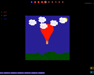
Thanks for trying it out! Definitely agree with the comments - I tried to expand the area and it didn't look great, and ran out of time to improve the look. Something for "Countdown To NYE 2 - Explode Harder".
s0lly
Creator of
Recent community posts
Really enjoyed that, but the boss battle was possibly a bit too difficult. One issue I found was the collision detection between the sword and the walls was a bit too sticky and larger than I mentally assumed, meaning I got stuck on walls and corners too often. Otherwise, great concept and execution.
Great attempt! I like the choice of music. I'd suggest transitions for the music to make it feel that touch more polished. The use of text was quite ingenious and hit the concept of thoughts in the mind really well! I thought the swing mechanic was clever but didn't feel right as it was difficult to guess when it landed a blow or not. I thought the art was really good. Overall, great job - concept and implementation!
I like the attention to various mechanics like the UI elements scrolling. Personally I think the music was a bit jarring (but considering the medium you were targeting possibly understandable!) and I felt it difficult to understand the various obstacles without dying too often and getting frustrated. I really liked the use of screen space and the attempt at hitting as many themes and objectives as possible - tough!


