Very cool. The ghost is a little unwieldy at times. I had a hard time getting around the red ghost for a while. I really like the look and creepy feel of the game. Reminds me of Super Mario World.
Very fun. Lots of strategy. It took me a few seconds to figure out what to do. That being said, some sort of in-game tutorial to teach the player would be good. Nothing too specific. Maybe on the first level "Hold the magnet to attract the ball" "Let go to release" that sort of thing. There was a good variety of enemies. The font on the "Wave 1" countdown is a bit extra large. Maybe not so big?
It was an endless runner lol. It went on forever. I got to warehouse 20 before letting the fire take me. The environment was neat but there wasn't a whole lot to do except run. And if you tape the space bar you can jump forever. So after figuring that out, I never got stuck. So maybe something else in the level to force the player to change up their pattern could help. At the moment the level feels endless but samey.
Not bad. I like how you have to manage your money to get through the levels. That's unique. I got through to level 4. I'm not sure if there are other enemies than the saw blades. But some other enemies would be neat. In terms of current design critiques, the platforms shouldn't crush the player, in my opinion. I think they should be no collision on the bottom so you can jump through like with similar games of this style.
That was a blast! Haha, great music, great puzzles. I love how you can get moving with these little guys. It's nice that you tool physics into account and made the bounce pads weaker per extra dwarf. That made me rethink my strategy a few times. Good work!
I really like the mechanic of the head and body and how it can be used to navigate the map. I would like to see more to do though. There was a bit of exploration which is nice but no enemies or collectables.
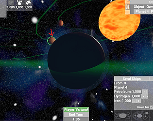
This is really fun. I love how the ships can reconfigure. Very cool. I would like to see more enemies though. For all the ships I have, there are hardly any enemies to shoot down. Even if they're only a one-shot ship or asteroid. Just something to do between the bigger stronger enemies.
I always enjoy these 3D Galagas. I had my students making them this year. I like the change up in the AI. The game could use some variety in enemies and a power up. For the jam, I didn't see how it fits the theme of joined together. I know it's mentioned about their weapons being hacked. I just don't see that in the game.
EDIT:
I didn't notice at first. I read in the comments that your shots trigger the enemy's and I was like "oohhhh" so yeah, I'm dumb. Ignore me lol
Ok, wow, this is really cool. Visually you have something here. I was greatly amused by interacting with the parchment and the little quips of dialogue, and how you can insert and change lines. That was neat. From a player point of view, I think the font choice while aesthetically pleasing to the game, is hard to read. Sometimes during story elements the text appears really small in the bottom left of the screen while at the same time big action things are happening with more text over there on the other side -- it can be dizzying for the eye.
This pretty cool. I like the mechanic overall but the jump is a bit floaty and the ground is rather slippery like he's walking on ice. That messes with gameplay some. Also the intro says "Maximum security prison" but it's so desolate and empty. Maybe an abandoned prison is more apt? Also, I don't think this is an ethical use of your prisoners. This labyrinth was deliberately designed to use people as things to catch buttons. What kind of place are you running here? The level design is great and the game is pretty fun.
I watched your video and tested it out. The game does a good job at teaching the player without needing to spoon-feed. The ambient music and the soft tones for sound effects works really well to encourage the player. I don't see anything particularly wrong with the game. The presentation is very nice. My only critique would be the size of the text and other prompts. It's really common for early graphic designers to feel the need to fill every inch of empty space with text or a some sort of graphic. However, from a graphic design perspective, that can make things feel a bit congested/cluttered. Don't be afraid of empty space. Give things some breathing room. Like when I completed the first mission this giant box shouted at me CONGRATULATIONS NEXT and I was like "WHOA! OK! DON'T HIT ME!" A simple contrasting overlay just big enough for the text to be legible is all you need. And maybe some breathing room between "congrats" and the button.
I see a lot of this style these days. I like the music choice, very soothing. The art is ok but the puzzles are where it gets interesting. Some of them are challenging and make you think which is the whole point. The one thing that irks me the most is on the first level. The characters move tile to tile yet there's a white dot in the middle of two tiles. Why would you do this to me? My OCD lol!
This definitely has a unique ominous vibe. I just wish there was more to it. The character moves abysmally slow and I can't always tell if he's moving or stuck on something. I did manage to get to where the boy falls into the well. But other than walking around and letting the people get taken by the creepy hands, I didn't see anything else to do.
It feels like Speed. The collision box is a bit sensitive. I kept clipping things that I wasn't near. But the car handles well and the visuals are neat. I could never get up to a fun cruising speed without randomly catching some invisible edge though.
This is the only gave I've finished. As an avid chess player, I found the game to be an interesting breath of fresh air. I was able to explore new positional ideas. It's weird that the pawn can move the way it can in this yet the other pieces remain largely the same. There were some areas where I felt the game was left up to chance. The last stage with the king, he didn't put up much of a fight. My favorite piece to be is the knight. At first I got take happy until I realized you become what you take. Put this on a mobile app. It will do well. Now in terms of the theme, I'm not sure how this fits in to joined together. It's true you become what you take but outside of that, decisions are isolated.
This was pretty cool. I like the visuals. The game has a very crisp look to it. And you definitely get that lost/alone in space vibe when you're out there maneuvering around. The controls could use some further refinement. There was also a time when I hit the station and the ship would spin around an invisible anchor point. Perhaps a physics defect?
I really like this art style. The cards are a cute way of handling characters. But I couldn't figure out what to do. I walked for a while and switched between the characters. It would have been nice to see this taken to the next level.
Very nice looking. The art is done well and matches the overall theme. The music is catchy. It took me a few tries to get the hang of how the movement was supposed to work. A tutorial section could help with that. The game does need a health bar. It's really hard to know how much health is left.
The title screen was squished and hard to read. I took a guess though and ended up as a random man lol. I didn't quite figure out how the two halves interacted. I guess that's the random aspect of it. Sometimes the movement made sense, other times the characters would teleport to random locations.
This is an interesting concept. I laughed when I heard the scream on the fall. That was pretty cool. The combinations are a little tricky to pull off and I noticed the basic attack is too high. It almost always misses the enemies. The most jarring thing though was the camera. I like that it shifts to give you a sense of direction but it's too abrupt and when you get it, the camera gets wacky.
Wow, thanks for the thorough review. Yes, there's definitely room for improvement. Firstly the plant in the middle. You're supposed to be able to jump into it and it kills you which gives the additional clue that it's dangerous. That feature is fixed now but I can't update it during the jam, sadly. For the spider, I wanted the fly to start out tangled and you have to wiggle until initially freed. The issue with the platforms/jumping has to do with them being sloped. At some angles the player capsule is just off the ground enough to not register as grounded for the jump to execute. making those areas flatter or using a line trace to update the ground position could help. Oh and yes, the text is mostly illegible. We'll fix that too :)
I thought I would love this but I honestly found it to be frustrating. The movement is awkward and slippery feeling and for how chaotic the level design is with how precise movements need to be for a snake game, this didn't work for me. I would clip nothing and still die. I think the concept is there but it needs some more refinement. The music is alright but doesn't feed into the sense of urgency that comes with the building being on fire.
We spidy people need to stick together ;) I enjoyed being the spider for once. That was a nice touch. I was a little disappointed in that I couldn't spin a web. Like I can shoot webs out but they don't stick to anything. It would have been really cool to build the web.
This game made my anti-virus software go waaaayyy up more than usual with the game jam games. So I wasn't able to play it. It kept quarantining the executable. I had to disable it to play. Normally it scans and passes it after a minute or so. Once I got in, it was neat. The art style feels like a mix of something from Virtual Boy and Undertale. The controls were a bit tricky to figure out as they're not following any standard convention. That's something you may want to change.
Looks like I Doged a bullet on that one! As a crypto investor this one really hits it home. It was fun and sadly accurate to the market at times. It does need a way to predict the upcoming block like Tetris does. Maybe it was there and I just didn't see it?
Very well crafted. I really like the gameboy color aesthetic. It has that Metroid 2 Return of Samus vibe. That being said, I do feel like something is missing, and I didn't always know what things did.