

Interesting take on the theme and great art!
Play game
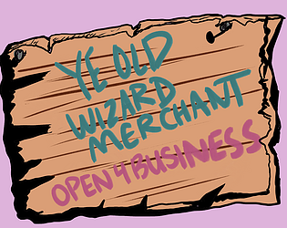
Ye Old Wizard Market's itch.io pageResults
| Criteria | Rank | Score* | Raw Score |
| Presentation | #1200 | 3.440 | 3.440 |
| Overall | #1931 | 2.960 | 2.960 |
| Originality | #1979 | 3.120 | 3.120 |
| Fun | #2342 | 2.680 | 2.680 |
Ranked from 25 ratings. Score is adjusted from raw score by the median number of ratings per game in the jam.
How does your game fit the theme?
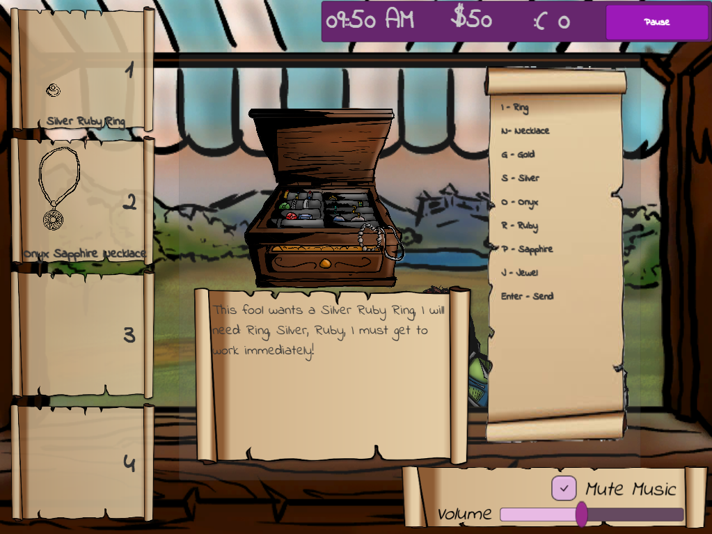
You get out of control of the customer's orders and can lose control of being able to complete them all.
Did your team create the art for this game during the 48 hour time slot?
Yes
We created all art during the game jam
Did your team create the audio for this game during the 48 hour time slot?
No
We used pre-existing audio
Comments
Fantastic art! The characters look amazing! The text was a bit small, but overall I had a good time playing it.
Submitted
HeatstrokeGreat music and art. Nice typing game. Had some trouble understanding why it would give me impossible expensive recipes on the first go. Overall very well executed concept
Submitted
ObstacontrolArt is great, but the style of it does make it a tad too hard to attempt to keep up. Reminds me of games like cook, serve, delicious, where memorisation helps in getting better at the game. It sounds odd, knowing the theme but it was too fast which made me go full circle and just do things at my own pace.
Hey Krzysztoffee! The speed of the game was meant to make the player feel like they were out of control. If this weren't in a jam, we probably would have added some sort of difficulty modifiers, like how it takes for customers to leave, unlimited money, stuff like that; however we couldn't here otherwise you WOULD be in control. Thanks for playing our game!
Firstly, nice artwork. I would have liked to give a higher presentation score, but the text size requiring me to bring my face within <1ft of the screen (15" MBP) to read it is a major detractor to the UX/UI. This is more so since there was sufficient space for a larger font-size in every place that needed it. The game does require some reading of the UI, so those extra pts to font size were expected and needed, especially with a stylized font like the one chosen.
I'm not sure if it was a display bug, but I did try to read it and gave it an honest go but couldn't get very far into gameplay before minor eye strain set in. I played it on Chrome web browser on a Mac, and using the browser's zoom-in (Cmd +) feature didn't remedy this.
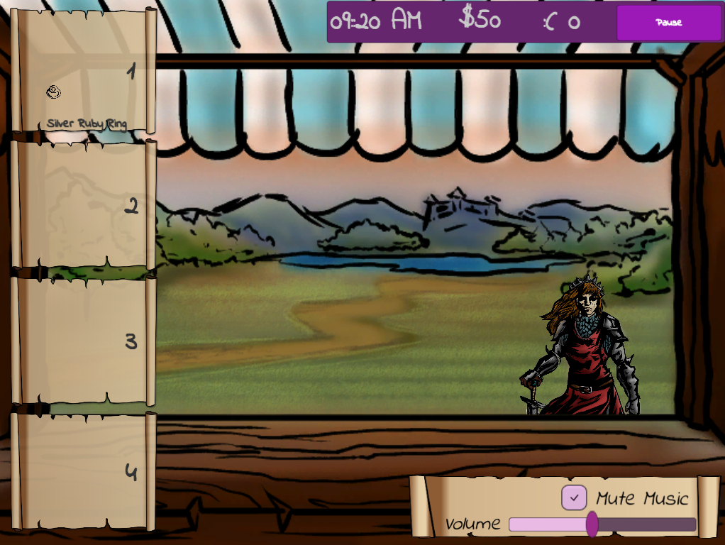
As for the gameplay, I think it could have been fun had I been able to read the text and engage it in earnest. From what I can tell, it is a simplified spin on recipe-execution gameplay a la Diner Dash or Overcooked. The customer departure speeds are very fast, but this factor is what enables the game to be in line with the jam theme. The flavor text could probably be reduced to shorts blurbs instead, so as to not distract from the elements with more gameplay significance.
One key criticism would be that much of the extra screen space populated with visual flourish could be instead used to convey some of the necessary information visually. For instance, rather than props in the background in the center fo the screen, the recipe could be shown visually with art and symbols there instead. This would make the essential game elements clear, front & center. Currently, it is difficult to tell apart FG from BG, gameplay elements from from decor, and HUD from game environment.
In all, it has an idea that works and enough art to go around, but the UX/UI flaws make it pretty unplayable for me. Still, clearly a good deal of effort went into making this, and that is certainly deserving of recognition.
Good work completing a game project in 48hrs, especially for the 2 (of 3) who are doing a game jam for the first time. Kudos on finishing on your time!
Hey apiruxb! Thanks for the feedback! While I know that some people have mentioned the text to be hard to read; and this is definitely a fair criticism, I haven't heard anyone saying it was hard enough to read that it caused eye strain, and I hope it didn't hurt your eyes to read it. Its possible that it's because you were playing on a Mac, although I'm not 100% certain.
We took inspiration from games such as "Cook Serve Delicious", but wanted the game to feel more stressful to fit the "out of control" theme to make the player feel like they are overwhelmed, hence why customers leave quickly, as you mentioned; and why we used the extra text instead of short blurbs.
Maybe try playing it on a PC and see if that fixes the UI issues for you? I hope you get another chance to play it, as even though it isn't perfect, we're proud of it, and happy to receive all the feedback we've gotten so far.
The mild eye strain was temporary and not so extreme as it may sound. It could be partly that my eyes were somewhat tired at the time as well. That said, I did have to get my face within a 1ft of the screen to be able to read it quickly enough. It might really be a display bug on the Mac as you said, though, since the texts did not seem to fit cleanly into the boundaries around them. Some sections’ text took up only a 1/10 of their spaces, and yet the customer dialogues actually seemed to extend to its edges. The fact that zooming doesn’t help also suggest so.
I’ve gone through my whole queue list +1 now (so 26 in total) and probably won’t be revisiting them for the time being. I’m also primarily on a Mac and don’t really feel like digging up my older Windows machine just to test one thing in a jam game. Perhaps someone with easy access to both can test for it?
In any case, putting aside the text display bug, I think it would still be better for “flow” purposes to have things be easy to process and act on. I understand the idea of making it feel a bit frenzied and hectic to be out of control, but I feel like making the UI and layout intuitive should still be a baseline. You have many other knobs to create the frenzy effect with here, and you’d probably prefer for the player to know exactly what to do but struggle to keep up vs. struggle to know what to do.
Plus, I personally believe that UX/UI should always be as intuitive as possible. Not to be confused with control scrambling gimmicks and visibility hindering vfx in some games, as those are actual gameplay elements in disguise. UX/UI is the player’s first direct contact point with the game, the channel of communication itself. The challenge should be within gamplay and game content rather than in the player’s ability to interact with the game to begin with. This is just my opinion on it, though.
All that said, as mentioned in the original comment, I do think this would have been fun for me if the UX/UI aspects were addressed. As you said, it’s not perfect, but it is a good showing. A lot of work went into this, implementation-wise and assets-wise. Having insufficient time to test and polish everything is kind of the nature of game jams to begin with. It’s part and parcel with the challenge, and you were able to clear it. You all absolutely should feel proud. Of course!
the art, music and vibe is very good. Controls are alright, i think my main issue was that reading the text in browser requires a lot of effort and you dont have time for that.
Maybe another font, some extra shading or bigger text could help that?
For me it made the game not really feel out of control, but just more stressful i think. Especially the game over screen had really small text, that i couldnt really read sadly.
Submitted
Glitch HitchArt is fantastic! And the idea is so good, I love the frantic feeling of trying to get everyone's orders in time. Reminds me of Flipline Studio's games (Papa's Pizzeria, Jacksmith, etc.). Definitely feels out of control. This concept is amazing and I hope it gets expanded on in the future!
If you expand this in the future, I have a few critiques :) First the difficult curve is tough, after practicing it several times I only got half of the orders right. I'm probably just a n00b...
Second, maybe less text in the order and instead just show which keys to press? The biggest challenge of this game is trying to find which key to press. Normally it's the first letter, but not always (sapphire is P, dragon scale is S).
Good work making this in 48 hours! It's a fantastic idea and I really do hope you expand it in the future. :)
Submitted
Pie on the FlyHey Xylo! Thanks for the feedback! This was the first game jam for two out of the three of us and we're really proud of it. The whole idea of the game was for it to be stressful and make you feel like you were losing control as you went along. So all the movement on the screen, the extra text; were meant to make you feel overwhelmed and stressed and therefore start losing control quickly. We hope we'll do even better next year!
I liked the art and concept. But I am not a fan of the controls. Maybe if the "ingredients" to make a order could appear in an UI and we could click on it, instead of just typing the letters.
Submitted
Crazy Ice-Cream ShopHey Nonyko! Thanks for the feedback! We went with the keyboard mainly because we wanted the player to develop a muscle memory for each order. So if I got a potion, I could just instinctively think "RDC" in my head and I would just type it. Next year we want to develop more on our controls, as this is the most critical feedback we've received. I hope you enjoyed it though!
Leave a comment
Log in with itch.io to leave a comment.