Play game
Celia's Castle's itch.io pageResults
| Criteria | Rank | Score* | Raw Score |
| Visuals | #1 | 4.778 | 4.778 |
| Audio | #2 | 4.111 | 4.111 |
| Theme | #2 | 4.444 | 4.444 |
| Gameplay | #3 | 3.778 | 3.778 |
| Overall | #3 | 4.019 | 4.019 |
| Creativity | #4 | 3.556 | 3.556 |
| Narrative | #5 | 3.444 | 3.444 |
Ranked from 9 ratings. Score is adjusted from raw score by the median number of ratings per game in the jam.
How did you choose to implement the Theme: Vampire in your game?
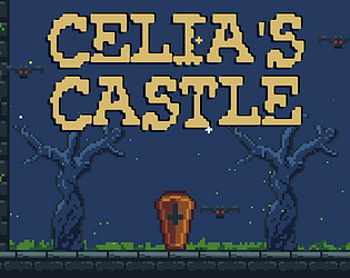
The main character is a vampire living in her castle.
Leave a comment
Log in with itch.io to leave a comment.


Comments
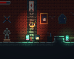
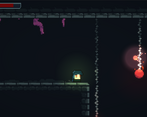
Pixel art is awesome! Really well done. The main song was good and the game itself was nicely done. Even though is a bit of a classic, the story works and is engaging.
Loved the graphics, music and controls. Well fitting style and nicely put together in the level.
Really enjoyed this game.
- Gameplay is very good.
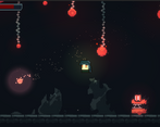
- Lots of variety in enemies.
- Great that you made your own artwork, as it is all really good and consistent.
- Sound effects and soundtrack were good.
- Theme is good
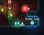
My only minor complaint, (and I used a keyboard, so this is probably why and I'm just not good at the game) is the jumping when trying to go upwards it felt a bit awkward and I struggled to get out of the pits when getting the health pickup, as you need to face the right way to jump up, but it moves to far over when you turn around that it becomes very hard to make the jump and then I fall all the way to the bottom and frustration ensues. So maybe just turn the sensitivity when turning round.
But again pretty minor, overall a really strong game, so keep it up! :)
This was a great game.
I liked the big number of enemies and that they were all different from each other other.
The lights also added a lot in my opinion, it was very easy to see the character and enemies, and at the same time they added to the general atmosphere.
The music is really great, and the sound effects were also pretty good.
The graphics were also good and the decorations around the castle added a lot.
What a lovely platformer! Well done!
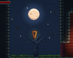
I play it with gamepads, the stetic is good, has good classic graphics like castlevania series; the intro was nice, I love how the cript going up and she emerges. I find some errors, don't understand if she jump or resize in tall? and in some points was capted in the ceil wall.
I think a vampire should be more kinestesic, the jump is so slow and you can't evade hits easily; so the gameplay is a hard error to fix, make it kinestesic!
In other hand, the intro is nice, but you can make something to make the game memmorable, different to the classical vampire plataformer histories, it is my impression
Hah yeah there was a bug where in very rare circumstances the main character would jump and stretch and sometimes get stuck in that stretched position. I couldn't figure out how to reproduce it so I put a bandaid fix to try to check every 4 seconds if the character is stretched out and if so, to try to fix. I haven't seen it be so bad as to be stuck in ceiling walls though so that's new lol.
Great feedback on the jumping and needing something to make it more memorable but could you elaborate what you mean by being more kinesthetic?
Anyway, thank you so much for providing feedback, this is immensely helpful!
Ok the kinestesi is the feel of movement, the flow of movement, for example, MarioBross has bad kinestesics, but HolowKnight is great so looks like parkour. Today platformer games need good kinestesics. But ok, maybe the stretched in my test kils the jump flow of movement, so maybe is not too bad like I experiment... ???
Gotcha. Thanks a ton for the great feedback and congrats on your awesome game!