
Play game
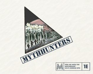
Mythhunters – A Mothership RPG Toolbox for Alternative Characters and Crew Generation's itch.io pageResults
| Criteria | Rank | Score* | Raw Score |
| LAYOUT — How well does the module get across information? | #19 | 3.815 | 3.905 |
| UTILITY — Does complexity inspire game prep? Or Is it very "Pick-up-n-Play"? | #22 | 3.536 | 3.619 |
| ART — How good is the art/graphic design? | #29 | 3.536 | 3.619 |
| Overall | #34 | 3.250 | 3.327 |
| WRITING — How does this read? does it emanate with horror, humor, drama...? | #35 | 3.350 | 3.429 |
| FAVORABILITY — how much do you personally like the submission? | #37 | 2.978 | 3.048 |
| GAME DESIGN — How good is the game balance or concepts there in? | #38 | 3.117 | 3.190 |
| THEME — How well is the jam theme used? | #49 | 2.419 | 2.476 |
Ranked from 21 ratings. Score is adjusted from raw score by the median number of ratings per game in the jam.
Judge feedback
Judge feedback is anonymous.
- It's a simple, neat module with little to complain about ... but I really can't say that it fits into the overall themes of the Jam even though the material remains relevant to almost every other variety of campaign.
Leave a comment
Log in with itch.io to leave a comment.
Comments
Love this - reminds me of all the useless characters that get murdered by aliens at some point in the movie about the stuff. :P
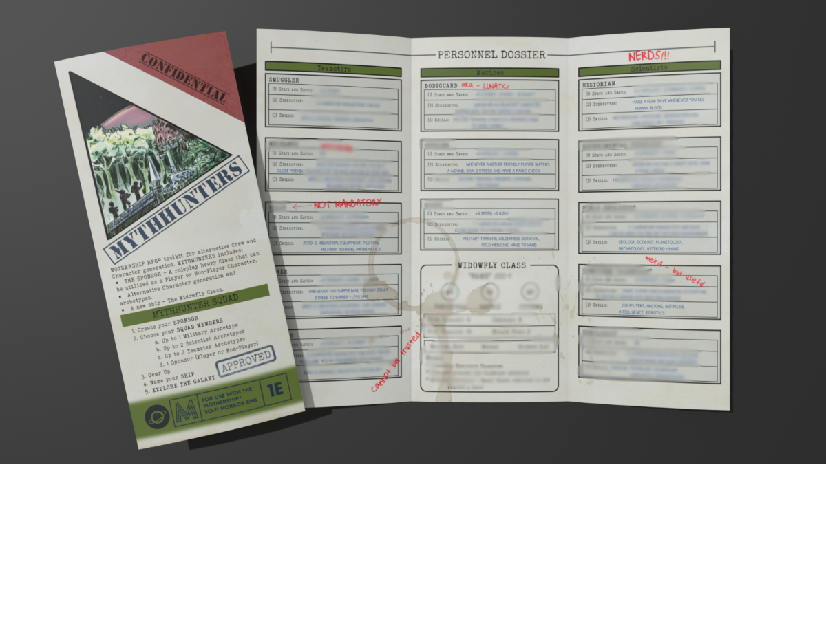
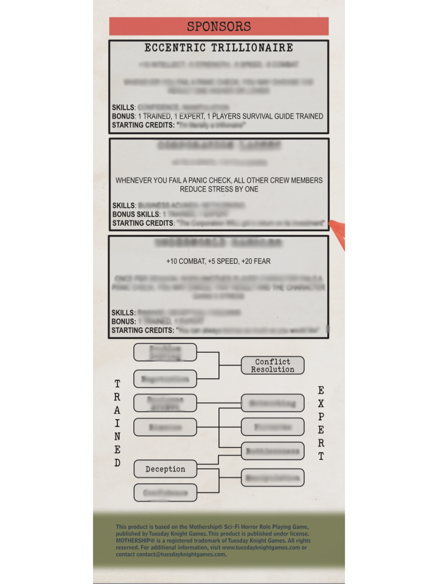
The blue bar at the bottom of the pamphlet's first / outer page is a bit jarring compared to the rest of the colors - it might be interesting if you made it one big stain like the coffee mug stain on the inside of the trifold. Misspelling of "Archtype" (missing e) on the last panel (middle of page 1). Very internally consistent, and well written!
Consider adding a printer friendly version as post-jam polish. Well done!
Awesome. As a supplement that tackles the reverse escort quest idea, this is stellar.
The name Mythhunters seems a little tacked on to score cheap theme points. In my opinion the theme of the jam should never be an obstacle for the writer to overcome, it should be an optional source of inspiration.
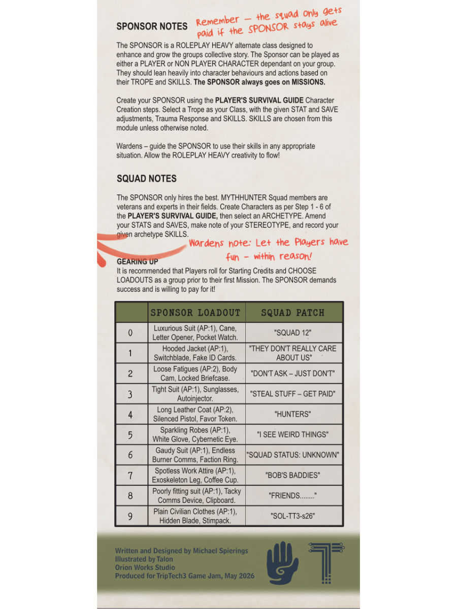
Mechanically I like sponsors and ship, not as fond of the crew stuff. I think I would be more ok with the crew stuff if it was obvious that it is an optional thing that makes the players more powerful. It could perhaps be mentioned in the text on the front page.
I am always excited for any Mothership pamphlet that can bend the genre in a different direction. I think this pamphlet, or the resulting post-jam draft, will end up right next to my Agent and Ultimate Badass rules tweaks. I think it would be interesting to pair this with Awaiting The Burning Gods.
My only critiques are regarding some of the layout, all of which is to personal taste. The skill list for the new Sponsor class could maybe use some denser line fill as well as some skill explanation. Maybe sacrificing the ship stats and rearranging the interior panels might balance things out better as the ship is not the draw of the pamphlet? It could still be included as a digital printout. Additionally, there are so many different colour shades on the page, it might be more cohesive if the colour palette were reduced a little.
Minor notes aside, this is exciting. The cover art is evocative, the layout textures lend the pamphlet a real in-universe quality, and the Sponsor seems like a great class option for a real stinker of a player.
Thank you very much!
I am planning on doing some more brain storming on the Sponsor skills post jam based on the feedback I've received here.
Colour pallete is going to change! Not sure what yet but reduced.
I won't lie, I did make myself laugh and giggle when the Corporate Lackey TR came to me. Everyone gets a little happier when the Corpo breaks down!
An interesting entry! Great utility and layout. This is definitely usable at a moment's notice. I think you nailed the art, too; you've managed to create a huge amount of visual interest out of only a few elements. The coffee ring and the red notes are just *chef's kiss*.
I'll second the notes you got about things like 'pampered' being skills. It might have been nice to lean more into the theme as well. That being said, I think this is a great addition to a Warden's toolkit, especially as the campaign goes on and the base four classes begin to feel a little used up.
Very very strong entry! The Sponsor is an excellent class idea, the art works pretty well for me (although I can echo the recommendations to restrain the colour palette a bit for sure), and the layout is coherent! I also enjoy having some bespoke "subclasses" for the core MoSh classes. Loadouts rock, Sponsor Trauma Responses are solid, and including a new ship type is the cherry on top (the more ships the better!) My criticisms mostly come down to semantic/style things:
All told, great stuff, really enjoyed reading! A lot of tables could use a Patron and it's good to see this niche filled in the 3PP catalogue. Well done!
Thank you very much! The Suit was definitely one of my influences/research material as I put this together.
Could you expand a little more what you mean by the cover page part, especially the comparability? Happy to chat that through via discord is it’s easier.
The first draft did call them trauma responses, with the intent of them being a second response. Some initial feedback drove a name change, some are less like trauma responses and more character traits - and essentially stereotypes are what they are - but I am definitely open to finding the right name!
I’ll do a post jam work through of some of the Sponsor skill/trait names! Thank you for the offer
With the cover page, I mostly mean that it doesn't really clearly lay out that when you say "Crew," you're specifically referring to the new Archetypes you've included! There's an explainer on the outside-middle panel that gives sort of the context I'm talking about, but it gets muddy since "crew" is used pretty interchangeably in a lot of MoSh stuff as "party" or "PCs," whereas here it's kind of a bespoke "Mythhunters Crew Archetypes" thing.
Gotcha! Makes sense with the Stereotypes, although I feel like there's probably a more accurate name out there. I don't even think there's anything wrong with fully saying "additional Trauma Response" or something. I know the core PSG allows other classes to "gain the Marine trauma response" if they undertake military training - its ambiguous whether it means replace, but I think it's justifiable that the game is meant to allow you to stack multiples. Certainly doesn't break if you do!
I love the report-style design. It feels sci fi but working class, which is perfect. I think it works really well, though I'd like a smaller palette used. It seems to be using 3 different shades of red and three of blue. If you're going to add red to the jam palette, I'd stick to just one shade of red and the two jam shades of blue.
Mechanically, it's hard for me to know how it would work in practice, but I really like the variety of options and how you've presented everything. I like the red diagetic metacommentary. It's a solid package with intriguing variations and new concepts.
I think the sponsor as a roleplay-heavy class is a great idea for those who don't want to be in combat or just want something different. Having to protect them to get paid provides the other PCs a fun complication. Good work!
Thanks very much, my influence for the interior was something like a WW2 style personnel file. The idea is the sponsor is looking through the files, picking their crew - hence the red scribble and coffee stains.
I think your feedback and benefaction-games highlighted what I already felt. I wasnt a personal fan of the colour scheme that ended up being picked, but I wanted to try and use it in the module - i will adjust that post jam to make the pamphlet just more coherent by itself.
Mechanically - it’s definitely a grab bag. Game balance wasn’t a big consideration for me when putting it together. I don’t feel it’s too much of a concern for Mothership and the types of players I’ve worked with, so flavor and vibes were the key for me
Art: The cover art is nice and overall this is reasonably easy on the eyes. There are too many different accent colors without a coherent palette.
Writing: Clear and functional. There's not much to say here, because the writing is pretty sparse aside from game mechanics.
Game Design: I like the concept. None of the archetypes seem wildly over- or under-powered, although I worry about the "infinite money" sponsors as PCs. I'm not crazy about the decision to use character traits as "skills."
Theme: It's obvious how this is intended to connect to the jam theme, but the integration is almost non-existent. It's implied by the name that these characters are hunting mythological relics but I think there needs to be at least a little text block offering guidance on developing a mythology and integrating the hunt for relics into other modules or homebrews.
Layout: Pretty clean and effective. The "bonus notes" scrawled over the top make it a bit chaotic and don't add much. I'm guessing you thought it was too boring otherwise... I did the same thing last jam—adding stuff because I felt like every panel needed to have something beyond blocks of text—and ended up regretting it and going more minimalist in my post-jam version.
Utility: Seems very straightforward to use for what it is, as long as you have a plan for a relic hunt adventure and just need some character archetypes.
Favorability: Kinda middle-of-the-road for me. I could see dropping one or two of these archetypes into the right game, but reading it doesn't inspire me to run such a game.
Thanks for the feedback. I completely acknowledge and know that this idea isn't for everyone and all playing groups and thats ok!
I think it's likely that most groups would opt to use the sponsor as an NPC, though I know personally there are players that would chomp at the bit to have fun being a Sponsor.
Regarding the color pallete - the accent colors are the colors chosen for the jam. I wanted to include them in the pamphlet as a nod to this jam and the unifying idea that comes from it.
Ah, okay, now that you explain, I do see that it's the jam palette plus red for the notes... and I actually like the jam palette, but red doesn't fit the symmetry established by those other colors, so that's what's making it feel random to me.