Play game
Shinkansen no Yume: Fursona [18+]'s itch.io pageResults
| Criteria | Rank | Score* | Raw Score |
| Stealth | #5 | 3.692 | 3.692 |
| Novelty | #6 | 3.846 | 3.846 |
| Play | #6 | 3.692 | 3.692 |
| Narrative | #9 | 3.769 | 3.769 |
| Horny | #12 | 3.692 | 3.692 |
| Overall | #15 | 3.333 | 3.333 |
| Kink | #18 | 3.154 | 3.154 |
| Harmony | #24 | 3.154 | 3.154 |
| Sound | #28 | 2.385 | 2.385 |
| Aesthetic | #33 | 2.615 | 2.615 |
Ranked from 13 ratings. Score is adjusted from raw score by the median number of ratings per game in the jam.
Early work
I built the bones of the battle timeline engine and wired together the pachinko physics over the holidays in Dec. All of the UI, dialog, flavor text, and combat mechanics were built over the course of Feb.
Leave a comment
Log in with itch.io to leave a comment.


Comments
I just managed to sneak in a play of this before the voting ended and I'm really glad I did! Complex mechanics but in a novel and fun way... Loads of scope for a full game here if you eased players into the gameplay a bit more... The text is excellent... A little more art would have been great but understandable that you didn't have time given how well-developed everything else is. I really really liked this one! :)
Play: what the fuck is this (complimentary)(mostly)
I love the base premise. RPG + Pachinko = fun. Amazing idea, looking forward to seeing it get crazy and complicated.
That being said, the controls are odd. It's weird that I have to press an arrow key in order for anything to be selected, instead of an option being auto-selected, it's weird that the enter key is the only action key instead of something more common like z, and the two of them combined makes the game weird and awkward, since the arrow keys and the enter key are both controlled by the right hand and it has to keep swapping back and forth between the two to just do one action. It's also a little difficult for me to understand what's happening, but that could be due to my next problem...
Aesthetic: There is only one thing worse than a game that automatically launches in full screen, and that's what happened to me: a game that launches in windowed mode, but in the top-left corner, with the top bar of the window utterly unaccessible and no way to move the game window to a playable position. Thankfully, you didn't make the window un-resizable, so I fixed it by dragging the corner of the window around until the window auto-snapped to a place where I could hit the maximize window button... Unfortunately, this cut off the dialogue choice windows a bit, so I could only see about half of the option text, and it also cut off ALL of the menus during battle so I had to blindly fumble around. Half of the time when I exited the windowed-fullscreen, it did something normal, but the other half of the time it went back to its top left position and I had to resize it. Resizing the window in windowed mode did not bring anything invisible back onscreen, the existing elements just kind of slid around. I can provide screenshots. The game was almost unplayable.
Aside from window complaints, I find myself wishing there was some kind of graphics during the dialogue, but I understand time and art constraints probably prohibited this lol. The GUI is really stylish, it looks retro in a way some people would complain isn't retro and then I'd call them old. I'm looking forward to more art in the game- perhaps alongside the portraits, you'd consider backgrounds for the main scene? I kept forgetting we were in a forest, my mind put us in a Spla2n Octo Expansion-like setting.
Sound: No music. The little blip sfx during battle are cute, but they did jumpscare me the first time I heard them. I thought this was a silent game, they caught me off guard... T_T
Narrative: There's a lot of narration before it gets to the gameplay. I have to wonder out loud if it was necessary for this early of a prototype? But it's well-written and funny, so I don't mind. Given the vibes and the wordplay, I'm assuming this is a parody of Persona? I've never played it, so I can't speak much on that topic.
Horny: I don't know if I can judge this fairly. On one hand, the sex stuff seems to mainly be set dressing, a replacement for fighting and hp. On the other, I can't see the flavor text everyone else is mentioning, so I might be missing a big contributor to this category...
Kink: Furries.
Stealth: It's not that kind of game.
Harmony and Novelty: The rest of the comment says it all. I adore the premise, but it literally fell apart as soon as I grabbed the controller.
Final Thoughts: Lots of potential, and I was very excited, but it fell flat due to one huge issue. Please please please please please make your game adaptable for different screen sizes. It's very important, even if it's hard. This was barely playable on my computer. :(
Thanks for taking the time to write such detailed feedback! 🤩
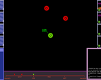
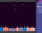
TBH, I was expecting more complaints about sizing issues since I've never distributed a LibGDX game before and I figured there were bound to be unexpected compat issues on some systems/configurations. The "flavor text" you refer to is probably the text that is supposed to appear in the lower right corner of the battle screen within the pink border (you can check out the screenshots on the game page to see what it's supposed to look like).
If you could share some of your specs with me, that'd be super helpful:
My best guess is that you're running at a desktop resolution with significantly fewer than 1000 vertical pixels, which is unfortunately a minimum requirement of the game currently. I'll likely try to accommodate smaller resolutions in the future; just need to stew a bit on where I can save on some pixels...
Good feedback on the controls. Never thought about it but using Z/X makes a ton of sense from the hands perspective. I also plan on finishing the currently half-working gamepad support~
Re: narrative, I actually didn't plan on having so much (or even any) dialog initially, but I thought it was important to set up the world a bit to establish its semi-consentual nature so the player just didn't get dropped cold turkey into "kobolds jump out of the bushes and try to rape you!!" 😅
FWIW, the "no default choice selected" was by design to prevent players from accidentally blowing past a meaningful choice if they were just mash skipping through the dialog.
Never heard of LibGDX but that name alone makes it sound hard to use D:
I'm running Windows 10, my desktop resolution is set to 1366 x 768, and I'm not certain what UI scaling is but it might be 100%. Tiny lil laptop lol. Makes sense why the game wouldn't size right, but now I'm wondering why it launched squished in the corner of all places... :thinking:
Re choices: that's fair, that's actually a really good decision, it just threw me off at first because I was expecting to be able to click the choices and I thought the game'd froze sdlfkjsdflkjsdf. The dialogue was cool too, I liked it! I envy anyone who got a game working and managed to add lots of words lolol. I don't wanna seem mean or like I'm complaining, I think this is super cool even just from the UI alone :') If I ever find myself in position of a computer with a bigger display, I'll definitely revisit this.
Interesting concept! I thought the story was cool, and that battle was kinda funny! The moves were hilarious! What would be cool is if it you can do shake moves on the planko board! Try to test your luck!
Thanks! Definitely thinking about ways to give the player some more control over the pachi; might end up adding a nudging mechanic like you suggested.
This is REALLY cool!
Wooow! Those battles were super cool! I love how you have the text on the side too!
The tactical sex battles have some pretty neat stuff going on. I feel like some of the mechanics could be condensed somewhat. The pachinko machine for example, could be right on the main battle screen. Instead of the wait timer, you'd watch the balls to bounce their way to the bottom and plan for your next move.
The writing is expressive and polished. My concern would be players glossing over the combat descriptions as they do appear quite rapidly and many of them repeat. Maybe they could be something that appears only for special attacks? I don't really like the descriptions stacking either, they become more of an "action log". Displaying one at a time would make each of them a lot more of an event.
I really dig the "90's futurist" ui style. It is however a little disconnected with the imagery of furries in a forest for me. Retro tactical cyberpunk is more what comes to mind, especially with the way that the attacks are portrayed.
It's a cool system with a lot of mechanics, but I would like to see it all become a little more streamlined.
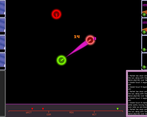
It took me a bit to notice I could change the start position of the ball by moving. Tho, I don't know how the icons effected the outcomes. Also, I liked the scrolling description of events. And, I found the combination of Plinko and a turn based RPG to be quite addictive. Add some specially ability and it'd be a pretty rock solid system.
Thanks! Yeah, I'm still hashing out the pachi mechanics, but the plinko playfield is indeed a long continuous loop where the angle of attack determines your entry point. I plan to eventually add a pachi-preview when you are choosing your attack target to allow the player to actually aim at "weak spots" when attacking. The icons don't actually do anything yet :P
Very interesting combat mechanics! Couldn't really tell if there was any benefit to moving and attacking manually rather than just autoattacking. Maybe it'll become more important when there are some more complex fights.
Really liked the lewd descriptive text for the fight, but I do wish that window was more prominent so I didn't have to keep my eyes glued to the corner of the screen for it.
Thanks! Moving before attacking allows you to control the angle at which your shot hits the target, which in turn controls the entry point on the pachi ring. Currently it doesn't matter all that much, but I plan to add more obvious "weak zones" for the player to go after.
Glad you enjoyed the writing! I plan to add controls that allow you to expand and scroll through the event console. Definitely got a little carried away and put a few long bois in there that are nearly impossible to read cause they roll the console so fast :P