Play HB
Hue Blaster's itch.io pageResults
| Criteria | Rank | Score* | Raw Score |
| Presentation | #103 | 3.533 | 3.533 |
| Enjoyment | #200 | 2.800 | 2.800 |
| Overall | #205 | 2.817 | 2.817 |
| Concept | #223 | 2.867 | 2.867 |
| Use of the Limitation | #265 | 2.067 | 2.067 |
Ranked from 15 ratings. Score is adjusted from raw score by the median number of ratings per game in the jam.
Team members
1
Software used
Godot (Engine), Aseprite (Art), BeepBox (Music), Sfxr (SFX)
Use of the limitation
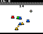
you have to change your color to the enemy to be able to damage them so you have to be your own *version* of the enemy
Cookies eaten
0 :(
Leave a comment
Log in with itch.io to leave a comment.


Comments
Very simple but addicting game
I like the visuals and sfx a lot! The experience could use some tuning though, two things stood out to me:
- Enemies deal damage on entering contact with the player, but since they do not die from this and do not deal continuous contact damage, you can end up just sort of hugging them after they've hit you once
- Having to spam the mouse button to shoot (especially on trackpad) is a massive pain. Enter The Gungeon compromised between wanting to encourage fast clicking but also wanting to support casual players by allowing automatic fire when holding the shoot button, but making its rate of fire slower than you could achieve by spam clicking.
Great entry!
Great aesthetics, good use of the theme, limitation its a bit of a stretch. I would say maybe have the health of the enemies be lower so you use the color switching mechanic more frequently. The sound effects are good but the music is very repetative. Over all good job, and eat a cookie.
The simplistic graphical style is super cute and charming, I really like that aspect. The shooting and movement feels good, though the enemy speed is just a bit high for your damage and movement speed. It was a little difficult to remember which color I would be rotating to, a more clear visual indicator of where you are in the color sequence would be helpful. When many squares spawned, they would start clumping together into one giant mass and it seemed to mess with the collision logic a little. The audio panning on the shots was fun, I liked that; however, the music loop was far too short and improperly trimmed so it was immediately grating and hampered my enjoyment of the experience a lot.
I think there is potential here for cozy little arcade shooter, but it needs some polish and more variability in gameplay. Good effort, I’m glad to have played and would give an updated build a chance in the future.
thank you so much for all the feedback, i'm working on 1.1 currently :) //i made the music and sound with ~40 minutes left lol
I loved the idea behind it, but the gameplay feels a little bit bug-fixing and adjustments. Overall, good game!
Hello! Nice little game.
There is flaws like the enemies move way too quickly and if you want to do something like that next time it could be cool to have upgrades (I don't think that there is some in the game).
Anyway, good job, keep doing games.
For a one person game, this is alright, enemies tend to get you stuck in a corner and damage you over and over and I would like to see better controls (arrows keys + mouse aiming + QE to change colour isn't feeling logical to play for me)
did you look at the description? you can use the mouse wheel to swap colors, and you can move with WASD if you really want to use QE to swap colors
I just glanced over it- Thanks for the answer ^^'
Classic game, fun to play. Music fits perfetly to the game. Only the collisions with enemies are sometimes buggy.
The artwork and sfx were pretty good and the movements were also nice!
I liked the concept and love the art!
Great visual part, but I would work on the idea and implementation
The sound effects really bring this game to life!