Play game
Retro City's itch.io pageResults
| Criteria | Rank | Score* | Raw Score |
| Visuals | #17 | 4.235 | 4.235 |
| Audio (Does not apply for Physical Games) | #22 | 3.529 | 3.529 |
| Overall | #46 | 2.941 | 2.941 |
| Fun Factor | #47 | 2.706 | 2.706 |
| Originality | #52 | 2.824 | 2.824 |
Ranked from 17 ratings. Score is adjusted from raw score by the median number of ratings per game in the jam.
Is your game a video game or a physical game?
Video
Was your game made solo or in a team?
Music by Alex James, programming/art by Juniper
Did you use any third party assets, if yes what assets did you use?
Monogram by datagoblin, Gallet City by Adam Saltsman
Does your game contain 18+ content (Nudity, Gore, Language)?
No
Leave a comment
Log in with itch.io to leave a comment.


Comments
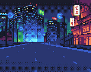
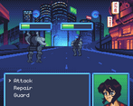
Okay that character design is totally an homage to Gunsmith Cats HAH I love it! Really great backgrounds and aesthetic. Maybe I just need to git gud but the combat felt a little unfair. Like, trying to repair was usually a death sentence, same with blocking. Maybe I'm missing something though, I just clicked the buttons and waited for my health to drop xd But yeah this is a fantastic demo entry and I'd LOVE to see more. Especially that UI...it's just begging to have lil animated bits everywhere!
really liked the overall presentation! I wish there was more direction because I'm not sure what the win condition was, but I kind of like the idea of a small scale RPG, so I hope this is something that you continue working on :)
Really great pixel art, would love to see more.
I liked the simple RPG system. Something about it was giving me Pokemon vibes. Brief, nice, solid.
Entertaining I see a lot of potential! loved the art and the music, would definitely like to see more! :3
Some real good pixel art on display here ^^
I had fun patrolling around the city, it's just too bad that the combat segments seem to lack a bit of animation, but hey probably the time constraints so totally understandable,
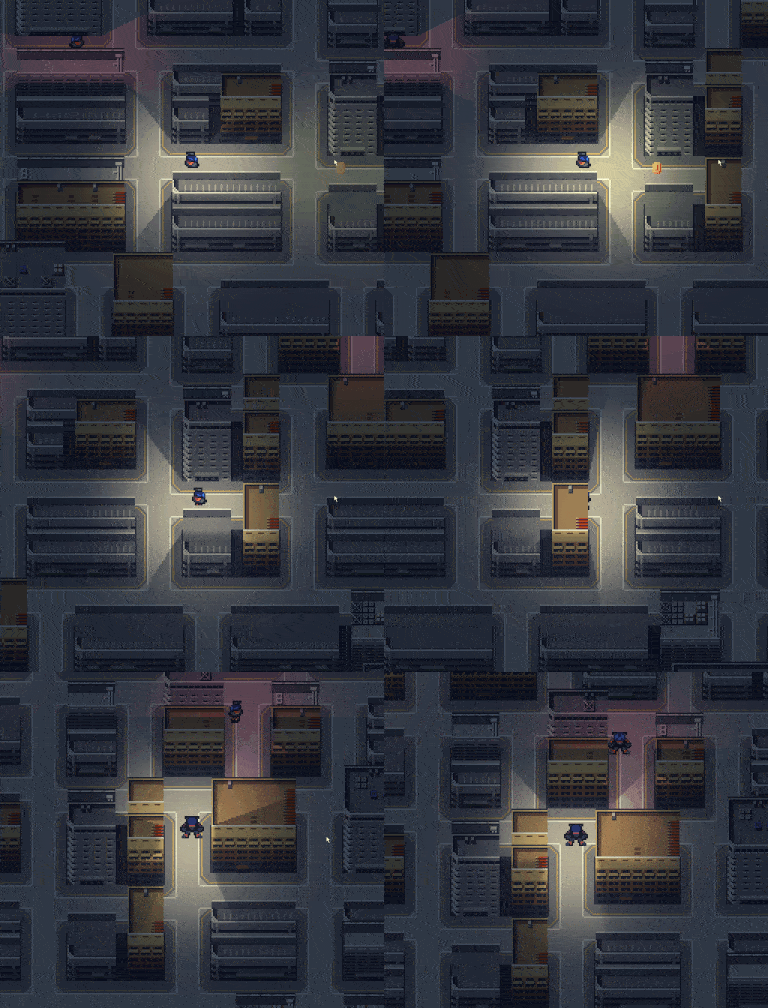
also real cool use of the lighting system.
Solid base on your entry so, good job :)
Definitely more of an outline at this point, but one with great style! Given it received better fleshing out, it could be very impressive!
The art style and light effects are fantastic. Nice work on the procedurally generated world.
Looked good but the movement was a bit clunky.
A very brief game, but a nice one. The lighting was certainly the highlight for me, and the pixel art the team did was pretty good. While a mecha RPG sounds pretty cool, this was a tad bare. Combat effectively required you to only use the fight option, as repairing or defending was always a net loss in health. Having either different types of attacks or maybe even party members could have helped flesh this system out.
All in all, a very pretty small game.
I ended up doing the whole combat screen in one day so I totally agree with you it was bare. The original game design was a bit similar to your comment (different party member with roles like "pilot", "gunner", etc.) But I ended up spending so long on the art and the random level generation I didn't have time. Thanks for playing regardless, appreciate the feedback!
Cool and godot :) The scrolling is a bit weird? I am a sucker for mecha rpgs ^^
Beautiful artwork!
I love the pixel art :)
It was just over too soon! I wanted to spend my coins on upgrades but I ended up reaching the end of the game.