Play game
Saikoban's itch.io pageResults
| Criteria | Rank | Score* | Raw Score |
| Enjoyment | #263 | 3.810 | 3.810 |
| Overall | #579 | 3.651 | 3.651 |
| Creativity | #695 | 3.667 | 3.667 |
| Presentation | #1322 | 3.476 | 3.476 |
Ranked from 21 ratings. Score is adjusted from raw score by the median number of ratings per game in the jam.
How does your game fit the theme?
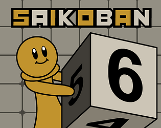
You roll a giant die.
Did your team create the vast majority of the art during the 48 hours?
Yes
We created the vast majority of the art during the game jam
Did your team create the vast majority of the music during the 48 hours?
No
We used pre-existing audio
Leave a comment
Log in with itch.io to leave a comment.


Comments
I really like the presentation of this it gives me old famicom vibes, the UX is pretty intuitive great job!
Thanks a lot!
I loved animations.Good job!
by the way could you play and rate my game?
Thank you!
And I already did that! :)
good job. i liked your idea
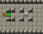
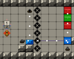
Really enjoyed this, I love the animations + the character's design. The levels are all well thought out, mechanics are introduced at a great pace, and I really appreciate the extra little details like the flashing numbers indicating each side of the dice's value. Those little touches really help to elevate this game over other similar titles. Good job!
also i really enjoyed the little mario galaxy style pictures in the text at the beginning explaining the rules :)
I love how you made someone push the dice, it makes it so different from other games like this. And it's good that the levels have different mechanics.
Thanks so much!
Wowow challenging but rewarding once you figure it out!! Satisfying because its so simple yet addicting
Thank you, that is very kind!
I played yours too. Though the die doesn't follow the traditional die pattern, I thought your game was also great. It's a very different type of game. Definitely super difficult. But great! Thank you for trying my game as well!
<3 Really good idea and levels <3 <3
Thanks so much! We were originally planning to make 20 levels, but sadly time caught up to us. But I'm still really happy we got to make 17!
The concept, art, and sound all made this game really, really great... Excellent work!
The sound was taken from a royalty free website, but all the art was made by @Tanoshee Games :)
Glad you liked the art.
Impressive the way you used the Dice mechanic
Thank you! We took inspiration from this Zelda puzzle:
at 0:50
Very nice game! I love the red numbers showing things I wouldnt normaly see. Sound effects and art are good. The animations look great!
That's high praise! Yeah I figured if we are gonna make difficult puzzles we should have some way of knowing all the sides of the die. Glad you liked it. I was worried it might be a bit unclear.
Thank you very much, I'm glad you liked the animations.
First I thought what is the meaning of 1,2,3,4,5,6 Forbidon then I see the player can go through. Level design is really nice. I noticed one bug, sometimes player can not push even if there is space. I don't know why you choose 2d for 3d looking game. I like the hands of player don't know why any way very good game.
Thank you for playing! That bug sucks. Unfortunately, we found it too late, there was no time to fix it anymore. When you encounter it, you have to reset the level.
As for the choice of 2d, there are three reasons for that:
-We like pixel art
-The idea was based on a Legend of Zelda: Oracle of Ages dungeon which uses a top down 2d style
-We don't have any experience with 3d games yet
Thank you for your feedback!
I guessed 1st one right you like pixel art, I also like pixel art.
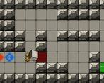
It's pretty hard ! I like the different features (levers, cannons…) which varies the gameplay !
Thank you! I especially like the cannons haha
this is an enjoyable and actually kind of hard game. I like how there is an actual character instead of just a bland dice and the character has some nice animations. I really like the pseudo 3d feel as there is a technically 3d dice but its not using a 3d renderer. However there are some things i'd like to point out being how sometimes the dice indicators are just broken as in they dont show the right numbers. It also seems like they are reversed sometimes. Other than that good job my guy!
Thanks so much! Appreciate the kind words and the feedback.
That's strange about the indicators. Will definitely look into that. That never happened to us during development. Can you point out any specific situation where that happened?
I appreciate the compliments about the graphics and animation, I had fun making those.
Fun and quite challenging puzzle game! I love the victory animation of the guy
Good game. I used a similar idea but you fleshed it out more, with more levels.
I love the victory animation, it makes it satisfying to finish the levels.
Yeah, I've seen quite a few similar ideas. I thought we had a pretty original idea. Anyway, glad you liked it, your game is pretty good too.
Thank you so much for your reply. I'll be playing yours too as soon as I have time. Looking forward to seeing what other people did with this concept!
I wanted to play this game, but the antivirus keeps thinking it might be a malware and makes it unplayable. I have to wait until analyzing is finished.
That's unfortunate.
Understandable. I can assure you it's just a game :P, but better safe than sorry. Hope you give it a shot when it's finished!
Alright, I was able to play it, and I must say it's really well made ! There are a lot of mechanics and it's really fun ! The dice display can be a bit confusing, but that might just be me.
Thank you so much! Loved your game as well.
Making the dice display more clear will definitely be a priority when making this into a full game. For now, we show the top and front. The pink number indicators tell you the bottom, left, right and back, but it's not very clear I agree. Do you maybe have suggestions on how to improve it? Maybe a side bar where you can see different sides of the die or something.
Would be great if you could leave a rating! ^^
Already did that.
I suggest making it so you hold a button, it shows a patron of the dice, and a square that shows the top square. A bit similar to what I saw earlier.
Thank you! Ah like an unfolded papercraft die?
Yeah.