Play game
Biggerer Smallerer Battler's itch.io pageResults
| Criteria | Rank | Score* | Raw Score |
| Style | #2140 | 3.387 | 3.387 |
| Overall | #3393 | 2.914 | 2.914 |
| Enjoyment | #3915 | 2.581 | 2.581 |
| Creativity | #4162 | 2.774 | 2.774 |
Ranked from 31 ratings. Score is adjusted from raw score by the median number of ratings per game in the jam.
How does your game fit the theme?
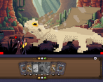
You are shrunk down Alice in wonderland style, all creatures are scaled up to be huge such as giant ferrets, giant rabbits, and a giant bearded dragon as the final boss he has lots of scales.
Development Time
(Optional) Please credit all assets you've used
Quinten - Team Lead, Code, Design & Production, Support, UX/UI
Tibeau - ( First Time Jammer ) 2D Art, Q/A, breaking Git
David - ( First Time Jammer ) 2D Art, Support
Lily - ( First-time Jammer ) 2D Art, Animation, Backup Code
Ethan - ( First-time Jammer ) Music & SFX & Ambience
Penguin - ( First-time Jammer ) Music & SFX
Seppe - Code, Programmer Art
Super - Code
Leave a comment
Log in with itch.io to leave a comment.


Comments
I don't know how to feel about this one. The art is nice, the fact that this is engine-less is impressive and all... but what's the game about? Just playing every card I could at every turn seemed to do the trick. I am very curious about what the original vision was.
The original vision was to mix old-school Final Fantasy & Fire Emblem with Heartstone.
You start of as "basic Bob / Bertha" an all round character, you go in the world finding more cards, you can recruit allies ( they add x cards to ur deck ) you would be able to keep 5 allies at the same time. And switching them out removed their class cards from the deck. You could find events where you gain / lose a card; sacrifice it to get better ones, and use growth / shrink potions at a merchant to up/down-cast its stats.
The combat system was supposed to have status conditions & effects- same with biome conditions; like desert was going to reduce accuracy & snow was supposed to lower your initiative / speed.
If most of the core-team is onboard we will revert the last-day spaghetti and make the full vision.
We underestimated the 4 day time-limit though. I as a team-lead only had 1 other jam game under my name for a 2 week jam. And most of the team were first-time jammers. Still think the entire team did great and we managed to get out a rough but playable prototype. <3
Hi - can you please confirm that you made all the assets in the game and didn't use generative AI to create them please!
Hi I am smolducky, one of the artists. I have contacted all of our artists for all our files so that you can go over them! Currently I can provide both character assets and card and deck assets, we have notified our background artist regards your query however he will need some time to be able to provide them as he is having his wedding as this moment, regardless he has promised us to send over everything as soon as he can after the ceremony. Please let me know how I can provide further assistance as would like to make sure any doubts over us using generative AI is cleared.
I'm Quinten, Both Team-lead & Lead-developer. I'm willing to provide my entire commit log and give you full access to our Github repository to inspect any of our "delicious spaghetti".
All assets are sorted into folders sorted by who made them, let me know if this is of any help to you.
Most of the team was always live on discord and we are adamant that there was no use of generative AI.
- Code wise even we couldn't figure out our spaghetti at times, it's also engine-less so I doubt any model would even be of any help.
- Art wise both Mr.Tibs & Ducky have responded with source-files. Yet waiting on a reply of our background artist.
- Music & SFX wise the team is gathering their source-files; we made a custom sound engine with block based audio based on a state-machine. This required a lot of skill to get right.
If any of the team lied to us and used AI behind our backs I would be devastated- We put our soul into this project, and some of us didn't get much if any sleep.
- Quinten / Computer_Q | "computer_q" on Discord
All good - thanks!
Congratulations on a team effort, especially to first timers! To me it's more impressive that you've managed to work something out with so many people, then the game itself.

Liked the presentation, but gameplay - not so much, since (if I'm not missing anything) it boils down to "drop shieldy card on da boys, spiky - on da enemies".
now the real question - did that ever happen?)
Thanks for playing :D
Underestimated the 4day deadline took a bit to get team synergy ofcouse :P So combat itself is a bit rough in its current state.
And no, this did not happen, but Typescript was adamant that it can happen XD.
Did you manage to beat the final boss; The giant lizard?
Yeah, I beat the lizard.)
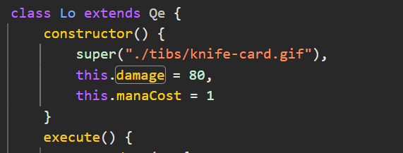
tbh, I eventually got lil tired and decided to be cheaty again
you gotta figure out how to protect your next game against me
Really need to look into adding "anti-Enweave" protection XD,
Fun to see people reversing source and just getting OP.
How dare you make my knife OP!
now time for me to do the same
This was so cute. Oddly, I felt 0 stress while playing. It kind of took me back to my last Inscryption playthrough, especially with the map. The art is very warming and the music is fitting that.
Some stuff that could use improving: UX design, mostly. It took quite a whole to figure out what the mana balls at the top right were, my characters were getting hidden behind the cards so I couldn't really tell who I was until I ran out of cards. Enemies felt a bit non-threatening, but that could be attributed to the absence of animations.
All in all, Kudos!
Glad you had a no-stress time playing, a break from some jam games for sure!
As part UX/UI designer for my dayjob I do agree that some stuff is lacking at best. All just came down to time, if this was like a week or 2 jam we'd have pushed & polished way further :) , just underestimated the 4 days & was a new experience working in a team for the first time :D
Did you manage to beat the final boss?- He's quite tough if you didn't pick up some extra cards :P
Slay the spire, but HTML god version! :D Art is very nice to look at, the music is nice! And the idea is good!
The art & sound teams did an amazing job, really proud of them <3
Did you check the jukebox for good vibes?
And I managed to create a game that functions like another without knowing it twice.
Lets see what next jam will be :P
Background looks great
Music is really nice, even if it probably needs to be balanced a little (especially with the credits music)
The battle needs some feedback (for attacks etc)
You also need to tell the player the card effects (even if it's on your page)
This kind of card game relies on strategy, and it doesn't seem like there is any strategy right now
There's also a little bug when you drag cards
GG for the custom engine though!!
That's impressive
The game page is also really nice
Thank you for your feed back! :D
So, finished playing and here's my review:
1. The art is really done well, although I would love to have better animations for actions. But the variety of enemies is complementing the lack of animations for me. Music is amazing, a lot of biomes is also a nice touch, in general this feels like a lot of content (I only counted 3 biomes and 5 enemies, unsure if there were more)
2. The difficulty of the game is nicely balanced, I had time and opportunities to heal and sustain damage while waiting for damaging type of card.
3. I haven't really noticed visual indicators. I believe that's because of custom engine, but would be nice to have at some damage numbers or heal numbers appear above enemy/player. It was also difficult to know what each type of card does - I'd say its better to have at least a text above them to say that some of them are damage cards, and others are healing cards.
4. I have noticed some bugs, probably it's also related to the custom engine. For example, sometimes the card at hand is hidden and I had to manually drag them to know what cards do I have
5. At first I didn't really understand the mechanics, but it's not very difficult to manage without a tutorial.
Overall, it's very impressive considering the custom engine you used. Keep making games, I want to see more of those!
Thanks for playing <3
Lily / Ducky, Tibeau / Mr.Tibs and David / Daves Law did a great job on the art. <3 If we had more time we would have fleshed out the combat more, was very hectic in the last few hours, only got combat & loop working 4h before deadline pretty-much.
There are 10 enemies & 3 biomes (4 if you count the boss)
Did not have more time to add more visual indicators, currently there is only the turn arrow & glowing selectable card. Mainly cuz it takes a while to do these from scratch in engine + "QUINTEN WORK ON CODE & MECHANICS THIS IS NONPRIO" - Tibs XD
I will continue to make games engineless- as this has become my signature trademark. ;)
I like the visuals, and the mix between jrpg and card game combat seems quite interesting!
But the game really lacks any feedback to player actions.
All in all, the fact that you can’t result predict the result of your actions or of enemy actions makes the combat really random. It’s a fun random, but I it kinda makes the game not worth replaying.
Nevertheless, good job!
Our vision for the project was a bit bigger, the ?'s were meant to be event tiles "find a new character" , "gain a special card", "lose a card", stuff like that. Programmer working on the cut-scenes did not get it ready in time, so we just made it a free move tile.
The card drawing & movement is something we spent much time on, still got all buggy when implementing client scaling & touch support sadly.
"Spending mana" on a card meant it insta-cast. This is a bug, so is the shop not telling card's mana cost. ( the shop is a Zelda-like "its dangerous to go alone take one" ) otherwise :D
I as a team lead definitely underestimated 4days vs 14days with the last jam, but seeing as this was my first team-effort and a lot of the team are first-time jammers I see this as an absolute win. :D
Thanks for playing! - Hope you enjoyed fighting lizards.
The HTML wizardry on show is insane. The game was built without a game engine and is so feature full and made with love it's absolutely insane.
So I like to write these things by getting the bad stuff outta the way first so let's do just that. The battle system honestly makes no sense to me at all. It really just felt like "random bull**** go!" every turn of just throwing cards at the enemy and honestly it worked for 99% of the game and I felt pretty much indestructible. Sometimes though when I tried to draw a card it just disappeared or showed up in my deck the round later but still flipped over and all around lots of very messy card interactions that had me thinking "is this a bug or am I doing it wrong?". The battle system was not really fun at all and without any information on what the cards actually did other than figuring it out via trial and error it was pretty much just all over the place.
The art is fantastic from start to end. The cards look fantastic I especially loved the animated ones. The shop keeper looked great as did the background and UI but the characters and monsters were SO much larger scaled compared to everything else it really broke the cohesion of the game for me. There's some weird scaling all over the place such as the characters looking too thin/squished and most of the monsters just being tiny sprite that have been re-sized 10x. Regardless of all the scaling issues it didn't make much of a difference in my enjoyment of the game and I still thought it looked really cool throughout. Not to mention the number of different backgrounds and enemies!
The audio was absolutely fantastic the music throughout the game was great and so well done and fitting but then when I finished the game... what the hell was that song? Hahaha it had such a British sense of "F*** it we're done let's just put something stupid and fun in that we care about". I actually loved it, felt very Monty Python nonsensical and just fun.
The pacing of the game was fine until I got to the end boss when it totally kicked my *** and pulling constant bad cards without being able to heal kinda sucked. I wish I could just keep pulling cards if I had energy cos having 10 energy and then just wasting it all every turn cos I had no cards to play felt kinda crap.
Overall an insanely well done game built in sprite of the various game engines available these days and is a pure technical and artistic marvel. I wish I enjoyed the battle system more but honestly with everything else going on for the game it's still super fun and clearly made with a lot of love.
Love to see one of your giant feedback write-ups Ecks.
This game was full out HTML wizardry, it did not even use a canvas element. I underestimated the 4 day time limit vs 14 with the Pirate Jam, also working with a team for the first time. Made some parts a bit messy at best..
I loved the audio & backgrounds the team made so much I gave it a dedicated "jukebox" button on the main menu <3 and padded the cards everywhere on this page, and most of the characters are very meme-able :D
The credits page was our collective "dev-log" / sh*tpost we kept adding to it as we worked on the game.
Battle system was cobbled together in the last few hours as I was scrambling to get it to work ;-; just wish we had more time.
Trying to get most of the team onboard to continue on this and implement the full vision for the battle system. :D
I liked the concept, but the game is basically Slay The Spire made on a game Jam. Which makes it hard not to look at all the unpolished things. Here's a list of my thoughts playing:
Sorry if my comment is to straight forward and negative. Not my intention to offend. I understand that the team is mostly new people for such an ambitious concept and because of the credits I can see you all did your best and had fun. This is my third jam and looking at the results, the games with the most simple concepts and fewer mechanics always come out on top. Hope you all keep going forward and improve further.
No worries, we can take some constructive criticism :)
Concept was meant to be Old school Final Fantasy / Fire Emblem X Hearthstone.
I'll go over every point one by one :
- Adding more & expensive cards could make this better, I do also like the idea of using MP to draw more cards.
- Sadly yes, the programmer that was working on dialog & transition screens could not get it done before the deadline, our team wrote it in the game description.
- This I fully agree with, cards should have a way of showing info, we added a magnifying glass late into development that you can drag onto cards to see the description, this however did not function well enough to ship, and with 2 hours on the deadline and descriptions not being written out we just reverted that.
- Next point falls into that too :) , The shopkeep is an "It's dangerous to go alone- take this." type of guy. You can pick a free card to add.
- Question mark, will be an "event space" in the post-jam update. Events could be having an extra team-member => more cards, a random free card or an upgrade to an existing card, or just a sudden ambush.
- Tibs, Torag & Ducky did an amazing job with the art, I'm proud of them and the team. <3
- The credits was our collective "shit-post" where we kept adding random dev images, glad you liked it. XD
Thanks for checking out the game, how rough it may be, And also writing up some feedback. :D
Coming from the Pirate Jam where I had 2 weeks, to then GMTK 4 days in a team is something I definitely underestimated as a team-lead & lead-programmer, but the team and I had a great time. :D
And trying to get at least most of the core team to continue working on the project, iron out all bugs and add cards fully.
You're too kind <3
This was a fun game to play! I really liked the art and music. I enjoyed the battle system too. The concept is fun too!
Here's some feedback if y'all choose to expand on this:
Overall, great work y'all! It's awesome how much y'all got done for the jam!
Glad you enjoyed our game :D
Spent a long time getting to deck to draw properly, to realise. "This is supposed to be automatic" -Nahh let's real-life cardgame this :P
The card's sometimes disappearing is a nasty bug we didn't get fixed in time, no worries as the card just insta-played XD However mobile is safe from this curse. ( As far as I had in testing )
Question marks were supposed to be events, like recruiting a new character, finding a random card, losing a card, getting ambushed, or general lore. Scope & Time made us unable to fully implement this, but we kept it in to balance the map's rng a bit better and to show future plans.
Blizzard should be 2 turn stun. However as status conditions were too broken to keep in final build, blizzard currently is just a fashion card that slipped in the cracks.
Had a great time working together with the team, and I want to fully implement all cards our artists drew. As of now, it's quite the spaghetti in places :P
edit: my comment originally duplicated for some reason, but leaving this one too because it has a reply :)
Glad to hear that you liked the art! Was really nervous about how it would end up as I had to cut down on details constantly. I really want to continue working on it and improve the existing sprites with more detail and animations.
Ooh, but now you have 2 replies, But; this one makes it 3 XD.
New meta for reply farming? Double-post :D - Happy you kept it with just an edit.
make it 3!
Really glad you enjoyed the art! It's hard to believe the amount of redraws (heh) I had to pull to make the cards feel just right,
Ducky was amazing to work with, especially seeing her enemy designs
Dave was also amazing with the backgrounds & implementation of our ideas.
We can't be more proud after seeing all these positive comments! :D
Great job Quinten! Also awesome to see you picking up some new jammers! The game is so cool and it feels cool to collect new cards and stuff. Some small animation for game feedback would've been helpful, at the beginning I didn't realize if I was doing something. Otherwise great art and awesome gameplay!
Thanks <3 Had a great time working on the project with the team.
For first-time jammers they all did wonderfully! The entire battle system was added last day in "crunch mode". ;)