Play game
Slay The #!@*&%'s itch.io pageResults
| Criteria | Rank | Score* | Raw Score |
| Audio | #155 | 3.148 | 3.148 |
| Innovation | #189 | 2.963 | 2.963 |
| Graphics | #240 | 3.000 | 3.000 |
| Gameplay | #245 | 2.741 | 2.741 |
| Overall | #254 | 2.852 | 2.852 |
| Theme interpretation | #365 | 2.185 | 2.185 |
Ranked from 27 ratings. Score is adjusted from raw score by the median number of ratings per game in the jam.
GitHub repository URL
https://github.com/aletail/gameoff-2023-dungeon-crawler
Leave a comment
Log in with itch.io to leave a comment.




Comments
Good job on the game! I always enjoy a dungeon crawler.
I like the ideas that are within the game. I could see it being expanded further.
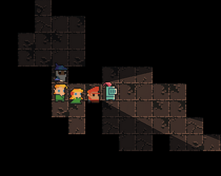
The art style and characters are great looking. I like the little personality each of them seem to have.
I don't know if it was intentional, but I always seemed to encounter the boss near the start. I tried playing a few different times, but it was always the same result.
Overall, it is a solid game.
Really cool dungeon crawler, very simple and fun
Thank you!
I really liked this concept!
With more time, I think you could develop a really unique game experience here.
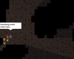
I especially liked that the game reacted to the environment - the speech bubble and the camera zoom in tight spaces were very effective.
The controls of moving through the dungeon, and the transition to combat was very satisfying as well.
Really inspiring stuff! Keep it up!
Thanks for the feedback!!
It might have been the high resolution of this monitor, but I could see quite a lot of the level, the dialogue text was very tiny, and the camera movement and zooming was quite aggressive. So maybe that’s something to keep in mind.
Having said all that, I love the idea and I think the idea of exploring a procedurally generated dungeon with a party like the one in this game is very enticing. The gameplay at this point is a bit simple (that’s a jam for ya), but it would be so cool to explore and discover good things (loot, equipment) and bad things (monsters, traps) during the adventure. There’s a lot of promise here! I loved the dynamic dialogue from the characters, really makes them feel more alive with a personality.
Great work!
Thanks for the feedback, I was wondering if people would have an issue with camera zooms.
I agree, there is a lot to be added 😁
this is a fun little game! the dynamic lighting was a looked great and touches like the zoom in when in the tunnels are excellent. i wish there was a bit more map to explore, but regardless i had a great time playing!
Thank you for the feedback!! Exploration is one area I would like to flush out some more (well a lot more)
Decent! I like the artstyle and also great job on the light and shadow! It really adds a lot to the overall atmosphere! I feel with a bit more polishing this could be huge!
Thanks for the feedback, much appreciated!
Simplicity is key! :)
Very nice concept here, altough in my browser the game window is quite little.
Nice job overall!
Thank you for the feedback, you can go full screen in the lower right hand corner of the screen (At least you should be able to)
I think the original Final Fantasy characters may have been more like this if their names had not been so limited in number of characters xD.
Anyway, fun little game! I like the music and the sound effects that were added. I thought it was neat that when zoomed out, you could see the entire level, although it did turn the characters into wee lil' bits. I think that could be used as a strategy element too, like if a path were not reversible, but you chose based on what you saw when zoomed out.
Other than that, I would say it could just use a slliiiiiight tweak on the battle balance...I think maybe increasing the cooldowns just a little. I see the idea there of using your heal at the right time, but I started to get the feeling that even if I didn't strategize that, and just used it when available, I wouldn't be able to lose. Mind you I didn't actually test it enough to be sure.
Also nice job on the lighting and shadows! Definitely adds a lot to the environment.
Thank you for the feedback, much appreciated!
NICE JOB!!!
I like the movement system with mouse and the general idea, but I think it's a little slow for the amount of player
actions.
Thanks for the feedback! I agree, there almost needs to be another activity to do while exploring the cave like discovering loot or something
I find the idea of managing a party of adventurers very interesting. The game is quite random, on my first attempt I encountered the #!@*&% immediately after starting the game before meeting other enemies. Also, I found dialogue difficult to read when zoomed out.
Still, It's a fun game, good job!
Thank you for the feedback! That was the original thought that came in my head, a party of adventurers walking through a cave/dungeon in single file. I actually played around with larger parties, like 9 and 20 but it was a bit too much.
This is a cool idea I'd love to see expanded on. Strong "vibes" and I like the art and lighting. It wasn't very clear to me what damage was doing when I pressed it, but I still pressed it pretty much whenever I could. Something that might help could be an enemy which uses a shield, so you'd need to save your attack for when it's vulnerable. Also wanted to mention I somehow totally skipped past the horde on my first try and only fought the boss ( though on my second playthrough I was able to fight both)
Thanks for the feedback!
I'm definitely refering to this game as 'Slay the tarnation' hahaha 😛
I found your project to be quite interesting and unique compared to the rest of this jam, congratulations! 😊
The designs of the characters are really cool, and them saying random phrases while playing makes them have more charisma. I would have added a few more phrases, but it's a nice detail that other developers wouldn't take into account! 😃
Now into the things that I'd polish:
Other than that, very interesting project, keep up the good work! 😁
thanks for the awesome feedback and kind words, you bring up some good points and some solid suggestions for improvements.
I think after this jam is over and the procjam I am currently in I may come back and revisit the project and add some of these improvements! Thanks for the suggestions, best of luck to you in the jam!
A very entertaining game with one of the most original ideas I've seen in the Jam. It's really fun, so good job^^
Thanks for the kind words and feedback!!
Well done! Really cute style and polished art. Also the fighting feels chunky. Some feedback would be that the use of the theme could have been slightly better, and maybe something could be added to make the gameplay more diverse. But overall, great job! Congratz
Thank you for the feedback! Agreed on all your points :)
I wish there was more deep to the combat, because the premise is pretty good
Would love to play a more polished version :D
But overall, good job!
Thanks for the feedback, much appreciated!!
I'm a sucker for pixel fantasy. I really liked the idea, although it was difficult to see strategy. Love the character names.
I'm not sure if the fuzzy pixels were intentional, if they were, I apologise. But there is a way to get sharper pixel textures in godot, if you wanted that.
I like the game title and am curious as to what it means.
Thanks for the feedback! The tileset I used was 16x16, I’d be interested to hear how to make it sharper (I have only been working with godot for a couple months)
As for the title, originally I was going to call it “Slay the blank” and have random bosses to kill at the end, but I wasn't really liking how it sounded. So I came up with the idea of using a “Grawlix” (I had no idea it had a name) This is used to censor obscene words, so hope it doesn’t offend anyone haha. Anyway a player can then put whatever word they want there or even change it anytime they want. Kind of a fun title I think
https://ask.godotengine.org/122518/how-to-import-pixel-art-in-godot-4 This post helped me out a ton
Thanks Professor Blue!
It was a different idea for sure but I find decision making lacking.
For example why would not I press the damage button when it is available ? Tank was also very tanky so same goes for taunt.
For example:
I think damage button could damage us a little to give the buff or even damage 1 person randomly so It is a risk to use it when party is low health.
Thanks for the feedback! I agree, it really becomes a matter of always hitting damage and taunt after their cooldowns, then saving that heal for when you needed it.
Very cool concept. Can't wait to see what you do next.
Thanks for the feedback!
This feels like a very strong proof of concept. The pixel art is very charming, and I enjoy the bits of conversations between party members during the travel. Everything is very well animated, and the visuals seem as though they have a good level of polish. I was legitimately surprised when the Boss started crashing through the walls to get to my party.
I'd be interested in see what this game looked like after another month of work. It seems as though you have a strong base here, and all you need is to add more for the player to do. I'd also suggest making combat a bit more complex, as at the moment I don't feel as though there's too much decision-making to be had. Lovely game, and I'd love to see more!
Thanks for the kind words and feedback!!
Agree about the combat, I had some ideas that I couldn’t quite make happen, it just needed more time to flush out.
Most of the artwork was from an artist here on itch.io: https://0x72.itch.io/dungeontileset-ii pretty awesome stuff and easy to work with
The core mechanics have a lot of potential, playing as a party, moving by grid, etc. A bit more time and this will turn out great!
Thanks for the feedback, I plan to iterate on the mechanics in future projects as I did like how some of them turned out.