On Sale: GamesAssetsToolsTabletopComics
Indie game storeFree gamesFun gamesHorror games
Game developmentAssetsComics
SalesBundles
Jobs
TagsGame Engines
A jam submission

Cruel ThirstView game page

Fireside Game jam
Submitted by RicoTV — 6 hours, 27 minutes before the deadline
Add to collection

Play game

Cruel Thirst's itch.io page

Results

CriteriaRankScore*Raw Score
Art/Graphics#83.3663.615
Audio/Music#133.0793.308
Theme#132.7212.923
Overall#152.5492.738
Overall#162.0052.154
Fun/Engagement#171.5751.692

Ranked from 13 ratings. Score is adjusted from raw score by the median number of ratings per game in the jam.

Judge feedback

Judge feedback is anonymous and shown in a random order.

  • I really enjoyed your audio. All of your music, SFX, and voice were very nicely done for the feel of the game. Graphics style was great, especially your opening cutscene. I really like the gritty feel of the graphics, this adds to the ambience. Unlike most I did not see an issue with controls or not knowing what to do, the instructions were clear enough for me. I understand it was an unfinished product which is why I lowered my overall score. I am keeping my fun/engagement score up because I really did want to play this game even if I could only get so far. The fact that I still wanted to play more speaks to the level of engagement. There are bugs with who/what could be eaten, and a lot of that comes out in play testing once you have a level finished and are refining. For a first game jam and learning the new engine, bravo. This was a great first shot.
  • I see you got sick and didn't finish the game as you intended to, so I'll just say the art is nice and the concept is not at all what I expected. So points for that. Issues: -It didn't seem to feed every time I pressed the button. -The auto-movement was a little strange. -Keeping the "Press I for instruction" in game would have helped. I didn't know how to feed til my second playthrough. Overall, Interesting, if maybe a little over scoped and in need of some fleshing out.
  • Congratulations on your completed entry into the Fireside's first ever Game Jam!

Did you work alone, or as part of a group? (If in a group, list their names)
Alone

Disclose if you used any public domain assets or not.
Used free to use piano on title screen and free cat and rat samples sound FX

Leave a comment

Log in with itch.io to leave a comment.

Comments

That intro was killer O.o well done!!

Submitted

Echoing what a lot of people said already, I thought the presentation and art in this one was top notch, good job! One thing I would recommend (and this might be gdevelop, i'm not sure how it handles text,) the text, especially the script font, is harder to read when it gets pixelated. Making sure it stays a vector object so it's clear at any size would make this a lot easier to read.

I understand the game is unfinished, and I think you did the right thing by submitting it because when it comes to game jams literally anything is better than nothing, so good job! However,    I think it would be a good idea to note exactly what's unfinished about it on the itch page (like that it can't be beaten and what features are missing) because it would cut down on the confusion of reading the instructions and being completely stuck  because the player can't tell if they're doing something wrong or not.  But that being said I think this would be a great project to flesh out after the jam is over, and if you do I'd love to play the finished version!

Submitted

Amazing intro. The sprites' art styles sometimes clash with one another, but there's some good ones. I just couldn't figure out what I was supposed to do :\

Developer(+1)

Thanks for the feedback I felt pretty good about the intro, sorry the game was a bit unfinished I had some core (what I thought should be straight forward) behaviors pretty much sorted till they didn't want to work on me. I spent a while trying to get it less broken (setting on fire) as was all I could muster I was going to put a coffin or lair at the end but then I figured I had no were or time to make the next bits.

I promise a more complete game next time :)


Submitted

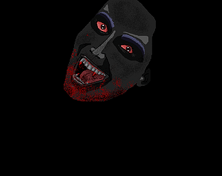
What an impressive intro! Loved the cool character, the great music and voice work, and the general atmosphere you created for this game. I think you really nailed the aesthetic you were going for. That being  said, there's a few things that I think are kind of holding me back from loving this. First, I could not figure out for the life of me what to do. I read the instructions and still couldn't figure it out. Second, It looks like the art for the foreground and background really clash, like maybe they were from different art sets or just made in different resolutions, or just poorly scaled and blurry.  It can be a little ugly at times, which is only noticeable because the other artwork just looks like it had so much care put into it. I  think the story for this one really could have been great had you had more time to expand on it. The particle effects when the sun is rising were really cool how they just gradually show up, and I love how it is almost a pleasant happy moment when the sun takes you. 


Overall though, great work!

Developer(+1)

Thanks so much for checking it out and your feedback.

I think I over scoped a little and next jam will try a more concise concept. I just started learning Gdevelop and doing this Jam helped me learn more than I expected.


Look forward to the next Jam :)

Submitted

That intro needs to be skippable, it IS very cool, but after I couldnt figure out what to do and restarted to read the instructions and tried again, it was not so cool the second time around.

The instructions didn't actually help much, I just could not for the life of me figure out what I was supposed to do, which is a shame because the visuals and audio are top notch, but it wasn't much fun to play. I couldnt help but feel that I was doing it wrong and there might be a good game in there, but if that's not communicated to the player, there's not much we can do. I'm sorry you fell ill and really wish to see what the game could have been if you had more time. Drop me a reply if you update the game further because it looks really cool.

Developer

Thanks for the feedback, I will definitely keep your advice on the intro in mind - you are 100% right (I know cos all the times I playtested got a little much).

I am sorry for the game experience I didn't quite get were I wanted and rather than not submit as I was excited to do a first Jam I let it be un winnable. I really had the concept down to be a lot better with morality choices and I pictured a proper ending (although no way I could do that in Jam time). 

Goal for next Jam = playable and payer can win.

;)

Submitted

The beginning of the game Animation and story was incredible ! but when the game started its kinda a bit hard to understand what to do, i started to click every button to try something, but i noticed at the beginning there was a small word says press i for instructions, i noticed it when i already pressed space, i had to read the instructions before i jump in <.> but maybe make that word bigger to people to see the instructions button before they start, or force them to see the instructions before the game starts, overall the raining effect and the vampire animation and story telling at the beginning is amazing <3

Developer(+1)

Thank you, sorry I didn't get to make the game more playable. I learned some fun tricks in regard to particles and layer effects making the scenes. 

I tried several times to figure out what to do, I hit every key and clicked every button. Not sure what I am supposed to do? My vampire got to a path where I could select up or down but that was it? The intro art was so cool too! And the theme is right on point, its a shame you couldn't finish it.

Developer

Yeah I wanted to get it working a bit better but my progress fell off when I lost pretty much 2 days. I would have really liked to have had at least two levels, and a results scene in between showing how sadistic/compassionate you had been. 

I was going to put a resting place at the end of the path (so he could hide from the sun and therefore win the level), but as I had nothing I could add felt I might a well let him die. I understand it would have been frustrating for players so sorry, he was meant too have a hunger death too. 

I did kind of get a feral mode working but again beyond base behavior and look needed much more work.


Thanks to everyone  for taking the time to check my "game" out, it was my first jam and I learned a lot even putting this together.

Look forward to the nest jam :)