

There was no miner, so that wouldn't have been it. There may have been a thief in that round, if that could be relevant. Hope you figure it out!
The Gray Space
138
Posts
1
Topics
22
Followers
1
Following
A member registered May 03, 2021 · View creator page →
Creator of
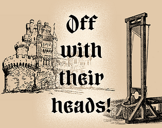
Keep your Monarch's head on or you'll lose your own!
Strategy
Play in browser
"Well, why didn't you just leave her?" and "Just leave him then" you hear them say, but things aren't that easy...
Interactive Fiction
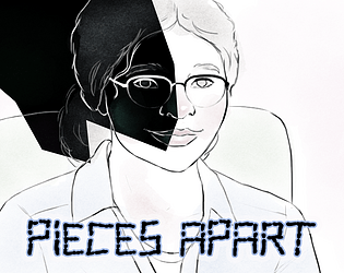
An interactive story about dissociation; feeling broken up into pieces
Interactive Fiction
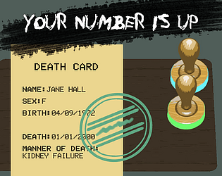
The afterlife is endlessly bureaucratic. Dying is a tedious business.
Simulation
Play in browser
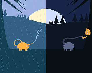
Two creatures with two opposing roles. Can you keep the balance?
Puzzle
Play in browser
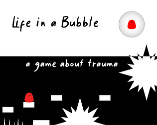
A game about how trauma changes how you experience the world
Platformer
Play in browser

Recent community posts
Love the atmosphere and audio. I like the combination of the turn-based mechanic with the feel of an exploration RPG. I quite enjoyed the upgrade system, although I'd want the ability to skip them if I'm happy with my setup.
For just a game jam version, this was a great experience. For a potentially full version, I'd say this is currently lacking just a bit of motivation of curiosity to pull me in further. The gameplay is fun, but it should tease a bit more about why I'd want to explore these caves, what could be down the next ladder if I just keep going.
Potential bug: it froze for quite a while after I claimed the Leftovers item upon clearing the second room. It did keep playing, but it paused for like a solid 10-20 seconds.
This is a surprisingly polished game. I could easily see this becoming a full release on Steam. I get slight Inscryption vibes from this, but it's also uniquely its own thing (with the classic elements of chess, of course).
I'm not entirely sure about the current balance. Random cards can be almost unusable, as they would risk putting me in an awful position (or they do), and then I'm waiting for better cards but watch the timer run out. And I understand the timer being there in accordance to the jam theme, and it obviously ties into the theme of playing against Death as well, but I also wanted to build a strategy and have the time to do so (and couldn't with the random cards). I think the game might need to push in either direction more (fast-paced strategy with time pressure, or slow meticulous strategy without a timer) and provide the cards for that type of gameplay.
Also, ideally, I would have the first game/few games be pretty easy, just to teach the core mechanics and get the flow of the game. Thinking about Inscryption again, whose tutorial and early game are just perfect.
The overall look and feel of this game is amazing. Definitely worth continuing with.
Love the style, the animations and chatting sounds are hilarious and the writing is fun. There is quite a bit of world building that adds some depth to a game about counting coins. And I quite like the style of the currency symbols as well.
Right now there is a fair bit of reading involved to get started. Which may or may not be bad, but I think about a game like Papers Please that gets gradually more complicated as well, and yet manages to design it in such a way that I wasn't outright spending time reading manuals. I think a game like this could benefit from more of the book's tutorial being integrated into the gameplay itself, while utilizing the book as just a reminder.
Also, this probably wasn't what you were going for, but this would actually make for a fun educational game for kids to learn some maths.
I like the graphics, the music's fun and the sounds and animations are satisfying. I also liked clever bits like watering down the pipes to spread it evenly across multiple plants. It was a bit precise at first and had to die a few times to get into it, but once you're into it it's well-balanced enough. I do wish there were checkpoints I suppose, and with games like these I always kind of want to know how much longer until the next safe spot.
I really enjoy the visual aesthetic of this game and music, but I do think the camera needs to be panned out quite a bit more so I can see more of the screen, and so the camera doesn't move as erratic when you jump. I mean, that might just be me, but I can't look at this for long before getting a little nauseated. Ideally, imo, the camera doesn't move vertically at all when you jump (unless it needs to follow the player outside the screen), it's much easier on the eyes. The jump and run do otherwise feel good to control, though.
The animations on the roulette are awesome and the music's interesting. The bit of story on the game page sounds interesting as well, it'd be cool to see it worked into the game.
I think there's interesting gameplay here that could be made more interesting with that storyline, but in this state it's tough to get into. There's a lot being thrown at you at once. Which is pretty normal for game jam games of course, it's to test an idea, but it would certainly benefit from an early game section that slowly eases you into all its different mechanics and upgrades.
What wasn't fully clear to me were some of the results. It'll say something like "10 slot chips x 2 multiplier" but then I still just get 10 chips, not 20? But overall, I felt like I was building towards a bit of a strategy with my mushroom colony and I managed to keep hitting the goals that were set.
The text is sometimes unreadable unfortunately. Some text boxes are hidden behind other objects or fall off the screen, some text doesn't fit its own text box. I think you need to make sure your UI/Canvas scales relative to the screen, so everything scales properly on different screen sizes.
I played this one for a while, I really liked the gameplay and the art looks great too. I like this kind of deduction puzzling. I did feel dumb at first not understanding how to determine a safe first click, and then opening a cursed one, but it feels like there is just no way around that? As others have said, that does feel unfair to the player. Either the puzzle should allow you to deduce the safe first click, or the game should show a single open grave to deduce the other graves from, or the first click should simply always be a safe one. I think the middle option makes the most sense. Nevertheless, it was enjoyable to play.
In one round though, the judge said there were zero cursed bodies in the surrounding tiles, but I still ended up digging up a cursed body. I don't know if that was a bug/mistake or a mistake on my end, but I didn't understand what happened there.
This sounds like a really fun concept to me, but I wouldn't know for the life of me how to open a .yyz file, I'd never heard of it. I think you'd be better off exporting it to a Window (and/or Apple) executable, meaning .exe, or perhaps better yet, something that can be played in the browser? It's a shame if lots of people skip trying your game because they can't open it.
The art and sounds were cute and I kind of like the idea of serving items to cat customers. Also, that title is great, I saw it on the Discord and got curious. I think the game felt balanced enough in terms of being able to make it timewise through the day. I do feel like it can use another mechanic to make things more interesting than simply clicking the item image that's displayed in a text balloon. Like, the video store simulator Retro Rewind has the player finding movies for customers, but he's asked to pick a good selection based on criteria and customer wishes. Tiny Bookshop does something similar. Other shop simulators have you build out your store by buying new upgrades. Those are layers that add some strategy and give the player more choice, and having choice is fun.
I would put a tutorial into the gameplay, not as a list of text at the start. Take me through the steps as I'm playing it.
Clicking the cart every time felt a bit tedious and unnecessary. Why not just have it open the whole time?
Also, the font (at the beginning) is difficult to read. Although mainly that's because of those blocks around the letters. It looks more to me like something went wrong with the embedding, perhaps?
This is a cool concept that had me curious right away, but it's difficult. At times I had a bit of a difficult time understanding what I was trying to do, making it quite trial and error. That meant lots of hopping back and forth, not fully grasping what I was doing wrong, because I wasn't totally positive on how to move forward. It felt like it required very precise timing. I think it's also just fairly difficult to think backwards for a longer period of time, but that could very well just be me. So it's an interesting mechanic for puzzles for sure, but it went a little hardcore on the difficulty too soon :) Imo it really is fine to just start with the most basic imaginable puzzles, simply to let the player get the hang of the mechanics.
Interesting play on the theme. I really like the reward system of how to build your own deck. I did find myself wanting to make combinations. Like, add 3 + 6 to make 9, then multiply it by -5 to take out the 45 in one big swoop. I think being able to create massive multipliers by cleverly stacking increasing amounts of things in the right order could make for really satisfying play.
I think this could use a bit more nuance in the writing and a more clear goal for the player. I'm being introduced to one character, have to make some choices for them, so it feels as though it's about their mental state, but then the focus seems to shift to the friend character's troubles. I'm not sure what I'm trying to do here and that makes me feel like a spectator following this story from a distance, rather than as the main character within the story.
Might also be good to consider who this game is for. Is it to make people more aware of what depression, relational abuse, etc. look like? Then the friend character should perhaps not be so blatant about it, but instead give small hints to the player that could easily missed in a day-to-day setting but can mean so much. Is it to talk about how difficult it is to get out of these situations? Then the build-up could do with being much slower. Just some thoughts while playing this.
This feels like a fun, crazy type of game being held back by clunky controls on the car. I'm not sure if the "push once to rotate by X degrees" turning of the car is an intentional design choice or a technical limitation, but I don't see it working for what this game could be. I'd love this to be hilariously frantic, where I drive like a maniac through the city, hit half the people, and maybe get one or two to their destination, and have a blast doing all that, but that needs some really tight controls and good physics to get it right. The artwork, music and general vibe of the game & narrative are really fun though, so does there's definitely something here worth working on further.
The World is Alien Yet Familiar jam comments · Posted in The World is Alien Yet Familiar jam comments
I love artsy games and I enjoy the premise here of writing out a poem by finding the missing words. I like that the length of the poem amounts to the number of steps the player can take. But I do feel that this could use a few more design iterations to get the most out of it.
See, I caught myself neither looking at the poem appearing at the top nor the words under my feet (clever as it is to show the amount of steps that way). I simply started looking for shiny things, clicked the word, then went on looking for the next shiny thing. It wasn't about the poem any longer, and that's a shame. While I don't have any concrete suggestions, I do think you could (for this game or future games) consider different ways to intertwine the poem more directly with the player's actions and goal, meaning the thing I'm going to be focused on/looking at. I remember a game (also on Itch.io) that does something like this that might be worth a play for inspiration.
Also, I would've liked to get to read the final poem at the end.
Sound design was beautiful and the technology used here to capture the forest is really fascinating, though admittedly it borders slightly on being a bit dizzying to move through, but not so much it deterred me from playing it to the end.
I feel like this entry is a case of "lots of ideas, not enough time to get them all into the game." (Mind you, that's most of my jam entries too, lmao). The premise is interesting but I wasn't entirely sure if I was playing it correctly, and I think I 'won' but was a bit unsure of that too. I was exploring it more than really playing it. But there's an interesting concept here that could become a cool game if explored further.
Some smaller things: the hit boxes on items are quite large, making me feel like I'm walking into invisible walls, and I think a highlighting feature could help clarify if items are interactable. Also, I think I found a bug — timer went down to zero (after 3 or 4 loops) and didn't restart that time, just stayed on zero.
I think this looks intriguing, but I just don't know what I'm actually supposed to do. I can't get past the second time god without the day restarting. I can't tell if I'm doing something wrong, but it's not like there are many things I can try. Game could use a bit more clarification/tutorial. I do like the premise of feeding these time gods to keep time flowing, and the music & style were nice.
THE WORLD IS ALWAYS ENDING. jam comments · Replied to Eads Brothers in THE WORLD IS ALWAYS ENDING. jam comments
For sure, and both game-styles have their merits. In this case though, imo, I think it would benefit from a bit more leniency, because a big aspect of the game's fun lies in watching the evolution of the world, and rewatching the same evolution just to get back to where you left off isn't super fun (to me, anyway).
I like that moving too far away makes the world too cold, and thought the opposite would happen if I got too close, but instead I just crash into the world and die. Wouldn't it make sense if getting too close doesn't insta-kill the player, but instead slowly kills the world (or pushes back its evolution, perhaps) by burning away the life you crash into? You kill your progress that way but do get to keep going, rather than the harsh "You died, go back to start" type of ending. Anyway, just thinking out loud here.
Normal Roller-Coaster Clicker Game jam comments · Posted in Normal Roller-Coaster Clicker Game jam comments
Can't believe I played this for as long as I did, lol. The beginning is brutal, but it does get satisfying when you build out your carts and gets to a 4-5 star rating. I do think this game would work better as an idle game, with the rollercoaster running automatically, as clicking it doesn't add much. The 8-loop made me chuckle, that looks mental.
Took me a round to figure out what I was doing, but that was fun. I was wondering at first why I couldn't slow down -- but it's fun that the very point is to build velocity in order to crash out and escape. Feels fun to play & replay, it's very satisfying to get a row of coins in one go.
Props for making all the assets yourself. I liked the music & sound effects, very retro.
I really like the concept of how changing the present doesn't affect the past, but it does vice versa. That's clever and can make for great puzzle design. I will say that it's important to remember the enjoyment should lie in figuring out the puzzle more than merely executing it, because figuring out I had to move the three boxes in a certain order to platform-jump over the gaps was fun, but because of the amount of boxes the execution became just a bit tedious. I also like how you can in fact off yourself by moving into walls, adds another thing to consider.
If you should consider working on this more, it might be fun to integrate more environmental design that explains and hints at what would decay or otherwise disappear over time, like, idk, a hot environment where a river runs dry, plants decay, etc. Right now, because nothing about the environment tells me what will be different in the other timeframes, it's more trial & error. There's lots more puzzle potential here!
Another thing, this one may be purely me, but the constant zooming in and out did start to give me a little bit of nausea. Just putting that out there.
Anyway, fun concept. Clean art and good audio. I also like the animations on the character, the jump looks a little 'stretchy' which I thought was fun.
So the trick is to bounce the boulder around like an indestructible all-powerful circus seal. I think that's how it goes in the Greek tragedy too.
Funny game, do wish you could see your progress up the mountain better, like how Getting Over It visualizes this with its background themes and random objects. Though I suppose it's part of the Sisyphus experience to have no clue how far along you are.
First impression: strong OG Pokémon vibes, which is great. Cool that it's playable on a Gameboy. This has a good style and it seems there's quite a bit to explore. Here's my feedback after playing for about half an hour.
Text: I wouldn't move the text box up and down for each new line of text, only at the start and end of dialog. It's a bit easier on the eyes that way. The amount of text shown at a time is also not a lot, which makes it harder to read a full sentence, I think the font could be smaller so sentences aren't broken up into three or four parts. It could also help to only start a new sentence at the top (meaning, don't make the last of those three visible lines the start of a new sentence).
Tutorial: it's a lot of text. I'd much prefer a sort of trial run as a tutorial, the kind where I do immediately get to play the game but the game takes me through the steps by highlighting the right elements. The arrows you use do this just fine, but the text still makes it feel too much like reading a manual right now. Try to limit the text down to the absolute bare necessities. A line like "You can talk to this NPC over there" could easily be cut, because the arrow hovering over the NPC already tells me where to go. Something like the save station that "clones your DNA" is really funny and clever, but an animation could explain this too instead of stating it through text. Basically, try using visuals as much as possible to show/explain things.
I'd also cut the tutorial up into smaller sections and sprinkle them throughout the game itself. In Pokémon, you're not immediately told how to battle, gain XP, take on gym leaders, etc. after all. Firstly, you're simply told to visit Prof Oak, so the player gets to learn how to navigate the world and interact with NPCs. Then, you're taken through your first battle. At the first gym, an NPC tells you about those. Etc. I'd incorporate much smaller, gameplay-focused tutorials like that for your game as well. Make your tutorials as much as possible a part of the game itself.
Music: the ship music is great, I ended up enjoying that tune a lot. The shipyard tune on the other hand sounds too chaotic and random to play for that long, I'd probably prefer something more chill to listen to while I'm going around shops and talking to NPCs. The music in the area that had lots of greenery and tumbleweeds was okay, but also had a beat that felt a bit too random.
Lastly, some random additions: are you limited in color use? If not, giving each area its own distinct feel with color would make them stand out more from one another. Storywise, I felt a lack of motivation for paying my debt, because it didn't feel like my debt all that much. How about a short intro that has the player crash or otherwise cause something that causes a debt? Just a thought. The flying minigame had slightly jagged controls, sometimes shooting upwards at high speed, sometimes lagging a bit, but it was otherwise a welcome bit of variation in gameplay. The controls for walking and interacting are good. I liked the NPCs I came across and enjoy the ability to pick different crewmates as co-pilot.
Anyway, this ended up being an essay, hope you can use some of that feedback. Very promising game!
Thanks for your reply! I was debating on whether the rest mechanic should be introduced earlier and that really confirms it, so I'll be making that change. That's good feedback about the story / writing too, interesting to read how someone else interprets it. The theme should definitely be more "trauma is an invisible hurt" and the difficulties that causes, but certainly not "others are mean for not seeing it". I wrote this more from a "this is what this feels like" perspective without fully considering it made it unclear to others what they should 'do' with that. That gives me some new things to think about. Ending it in a question for people to ponder over could be very interesting. Thanks for the valuable feedback!
This looks incredibly polished. The look & feel is great as is the music. The controls feel good and natural, respawn on dying feels fair.
However, this could just be me, but something does make this game hard on my eyes. I think it's the speed, it's really quite high. To compare I looked at Hollow Knight, which has a good pacing to me, but looks almost sluggish compared to the speed in this game. I'd probably want to see it lowered a bit. Alternatively, zoom the camera out further.
Wall jumping can be cheesed a little by just spamming jump into the wall; maybe a short cooldown on jumping would prevent that, if that's a problem to you.
The part where you have to drop down and avoid spikes feels a little unfair, because I can't see what's coming. I would either want to be able to move the camera down a bit to look ahead, or have the platform I'm dropping down to be in sight. It made it too trial & error. It bugged me that this made me want to give up, because the game was otherwise fun and feels polished. I admit that because of that I haven't seen enough of the game to give any further advice, but I could see this (or a sequel) be a good Metroidvania-like game too, with a world that isn't linear but can be explored in various directions, and upgradeable powers/items that could take you further down the dungeon.
Some small nitpicks: you should hide the mouse cursor in-game. I also didn't care for the timer, I would add it as a separate option, not something that's standard.
The music and art so far are lovely and set a great mood. I like the character art especially and the doors as level selectors. The game play though I still find a bit confusing.
The tutorial feels too text-heavy; I would prefer to be doing more in order to learn the controls, rather than read about them at length. The downside of this is also that it names a bunch of things in text and I still don't know what to do, because it doesn't show them. I'd rather have the game do things like highlight a button I have to press, with perhaps a single sentence explaining what it does, so I can see the effect of those mechanics immediately and understand how to use them. I find myself just pressing things a bit too randomly instead.
A small nitpick is that the text moves a bit too slow. I know you can double-click to write it out instantly, but for the "talking" effect it could still be a little faster.
I see you've gotten a bunch of feedback about the tutorial already and I agree it can use some work in order to get into the game flow quicker and easier. But the game's general great vibe and promise of what's to come definitely invites you into wanting to play.
I think if the camera gets some updates this could be a good, fast-paced game, but I found the current camera impossible to work with. It's extremely responsive, I started off spending a good 10-20 seconds just moving it to a point behind my character so I could actually see where I was going. Does it need to be movable with the mouse at all? Can't it just follow the player automatically without me being able to move it around so much? I see a bunch of other people have commented on it as well, and I'm no 3D expert myself either, so I'll leave it at that.